Table Of Content
Discover How a Strong Emblem Logo Can Uplift Your Brand’s Respect
There are many different styles of logos for brands to choose from, depending on their niche. From elegant wordmarks to awesome mascot logos, there is a large variety of logotypes to give your brand the intended impact. However, one type is especially popular among brands that want to make a mark – emblem logos.
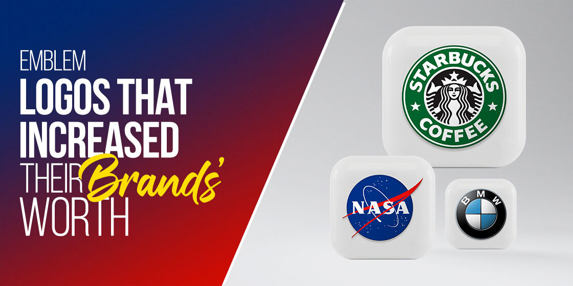
Now, an emblem today is one of the most popular type of logo recommended by logo design services for big brands, as it can tell an entire story and easily connects with the people. And you can see them all around you, from the Starbucks mermaid to the UPS shield. So what is it that makes this type of logo so successful and popular among the big brands? In it their design that instill a sense of trust and respect in their brands? Is it their timelessness or their ability to capture their history and legacy within their designs? Or is it something else?
Let’s take a look at what emblem logos are, and understand the brand logos for some of the top brands that use emblems, in order to find the answers to these questions.
1- What is an Emblem Logo?
Before we begin to break down and understand the famous emblem logos, we need to understand what they are exactly. Technically, an emblem is a symbolic badge that represents the company. In the past era, aristocratic families and other people of note had a coat-of-arms or a shield that was used as a seal representing them. They used it to ratify documents, or seal documents as a sign of authenticity.
There was often an air of nobility surrounding those who were allowed to have a coat-of-arms. It represented a rich legacy and history, something that raised the person or their family above the commoners.
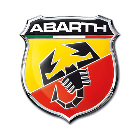
Today however, that trend has changed somewhat. In the world of business today, many brands are now sporting an emblem or seal as their logo. For example, take the logos for Abarth and Alfa Romeo. Both of those Italian automobile makers have a rich history spanning decades, and that history is given a touch of nobility by their emblem logo.
Some emblems are just a symbolic representation of the entity they represent, while others use a mix of words and symbols to give it a strong impact. Their purpose is to evoke the desired emotions from the audience. And some of these do it so well, that they transcend the state of just being a brand logo, something that is rarely achievable for many other types of logos.
So now that we understand the concept behind an emblem logo, let’s take a look at some of the most famous emblems we see around us today.
2- Famous Examples of Emblem Logos That Define Great Brands
Now when we talk about emblem logos, there are a few different styles for them too. For brands with an old and rich history and who prefer to be known as traditional, a vintage style emblem would be perfect. On the other hands, brands that wish to show that they have kept up with the times might prefer a modern logo.
And for those who want to create a logo that mixes elements from the other two styles, a timeless emblem is the way to go. Now, depending on your business niche and brand tone, your style of choice should be suitable to reflect that. For example, a company known for being cutting-edge in the industry but uses a vintage style for their logo isn’t going to get a great response.
Therefore its important that you choose the right style for your logo. Some of the most common styles include:
- Vintage emblems
- Modern emblems
- Timeless emblems
3- Vintage Emblem Logos
As we discussed earlier, emblems are generally associated with a long history and legacy of achievement. Therefore, it may seem obvious that the best style of logo for one would be vintage. Let’s face it, what could be a better representative of a rich history, than a design that looks dated too?
Vintage, however, doesn’t mean old and aloof from the consumers’ mindsets. Vintage means something that represents the old, but still appeals to the people of today. And there is nothing better for a brand that is looking to be there a few decades and even a century or more, to have a vintage emblem that could be tweaked slightly with the times to represent them throughout their life.
Let’s take a look at some of the brands who are rocking the vintage emblem look.
General Electric
General Electric, also known as GE, is one of the classic examples of vintage logos in action. The company has been in the market for around 130 years now, and has enough of a legacy to warrant such a logo.
But it isn’t just the history itself. The blue and while color scheme with an elegant yet bold script, using the style of initial logos for this emblem makes for an overall eye-catching design perfectly representing the engineering company.
Plus, the softly rounded lines and flowing pattern makes it look like it would be perfectly suitable as a wax seal, subtly representing its heritage.
Porsche
Like GE, Porsche too has a rich and long history. Its logo is one that is known across the world by automobile aficionados, adorning the faces of some truly remarkable cars for decades. A luxury brand, its logo is unique and attractive compared to a number of other car manufacturers, which makes it easy to recognize the brand quickly.
The design is an interesting mix of traditional and modern. First off, the color scheme and design makes it seem as if it is made out of metal. Next, the dark red and black that accent the design make for a great contrast against the dark gold of the shield.
The presence of this old-fashioned shield design on the front of modern sports cars might sound weird, but the design is one that lends perfectly well to representing the brand, even today, and makes Porsche’s logo one of the prime brand positioning examples in automotive industry.
Harvard

Harvard University is considered one of the best varsities in the world, and is one of the top schools to get into in the United States. Generally, in many countries around the world, you will find educational institutions sporting some of the best vintage logos ever.
That is because, like Harvard, they have been operation for more than a century, and they want their logo to represent that value. And it is that exact same reason why most educational institutes have university logos in the style of emblems.
The dark red logo shield fringed in dark brown-gold makes for an interesting design, as well as the Latin word Veritas, meaning truth, inside it. Overall, it is a logo full of history and legacy.
4- Modern Emblem Logos
Emblem logo does not mean a vintage logo. There are many modern emblems used by brands around us, who have taken the idea from the vintage style, and modernized it for the people and design aesthetics of today. let’s take a look at some of the modern emblem logos popular today.
Ferrari
You might think that a luxury and sports automobile company as old as Ferrari might have a vintage-style emblem, but that is not the case. Ferrari has always been known for testing the boundaries and challenging the status quo, right from the circumstances of its inception.
Originally, Enzo Ferrari, the founder of the company, was part of the Alfa Romeo company, running a works F1 racing team called Scuderia Ferrari. After issues with the company, Ferrari decided to separate from Alfa Romeo, and the house of the prancing horse was born.
As with some Italian sports car companies, Ferrari’s logo features the tricolored band of Italy’s flag at the top of a bright yellow background. One of the most iconic car logos of all time, it features a rearing stallion, and the name of the company below it.
The design is sleek and modern, yet perfectly represents the racing pedigree of the company, connecting their road cars with the horse stable, or Scuderia, of their F1 roots.
NASA

Despite being an official government entity, NASA has a logo that is starkly different compared to the other US department seals and logos. That is because unlike them, NASA’s true mission and purpose is something more abstract and creative.
NASA’s role in the US space program is one that has brought it wide acclaim. And as such, their unique emblem is one that makes it perfectly suited to the institution. Unlike other departmental seal which rely on the words around it to portray their meaning, NASA’s logo makes it quite clear.
A deep blue circle with little stars twinkling, with the institution’s name surrounded by a small white orbiting body, makes its purpose as a space program quite evident.
KFC
The logo for Kentucky Fried Chicken, or KFC, might not seem like an emblem to many people, but it checks all the boxes for one. The clear-cut outline of the logo’s shape, combined with a simple yet highly visible color scheme, the image of KFC’s owner, and the bold lettermark of the name, makes for a highly effective brand logo.
The style of the logo might not be traditionally that of the emblem, yet the purpose and the impact is the same. The image of the colonel and the red and white color scheme is one that has been associated with the restaurant for a long time now, and the combination of it all is one that is easy to remember and recognize among the many different restaurant logos.
5- Timeless Emblem Logos
Finally, we have some of the most timeless emblem logos that we see around us. All of them have become iconic within their specific industries, and have represented their brands so well that even without an accompanying wordmark like the logos above had, 9 out of 10 people would be able to recognize them easily.
Let’s take a look at them.
Superman
The superman logo is a prime example of a superhero logo that most people would be able to recognize. The S-shaped symbol colored in red over a yellow background have become an iconic symbol today, with people associating it with the fictional character quite easily.
A symbol of hope, it was used to depict a quintessential image the US had of itself; a massive power held back by its morals and restraints, and one that would be there to save the day every time.
Starbucks
The Starbucks logo today has become the universal symbol we associate with coffee. Many brands across the world have tried to mimic the design for their own brand logos in order to benefit from its brand value, yet they have failed.
The green and white color combinations is a calming one that perfectly suits the down-to-earth and natural feeling of a Starbucks café. Blending well with the brown coffee tones all around it, this emblem can be seen all around us, and not just in the US.
Volkswagen

Volkswagen, or the car of the people, is one of the quintessential German car brands that has a long and rich history that spans nearly a century now. Despite that, their logo is one of the simplest ones you will see out their, even more so than some wordmarks.
The design is the perfect example of German straightforwardness. A simple blue circle with the letters V and W placed one over the other makes for a plain, yet highly memorable emblem logo that has allowed the company to use it for decades without any notable alteration.
6- The Impact of Emblem Logos on Their Brands’ Worth
As we can see from the logos above, the emblem logo is the perfect style of brand symbol to represent a rich history for a brand. In many industries, that can be a huge factor in how customers perceive your brand, as businesses with a long history of operation have better chances of getting consumers compared to the one with a shorter one.
Therefore, depending on your niche, as well as your business goals, an emblem might be better for you in the long term compared to any other kind of brand logo.
Conclusion
In short, emblem logos might seem like a rare thing, but we can see them in action all around us. Mostly, it is about how well the design is executed in order for it to represent the brand and its legacy perfectly, which is something most new designers fail at.
However, if you learn how the logos above managed to portray their brand message, values, and legacy into a single design effectively, you will know how to recreate that for your brand too.
People Also Ask (FAQs)
| 1- What is an emblem in a logo? An emblem in a logo is something that mimics a seal, crest, coat-of-arms, etcetera. It depicts the brand, its legacy, and sets it apart with a unique design that adds a bit of nobility to the logo. |
| 2- Is the Nike logo an emblem? Yes, the Nike logo, also called the Swoosh, can be considered an emblem. |
| 3- How is an emblem different from a brand icon? An emblem contains more of your brand identity, meaning it often has more detail than a brand icon. An icon however, can be a single element from your emblem, used for buttons and other call-to-actions, which makes it different from the brand emblem. |

Logopoppin
Logopoppin is a graphic design agency that specializes in logo designing, web development, video production and advanced branding services. We love to innovate businesses with new age technologies, allowing them to improve their visual reputation.

