Table of Content
Discover How You Can Create Amazing Etsy Logo Designs for Your Online Store
Of all the popular eCommerce platforms we know of today, Etsy is one name that we have been hearing a lot about these days. Today, Etsy is said to be a top choice for people who are looking for something unique and artistic, such as crafted items like furniture, jewelry, handbags, and more. Plus, you can also find vintage items and craft supplies on the platform easily.
Now, the reason we call Etsy an eCommerce platform and not a store, is that it allows individual sellers from around the world to form their own store on Etsy, with unique items and an Etsy logo. We all know that no business around the world can function properly without a logo to represent its brand. And the same goes for these stores on the Etsy platform.
However, the question is – what differentiates the Etsy logo design from a normal business logo? And if there is no difference, then can we develop a logo for our Etsy store the same way we would for a normal business store?
Let’s dive in and discover the answer to these questions, and see how we can work with a professional logo design services to create an amazing Etsy store logo for our online business.
What Is an Etsy Logo and Why is it Important for Your Store?
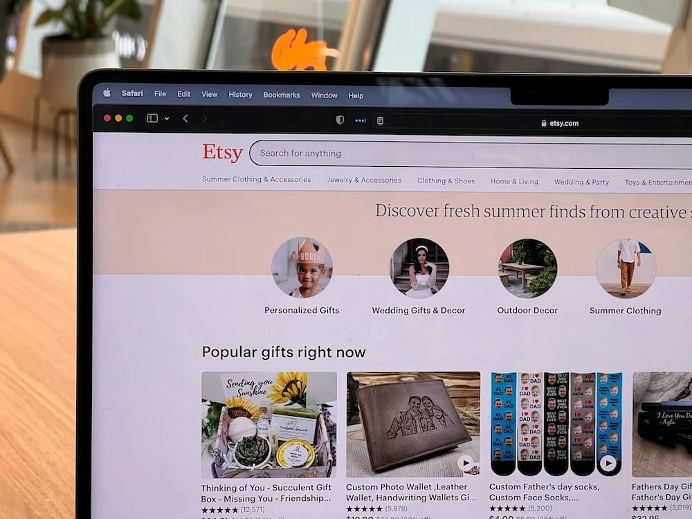
As we mentioned earlier, an Etsy logo is a logo that you create and upload to your online store on the Etsy platform. Like a regular brand logo, its purpose is to represent your store on the platform, and help your followers find your products easily and quickly.
Now, in some instances, it can be argued that unlike a regular brand logo in a less competitive niche or platform, the Etsy logo needs to be far more impactful. That is because stores on Etsy or any other such platform face a higher degree of competition compared to regular businesses.
Imagine that you are a store that sells hand-designed canvas bags. It is possible that locally, your business will have less competition. However, on the platform, consumers looking for something like this will have access to dozens of such store, which may make it difficult for your store to stand out.
That is where the Etsy store logos come in. With a well-designed logo for your store on Etsy, not only will you be able to stand out within your local market, but will also have access to potentially a far larger market. Thus, your business would not only grow, but will also allow it to expand its potential.
Moreover, it would help you eliminate any potential confusion among consumers who may be confused between your store and one that may have a similar name and item catalog. For example, let’s say your store is called “Bagsly Aisle” which sells hand-decorated leather purses and bags. A competitor starts their store called “Bagly Aisle” and similarly sells hand-decorated leather purses and bags.
In such cases, a potential customer who just saw your store’s name while passing by would have a hard time differentiating between the two. And chances are, they would be equally likely to browse and patronize your store, as they are your competition.
However, let’s say you have a logo representing your store as well. Chances are that the consumer would have a far easier time remembering your logo than they would your name. And that would mean a much lower probability of a competitor stealing your customers die to mistaken identity.
That is why having a great logo designed for your Etsy store is so important to your business’s success.
Elements That Can Help Your Etsy Logo Design Stand Out
For each type of design, some elements can be tweaked and made the hero, so that it becomes central to their design’s identity. In terms of brand logos, some designs are known for their unique typography, such as the logo for Coca-Cola, some for their iconography, such as the NBC symbol, and others for something else.
When it comes to your store’s Etsy logo, its important that your design stands out distinctly. But what elements can you change to ensure that your design stands out among the crowd? While senior designers may understand that many subtle elements can be tweaked to make a design stand out, some common elements can drastically change your design’s impact.
Now, what are these common elements? Well, the following design elements can not only be tweaked to increase your logo’s impact, but can also be made the hero of your design. Those elements are:
- Your logo fonts
- Your color palette
- Your iconography
Logo Fonts
Your logo fonts are an important part of your logo. Most brands incorporate some form of typography within their designs, either in the form of purely wordmark or lettermark logos, or as combination marks incorporating iconography and typography. Some brands with image-based logos even create separate wordmark logos as secondary brand symbols, designed just as carefully as their main logos.
The fonts you choose for your logo’s typography are important; as they are an element that can help portray your business’s tone and vibe. They are a critical element that helps in attracting and filtering quality leads to your business, as only the right kind of consumers will be attracted to your business logo.
For example, if your business deals in vintage items, yet your Etsy logo features futuristic typography, it is highly likely that your store would fail to attract the right people. On the other hand, with a classic font, you would have a much easier time attracting and converting the right leads.
Color Palette
Just like fonts, your color palette is an important element in your Etsy logo’s arsenal. There has been a lot of research about the impact of colors on consumer behavior in the last few decades. And businesses have used this research to their advantage, by fostering and capitalizing on the consumers’ perceptions to help their businesses grow.
For example, there are many restaurants, specifically fast food restaurants, which use red and yellow in their color palette. Now, while red is used to portray passion and youth, yellow is used for energy and joy. However, when you combine the two, as in the McDonald’s logo, you end up with one of the most potent color combinations that made a restaurant chain world famous.
The resultant combination is used to inspire feelings of hunger and passion, and helps the consumers associate the brand with those feelings, specifically youngsters. Thus, it is important to use colors that complement your business vibe, and are designed to help consumers connect with your brand better.
Iconography
Finally, we come to the last, and arguably one of the hardest elements in your design to tweak. And that is your iconography, or logo symbols. Finding the right iconography to represent your brand and its vibe can be a difficult endeavor in itself. From choosing the type of iconography, such as animal designs, abstract art, and more, to choosing the style of that iconography, from realistic, to animated, it can take a lot of effort.
However, when you find the perfect iconographic design for your logo, there is nothing that can match its impact. Imagine Ferrari without its iconic rearing horse, World Wildlife Federation without their panda, or Twitter without its iconic blue bird. In fact, when it comes to Twitter, you do not have to imagine it. People took up in arms, metaphorically, when Twitter’s new owner Elon Musk decided to change the brand’s iconic logo and name.
Even now, with it being months since that change, people are still not used to the change. That is because after so long, people had gotten used to that symbol. In fact, they had started associating the app and its activities with that symbol.
That makes it an element that can make or break your brand, if not given the right respect.
How to Create a Perfect Etsy Logo to Enhance Your Store’s Brand?
So far, we have discussed the importance of having an Etsy logo, and the common elements that you need to address to ensure that your Etsy logo design is a success. However, knowing what to change and tweak is only useful if you know how to make a logo in the first place.
And that is what we are here for. We have compiled a small guide to help you create an amazing logo for your Etsy store. Now you may be saying that you are not a designer, and that you will need professional help to create a brand logo. However, that doesn’t mean that this guide won’t help you with that either.
By following the steps in this guide, you will be able to guide your hired logo designer better, and will be able to achieve a close representation of a brand symbol that you envisioned. Let’s read on and find out how you can accomplish it.
Understand Your Audience and Brand
The first step you have to take when you ask the question “how to design a logo”, no matter if it is for your Etsy store or for your brand in general, is to know your brand and target audience. Let’s start with the target audience.
The reason you need to keep them in mind and understand them is that they are the ones who are going to view your logo. In fact, not only are they the ones supposed to view your Etsy logos, they are the ones who are supposed to be influenced by them. So understandably, it is their sensibilities and perceptions that we need to think about when creating our Etsy logo design.
Now coming to the brand, you should know your brand so that you can create the perfect logo design to represent it, as well as its values and brand message. And it is the combined might of both brand and audience understanding that will help you create the ideal logo.
Pick the Perfect Font for Your Logo That Matches Your Vibe
Many brand logos feature some sort of typography within it, or use it for their secondary brand logo as a wordmark. That means that there is a high chance that your brand logo would need some sort of suitable fonts to go for its design.
Now, using commonly available fonts as-is can be detrimental to your brand, as consumers would look at your logo and feel as if its familiar and generic. That is why most big brands that use typography in their logos use custom fonts, which are often derived from the more traditional fonts.
For example, the Coca-Cola logo is an old one, but it has been tweaked over the years. And today, while the typography of that logo may seem vintage, it is a case of cleverly modified vintage fonts with some modern elements to give it that old, legacied look.
Choose a Suitable Color Palette to Represent Your Brand
According to widely accepted color theory, different colors and shades have the ability to influence the way we feel. Now, the effect from some shades is due to our body’s physiological makeup, while others are due to societal and cultural perceptions.
For example, take the color black. In some regions of the world, that is the color of bad luck, darkness, death, and despair. In other cultures, it is the color of opulence, dignity, and distinguished stature. Therefore, depending on where your target market is located, you would need to understand how they would perceive your choice of color palette.
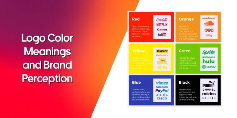
That is why you need to be very careful when choosing your shades, to understand the various logo color meanings and how they might impact the delivery of your brand message. Only with the right combination of design and colors will you be able to deliver it effectively.
Select the Imagery That Tells Your Story
As you know, many logos have some form of imagery as part of their design. It can be something small and subtle, or it may be the centerpiece of your design like the star for the Dallas Cowboys logo. But no matter what its significance within your design, it should match the ideals of the message being portrayed by your logo.
Take the logo for HBO as example. HBO, or Home Box Office, is a media broadcaster that is known for airing movies and TV shows for cable and on-demand. Its logo has been a subtle mark that most of us remember or are currently familiar with. Now while the logo is decidedly a wordmark, the design of the letter “O” has a little artistic flair to it. It is designed to look like an old spool of film, that was used to record and play films.
This design element may be a subtle one, but it is quite effective at enhancing the message portrayed by the brand logo.
Sketch a Few Ideas and Get Feedback from People Close To You
Once you have the basic idea of what your logo should have, with the fonts, color palette, and the imagery chosen, you are now ready to get down to the design phase. However, you won’t be working on your final logo yet. This stage is a kind of visual prototyping and testing, where you will create a few preliminary designs that suit your current understanding of the logo, and test them our among a few close people.
Now, the reason for this step is because it allows you try new and unorthodox methods to create distinct and unique sketches. This is achieved by forcing you to stop thinking with your perceptions and adopt new ideologies in order to come up with new designs.
Now once you are done sketching, you will them present those to your close friends and family, that is people you trust to be honest. They will then give their views and feedback to you, which you can use to tweak and shortlist one or more of these designs for further improvement.
Select the Design That Best Suits Your Business Image

Once you have got the feedback, you can now shortlist the most suitable of those designs based on the comments received. What you will do here is that you will create a sort of rubric for each sketch, with elements like connection with brand image, perception of target market, and more as part of the selection criteria.
The design that best suits those criteria would be then chosen for further refinement, so that it can finally get into the shape of the Etsy logo your brand deserves.
Upload It to Your Etsy Store
Once finalized, you need to export your Etsy logo design into suitable image formats, based on where you may need it. For example, you may add that design to your brand media, such as stationary, product packaging, and more.
Finally, once the logo seems perfectly finalized, you are now ready to add it to your Etsy store. Just log in to your account, and click on the image icon at the top of the page. Click the camera button, after which you will be able to choose and upload your desired logo image to the store.
Now your new logo will be featured on your Etsy store account.
Conclusion
To sum up this article, we can say that creating an Etsy logo for your online store is one of the most important things you can do to prepare it for success. However, a few things need to be remembered and addressed before you end up with a design that can be said to represent your brand effectively.
But, once you understand those elements, all you need is a little guidance to help you create the perfect logo for our Etsy brand, no matter if you create the logo yourself or hire a professional for it. And this article is the perfect blend of tips and design guidance to help you get started.

Logopoppin
Logopoppin is a graphic design agency that specializes in logo designing, web development, video production and advanced branding services. We love to innovate businesses with new age technologies, allowing them to improve their visual reputation.

