Table of Content
Discover Some of the Best Event Planner Websites to Inspire Your Own Creative Layout
Planning a small event or gathering is not that big of a deal. But when the event gets bigger, that’s when you need the help of a professional event planner. Now, event planning can be a big hassle to do well, especially if you have little to no experience doing it before. Therefore, an event planner needs to highlight the types of event they specialize in, like weddings, corporate events, fundraisers etc.
In this digital age, ads on billboards, TV, or radio are not the way to go about it. You need something more versatile, yet highly expressive and personalized. You need a website. Now, a look on the internet will get you several event planning website ideas. But not all design approaches will ensure success. So how can you come up with a design that suits your business needs?
Let’s dive in and inspire your creative brain to come up with an event planner website perfect for your business. We will discuss some of the top event management websites, and see how you can hire professional web design services to incorporate those insights into your own web design.
The Concept behind the Inception of Successful Event Planning Website Ideas

The event planning and management business is a multi-discipline business, and a tough one at that. It requires a mix of management, negotiation skills, planning acumen, and most importantly, a creative streak.
So how can these traits be incorporated into your event planning website ideas, especially when combined with your brand’s vibe? Too serious or corporate-like, and you may lose potential customers looking for a light-hearted event. On the other hand, unrestrained creativity would end up alienating corporate clients, who would be looking for someone with a mature and nuanced approached to event planning.
Ideally, your event planning business would specialize in a specific kind of event, even if you offer other types. For example, let’s say you run an event management company that deals with weddings, open-air corporate events, fundraisers, and more in the countryside. However, despite the multiple offerings, what your people specialize in are weddings.
Therefore, for your website, you should center it around your best offering, i-e weddings. The rest of your event offerings should be placed so that they are only visible once the viewer goes past the initial folds of the landing page or homepage. This would improve your site experience, as you will avoid overloading the consumers with too much information at the same time
Now, what would be considered a good event planner website? It would be one that has a unique and catchy name, and a design that is both aesthetically pleasing and quick to load. It should also be able to guide a visitor through their entire journey, from visiting the site to filling a form or scheduling a meeting.
Therefore, you need to find the right balance between an underwhelming and overwhelming design, so that you site appeals to the consumers, gets them the information they need, and converts them. That is the idea behind the concept of a successful event planning website.
Common Characteristics of a Good Event Planner Website
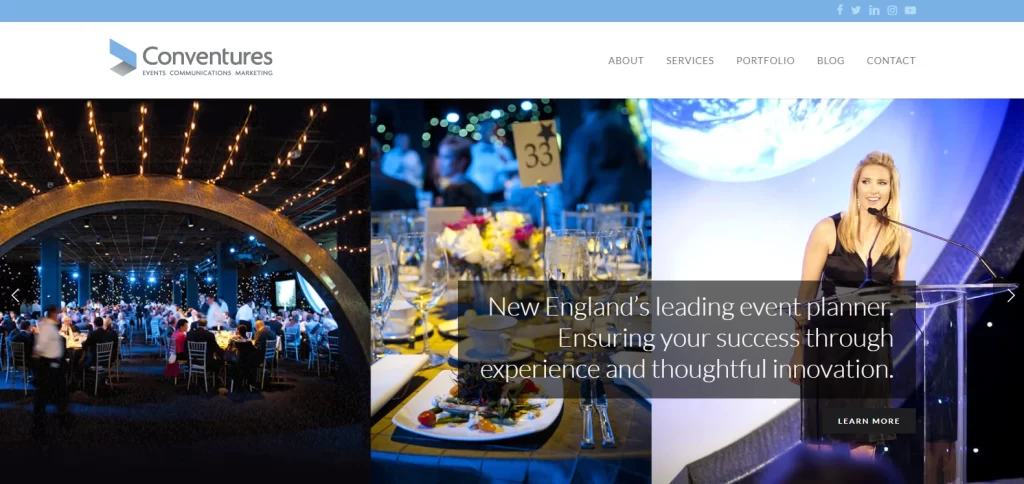
So far, we have taken a look at the importance of having an even planner website, as well as the concept behind successful event planning website ideas. But while it’s easy to understand how a successful event planning website differs from an average one, the question is – what characteristics define a strong event planner website actually?
There are many factors that dictate whether a website becomes a success or a failure. But a vast majority of them are only applicable from time to time, and quite rarely at that. However, some common traits can help you evaluate whether your event management website is a success or a failure.
Let’s take a look at four of the top characteristics of a good event management website.
Improves Organization and Flow of Information
The first trait of successful business website, whether it is for an event planner or some other business, it needs to improve and streamline the flow of information to the consumer. Now, improving the flow of information can be either by structuring the layout of your website for easier reading and comprehension.
On the other hand, a bad website would have a haphazard design, which is either too cluttered or full of irrelevant house member. Therefore, a good event planner website is one that has a clean UI, well-structured and carefully curated information, and is optimized for the mobile environment.
Better Results Due to Increased Attention to Detail
Now, some people may attempt to go around this limitation and shortcoming of a below-average site by keeping it simple. They may only opt to add just enough content to describe your services, with your contact information added to the end for customers who are interested in working with you.
However, some sites are innovating event planning website ideas to include a suite of features designed to make the process simpler and easier. Some of these features include checklists of tasks to do, the ability to add plans like seating plans or floor plans, and much more capabilities often found in dedicated event management software which ensures that there is a lesser chance of missing something crucial for an event.
Easier Collaboration between Clients, Vendors, and the Event Planner
Another way to boost your business with an event planner website is to design it in a way that allows all of the stakeholders for an event, such as the event planner, the client, and various vendors to collaborate easily within the same platform.
One way to do it would be allow the ability to create projects, where an event planner may add everyone who has a key involvement in the project. This way, all the communication would be curated within a single platform, saving you the effort of going back and forth trying to find something you need.
More Intuitive and User-Friendly
Finally, compared to the old method of a customer discussing an event over a call or in person, with the event planner taking notes manually, the digital aspect can make things simpler. It can allow customers to add the required information at the initial stages of the project, allowing the event planner to study them and evaluate whether a call or meeting is required for elaboration.
This saves both time and effort for all parties involved, while at the same time simplifies the process, removing redundant, time-consuming tasks from the process.
Eight Top Event Planning Website Ideas to Inspire and Kickstart Your Design
So far we have looked at the various characteristics that define good event planning website designs, and have discussed the idea and need behind the development of a successful event planner website. The question however is, what does a successful and impactful event planner website look like, and how can you incorporate that into your own design?
Let’s take a look at some of the best examples of highly popular and effective event planning websites, and see how they have managed to get where they are in terms of web design.
D.R. Roberts Events Management
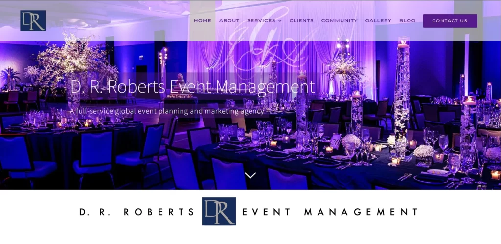
If your event planning business works with high-end events, then you may take a leaf out of D.R. Roberts Events’ book, and utilize the power of color theory. Their website, though somewhat simpler than some of the other options on this list, is a great example of incorporating elegance and royalty in their design.
First, let’s start with their choice of color. Purple is a color that many designers find difficult to work with, due to its inherent connotations with opulence, riches, and royalty. Moreover, its deep shades have overtones of indulgent creativity combined with grace.
Next, there is the full-sized carousel as the first fold of the homepage, which has a set of high-quality aesthetic images of various events covered by the event management company. Then, the interactive elements draw you in, slowly guiding you towards a CTA, where you will be asked to make a decision and choose them as your event planner.
Overall, this amazing event planner website is a great start to this list.
Oxygen Eventworks
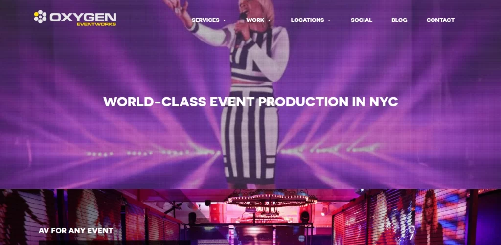
Next up, we have Oxygen Eventworks. Based in the heart of the NYC, this event planning company knows whats up, and has a successful track record across a wide range of events. Its website is an eclectic mix of modern design with some creative upscale elements thrown in. For example, just like D.R. Roberts Event Management, Oxygen too uses emotionally volatile shades including purples and pinks, understanding the importance of using shades with the right color meanings.
That, combined with their translucent overlaid grid pattern arranged asymmetrically, makes it one of the best event planning website ideas to implement on our list. Besides all of this, the company has interspersed images from its various events throughout the design, some on the forefront, while others as a hazy background. Overall, not a bad example to emulate, especially if you are located in a hip urban area like the Big Apple.
Twenty Three Layers
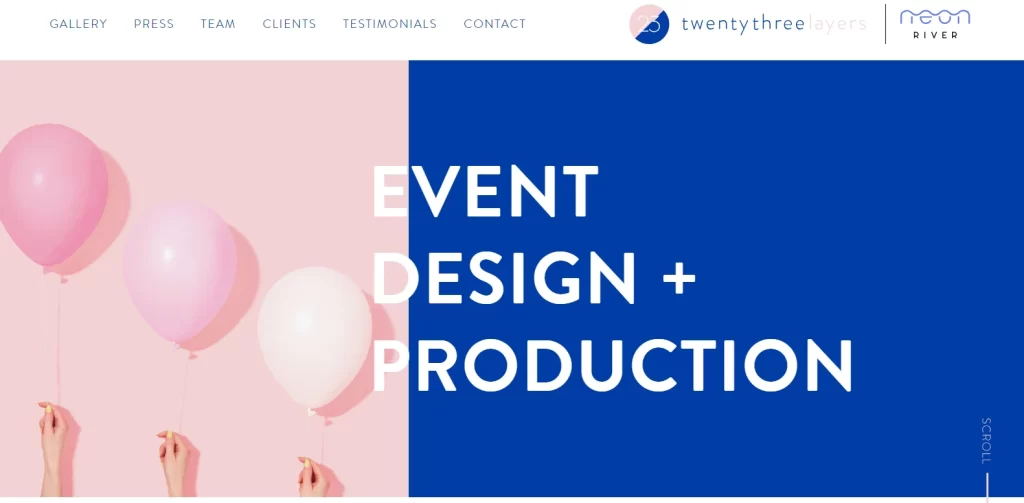
We can honestly say that this website for Twenty Three Layers event planning company sports the most unique design on our list, or even in general. It harnesses the power of visual shock to its benefit, by utilizing high contrast color combinations that clash perfectly enough to fascinate, rather than turn away.
The website uses an avant-garde approach with a light pink and a less-vibrant navy blue take up the entirety of the screen’s first fold. The text uses large, sans-serif typeface colored white to be visible properly.
However, for the following folds, the design uses blocks of light pastel pink and blue over a white background, with the text now colored accordingly to complement the style. Overall, the design is quite soothing and attractive to view. What makes it stand out however is the fact that rather than highlight the events they have covered, the company prefers to portray their creative flair. This approach to getting customers is what has helped Twenty Three Layers Events convert and retain customers.
Event Tech
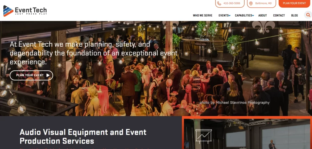
Unlike the event planning website ideas discussed so far, the website for Event Tech is all business and professionalism. Eschewing the approach of showcasing their creativity, the company opts for highlighting the variety of events they plan and manage.
A vast portion of their homepage is centered on images, with the second and third fold of the webpage designs to mimic independent elements sliding over a static background, which is another high-res image from one of their events.
Besides that, they also use hover animations and dynamic elements, which add to the overall pleasing experience. The color scheme uses a lighter shade of orange, combined with three different shades of blue, from dark navy to dark and sky blue. Overall, this is a website that represents an event management company that insists on professionalism.
NOLA DMC
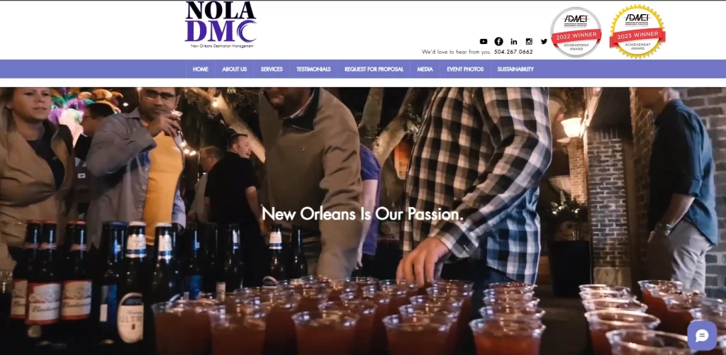
No one can party like the New Orleans people, and it would make sense that an event planning company based in New Orleans would be experts on having a good time. NOLA DMC is a company that aims on providing its customers with a pre New Orleans experience unlike any other.
Their website has a video of various events managed by the company, from parades to carnivals, as well as corporate get-togethers where people can let their hair down and enjoy the company of their peers. The color scheme is a simple white and purple.
Keeping with their approach of providing pure experiences, their website just has four folds, with the video being the highlight, and incidentally the first element that a visitor sees. Overall, this simplicity in design works well with the vibe of NOLA DMC.
Handy & Dallaire Events
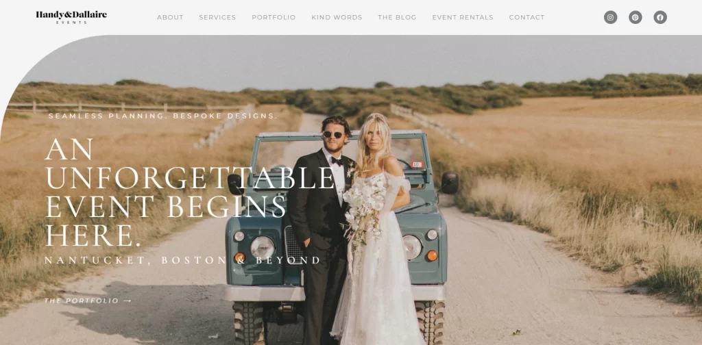
When it comes to some events, namely weddings, people want their money’s worth. They want something special, elegant, and most importantly, unique. But how can you portray these traits in your event planning website ideas?
Well, the answer to that question can be found in Handy & Dallaire Events’ exquisite website. The design is simple, dare we say minimalist, and done in neutral colors like contrasting shades of gray. The design showcases a full-sized image of a newly married couple posing for a photograph on a picturesque country road in the middle of nowhere.
Moreover, the webpage employs extensive use of negative spaces in designs, which lets the visitor focus on the images and the snippets of text without distraction. Even the navigation menu is designed with uniqueness in mind, using phrases like “Kind Words” instead of the more common “Testimonials” or “Reviews”.
Overall, we can honestly say this is honestly one of the top three event planning website ideas on this list, with the top spot being contested between Kristina Banta Events and them.
Andrea Freeman Events
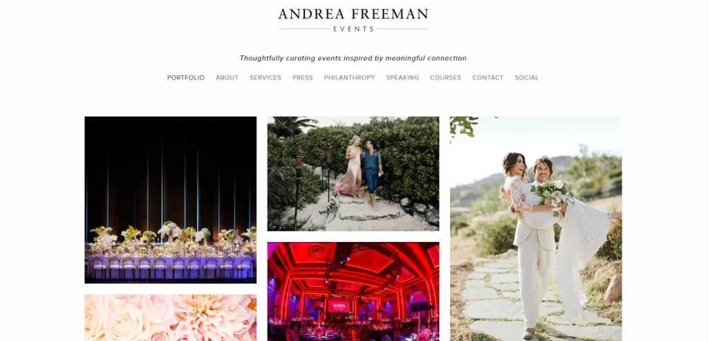
Andrea Freeman Events is one of the world’s most highly sought-after companies, having managed many high-end events such as celebrity weddings, anniversaries, fashion events, and more. with such a high profile, it uses a unique style for their event planner website. Their website starts with a grid of images featuring different events covered by the company. This is a great way to capture a visitor’s attention instantly, enamoring them with high-quality aesthetically pleasing images as soon as they open your website.
These images, featuring photos from events like the wedding of celebrities Ian Somerhalder and Nikki Reed, are the perfect way to showcase their expertise, creative approach, and aesthetic appeal. Frankly, this misses the top spot on our list only because compared to the rest, Andrea Freeman Events are in a league of their own.
Kristina Banta Events
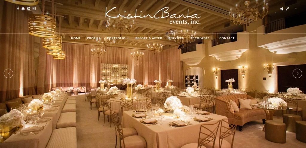
Kristina Banta Events are, to be honest, our top pick for event planning website ideas to try to emulate. For us, it beats out Handy and Dallaire Events by the thinnest of margins, but we understand that for many people who favor a simpler approach to design would favor the latter more.
Their website design follows the design adage of “trusting the process”. Their homepage is nothing but a full-sized carousel of images from their various events. And what beautiful images. The design of common elements, such as the logo and menu is made to complement all of the images on the carousel, and it highlight the company’s focus on managing high-end events.
With this unique take on a company website, they allow the visitor to bask in the elegance of these high-quality images, before deciding what page they want to visit next. This allows for an unadulterated exposure to the company’s quality of work, which in itself is a great converter of leads.
FAQs
| What is an event planner website? An event planner website is a website that represents and portrays an event planning business on the internet. It can be used to highlight the company’s offerings, showcase their expertise, garner feedback, and promote the business. |
| What is the difference between an event planning and event management business? For all practical aspects, they are one and same. However, by definition, their difference lies in their scope of work. An event planner may only plan and suggest elements like seating arrangement, color theme, floral arrangements etc., while an event manager would actually manage and coordinate all aspects of the event such as vendors, deliveries, and more. Usually an event management business has event planners on their team, therefore they are often bundled together. |
Conclusion
Summing it up, coming up with the right event planning website ideas depends entirely on the sites you visit and research. For example, if your event management company wants to cater to a high-end clientele, yet the types of websites you research cater to a more contemporary crowd, you won’t get the necessary insights.
In order to ensure that you end up with a good event planner website, you need to evaluate your expert niche. Center your design on that type of event, while offering other event types as a secondary option. This will give you a better chance at success, as visitors will be able to gauge your passion and expertise more accurately that way.
Overall, if you are looking for ideas for your event management website’s design, this article is a great place to start and serves as the ideal web design guide for event management businesses.
Related Resource: Check out top event planner logos here for inspiration.

Logopoppin
Logopoppin is a graphic design agency that specializes in logo designing, web development, video production and advanced branding services. We love to innovate businesses with new age technologies, allowing them to improve their visual reputation.

