
Table of Content
How the Carolina Panthers Logo Changed To Represent the Team Over the Years
The Carolina Panthers are one of the NFL’s thirty-two teams who are currently playing in the League. Based out of Charlotte, North Carolina, the team has one of the biggest fan bases in the entire National Football League, and is represented by a black and blue design of a snarling black panther as its logo.
Now, there is nothing new or odd about an NFL team being represented by an animal. However, it is the way that the logo perfectly encapsulates what it means to be a strong professional sports team that makes this logo so effective.
And despite being one of the newer franchises, the team has managed to make its mark, garnering a strong fan following that has resulted in sold out games since 2002. However, from a design and branding perspective, there are some things that need clarity. For example, the states of North and South Carolina have been non-partisan for a long time now. However, in recent years we have seen the campaign #OneCarolina associated with the Carolina Panthers tea.
So, the question is, what is about its logo that has got people from two competitive states to rally behind the Carolina Panthers NFL team? Does it have something to do with the panther imagery, which is somehow connected intrinsically to the land of the Carolinas, as in the case of the Denver Broncos logo? Or is it something else?
Let’s discover the inception and the evolution of the Carolina Panther symbol, and see how it rallied together two old rivals. We will see what makes it so special, and learn how experienced logo design services can use it to their benefit.
The History of the Carolina Panthers – The Team That Beats to the Hearts of Two States
Before we begin to discuss the concept and evolution of the Carolina Panthers team logo, let’s take a look at how the team came to be in the NFL in the first place.
By the early 1990s, the NFL has 28 teams, equally divided between the AFC and NFC conferences. However, since the late 1980s, former wide receiver for the then Baltimore Colts, and Charlotte, New Carolina native, Jerry Richardson had been trying to gain support for a local NFL team. Taking up his cause, and setting aside their opposing politics, businessmen and politicians from both North and South Carolina started lobbying current NFL franchises to support this premise.
As a former professional football player, Richardson had wanted a local NFL team for a long time. And when George Shinn managed to get the NBA franchise Charlotte Hornets enfranchised, he decided to try for one from the NFL as well.
In order to show the NFL that there was a massive demand for football in the Carolinas, Richardson’s company held preseason games between existing NFL teams in both North and South Carolina. The locals showed their support by buying tickets in large quantities.
Finally, believing their bid to be a solid one, they officially submitted an application to the League later that year, and by unanimous support from the existing 28 franchises, they were awarded the expansion. This made them the 29th NFL team, with the Jacksonville Jaguars becoming the 30th franchise. Both franchises later debuted for the 1995 NFL season.
As of now, the Panthers are the newest team in the NFC, and the third youngest team in the NFL, if you do not count the dissolved-then-reinstated Cleveland Browns as a new franchise.
Over the years, the franchise has seen some success, winning the NFC South title five times, second only to division rival New Orleans Saints, and the NFC Conference twice. Moreover, they have also qualified for the playoffs eight times in 27 seasons, much better stats then the Jacksonville Jaguars who joined the League at the same time.
As for the team, the next few years were a time to forget. They faced steadily declining performances that culminated with the team finishing the 2001 season with a 1 – 15 record, an NFL loss record that lasted until the 2008 Detroit Lions season.
With the NFL introducing its 32nd team in 2002, the Panthers moved to the newly created NFC South, along with their fellow NFC West teams Falcons and Saints, and joined by the Buccaneers. They finished the 2002 season with a 7 – 9 record, despite having a defense that was ranked the second best in the league, and because of an abysmal offense that was ranked the second worse in the league.
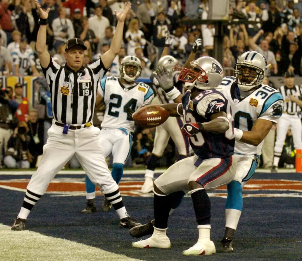
The 2003 season was a surprise turnaround for the franchise, finishing with a 11 – 5 record, and winning their first NFC South title. Moreover, the team also became the NFC Conference champions, making it to their first Super Bowl appearance.
The 2003 Super Bowl, also called the Super Bowl XXXVIII, was played between NFC champion Panthers, and the AFC champions New England Patriots. The match was a close one, with the Patriots winning with a final score of 32 – 29. However, some experts rate it as the “Best Super Bowl match of All Time”.
The 2004 season was marred by bad luck, with more than a dozen Panthers players being sidelined due to injuries, and the season finished with a score of 7 – 9. 2005 was better, with the Panthers making the playoffs with an 11 – 5 score, and winning the first round of the playoffs with a 23 – 0 shutout against the New York Jets, a first in the NFL since 1980.
The upcoming years a mix of ups and downs for the franchise, with the team failing to replicate the greatness from their first Super Bowl appearance season. However, despite this, they have the support of both North and South Carolina football fans behind them, through thick or thin.
A Look at the Carolina Panthers Logo and Its Hidden Significance
When we take a look at the Carolina Panthers logo, many of you would just see the roaring panther. However, something about it has managed to rally to rivaling states behind it, making it one of only two NFL logos to have ties to multiple states.
Now, there is no connection between the Carolinas and the black panther. However, culturally, it has had a huge impact on the region in a relatively short time. The North and South Carolina have long had their differences, with each of them trying to get one over the other whenever possible.
However, the Carolina Panthers logo and team are two elements for which they forget their differences, and lend their support to the concept of #OneCarolina. It has bought two groups of people together, making them forget their differences, and helping them support their team properly.
Now, some people out there claim that that the design for the Carolina Panthers logo is based on the combined map of North and South Carolina. Upon hearing this, we were rightfully skeptical, and decided to check and see if there was any truth to it.
After overlaying both designs, and trying to make the images fit over each, we can say that the two shapes only slightly match each other’s shape. And its nothing more than just coincidence that it occurred.
Overall, the Carolina Panthers symbol has made a huge impact on football and their fans in the Carolinas, making it culturally significant to the region.
Evolution of the Carolina Panthers Logo Over the Ages
Now that we have taken a look at the history of the team, and the influence of the Carolina Panthers logo on the locals, we understand that despite a short tenure, the Panthers have made their mark. Despite less than thirty years playing in the NFL, the team represents the football fans from two different states, North and South Carolina. That makes it only the second team besides the New England Patriots to manage that.
In this short amount of time, the franchise hasn’t felt the need to change its logo too many times, just like the case with the Dallas Cowboys logo. And despite some minor design tweaks, they have left the design as close to the original design as possible, which is still remarkable considering the dynamic nature of the industry.
Therefore, without further ado, let’s take a look at the evolution of the Panthers logo, both primary and the wordmark.
1995 – 2011 Primary Panthers Logo
With the team’s debut in the 1995 season, that was the year the first Carolina Panthers logo was revealed as well. The logo design features the snarling head of a panther, portraying ferocity and strength, just like the Philadelphia Eagles logo.
The aggressive imagery, combined with the color scheme of black throughout the design, and accented with some blue and white, make it highly memorable. However, the straight, long, vampire-like fangs, comically long whiskers, and a short head compared to the body of the design are just some of the things that were out of place in an otherwise great design.
Initially, the design featured just the head and the shoulders of the panther, with the entire outside edge of the design colored blue, while inside the design was colored black. By conjoining the accents with the border, the team managed to create a well-defined animal logo that, while not quite realistic, had the potential to be a great logo. And it proved that, representing the franchise for sixteen seasons.
2012 – Present Carolina Panthers Primary Logo
With the original Carolina Panthers logo being used for more than a decade and a half, by 2012 the franchise wanted to revamp its imagery based on the changing aesthetic and dynamics of the game. With 2012 introducing a new style of uniforms in the shape of Nike’s Elite 51, the changing dynamics of the uniforms demanded that the logo too be revamped.
The franchise came up with a unique way to edit tweak the logo for modern aesthetics, without losing the essence of the original design, something many team logos such as the New Orleans Saints logo struggle with. First, the blue outline was removed, with only the blue accents remaining in the design. Next, the head of the panther was enlarged to be more realistic, the fangs made more naturally curved, and the whiskers shortened and colored blue instead of white.
The blue accents were also reworked to look more natural, as if the light is glinting off a sleek black body, throwing shades of blue. And these changes made the logo more impactful. The comparatively larger and more ferocious design was better suited for visibility, and looked a lot more modern without losing its classic appeal. That is why, this version of the logo is still being used to the present day.
1995 Panthers Wordmark Logo
Besides their primary symbol, the Carolina Panthers logo also featured an accompanying wordmark. The first year of the team, the design of their wordmark logo was made to look like a waving flag or banner, with the name of the team on it in custom logo fonts.
Over a black background, the wordmark was written in two pieces, with the word “Carolina” written in all uppercase, bold letters. The letters were colored the same blue as the primary logo’s accents, and had a thin white inner and outer outline.
The word “Panthers” on the other hand, was written in a larger, bold, sans-serif font, except for the last letter of the word, which featured a swish to its lower stroke that ran underneath almost the entire word.
Now, while it looked okay at that time, the design was more reminiscent of a college or high school team logo, rather than a professional sports team. And that is why it was used just for a single season.
1996 – 2011 Carolina Panthers Wordmark
The second season of the Carolina Panthers in the NFL saw the team sport a new wordmark logo. This version of the Carolina Panthers logo wordmark was designed to look and feel wilder, with rough, dappled edges to the letters to make it look as if written by savages.
The color blue was used throughout the design, similar to the shade used by the Detroit Lions logo at that time, and had a decidedly animalistic feel to it. The typeface was a script-like font that was written in all uppercase letters, with a slight tilt to them.
This new design was a big departure from the earlier iteration, and better represented the wild nature and ferociousness of the Panthers. So good was the logo that it was used for fifteen seasons before the major logo revamp of 2012.
2012 – Present Wordmark for Carolina Panthers

In 2012, the new Carolina Panthers logo was revealed, along with a new wordmark. This new design was more modern, and did not have the same animalistic feel as the previous wordmark, which was a sharp contrast to its primary symbol counterpart.
The new design featured tall, angled letter with little serif at the top of each letter, kind of similar to the Atlanta Falcons logo wordmark. The letters were all in uppercase, and had a uniform size across the design. While quite plain for the most part, some of the letters featured scratch marks as if made by a panther’s claws, which was the only sign of the symbol’s wild nature in the wordmark.
The color scheme used was a shade of blue a few degrees lighter than the one used in the previous design, which made it stand out better when accompanied by the primary logo symbol.
FAQs
| What does the Carolina Panthers logo mean? The image of the snarling panther depicts a drive for forward movement, a proclivity to attack, and sheer animalistic determination. |
| Why did the Carolina Panthers change their logo? The Panthers changed their logo to make it more prominent for the new uniforms developed by Nike, with bigger, more expressive features. |
| Is the Panthers logo designed to look like the map of its states? No, the Carolina Panthers logo is not designed to the shape of the map of the Carolinas. It is just an urban myth, while in reality the similarity in the shapes is nothing more than a coincidence. |
Conclusion
To sum up the discussion, there have not been a lot of changes to the Carolina Panthers logo. However, a big reason for that is that the franchise was able to create a logo that represented their qualities and values perfectly, and were smart enough to make the changes required at just the right time.
Over the years, the NFL has seen many team logos being changed, with some like the LA Rams logo featuring a number of massive changes in quite s short period of time. That was because of the team’s history of moving from city to city during the decades, which made it difficult for the team to retain a logo.
Then there is the case of the Washington Commanders logo, whose previous identity as the Washington Redskins survived for decades before public outrage at the insensitivity of its inspiration changed it. In both these scenarios, the reason for changing their logo was out of the team’s control.
However, it is possible that with a help of a savvy brand logo designer, they could’ve come up with a logo that would have represented their qualities rather than the name. And that would’ve helped them retain their visual identity with just minor tweaks after the fact.
Latest news you want to know!
Subscribe for cutting-edge design inspiration at Logo Poppin! Elevate your brand with updates on logos, branding, web design, and video animation.
Note that by clicking “subscribe,” users may agree to our privacy policy and consent to Logo Poppin to use your contact data for newsletter purposes.
Logopoppin
Logopoppin is a graphic design agency that specializes in logo designing, web development, video production and advanced branding services. We love to innovate businesses with new age technologies, allowing them to improve their visual reputation.

