
Table of Content
Discover All FIFA World Cup Logos and Their Transformation Through to the Modern Day
The FIFA World Cup stands as the peak of football glory today, and has been since its conception. Despite the popularity of football leagues like the English Premier League, or La Liga, nothing matches the World Cup’s ability to captivate audiences worldwide.
Known for showcasing the perfect blend of athleticism, skill, and national pride, it features 32 team competing for the chance to win the glory – the famous World Cup trophy. Since its inception in 1930, the FIFA World Cup logos have evolved from simple, poster-like designs to iconic symbols of today, reflecting the changing football and design aesthetic.
Join us as we start on a journey through the decades to explore the evolution of the tournament’s symbol, and discover how a modern logo design agency incorporate its modern aesthetic into its work.
Origin of FIFA and the Early Years of FIFA World Cup Logos – Posters, Not Logos
In 1930, the Fédération Internationale de Football Association arranged the first FIFA World Cup, known simply as the World Cup. This tournament was played between the senior men’s national teams of FIFA’s member countries. The tournament is arranged every four years, and it has been postponed only twice since its inception, in 1942 and 1946, due to the Second World War.
Over the years, the World Cup has grown from 13 teams in the first tournament, to 32 teams in the last tournament. And the upcoming 2026 World Cup will feature 48 teams. In their earliest iterations, the logos were more similar to posters rather than the conventional sports logos we are used to today. Let’s take a look at what they looked like.
1930 FIFA World Cup Uruguay Logo
The inaugural FIFA World Cup in Uruguay marked the beginning of the iconic tournament. It featured an eclectic style of design, using geometric shapes and designs to create an image of a goalkeeper stopping a goal.
1934 World Cup Italy Logo
The 1934 FIFA World Cup in Italy continued the tradition of using posters as the primary style of the tournament’s visual representation. These posters highlighted the host country’s official emblem alongside the game imagery, as well as the flags for some of the major participants in the background.
1938 World Cup France Logo
In terms of design, the 1938 FIFA World Cup held in France saw further evolution in terms of aesthetic, with the posters now featuring bold typography and dynamically colored illustrations. While not yet a proper logo in the modern sense, this design was crucial in laying the groundwork for FIFA World Cup branding in the future.
1950 World Cup Brazil Logo
The 1950 FIFA World Cup in Brazil saw the last of the poster-style FIFA World Cup logos, and it saw the start of a distinct tournament logo began to take form. Held after more than a decade due to World War II, the tournament’s logo design featured a player’s foot kicking a ball, with the sock featuring the flags of the nations’ participating.
Golden Age of FIFA World Cup Logos of the Mid-20th Century – Enter the Brand Logos
Post 1950, the concept of sporting tournaments having a proper logo saw a surprising uptick. With the trend already changing in the FIFA world as well, the next FIFA World Cup logos until the end of the 20th century saw a variety of football logos emerge.
Let’s take a look at the secrets they held.
1954 World Cup Switzerland Logo
The 1954 FIFA World Cup was held in Switzerland, and it introduced the concept and importance of a unified brand identity. The new logo for the tournament was prominently displayed on official merchandise and marketing materials, as its design made it easy to do so.
The emblem featured a stylized football featuring the colors and symbol of the Swiss flag, placed at the center of a globe. This represented the global appeal and range of the sport, an element that was not captured by the previous designs.
1958 World Cup Sweden Logo
The 1958 FIFA World Cup, which was held in Sweden, marked a new milestone in logo design with the introduction of a proper visual identity that extended beyond the tournament itself. With the tournament designers going for a proper brand symbol, the emblem featured a lettermark in blocky sports fonts, with the top featuring a football with the sun shining on a small patch. This represented the polar phenomenon of constant nights and days in some regions of the country.
1962 World Cup Chile Logo
The 1962 FIFA World Cup in Chile continued the trend of incorporating national symbols into tournament logos, with the emblem featuring a large football stadium with the Chilean flag. This was placed over a large round shape, the bottom half of which was a globe, while the top half was a football. This showed that the designers were quickly learning how to design a logo representing both the tournament and the host country in the same design.
1966 FIFA World England Logo
The 1966 FIFA World Cup in England marked a departure from traditional logo design, with the introduction of a more abstract and modern aesthetic. The emblem featured a giant Union Jack, over which was a round blue football with a globe-like pattern. Over this was the golden FIFA trophy, and underneath the design was the host team’s logo symbols – the three-lion passant guardant, the symbol for King Henry I of England, and the British Royal Coat of Arms.
1970 FIFA World Cup Mexico Logo
The 1970 FIFA World Cup in Mexico embraced vibrant colors and bold imagery, reflecting the country’s rich culture and festive spirit. The emblem featured a dynamic Aztec-inspired football design, which used a style that resulted in the perfect negative space logo. The colored shaped of the design were a bright blue, and the bottom featured an interesting font for the wordmark.
1974 World Cup West Germany Logo
The 1974 FIFA World Cup in West Germany introduced a modern, minimalist approach to logo design. The symbol featured a simple yet powerful design of concentric lines flowing into a circle, symbolizing unity and teamwork. This design set a new standard for clarity in FIFA World Cup logos and branding.
1978 FIFA World Cup Argentina Logo
The 1978 FIFA World Cup in Argentina showcased the host country’s passion for football through its emblem, which featured a classic black and white football framed by two pairs of blue and white lines. The use of Argentina’s national colors with the football emblem was a great way to connect the two brands, representing Argentina’s close ties with the sport.
1982 World Cup Spain Logo
The 1982 FIFA World Cup held in Spain embraced a more traditional approach, and featured one of the simpler FIFA World Cup logos on this list. The design featured an iconic football flying through the air, with a red and yellow streak behind it showing its streak. Although the concept was similar to the previous Argentinian design, this one was quite simple in its visual representation.
1986 World Cup Mexico Logo
The 1986 FIFA World Cup in Mexico bought another great Mexican design after the 1970 tournament, with the emblem featuring a red and white football surrounded by two gray globes. Each globe featured one-half of the Earth, representing the truly global reach of the tournament. This design captured the essence of Mexican culture and tradition, creating a sense of excitement and anticipation for the tournament.
1990 FIFA World Cup Italy Logo
Talking about interesting FIFA World Cup logos, the 1990 FIFA World Cup in Italy introduced a more sophisticated and elegant logo design. Using two-tone green and red color combinations to offset the anthracite of the football’s 3D design, the design featured an offset-tilt wordmark at the bottom too. This design reflected Italy’s reputation for style and sophistication, with the digital design setting the tone for a memorable tournament.
1994 World Cup USA Logo
The 1994 FIFA World Cup in the United States embraced a bold and dynamic aesthetic, with the emblem featuring a stylized blue soccer ball bursting through flowing red and white lines. This design, although simple, was perfect in showcasing the design aesthetic of that era.
1998 FIFA World Cup France Logo
The 1998 FIFA World Cup held in France featured a logo that celebrated the country’s rich history and cultural heritage. The emblem featured a stylized modern football emerging over the horizon of France as if seen from space, creating a sense of national pride and excitement, and showcasing the sport of football eclipsing the world.
Modern Era FIFA World Cup Logos – The Emphasis on Globalization of the Sport
Finally, we enter into the 21st century, and with it, we see a massive change in how sports approached logo designs. While American sports leagues had long had well-defined symbols, such as the popular MLB and NFL logos, most European sports leagues had no such defining logo.
Let’s take a look at how these modern FIFA World Cup logos changed the game.
2002 FIFA World Cup Korea/Japan Logo
The 2002 FIFA World Cup in Korea and Japan marked a significant milestone in FIFA’s branding, with the new logo a complete departure from the ones before it. The emblem now featured a dynamic and geometric design of a football, combined with the profile of a fan waving a flag, into a cohesive design symbolizing the unity of the host nations. Combined with the color scheme used, the project resulted in one of the best FIFA World Cup logos on this list.
2006 FIFA World Cup Germany Logo
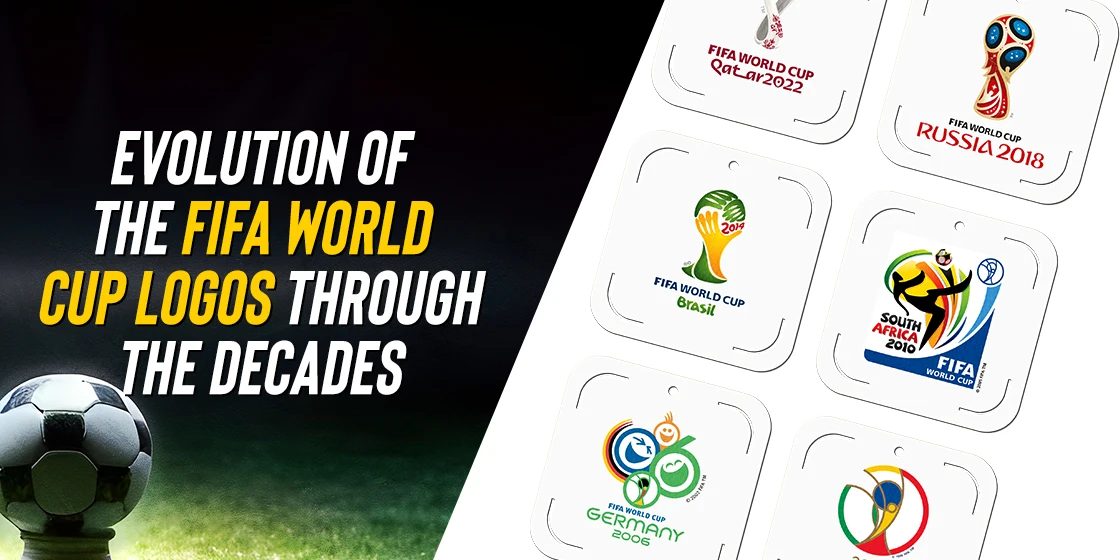
The 2006 FIFA World Cup in Germany embraced a lighthearted, modern design aesthetic, with the logo featuring a set of three circles showing smiling and laughing faces. The two bigger circles were also designed to represent the year of the tournament, forming “06” with their design. At the bottom, they incorporated the previous FIFA World Cup logo, continuing its legacy, while the circle above it featured a tri-color streak encircling half of it, in the colors of the German flag. This design reflected Germany’s reputation for innovation and efficiency, setting the stage for a memorable and successful tournament.
2010 FIFA World Cup South Africa Logo
The 2010 FIFA World Cup in South Africa celebrated the tournament’s first-ever hosting on the African continent with a logo that embraced the country’s rich cultural heritage and vibrant spirit. The design featured a dynamic composition of multicolored strokes, predominantly in the colors of the country’s flag, even incorporating the 2002 FIFA World Cup logo into the design. The unconventional yet exceedingly attractive logo had a decidedly African feel to it due to its vibrancy.
2014 World Cup Brazil Logo
The 2014 FIFA World Cup in Brazil embraced the country’s passion for football with a logo that captured the energy and excitement of the tournament. Taking the central part of the 2002 logo as the synonymous FIFA World Cup logo, they put it front and center in the form of a trophy. The design looked as if it was made by hands coming together, while the top part looked like an abstract football design. The color scheme was Brazilian green and yellow, and the whole design was vibrant. Despite this, football fans ridiculed the design across the world.
2018 FIFA World Cup Russia Logo
The 2018 FIFA World Cup in Russia showcased the country’s rich history and cultural heritage with a logo that celebrated the tournament’s return to Eastern Europe. Although the basic profile was the same as the previous iteration, this design is considered one of the most iconic FIFA World Cup logos of all time. The emblem featured an amazing composition of a football and Russian motifs, from Faberge eggs to Saint Basil’s Cathedral, and even the Sputnik space probe. The fans lauded even the striking dark red and blue color scheme, accented by metallic gold.
2022 FIFA World Cup Qatar Logo
The 2022 FIFA World Cup in Qatar embraced a futuristic aesthetic, and featured another departure from a symbol that people had now grown to love. Taking a similar profile, the designers turned it into a figure-of-eight shape covered in an embroidered cover, to represent the 8 World Cup stadiums. The color scheme featured Qatar’s colors, while the wordmark had an Arabic calligraphic feel to it. While the design was progressive and visually striking, it did not go over as well as had been expected.
2026 FIFA World Cup USA/Canada/Mexico Logo
The upcoming 2026 FIFA World Cup will be held jointly in the United States, Canada, and Mexico. This will mark the first time that Canada hosts the World Cup, making it a great milestone. However, the design of the logo for this tournament has been a major hit-and-a-miss. Since the logo for FIFA World Cup 2014, people had been wondering if FIFA was deliberately focusing on the trophy for the tournament logos.
That was proven to be true when the 2026 World Cup logo dropped, featuring a blocky “26” as the background, and the golden trophy featured prominently at the front. And this strategy has not gone over well with fans, with many decrying the lack of creativity in this design.
Frequently Asked Questions
| What does the 2022 FIFA World Cup logo represent? Created by “Designed by Unlock”, a Lisbon-based design firm, the logo represents Qatar’s heritage, as well as the country and sports constant rise. The design can be considered as an infinity symbol representing the brand’s growth, as well as a number 8, to represent the eight tournament stadiums. |
| What is the FIFA World Cup logo for 2026? The World Cup logo for 2026 features a massive, blocky “26” written vertically, with a hi-res image of the World Cup trophy superimposed over it. The numbers at the back are colored a simple black, and while the design is minimalist, it lacks a certain creative flair that FIFA logos are known for. |
Conclusion
To sum it up, the evolution of FIFA World Cup logos reflects the changing landscape of football and graphic design over the years, from simple beginnings to the global phenomenon they are today. And with each new iteration, the design tells a story of the tournament’s journey, capturing the spirit and national identity of each edition.
As we look forward to future tournaments, we hope that all FIFA World Cup logos that are yet to come feature that same creative streak, to foster a sense of universal appeal and camaraderie.
Logopoppin
Logopoppin is a graphic design agency that specializes in logo designing, web development, video production and advanced branding services. We love to innovate businesses with new age technologies, allowing them to improve their visual reputation.

