
Table of Content
Explore the Complete History of Formula 1 Logo Below
When it comes to talk about racing, the F1 logo always comes first in the mind of many people. It represents an elite tournament in which best of the best racers compete with each other. Over the years, this logo has remained a symbol of high-quality racing, which is why its prominence in the industry is simply unchallenged. The F1 logo history dates back to early 1980s when the concept of professional racing was introduced newly in the world. Since then, this logo is seen as the icon of professional racing that involves highly skilled racers from around the world.
The branding history of F1 is quite diverse, as the logo of the tournament saw transformations in different eras. Crafted by professional logo design services, the purpose of every rebranding was to keep the identity of the tournament fresh, and it really worked well for the event. Over the years, the popularity of F1 has taken a huge leap, as more and more people have shown a great interest in the professional racing. Today, it has become a symbol of high class racing that involves super fast cars and skilled drivers sponsored by many big brands in the world.
In this blog, we will discuss in detail the history of the F1 logo. This will be a good read for those who love to watch F1 racing and want to learn about its detailed history. So, let’s start from the beginning by understanding how this tournament got started.
A Quick Look at the Origins of Formula 1
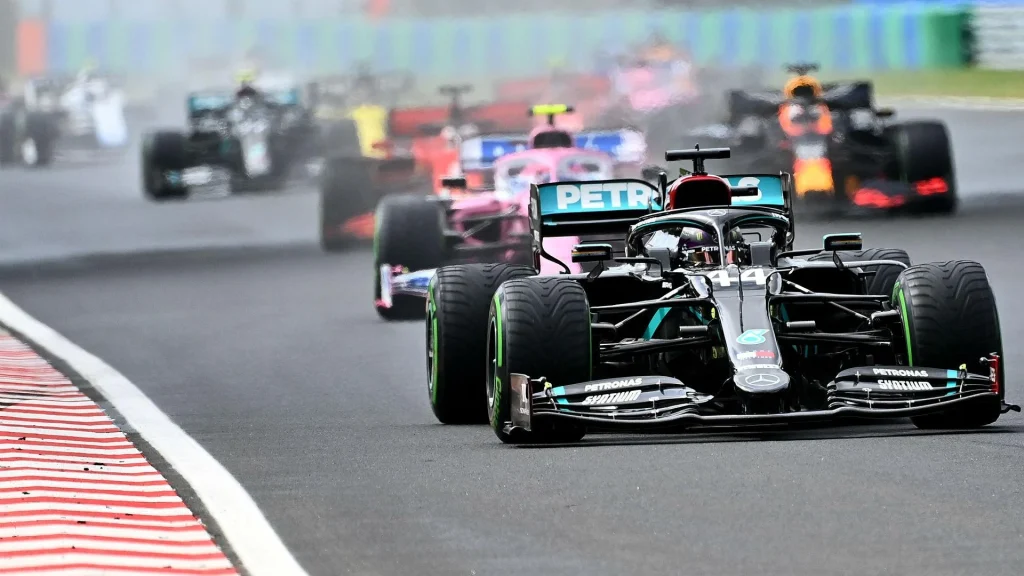
The origins of Formula 1 can be traced to the year 1950, when it was officially established by the Fédération Internationale de l’Automobile (FIA). This marked the beginning of a revolutionary era in the world of motorsports. Formula 1 was not just a new racing competition, but the birth of a highly organized sport that would grow into a global phenomenon. It brought together the best drivers, engineers, and manufacturers from around the world, setting the stage for an international competition that would evolve into one of the most prestigious sporting events.
From its humble beginnings, Formula 1 quickly captured the imagination of motorsport enthusiasts worldwide. Over the decades, the sport has become synonymous with cutting-edge technology, thrilling races, and the pursuit of excellence. The championship series has grown to feature iconic tracks, legendary drivers, and fierce rivalries that have shaped its rich history. Formula 1’s unique blend of speed, precision, and strategy has made it a captivating spectacle, drawing millions of viewers to each race and cementing its place at the pinnacle of motorsport.
Today, Formula 1 is not just a leader in motorsport viewership, but it is also taking significant strides in promoting sustainability and environmental responsibility within the industry. The sport has embraced various innovations aimed at reducing carbon footprint, such as hybrid engine technology and sustainable fuel initiatives. In addition to its commitment to the environment, Formula 1 continues to inspire future generations of drivers and engineers, pushing the boundaries of what is possible in both sport and technology.
History of F1 Logo
Just like other sports logos, the F1 logo has also a rich history spanned across decades. It evolved from time to time, keeping the tournament identity perfectly fresh for branding. If you do not know how the F1 logo evolved through the years, take a look at the complete history of different F1 logos in detail below.
F1 Logo (1985-1987)
The original Formula 1 logo, introduced at the inception of the sport, featured a design that was both simple and distinct. The logo was primarily composed of a long horizontal rectangular shape, which housed the wordmark “F1” at the center. To the left of this wordmark logo was a rounded emblem that complemented the overall aesthetic, creating a balanced and recognizable visual identity.
In terms of color, the initial Formula 1 logo utilized a combination of blue and gray tones to evoke a sense of professionalism and modernity. The background was a soft light gray, providing a neutral canvas that allowed the darker blue elements to stand out. The emblem incorporated both a darker blue and gray, which added depth and contrast to the design.
F1 Logo (1987-1993)
In 1987, the Formula 1 logo underwent a significant redesign, evolving into a more compact and confident version. The new logo featured a bold, black wordmark for “F1,” which was designed using three distinct, stylized elements. The wordmark was further accentuated by a bright yellow underline that added a sense of energy and motion, symbolizing the speed and excitement inherent in Formula 1 racing.
Above the main “F1” wordmark, the logo incorporated the FIA lettering, representing the Fédération Internationale de l’Automobile. This addition reinforced the connection between Formula 1 and the global authority behind its regulation and organization. The combination of the bold black wordmark, and FIA letters above created a logo that was not only visually striking but also a symbol of authority and prestige within the world of motorsports.
F1 Logo (1993-2018)
In 1994, a new and distinct emblem for Formula 1 was created, marking a significant evolution in the sport’s visual identity. The design was conceptualized by Carter Wong Design, a prominent London-based agency, under the leadership of its head, who sought to craft a logo that captured both the dynamic nature and the competitive essence of Formula 1. The emblem featured a clever use of negative space, with the number “1” subtly incorporated into the design.
The red speed lines, in particular, conveyed a sense of speed and energy, elements central to Formula 1 racing. The choice of black and red for the color palette was symbolic of strength, determination, and passion, qualities that are integral to the sport. By incorporating the number “1” in the negative space, the logo reinforced the idea of Formula 1 as the pinnacle of motorsport, where precision and performance are paramount.
F1 Logo (2018-Today)
In 2018, the iconic Formula 1 logo underwent a complete redesign, marking a bold new chapter for the brand’s visual identity. The reimagined logo features a striking and modern design that symbolizes both speed and progress. At the heart of the logo is a bright red, stylized “F,” which is designed to lean forward, suggesting forward motion and a sense of racing into the future.
Complementing the forward-leaning “F” is the clean, diagonal line of the “1,” which is sleek and minimalistic, yet bold in its simplicity. This sharp, angular form of the “1” contrasts with the fluidity of the “F,” creating a harmonious balance between the two elements. Together, the design elements reflect Formula 1’s commitment to both its storied heritage and continuous evolution.
Color of F1 Logo
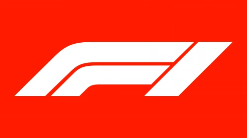
The modern Formula 1 logo prominently features a bold and dynamic color combination, with red and white taking center stage. The bright red, which makes up the stylized “F” in the logo, symbolizes energy, passion, and excitement, all of which are core elements of Formula 1 racing. Red is also a color deeply associated with speed and action, making it the perfect choice to represent the fast-paced nature of the sport.
Alongside the red, white is used to create a strong contrast and add sophistication to the overall design. The clean, angular line of the “1” is also in red, which helps ground the logo and provides visual balance. White is a color often associated with strength, elegance, and professionalism, making it an ideal complement to the energetic red.
Frequently Asked Questions
| Why is F1 tournament so famous? The F1 tournament is famous for its high-speed, thrilling races featuring the world’s top drivers and cutting-edge technology. Its global appeal is amplified by intense rivalries, iconic tracks, and a rich history of innovation and excellence in motorsport. |
| Why did F1 change their logo? F1 changed their logo in 2018 to modernize their visual identity. The new design aimed to enhance brand recognition and appeal to a global, digital-savvy audience while staying true to the legacy of speed and precision. |
| What is the color of F1 logo? The F1 logo features a vibrant red and white color combination. The red symbolizes energy, passion, and speed, while white adds sophistication and contrast to the design. |
Final Words
That brings us to the end of this blog in which we have discussed the history of F1 logo in detail. It is undoubtedly the most famous emblem in the entire professional racing industry. It presents a prestigious tournament that includes skilled racers from around the world, indulged in stunning racing battles to clinch the ultimate glory. The logo perfectly demonstrates the true class of this tournament, showcasing why it is considered as the pinnacle of auto-racing in the world.
Logopoppin
Logopoppin is a graphic design agency that specializes in logo designing, web development, video production and advanced branding services. We love to innovate businesses with new age technologies, allowing them to improve their visual reputation.
