
Table of Content
The Inspiration Behind the Facebook Logo Design That Revolutionized Social Media
Facebook is arguably, the most iconic social media company of this generation. Released to the general public in 2006, the platform has expanded and improved in leaps and bounds. Moreover, the company, now known as Meta, owns other popular social media platforms like Instagram and WhatsApp. That makes the Facebook logo one of the most well-known social media logos of all time.
Today, social media is far more than a mode of socialization and communication. It is now an avenue of marketing, branding, and a popular source of income for many people. Brands have social media handles and pages to promote their business, market and sell their products, and connect with their consumers.
Big Brands like these social media companies generally pay large sums of money to professional logo design services to create iconic logos.
Let’s discover Facebook logo evolution to see how it became such a well-known icon today.
1- The Facebook Logo – How Did It Come to Be?
Initially starting as Facemash, it depicted a website that allowed users to vote between the attractiveness of two random female students. The facemash logo soon evolved into the iconic blue-toned facebook logo we know today.
Since the launch of the original Facebook logo, the design has seen very few alterations or modifications. For the large part of its life so far, it has featured the company’s name in simple, lowercase letters. The color theme has always been white on blue, and the frame’s shape is rectangular and label-like.
When the company first came into being, its founders Mark Zuckerberg, Eduardo Savarin, Dustin Moskovitz, and Chris Hughes named it The Facebook. The logo was the company’s name written in light blue font over a darker blue background, and it wasn’t long before it was changed.
In 2004, at the behest of Napster founder Sean Parker, the team dropped the word “The” from their name and from their logo too. But the logo modification wasn’t finished. At the same time, the font color of the original Facebook logo was changed from light blue to bright white.
It wasn’t long before Facebook showed that it was here to stay, and started acquiring other social media apps and platforms. And since acquiring WhatsApp, Instagram, and more, the company has introduced different icons meant to be used for various purposes. These icons are derived from the primary logo featured on the company website, making them distinct in their purpose yet similar enough to provide a sense of conformity.
The project for the logo design was headed by Mike Buzzard, the co-founder of the Cuban Council. With the help of his team, he designed the iconic Facebook logo we know now. At the time, he was offered equity for the design work, but he refused.
Facebook Logo Colors
There is exciting speculation about the company’s choice of a color palette. According to sources, the CEO of Facebook, Mark Zuckerberg, suffers from deutronopia, also called color blindness and specifically red-green blindness. However, he can distinguish minute differences between shades of blue that would go unnoticed by most of us.
The New Yorker was the first to claim that this disorder influenced the choice of using a blue-toned color scheme. And considering the design changes, the logo has seen over the years, only the shade of the blue background and the font itself has been tweaked over the years.
Incidentally, a lot of social media icons use shades of blue in their logos, such as the Discord logo, or even Myspace, Telegram, and Skype logos.
Facebook Logo Font
The iconic typeface used in the Facebook logos and wordmarks is a custom-designed, sans-serif font. The style of the lowercase characters is quite similar to that found in popular fonts like the Fact Bold and the Nuber Next Heavy.
The modern Facebook logo, however, is written using a modified form of the Klavika Bold font. In contrast, style is similar to the ones from the past. The design changes that differentiate it from Klavika include the contours of a few letters and the letter “A” shape.
Eric Olson designed this font, and the modifications were made by expert graphic designer Joe Kral.
2- The Facebook Logo History and the Rise of the Company It Represents
The company had quite an auspicious beginning. In 2003, a second-year student at Harvard University called Mark Zuckerberg was part of their computer science and engineering program. A natural prodigy in the subject, he was pretty adept at developing a variety of software products.
One day, while under the influence of alcohol, he created a website called “FaceMash.” It is a fact that he admitted pretty early in his blog, he made the website to allow Harvard students to view two pictures of their fellows and rank them on their attractiveness.
Understandably, it sparked a wave of outrage within the campus, especially among the female students who felt the primary targets of this activity. University officials quickly took down that website, and Zuckerberg barely missed being expelled for his actions.
However, the quick popularity of the site and how existing users converted others to join the platform laid the foundation of what would one day be called Facebook.
A year later, Mark had the idea to create an online directory of all students at Harvard and called the project “The Facebook.” However, a week after its launch, he was accused by three fellow students of plagiarizing their idea.
They claimed that Zuckerberg promised to help them build a site similar to the new “The Facebook,” called HarvardConnection.com. However, he instead took the idea to develop his rival site. After tipping off the local varsity newspaper called the Crimson, an investigation began into the case.
Despite the controversy, however, “The Facebook” was quite popular among the students at the university. Within a month, more than half of the undergrad students were a part of the platform. As rumors of the platform started to rise in rival colleges, Zuckerberg soon allowed access to students of rival varsities such as Columbia, Stanford, and Yale.
Very soon, students from all Ivy League colleges were allowed to join the platform. Within a span of months, university students from across Canada and the US could enter “The Facebook,” and soon, people from around the world as well.
The Transformation of Facebook into a Company
In late 2004, the company was officially incorporated. Zuckerberg’s friend, advisor, and Napster developer Sean Parker was announced as president of the new company. In 2005, the word “The” was dropped from the logo, making for a simple name easy to remember.
Purchasing the domain name for $200,000, the company planned for a global launch of the platform.
2012 saw the company holding its first Initial Public Offering, and the previously private company sold its stock to willing investors. And the popularity of the company has been so great its stock has performed excellently since the IPO.
3- What Does the Facebook Logo Look Like? Evolution of the Facebook Logo Over the Years
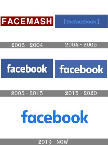
Let us now look at the evolution of the various types of logos Facebook has used through the years.
The facebook logo PNG file is available on a number of sites on the web. However, they come with limited permissions. In case you need to use them for your websites or business cards, the images are easy to use as favicons.
The Facemash Logo (2003)

The company’s first logo was for the website called “FaceMash.” It featured the name of the website in white, blocky uppercase letters over a maroon background. While not technically a logo for the social media platform, it laid the foundation for something truly extraordinary, and we see this style copied throughout the Facebook logo evolution.
The Facebook Logo (2004)
Newly renamed “The Facebook,” the new logo featured the name in a bracketed, lowercase font. There was no space between the two words in the title, and the characters were written in a light blue font over a dark blue background. Moreover, there was a strange square bracket around the name, which made it one of the weirdest Facebook logo variations on this list. Moreover, the color blue for the logo may have been due to Zuckerberg’s color blindness, but it also adds to the Facebook logo meaning by evoking trust and reliability through color theory principles.
The First Facebook Logo (2005)
The company dropped the “The” from the name, as well as from the logo. The original Facebook logo featured a sans-serif white typeface, with lowercase letters spelling out the company’s name. The new logo also featured a taller design, with the blue background colored a few shades darker than before. This meant that new Facebook logo size was larger and more visually apparent than the previous version.
Facebook Logo Modified (2015)
In this version, the typeface was swapped for a modern, softer font. The letters were still written in white. However, the background was lightened a few shades. The most memorable thing about this logo was the new shape of the letter “a” and the modified forms of many other characters.
The lightening of the shade and softening of the character lines made the logo more accessible, which allowed more businesses to feature their social media handles on websites and other media. By understanding the importance of social media for business, and modifying their logo and icon for better adaptability to other brands, helps more businesses adopt Facebook for their branding and marketing.
The Facebook Logo Modernized (2019)
The year 2019 saw the disappearance of the blue background. The shade used was a medium blue, written over a white background. The new logo looked dashing and was a massive hit with the users who hadn’t seen a new logo or alteration in a little while. Even the Facebook logo icon now used a circular background instead of a square.
Moreover, with the color inversion technique used for this new variant that made the wordmark blue, this made the background for the new Facebook logo transparent. This was perfect according to the modern design trends, as it allowed for more seamless and integrated branding across different mediums, an important tenet of social media best practices.
The New Facebook Logo Redefined (2021 – Present)
Since 2015, the Facebook logo released then by the company can be seen everywhere around us. However, that is because it has only ever been tweaked very slightly, as many aren’t willing to make that mistake. The idea behind it was to simplify the design and aesthetics in favor of utilitarian values by the company.
The new vastly superior and streamlined logo looks quite good featured on a variety of screens. Moreover, it portrays a sense of modernism and simplistic appeal, something in line with the austere design values of today. The smaller and simpler logo is perfect for small screen sizes of our phones, ushering in the smartphone era.
On the other hand, the full-sized wordmark hasn’t been phased out completely, which means that designers can choose from a couple of Facebook logo sizes when trying to find the perfect match. Therefore, depending on your design needs, you can either go for the full-sized wordmark, or the newly introduced round symbol.
4- Facebook Logo Icons
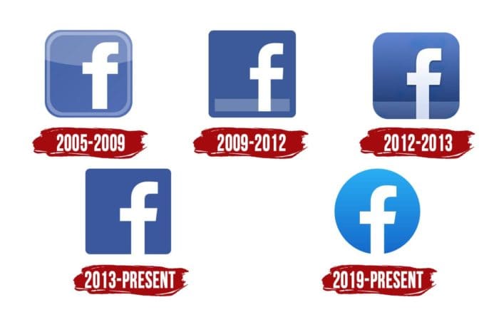
Just like the Facebook logo, the icons have changed with the times. And with each redesign, the icons have grown more straightforward and more minimalistic.
The first facebook icon on the list was the most intricate one of the bunch. The classic lowercase letter “f” with a slight shade at the back was placed in a light blue frame. However, from 2009 to 2013, there was another Facebook logo change that introduced a light blue line at the bottom of the icon.
In 2013, the icon’s border was removed, and the image was made to look as if a shape in the style of the letter “f” had been cut from a blue sheet. And finally, the current design released in 2019 saw the first significant change in the icon – the background is now round instead of a square.
These symbols are also perfect to be used as social media icons for business cards. As most businesses and private contractors use social media for business today, it is a great way to capture new customers.
How To Get the Facebook Logo?
Now that you know that you can use the Facebook logo as an icon on your website, downloadable content, business cards and more, the question is – how to get the Facebook logo in the first place?
Multiple websites can help you get the right size and format of the social media logo you need for your website. Depending on your needs, you can download from a wide variety of vector graphics available online, in full color as well as monochrome palettes.
You can choose the Facebook logo vector that suits your needs, and download it to add to your design. That way you will be able to boost social media engagement for your business using other modes of outreach too.
Creating Custom Logos For Your Facebook Page
For the vast majority of Facebook users, the social media platform is just a source of recreation. However, for a sizable portion of the social media’s user base, the Facebook platform is also a source of business. People use Facebook to create business pages, and even communities and groups. And often, those need custom graphics to identify them.
One of the most popular ways to differentiate your business through graphics is by creating a custom logo for your page or community. But how can you do that?
First, you need to come up with some Facebook logo ideas by researching pages or communities with similar tone or target market. Based on that research you can hire a professional logo designer or use an online Facebook logo maker tool to create your custom logo. Keep in mind though that your custom image or logo does not go against the Facebook logo guidelines or general social media dos and don’ts, or the platform may end up penalizing you for the infraction.
However, in order to ensure that you are able to modify or edit your logo in the future, you need to demand and keep safe your Facebook logo SVG or vector file.
5- The Arrival of Meta – What Does It Say About Facebook?
 In 2021, after acquiring multiple social media platforms including WhatsApp, Instagram, and more, Facebook decided to separate the Facebook product from the brand itself. In a move similar to Google’s Alphabet, the company now calling itself Meta Platforms Inc. has now focused itself on developing a Metaverse.
According to the company, the Metaverse refers to the integrated platform which connects all of the company’s offerings and services, for a seamless user experience.
Now, for many people, this move might not have made sense. But by separating the Facebook brand from the company, they have allowed both of them to develop individually, as well as part of a unified environment. And judging from Google’s example, it can be highly rewarding when done well.
From a business point of view, the buying of multiple social media channels and integrating them into a single, parent platform is a smart move. Previously, people used different social media channels for different purposes. For example, Facebook was more for textual posts, while Instagram for media like images or videos. Businesses often looked for specific times to post their content on individual social media channels for the best impact.
However, with the integration of both Facebook and Instagram into the same platform, users can now post images to Instagram and share them on Facebook and vice versa, quite easily. That means that businesses can now post on various social media channels simultaneously, without worrying about missing the best time to post on social media for each individual channel.
6- The Popularity of the Facebook Logo – Why is it so Popular?
Over the years, the Facebook logo has changed the way we perceive and use social media. Now it has become the standard of any social media platform, combining business and communication seamlessly, especially when it appears next to the Instagram logo as part of the Meta family.
Despite the data misuse allegations in recent years, Facebook is still one of the most used social media platforms around the globe. And let’s consider the users on its acquired platforms like Instagram and WhatsApp. The user base runs into the billions.
If you want an iconic logo like Facebook for your business or website, we can help you. Our designers are experts at creating modern and attractive logos that are designed to represent your brand perfectly.
People Also Ask (FAQs)
| 1- What font is used for the Facebook logo? The font used for the Facebook logo nowadays is a modified version of the Klavika font. |
| 2- How do I get the Facebook logo? You can easily download the Facebook logo from a variety of sites online that offer both PNG or vector graphics to allow designers to use them within their designs. |
| 3- What color is the Facebook logo? Historically, Facebook has always used shades of blue for its logo, due to the fact that Mark Zuckerberg suffers from color blindness, which makes blue the richest shade for him. |
| 4- How do I change my Facebook logo? If your website or other graphics use an older version of the Facebook logo and you want to change that, you can download a vector for the new logo variant from the web, and use that to update your design. |
| 5- How do I make a Facebook logo vector? If you know how to use tools like Adobe Illustrator or other similar tools that create and edit vector files, you can use them to replicate the Facebook logo into the vector format or edit it into your existing design for a downloadable content, website, business card, or more. |
| 6- What size should my Facebook logo be? Generally, according to the Facebook guidelines, your logo on your Facebook page should by 170 x170 pixels in size. |
| 7- What are the Facebook logo guidelines? Facebook allows people to use the F logo to advertise their presence on social media. However, the full wordmark is strictly off-limits for all users, as that refers to the corporate identity for the social media business. Moreover, you are not allowed to change any aspect of the logo, be it dimensions, color, orientation or more. |
| 8- What is the history of the Facebook logo? The Facebook logo originally started out as Facemash, which featured a red and white color palette. However, the brand soon identified as The Facebook, and had a logo that featured the name is all lowercase lettering, and flanked by square braces on each end. Colored in shades of blue, they would dictate the color policy for the brand’s digital assets for the future. Finally, the company dropped the word The from the logo, as well as the braces, promoting the new name and logo that said Facebook. Since then, the brand has modified their logo a few times to ensure that the design keeps up with current design trends. |

Logopoppin
Logopoppin is a graphic design agency that specializes in logo designing, web development, video production and advanced branding services. We love to innovate businesses with new age technologies, allowing them to improve their visual reputation.

