
Table of Content
Discover How the Fairy Tail Logo from the Manga Came to Be
Hiro Mashima’s beloved manga series, Fairy Tail, has captivated a global audience with its enchanting world, interesting characters, and themes of friendship, loyalty, and perseverance. At the heart of this magical universe lies the Fairy Tail Guild, a powerful mage guild known for its partnership and willingness to take on any challenge.
Integral to the guild’s identity is the iconic Fairy Tail logo. This emblem, a stylized depiction of a fairy with outstretched wings, often incorporated within the guild’s wordmark, serves as a symbol of belonging, strength, and the unbreakable bonds. It is more than just a logo; it represents the very essence of what it means to be a part of the Fairy Tail family.
In this article, we will explore the symbolism and design elements of the Fairy Tail symbol offers. We will look at it from the perspective of a professional logo design agency to get a deeper appreciation for the manga’s themes and the enduring appeal of its iconic guild.
Let’s begin.
What is Fairy Tail? An Overview of the Manga’s Storyline and Related Media
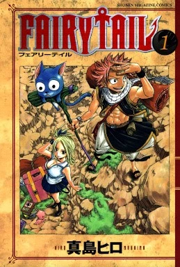
Fairy Tail is a Japanese manga series written and illustrated by Hiro Mashima. It was serialized in Weekly Shōnen Magazine from August 2006 to July 2017, amassing a considerable following for its engaging storyline, dynamic characters, and emphasis on the power of friendship.
The story is set in the fictional land of Fiore, a world filled with magic, where mages join guilds to take on various jobs and missions. The narrative primarily follows the adventures of Lucy Heartfilia, a young celestial spirit mage who runs away from her wealthy family to join the Fairy Tail Guild in the city of Magnolia.
Upon arriving at Fairy Tail, Lucy befriends Natsu Dragneel, a dragon slayer mage with the ability to control fire, and his loyal Exceed companion, Happy, a blue cat with the ability to fly and talk. Together, along with other eccentric and powerful members like the ice-mage Gray Fullbuster, the armored mage Erza Scarlet, and many others, Lucy embarks on numerous exciting quests.
The entire storyline of Fairy Tail is characterized by its blend of action, comedy, and heartfelt moments, exploring themes of loyalty, family (both by blood and by bond), and the importance of never giving up in the face of adversity. The Fairy Tail Guild itself is depicted as a chaotic group, but one that is fiercely protective of its members and united by an unbreakable sense of camaraderie.
The immense popularity of the manga led to a vast array of related media, further cementing Fairy Tail’s place in popular culture. This includes anime series and various comic book cover ideas, which follow the manga’s storyline and have garnered their own dedicated fanbase.
Several original video animations (OVAs) and feature films have also been released, expanding the Fairy Tail universe and offering new adventures for the beloved characters. Additionally, there have been numerous video games and various forms of merchandise, all featuring the iconic characters and the recognizable Fairy Tail logo. The widespread adaptation and consumption of Fairy Tail across different media platforms underscore its enduring appeal and the power of its central themes and visual identity.
The Fairy Tail Logo Explained – What Does It Represent?
The Fairy Tail logo is a carefully considered design that embodies the core tenets and spirit of the Fairy Tail Guild. It exists in two primary forms: a symbolic representation and a wordmark incorporating the guild’s name. Both forms are instantly recognizable and carry significant meaning within the context of the manga and its wider universe.
The Fairy Tail Logo Symbol

The central element of the Fairy Tail logo is a stylized depiction of a fairy with outstretched wings. This imagery directly references the name of the guild and evokes the magical nature of the series’ world. Fairies in folklore are often associated with magic, whimsy, and a connection to the natural world, all themes that resonate within the Fairy Tail universe.
The outstretched wings of the fairy can be interpreted in several ways. They symbolize freedom – the freedom of the guild members to pursue their own paths, take on diverse missions, and express their unique magical abilities without rigid constraints.
The wings also suggest potential and the ability to soar to great heights, reflecting the powerful magic wielded by the guild’s mages and their capacity to overcome seemingly insurmountable challenges. Moreover, the act of reaching out represents the bonds of friendship and the willingness of the guild members to support and protect one another.
The design is not overly ornate, maintaining a level of simplicity that makes it easily recognizable and reproducible. It is presented in solid color combinations, often a vibrant hue that stands out and catches the eye. Throughout the series, the guild mark is stamped onto the bodies of the guild members, often on their hands, arms, or shoulders.
This signifies their affiliation with Fairy Tail and serves as a constant reminder of their bonds and their identity as part of the guild family. The placement of the mark is a source of pride for the members, a visual declaration of their loyalty and their connection to something larger than themselves.
The Fairy Tail Wordmark Logo
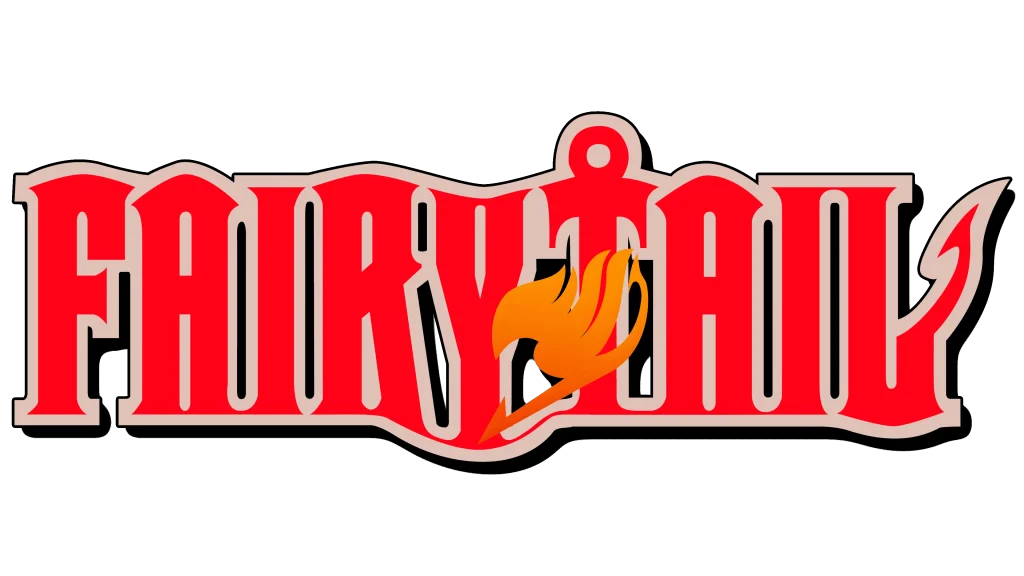
Accompanying the fairy symbol is the Fairy Tail wordmark, which typically features the guild’s name written in distinctive and stylized logo fonts. This typography style often has a slightly whimsical and fantastical feel, further reinforcing the magical nature of the series.
The letters might have unique flourishes or a slightly uneven quality, contributing to a sense of charm and individuality, much like the members of the guild themselves. The wordmark is usually positioned near or integrated with the fairy symbol, creating a complete and recognizable logo.
The colorsof the wordmark often complements the color of the fairy symbol, maintaining a cohesive visual identity. The consistent use of this specific font and color combination across various media, from the manga pages to the anime adaptations and merchandise, helps to solidify brand recognition and creates a strong visual association with the Fairy Tail universe.
FAQs
| Is Fairy Tale popular in Japan? Yes, Fairy Tail is quite popular in Japan. |
| Why is Fairy Tail called Fairy Tail? As explained in the episode 1.27, it is a play on the story’s mystery of whether a fairy has wings or not. |
| Is Fairy Tail good or bad as a series? Fairy Tail is considered a good series with themes of happiness and friendship. |
Conclusion
The Fairy Tail logo, with its elegant fairy symbol and distinctive wordmark, is far more than just a visual identifier for Hiro Mashima’s popular manga series. It serves as a potent symbol that encapsulates the very essence of the Fairy Tail Guild and the core themes that resonate with its global audience.
As a permanent mark etched onto the bodies of the guild’s members, the logo signifies belonging, pride, and an unbreakable connection to the Fairy Tail family. The iconic symbol has become synonymous with the series’ enduring appeal, representing the magic, adventure, and the powerful message that together, even the most eccentric individuals can find strength and purpose in their bonds with one another.
Logopoppin
Logopoppin is a graphic design agency that specializes in logo designing, web development, video production and advanced branding services. We love to innovate businesses with new age technologies, allowing them to improve their visual reputation.
