Table of Content
Take a Look How America’s Favorite Retail Store Logo Evolved
Family Dollar is a name that is well known in the retail circuit of the US. It is an American company that was founded in late 50s to provide cost-effective shopping solution to the families. From the very start, the company advertised its logo with different taglines of budget-saving shopping. This is the core reason why the Family Dollar logo became instantly popular in the market, as more and more people rushed to its stores to buy variety of products.
Today, Family Dollar operates with thousands of stores across the US. They have built a very strong reputation in the market on the basis of providing budget-friendly retail shopping solutions. The logo of the company is well known to everyone in the US, because it is a trusted source of shopping for many middle-class families. Designed by professional logo design services, the current Family Dollar emblem is not similar to the original one. It has been redesigned several times, precisely to keep the branding of the company fresh as per the latest trends.
If you don’t know about the previous Family Dollar logos that have come before 2000s, read this blog to know about all of them. It will let you know how the Family Dollar logo evolved over the time, shaping taking the branding of the company to the new heights.
Origins of Family Dollar
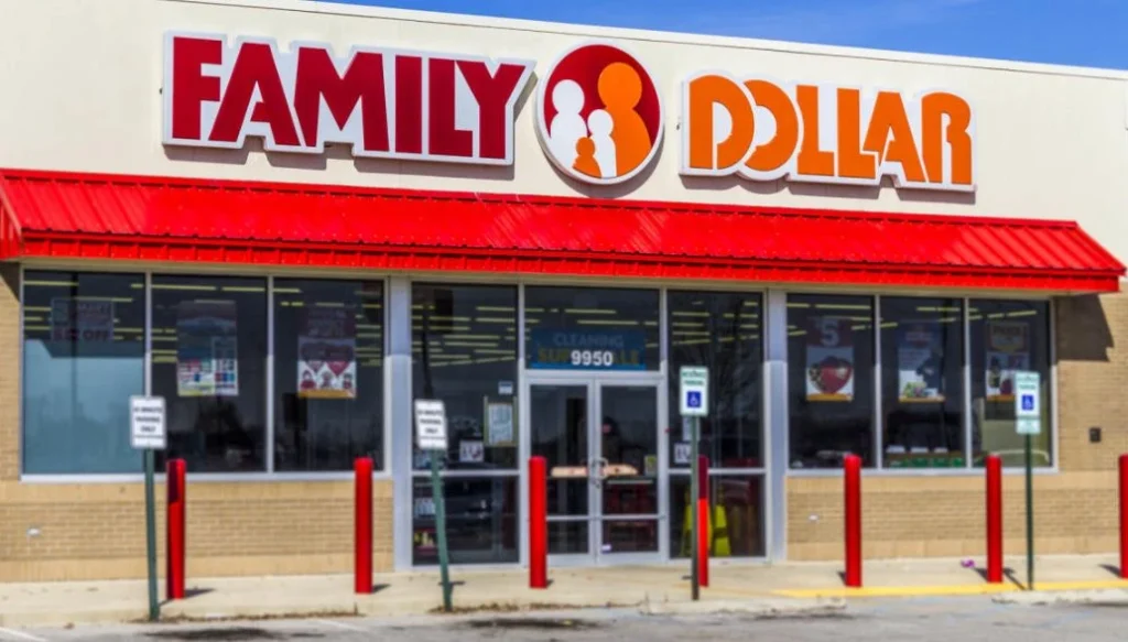
Family Dollar began its journey in 1959 with the opening of its first store in Charlotte, North Carolina. This modest beginning marked the launch of what would eventually become a major player in the American retail industry. Founded by Leon Levine, the store was built on the principle of offering quality merchandise at low prices, a concept that resonated deeply with budget-conscious consumers.
Over the following decades, Family Dollar expanded rapidly, opening new locations across various states. The brand’s focus on affordability, convenience, and accessibility allowed it to grow steadily and reach communities often underserved by larger retailers. Its stores were typically located in easily accessible neighborhoods, making it a convenient shopping destination for everyday household goods, food, and clothing.
Through consistent growth and a clear understanding of its target market, Family Dollar established itself as one of the most recognizable names in the discount retail sector. Its evolution from a single store in Charlotte to a nationwide chain illustrates the success of its business model and its commitment to meeting the needs of American families. Today, Family Dollar is considered one of the most significant and enduring discount retailers in the country. Its success showcases an example of creative branding and pinpoint audience targeting that made a small startup into a modern retail giant.
History of Family Dollar Logo
Unlike Dollar Tree logo, Family Dollar has introduced different types of logos to keep its branding elevated. All of them were based on a wordmark, but had different styling connotations as per the prevailing trends. Let’s take a look at all these logos below.
Family Dollar Logo – 1959

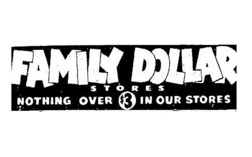
In 1959, Family Dollar introduced its original logo, which prominently featured the company’s name and its initial slogan. This early branding effort was a direct reflection of the company’s core philosophy: providing consistent low prices without the need for special promotions. This slogan was carefully crafted to communicate the store’s commitment to value and affordability.
The logo and slogan served as vital components of Family Dollar’s identity during its formative years, helping to establish trust and recognition among its customer base. At a time when many retailers relied heavily on temporary discounts, Family Dollar’s promise of everyday low pricing stood out as a dependable and customer-friendly approach.
Family Dollar Logo – 1960
During the 1960s, Family Dollar underwent a rebranding initiative that included a significant change to its vintage logo design. This transformation marked a shift in the company’s visual identity, reflecting its efforts to modernize and appeal to a broader customer base. The updated logo aimed to establish a more recognizable and consistent brand presence across its expanding network of stores.
The redesign was part of a broader strategy to align the company’s image with evolving consumer expectations. By adopting a new logo style, Family Dollar sought to convey a sense of reliability, helping to differentiate itself from competitors. This visual change played a key role in reinforcing the brand’s identity and supporting its continued expansion throughout the decade.
Family Dollar Logo – 1976

In 1976, Family Dollar introduced a completely new logo as part of an effort to refresh its brand identity and better reflect the company’s evolving image. This redesign was a strategic move aimed at presenting a more appealing visual presence to customers. The introduction of the new logo came at a time when the company was continuing to grow, and it served to strengthen brand recognition across its expanding network of retail locations.
The updated logo featured a sleek and modern look, achieved through a minimalist approach that emphasized simplicity and clarity. The choice of font played a crucial role in creating a clean appearance that stood out in the competitive discount retail market. By moving toward a more refined design, Family Dollar was able to convey a sense of professionalism and trustworthiness through its new logo.
Family Dollar Logo – 1982
In 1982, Family Dollar introduced a new logo design that marked a pivotal moment in the evolution of its brand identity. This redesign was not just another update, but rather a foundational shift that set the tone for the company’s visual image for decades to come. The new logo incorporated distinctive elements that gave it a strong, recognizable presence and helped it stand out in the crowded retail market.
What made the 1982 logo particularly significant was its lasting influence on the company’s visual identity. While minor adjustments and refinements have been made over time, the core structure introduced in 1982 laid the groundwork for a unified brand image. This enduring design choice speaks to the logo’s effectiveness and its alignment with the company’s values and mission.
Family Dollar Logo – 1997

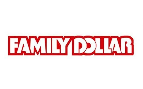
In 1997, Family Dollar unveiled a newly designed wordmark logo as part of a broader effort to refresh its brand and keep pace with contemporary design trends. This new emblem marked a deliberate shift toward a cleaner, more refined visual identity that reflected the company’s continued growth and relevance in the competitive retail landscape.
The updated logo featured a minimalist design that emphasized simplicity and elegance, aligning with the popular design aesthetics of the late 1990s. The use of a modern typeface added to the logo’s sleek and stylish appearance. This understated yet effective design helped to reinforce Family Dollar’s image as a reliable and contemporary retail destination, while still preserving its core message of affordability and accessibility.
Family Dollar Logo – 2008
In 2008, Family Dollar introduced a refreshed logo. One of the most notable aspects of this redesign was the introduction of a new color into the logo’s palette i.e. orange. This addition marked a significant departure from previous versions, which had typically relied on a more limited and traditional color scheme.
The strategic use of orange in the logo not only made the brand more visually striking but also helped convey a message of friendliness and affordability. The 2008 redesign reflected the company’s commitment to staying relevant in a competitive retail environment, using color psychology and design trends to create a more inviting and dynamic brand image.
Frequently Asked Questions
| Why Family Dollar is famous in the US? Family Dollar is famous in the US. for offering a wide range of everyday household items at low, affordable prices. It is a popular discount retail chain, especially in low- to middle-income neighborhoods. |
| Who is the founder of Family Dollar? Family Dollar was founded in 1959 by Leon Levine, a 21-year-old entrepreneur from North Carolina. He opened the first store in Charlotte with the goal of offering affordable goods to working-class families. |
| What is the color of Family Dollar logo? The Family Dollar logo features a vibrant red and orange color scheme. Specifically, it uses red and orange, complemented by white accents. |
Final Words
That concludes our entire article in which we have discussed the complete history of Family Dollar logo. It is an emblem of a famous American retail store that is active in the country since late 50s. That is the reason everyone is quite familiar with this logo, especially those who love cost-effective shopping from budget stores. This article has discussed the evolution of Family Dollar logo from the very beginning, so that you can understand how this iconic logo established its reputation in the US.

Logopoppin
Logopoppin is a graphic design agency that specializes in logo designing, web development, video production and advanced branding services. We love to innovate businesses with new age technologies, allowing them to improve their visual reputation.


