Explore All the Creative Fonts Associated with Taylor Swift’s Album Covers
The name of Taylor Swift is known to everyone in the music industry. She is one of the most successful American singers of this era, having millions of followers around the world. Besides songs, the album branding of Taylor Swift is also very popular in the world because of its creative style. The fonts used on some of her album covers are simply magnificent, exhibiting sheer class and style all over. They are often classified as Taylor Swift fonts, as they have been derived directly from the branding components of the singer.
Unlike albums of other musicians, the branding of Taylor Swift has always focused on diversity. She always comes up with different types of covers to showcase versatility in her style. Many branding services can take a good lesson from this fact, as how personal branding can be diversified by using different types of methods. Not just fonts, but the overall concept of her album covers frequently gets changed, showcasing her broader perspective of promotion.
In this blog, we will look at different types of Taylor Swift fonts that are popular in the market. Sourced directly from her albums, these fonts are pretty fantastic and can be used in the designing of wordmark logos, company banners and more others.
A Quick Look at the Popularity of Taylor Swift

Taylor Swift’s popularity in the United States is a cultural phenomenon that transcends music. Emerging as a country music prodigy in the mid-2000s, Swift quickly established herself as a cross-genre superstar. Her ability to authentically connect with fans through autobiographical lyrics has been a cornerstone of her success. Each album release feels like an event, drawing massive attention from both fans and media. This consistency in producing hits has made her one of the most versatile and celebrated artists in the country.
Swift’s influence extends beyond her music; she is a cultural icon whose brand impacts fashion, social media trends, and even political discourse. Known for her savvy marketing strategies and direct fan engagement, she has cultivated one of the most loyal and active fanbases, the “Swifties.” Her tours consistently break attendance and revenue records, including the monumental Eras Tour, which has been dubbed a significant economic driver, boosting local economies across the U.S.
Economically and socially, Taylor Swift’s impact in the U.S. is staggering. Her ability to dominate streaming platforms underlines her unparalleled commercial success. Swift’s influence on the music industry is evident in her strategic re-recording of her albums to regain control of her masters, which has set a precedent for artists advocating for their rights. Simultaneously, she wields significant cultural power, often shaping public discourse and setting trends.
Trending Taylor Swift Fonts
There are various Taylor Swift fonts that are used by many designers around the world. These typography styles are quite unique, hence they get the attention of people quickly. If you do not know much about them, take a look at the list of Taylor Swift fonts given below.
Lover (2019)

For her celebrated album Lover, which shattered numerous records and solidified her status as a pop powerhouse, Taylor Swift made a deliberate and artistic choice in selecting the font Satisfy. This brush-style typeface, known for its fluid, handwritten aesthetic, complements the dreamy, romantic essence of the album. Its soft curves and flowing strokes evoke a sense of intimacy and nostalgia, perfectly aligning with the themes of love, vulnerability, and optimism that permeate the album’s lyrics and melodies.
The use of Satisfy not only underscores the album’s personal and heartfelt tone but also reflects Swift’s meticulous attention to detail in her artistic expression. This vintage font enhances the pastel-toned, watercolor-inspired visuals of the album artwork, creating a cohesive and emotionally resonant experience for fans. By pairing such a visually expressive, Swift ensured that every element of the album resonates as a unified celebration of romance and creativity.
Fearless (2008)
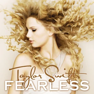
For her groundbreaking 2008 album Fearless, Taylor Swift selected the font Carla Sans Light to serve as a defining visual element for the project’s branding. This clean and elegant sans-serif typeface perfectly complements the album’s overarching themes of youthful whimsy, hope, and bold aspirations. Its light and airy design reflects the dreamy yet determined essence of Fearless album. The choice of such a refined and minimalist font underscores the album’s emotional depth while maintaining a sense of accessibility and simplicity.
By using Carla Sans Light, Swift achieved a visual harmony that mirrors the album’s spirit of fearlessness and longing. The font’s subtle curves and delicate weight align with the album’s blend of soft vulnerability and steadfast resilience. This design choice resonates with the storytelling in songs like “Love Story” and “You Belong with Me”. The understated elegance of the typeface allowed the focus to remain on Swift’s poignant lyrics and melodies, while still adding a layer of sophistication to the album’s visual presentation.
The Eras Tour
The “Eras Tour” is a vibrant celebration of Taylor Swift’s musical evolution, showcasing her journey through diverse genres and styles. From her heartfelt beginnings in country music to her chart-topping ventures into pop and her foray into the introspective world of indie-folk, the tour highlighted the depth and breadth of her artistry. Each phase of her career was thoughtfully represented, offering fans a nostalgic yet dynamic experience that paid homage to her impressive repertoire.
Adding to the tour’s visual and thematic elegance was the sophisticated use of the “Sequoia” font. Its refined and graceful design complemented the grandeur of the event, embodying both the timelessness of her legacy and the adaptability that defines her work. The font’s aesthetic mirrored Taylor’s own versatility, seamlessly transitioning between the grandeur of her pop anthems and the delicate intimacy of her indie-folk melodies.
Speak Now (2010)
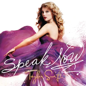
The album Speak Now conveyed its deeply personal and introspective themes not only through its lyrics and music but also through the thoughtful choice of its typography. The font, Sudestada, played a pivotal role in visually reflecting the essence of the album. With its handwritten-style design, the font evoked an intimate and authentic feel, as if each word and title were carefully penned by Taylor herself. This choice underscored the album’s narrative nature, highlighting its stories of love, regret, self-discovery, and emotional growth.
Beyond its stylistic charm, Sudestada added a layer of connection between the artist and her audience. Its imperfect, flowing strokes symbolized the vulnerability and sincerity that defined Speak Now. This creative decision transformed the typography into a visual extension of the album’s themes, making the overall experience more immersive. By embracing a font that felt personal and heartfelt, the design further emphasized the intimate relationship Taylor cultivated with her listeners.
RED
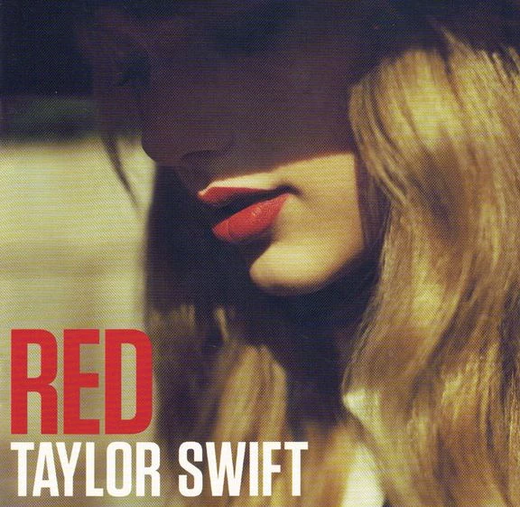
When Taylor Swift unveiled her highly anticipated album RED, she made a bold statement not only with her music but also through the choice of typography. The Tungsten font, a robust and condensed sans-serif, became an integral part of the album’s visual identity. Its strong, clean lines and modern design perfectly aligned with the album’s fiery and emotionally charged themes. From heartbreak to resilience and self-empowerment, this masculine font captured the essence of RED, an album that embraced intensity and complexity in both sound and storytelling.
In many ways, the font felt like an extension of the album’s signature attitude. Its sharp, commanding presence communicated the same unapologetic finality and confidence that defined the album’s spirit. Tungsten wasn’t just a design choice, it became a visual representation of RED’s ability to evoke strong emotions and make a lasting impact. By pairing this bold typeface with a daring musical approach, Taylor solidified RED as a landmark moment in her career, one that remains etched in the hearts of fans and the annals of pop culture.
How to Find and Download Taylor Swift-Style Fonts
Many fans search for ways to recreate Taylor Swift’s distinctive album typography for personal projects and social media content. While specific font names vary across her discography, understanding the style characteristics can help you find similar alternatives for your own creative work.
Start with free font resources like Google Fonts, DaFont, and FontSquirrel when looking for Swift-inspired typography. Search terms like “script fonts,” “handwritten fonts,” “bold sans serif,” and “elegant serif” will yield options that capture the essence of different album eras. For more professional projects, consider premium font libraries like Adobe Fonts, which offer high-quality typefaces with proper licensing for commercial use.
When selecting fonts for Taylor Swift-inspired designs, focus on emotional resonance rather than exact matches. Look for script fonts that feel romantic and personal, bold sans serifs that convey confidence and energy, and clean serif fonts that suggest sophistication and timelessness. Many designers successfully create Swift-inspired content using font combinations that capture the mood of specific eras rather than replicating exact typography choices. Remember to check licensing requirements for any fonts you download, especially if you plan to use them for commercial projects or social media content that might be monetized.
Typography Principles Behind Taylor Swift’s Album Design
Taylor Swift’s album typography demonstrates fundamental design principles that any creator can apply to their own projects. Her visual branding consistently aligns font choices with musical themes, creating cohesive experiences that enhance emotional storytelling.
Each album era employs typography that reinforces its central aesthetic. Country-influenced albums tend toward fonts with organic, handcrafted qualities that feel authentic and personal. Pop albums embrace cleaner, more geometric typefaces that project confidence and modernity. Indie-folk albums return to serif fonts with literary associations, suggesting depth and introspection. These choices aren’t arbitrary—they create visual hierarchies that guide audience attention and establish emotional expectations.
Color interaction with typography plays a crucial role in Swift’s album design success. Light, airy fonts pair with pastel color palettes for romantic themes, while bold, condensed typography works with high-contrast color schemes for more assertive musical statements. Understanding these relationships helps creators make informed decisions about color combinations in their own work. The key principle underlying all Swift’s typography choices is authenticity—each font selection feels genuine to its corresponding musical era rather than following design trends that don’t serve the artistic vision.
Creating Swift-Inspired Social Media Graphics and Designs
Social media content creators frequently seek typography inspiration from Taylor Swift’s album aesthetics for quotes, announcements, and fan content. Understanding how to adapt these visual principles creates engaging content that resonates with audiences.
For romantic or inspirational content, choose script and handwritten-style fonts that echo the dreamy, personal feel of Swift’s more intimate albums. These work exceptionally well for quote graphics, lifestyle posts, and content focused on relationships or personal growth. Bold, condensed fonts capture the energy of Swift’s pop eras and perform well for announcement graphics, promotional content, and any posts requiring strong visual impact.
Layer typography effectively by mixing font weights and styles within single graphics. Combine a bold headline font with a lighter, more readable body font for optimal visual hierarchy. This approach mirrors professional album design while maintaining readability across different devices and platform requirements. Consider how your chosen fonts will appear at various sizes from small mobile screens to larger desktop displays. Test your designs across platforms to ensure consistent visual impact. Remember that successful Swift-inspired design isn’t about copying exact elements, but rather understanding the emotional qualities that make her visual branding so effective.
Album Typography Trends and Font Style Evolution
Taylor Swift’s discography showcases broader typography trends that have evolved throughout the music industry over the past two decades. Studying these changes provides insight into how font choices reflect cultural moments and artistic movements.
Early 2000s album designs favored fonts with personality and handcrafted qualities, reflecting the era’s emphasis on authenticity and personal connection. As digital music platforms grew, typography needed to perform well at small sizes on screens, leading to cleaner, more simplified font choices. The streaming era brought renewed focus on bold, eye-catching typography that stands out in crowded digital environments.
Recent years have seen a return to more sophisticated, literary typography as artists reclaim control over their visual presentation. This shift reflects growing appreciation for vintage logo designs and timeless aesthetic choices that transcend temporary trends. Contemporary album typography often combines multiple font styles within single projects, creating rich visual experiences that support complex musical narratives. This evolution demonstrates how typography trends respond to both technological capabilities and cultural values, making font choice an integral part of artistic expression rather than mere decoration.
Frequently Asked Questions
| Why the branding of Taylor Swift albums is so famous? The branding of Taylor Swift’s albums is iconic because it meticulously aligns visual elements with the album’s themes, creating a cohesive narrative experience. This attention to detail fosters a deep emotional connection with fans, making each era uniquely memorable. |
| What are Taylor Swift fonts? Taylor Swift fonts refer to the distinctive typography styles used in the branding of her albums, tours, and merchandise. These fonts enhance her storytelling by visually embodying the mood and aesthetic of her music eras. |
| Which Taylor Swift album has been the most famous till now? Taylor Swift’s 1989 has been one of her most famous albums, marking her transformation into a pop icon with chart-topping hits. Its commercial success, critical acclaim, and cultural impact cemented it as a defining moment in her career. |
Final Words
That concludes our entire blog in which we have discussed different Taylor Swift fonts that are popular in the market. These fonts are pretty unique as they showcase different types of styles designed with stunning perfection. Each font listed above is taken directly from popular album covers of Taylor Swift. They precisely show how creative personal branding of Taylor Swift is, incorporating different types of styles and font classes.
If you are also looking to design a wordmark logo or promotional banner, consider one of these fonts to bring an interactive flare of elegance. They can be used to design a variety of branding elements, precisely as per your needed requirements.

Logopoppin
Logopoppin is a graphic design agency that specializes in logo designing, web development, video production and advanced branding services. We love to innovate businesses with new age technologies, allowing them to improve their visual reputation.

