Table of Content
A Look at the Different Fantastic Four Logos through the Years
Marvel comics have a variety of characters that they have used over the years. In fact, the comic giant has hundreds of characters, whether they are those related to the X-Men, the Avengers, or any of the other mainstream teams from their world of fantasy.
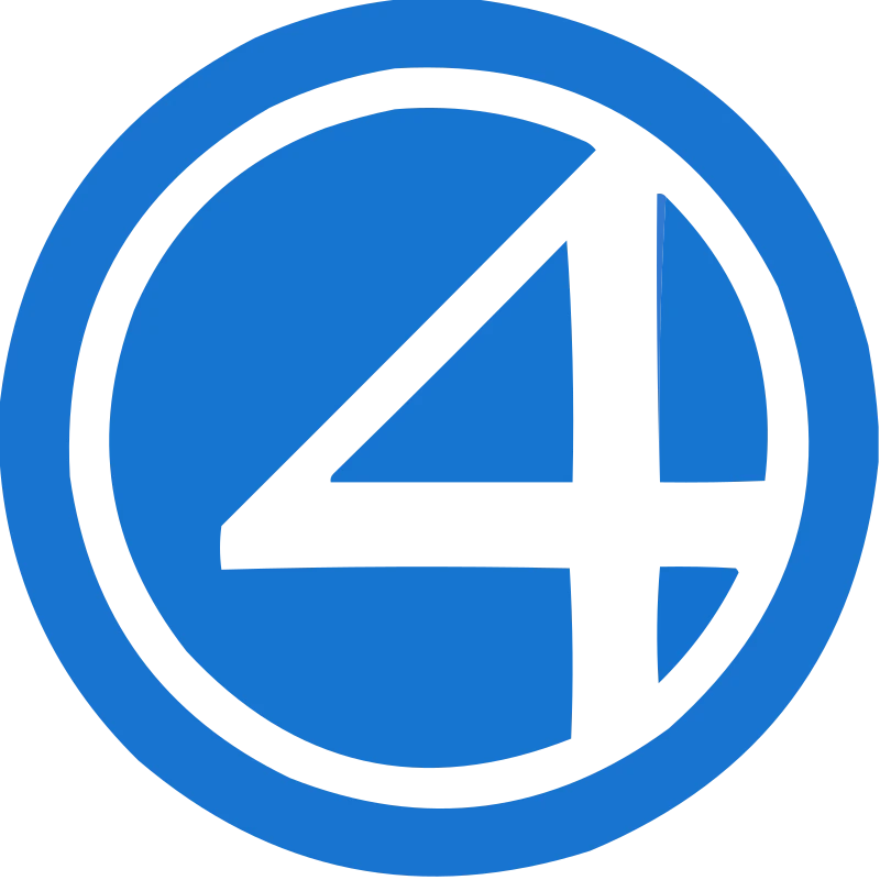
Now, one of the more famous of those teams from the Marvel Universe is the Fantastic Four. Consisting of Reed Richards, Sue Richards, Johnny Storm, and the Thing, the team has a rich history for comic book fans. Such is their fame that their stylized Fantastic Four logo depicting a glyph of the number 4 is one of the most recognizable symbols in comic book characters today.
But how did it become so famous? What is it about this team logo that speaks to the people? And how has the logo design’s evolution helped keep it near the top of all of Marvel’s superheroes? Let’s explore that evolution and see how experienced logo design services can be the difference between building a successful brand and a mediocre one.
Who are the Fantastic 4?
Let’s begin with the team itself whose logo we are going to discuss today. Who are the Fantastic Four? Well, the Fantastic Four is a team of superheroes who are led by Reed Richards, also known as Mr. Fantastic. Considered the smartest man alive, even by his rivals such as Ironman and Dr. Strange, and Doctor Doom, Mr. Fantastic and his team have a rich history throughout the Marvel comics, whether it is as part of their own series, or even in many crossover events.
Originally, before the cosmic radiation event that gave them superpowers, the team was on a scientific mission into outer space. However, after suffering the effects of the cosmic rays, the team decided to forgo any secret identities and do their part as superheroes.
For each team member, the powers were unique and diverse. Reed Richards, aka Mr. Fantastic got the ability to stretch and expand his body as he wished. Sue Richards nee. Storm, aka Invisible Woman, got the ability to make herself invisible, as well as generate force fields. Johnny Storm, aka Human Torch and Sue’s brother, got the ability to generate flames, surround himself with them, and fly. Finally, the fourth member of this group is Ben Grimm, aka The Thing, who had his flesh turned into a rock-like substance, giving him immense strength, durability, and endurance.
Overall, they have a rich history with various Marvel characters, such as Namor the Submariner, Annihilus, Galactus, and more. And they have been a central team of characters for Marvel, with both animated and cinematic adaptations made of the team’s adventures.
The Evolution of the Fantastic Four Logo for Comic Prints
Now that we have had a brief overview of the team and its origins, let’s take a look at the various Fantastic Four logos that we have seen throughout their comic run. With over six decades of comics published, the team has witnessed many changes to their wordmark logo, based on the era’s aesthetic, and the designer’s preferences. This is common with characters that were originally designed for the golden age, as can be witnessed in the case of the Batman logo.
Let’s start with the first logo on our list.
1961 – 1962
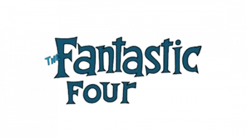
The Fantastic Four first debuted in 1961, and with them, the first wordmark logo was created for them. This iteration of the team logo featured an uneven and grotesque-style font, with two lines of different sized letters. Moreover, the designers also stuck in a minute “The” before Fantastic, which only served to make the design too complicated for good visual appeal.
The color scheme was a dark blue, in homage to the Fantastic Four’s iconic costumes at that time, and the text was left aligned.
1962 – 1970, 1980 – 1981, 1992 – 2002
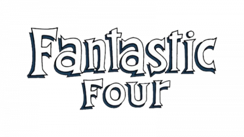
In the second iteration of the Fantastic Four logo, the font remained the same for the most part. However, there were a few visible changes. First, they inverted the colors, with the letters now colored white and the blue relegated to the shadows beneath those letters. Next, they center aligned the text.
This gave the letters a raised look, making them more visible, and improved readability. Moreover, the designers also removed the attached “The” from the wordmark, making it read simply, Fantastic Four. And this iteration of the logo was so good, that it was used in three different eras, for a combined total of 19 years.
1970 – 1972, 1981 – 1987
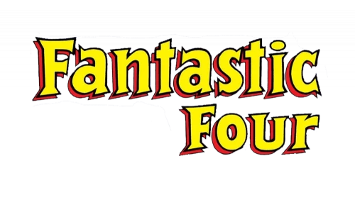
This next version still kept the style of the lettering the same, with a further few changes. First, they made a drastic change to the color scheme of the logo. Instead of the white and blue motif, the logo now had bright yellow letters with red shadows. The reason for this change was to reflect the rising focus on the human torch during this time.
Secondly, they now aligned the words to the right margin, which makes it perfect for the new color scheme to impart its fullest impact. This version of the logo was used two different times, for a cumulative total of 8 years.
1972 – 1975
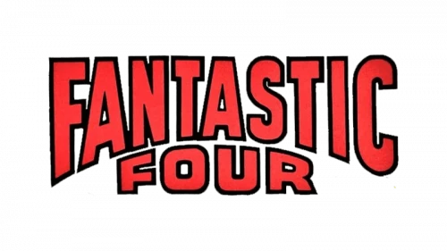
The Fantastic four logo we are going to discuss now is a departure from the previous iterations, as well as the ones to come ahead. The combination of the chosen font, visual style, and the color scheme makes it look like a wordmark for an anti-hero such as Dare Devil or Punisher.
The typeface used was a blocky font, which was made to look as if it was curved from both the X and Z-axis. The resultant arch from the curve of the “Fantastic” had the word “Four” fitted inside. The color scheme was a deep blood red, with a black outline. The combined visual impact was one that many fans would expect, which meant that this iteration of the logo was only used for three years.
1975 – 1980, 2009 – 2012
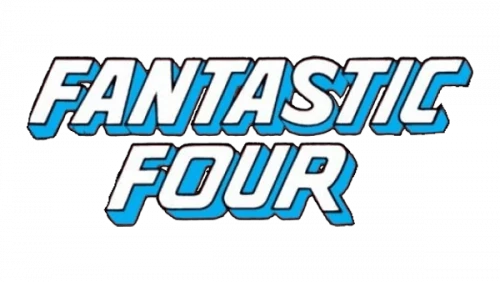
The next iteration showed the designers going back to the basics, with the name of the team now in three-dimensional blocky letters, using a blue and white color scheme as per the team brand. Gone were the arched lettering, with the new letters now italicized to show a more modern and futuristic style.
The words were again center aligned, making for a highly visible, and on-brand wordmark logo that perfectly represented the team image. Unfortunately, while this iteration was used twice, it only ran for a cumulative 8 years.
1985 – 1992, 2004 – 2008
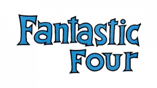
When we talk about this iteration of the Fantastic Four logo, it may look similar to the early 60s design. However, there are a few subtle changes. For one, the letters are outlined in black. Secondly, the inter-character spaces have been increased.
The overall result is an improvement on the early design, making it both more visually pleasing and easier to read.
2002 – 2004
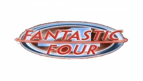
The next version of the logo is again a departure from the traditional Fantastic Four logo design. the color scheme used was a red and white, superimposed over a silver and dark scarlet emblem of the team. The letters are thin and italicized, which, combined with the background, make it hard to read.
However, despite that, the addition of the team emblem as background meant that the logo was good enough to be used for two years, from 2002 to 2004.
2008 – 2009
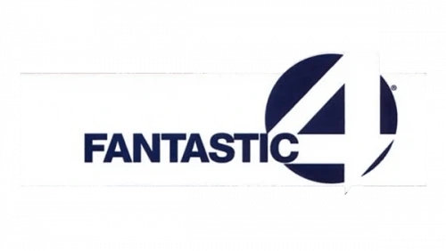
The 2008 iteration showed that designers were looking to go in a different direction than the ones the logo had taken previously. The new design featured a plain, sans-serif wordmark, with the team emblem showing a bold number 4 replacing the “Four” part of the wordmark.
The color scheme was also changed to a dark navy blue, making the entire logo look like it would be better suited at representing a corporate business than a superhero team. That unfortunately was the reason the logo was only used for a single year.
2013 – 2014
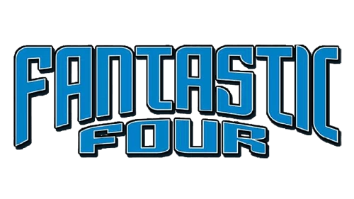
This next design of the logo looks quite similar to the 1972 design which had an arched shape and a blood red color scheme. However, the designers decided to modify some of the more controversial elements of that logo.
So, for 2013, the new design featured a similar arched shape, but with the letters softly rounded rather than sharp and angled like the earlier version. Secondly, instead of the blood red color scheme, the design team used the Fantastic Four’s iconic blue color.
However, despite the changes, the new design was only used for a single year. The retro design of the logo was something that didn’t speak to the fans, as the prevailing trend at that time was upgrade the logo designs for the modern aesthetic, as in the case of the Wonder Woman logo.
2014 – 2015
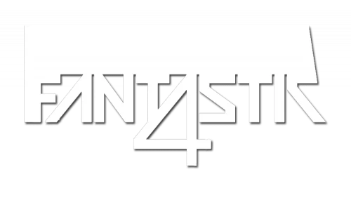
For the 2014 version, the logo saw another drastic change. Understanding that too retro was something that the fans were not looking for, the designers created something they believed to be perfectly modern enough to suit the fans’ expectations. Now, had the design been for a younger or newer character, for example the Nightwing logo, it might have been more successful as it would have appealed to the younger audience.
The design was quite experimental and ambitious. The wordmark was a futuristic style of font that spelled “FANTASTK”, where a big stylized number 4 replaced the middle “A” of the wordmark. The entire thing was colored white, with gray accents added at strategic points to subtly emphasize the letters.
However, they failed to understand what the fans actually wanted. They didn’t want a modern design for modernity’s sake. They wanted the final logo design to embody the history of the logo’s brand, with updated visuals according to the modern aesthetic. This resulted in this experimental design being used for just a year before being replaced.
2018 – Today
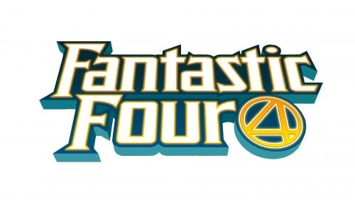
Finally, in 2018, the current iteration of the Fantastic Four logo was released. This design may look retro at first glance, but it perfectly balances the rich history of the superhero team from the past six decades, with subtle modern design elements.
The color scheme featured white accented with a shade of blue that darkens as it moves upward, and the team emblem added to a corner of the design, colored in a yellow that darkens into a fiery orange. This adds Johnny Storm’s signature color to the design, thus combining different successful elements from multiple logo variations.
Cinematic and TV Fantastic Four Logo Variations
The logos we discussed earlier were those used or the comic book runs. However, the cinematic and animated variants of those characters featured some different Fantastic Four logo designs. Let’s take a look at what they represented.
1967 – 1968
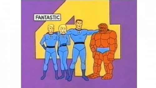
The 1967 animated TV series featuring the Fantastic Four had a bold and enlarged number 4 over a purple background. A small wordmark featuring the word “Fantastic” written in a sans-serif font. It also had the entire team standing in front of the logo design.
It might look a little simple and retro by today’s standards, but at that time it was considered quite futuristic.
1978
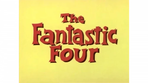
The 1978 iteration of the animated series logo featured the red colored wordmark over a yellow background. The style of the logo was one from that era’s comic book’s symbol, with only the color changed, and the word “The” added to the top of the wordmark.
1994 – 1996
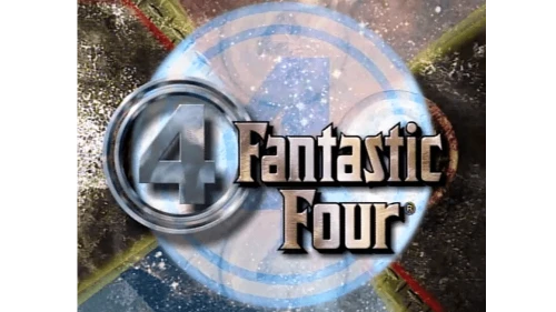
The 1994 Fantastic Four logo was one that could be considered truly futuristic. Gone were the flat and pale colors, with a large number of design elements colored with metallic colors. The left side of the design featured the team emblem, with a silver double ring with the number 4 inside it. The background featured a mix of celestial colors and design elements, making for a perfect sci-fi style design, such as those often featured for team symbols like the Justice League logo.
2006 – 2007
The 2006 variant of the logo had a slightly changed font for the wordmark, with the emblem now featuring a single ring around it. The metallic design was ignored in favor of flat color scheme of purple and pale yellow, with white and red accents.
2015 – Today
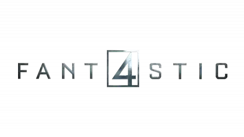
The 2015 cinematic release for Fantastic Four saw a new logo created. Going back to the metallic coloration, the logo is simple and no-nonsense, similar to how the modern cinematic superhero logos are designed. The middle letter A is replaced with the number 4 in a square box, a stark departure from the longstanding emblem rings.
Brand Elements of the Fantastic Four Logo
Over the years, a few constant brand elements have featured in multiple iterations of the logo. Some, like the white on blue color scheme has been more prominent, while the style of font used has been more abstract and changing according to different runs of the comics and the artist behind them.
For every superhero character, there are often some elements of color that are constant. For example, when we talk about the Superman logo, there is always some element in red that identifies the Kryptonian’s symbol. Let’s take a look at some of the common brand elements in the Fantastic Four logo iterations we saw earlier.
Fantastic Four Logo Colors
For the most part, the colors white and blue have been the predominant colors in the past six decades of Fantastic Four. However, here and there, a few additional colors such as yellow and red have also featured.
Similarly, for the animated iterations, the colors purple and silver have also made their way into the color palette for this logo.
That is similar to how the Spiderman logo was often featured in black over a red and blue background. However, since the multiverse events, the new iterations have been trying out the symbol in white, or red, or even white highlighted with red.
Fantastic Four Logo Fonts
As for the fonts, the predominant styles have been a grotesque-style font for around 25-30 years, and a sans-serif blocky font for the rest of it. Moreover, a few avant-garde styles were also introduced in between, but they saw little popularity with the fans.
FAQs
| What is the history of the Fantastic Four emblem? The emblem is usually the number 4 within an oval or round band, which is used by the team members as a badge on their costumes, similar to the Avengers symbol used by the Avengers. |
| Is Fantastic Four Marvel or DC? Fantastic Four is from Marvel Comics. |
Conclusion
To sum it up, the Fantastic Four logo, for the most part, has been a wordmark logo with roots in retro design. And while it may not have managed to reach the heights of its other Marvel peers, the fact is that the fantastic Four and their emblem is something that is quite dear to the fans of the comics.
Nevertheless, the logo used by the team now is one that perfectly embodies their history with the modern aesthetic of comic book heroes today.

Logopoppin
Logopoppin is a graphic design agency that specializes in logo designing, web development, video production and advanced branding services. We love to innovate businesses with new age technologies, allowing them to improve their visual reputation.

