
Table of Content
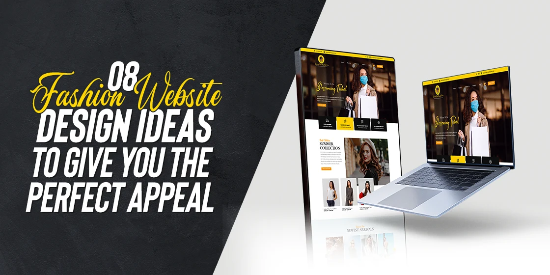
Discover Amazing Fashion Web Design Ideas to Help Create a Great Fashion Website
Building an effective online presence is a must-have these days, especially if you in a socially entrenched industry such as the fashion business. Consumers today often turn to social media and the web to see what the latest trends in fashion hold, from their favorite influencers to the latest offerings from the top fashion houses.
However, in order to convert the largest number of consumers towards patronizing your brand, especially at the right time, you need a website. But with no idea about the web development industry, how can you come up with a fashion website design that is right for your brand?
Well, getting a website developed for your fashion brand isn’t difficult, especially if you hire professional web design services to do it for you. However, what takes a bit of effort and time is finding out what works best for your brand. Once you know that, only then can you hire a professional to create the website you desire for your brand.
So, let’s dive in and discover the top fashion web design ideas, and see how you too can elevate the impact of your fashion website to make your mark effectively.
Web Design Trends That Are Perfect for Fashion Website Design
When it comes to looking for design trends to follow, two types can affect your website’s impact. The first type are the general web design trends that all professional websites refer to when creating their design. The second type relate to the specific niche and industry of your website.
Depending on what your website is supposed to sell, the design trends you will need to follow will differ. For example, if your fashion business promotes bespoke tailoring services of various kinds rather than ready-made articles, then your page would look better with collapsible sections that span the width of the page.
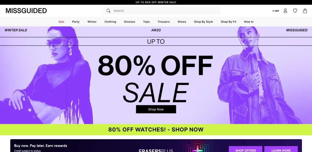
On the other hand, if your store sells ready-to-wear clothes and accessories, then a tiled view displaying the larger number of articles per view would be the better choice. Moreover, for the former style of fashion website design, the hero of your homepage would feature a visual display of your primary service, showcasing your expertise, as in the case of Missguided. For example, if you specialize in bespoke men’s suits, it may feature a collage of models wearing different versions of your expertly tailored suits.
Similarly, your website’s look will depend on your brand aesthetic. If your brand has a loud and in-your-face aesthetic, then your website would do well with a similarly loud design. However, if elegance is what your brand exudes, then a minimalist design is what you should aim for. This general rule of thumb is also found followed in many of the top luxury fashion brand logos.
In the end, you need to understand that in the fashion industry, visuals can be your friend or your enemy, especially when it comes to social media or brand website.
Importance of Visuals in Creating a Great Fashion Website
Essentially, visuals play an important part in ensuring the success of a website. However, when it comes to industries like fashion, attractive visuals become more than just important – they become essential. But why? Why are visuals such an important aspect of such industries?
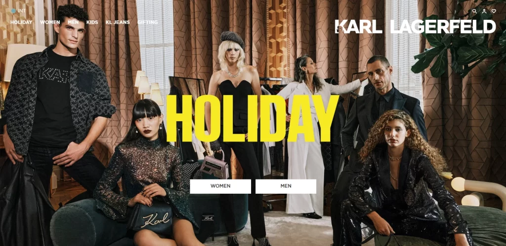
Well, think about it. Industries like fashion and beauty rely on the visual appeal of a person’s appearance, whether its via apparel or otherwise. These industries primarily target the sense of sight, just as the perfumery industry relies on scent. So, when a visitor looks at your fashion website design, they expect and desire a collection of amazing visuals, with little in the way of text to distract them from it, like Karl Lagerfeld’s homepage hero.
In fact, even if you are looking to start a fashion blog, your content should feature imagery and video media heavily, rather than just relying on text. Similarly, you can use other visual elements such as various color combinations to evoke the desired feelings in the visitor.
Colors are an important tool in a marketer’s arsenal. With the right color palette, you can draw the viewer’s eye, emphasize the focal point of your design, and set the desired brand tone for all to see. And as you cannot rely heavily on textual content to convert consumers in the fashion industry, effective visuals play an important role in ensuring the success of your website.
8 Fashion Website Design Examples That Inspire Some Great New Sites
Many different types of websites can be found in the fashion niche, ranging from designer fashion houses, to simple fashion retail businesses, and even fashion bloggers. Each of those fashion website designs have different and specific purposes, which mean that they all sport a somewhat modified design aesthetic, despite all being fashion websites.
Moreover, various websites how web design aesthetic changes as a brand grows, with established and popular brands like Versace sporting web designs that is distinctly different from a smaller and newer fashion house.
So, without further ado, let’s take a look at some great fashion web design ideas as examples, and see how they managed to create websites that attract and convert consumers.
Massimo Dutti
Massimo Dutti is a Spanish fashion house that specializes in premium wool and cashmere apparel products. Established in 1985, the company is part of Inditex, known as the world’s largest fast fashion group, including the ownership and operation of the famed fashion brand Zara as well as many others.
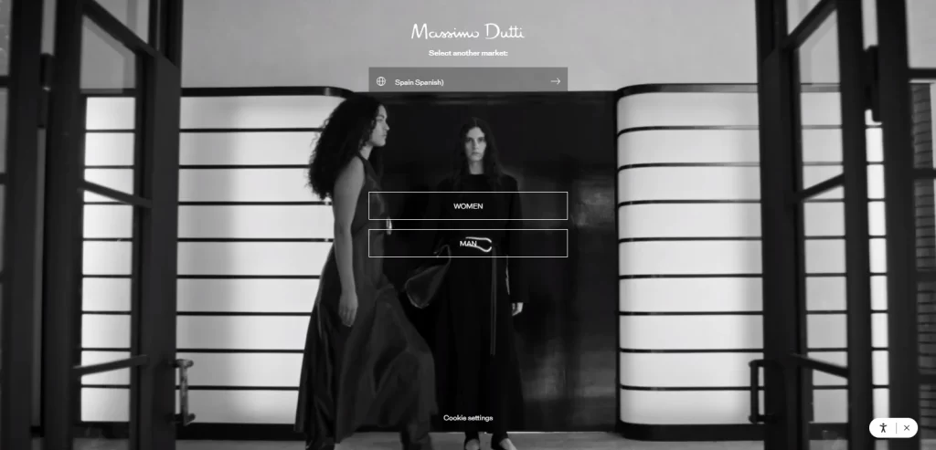
Established in Spain, yet with a name that sounds fashionably Italian, the brand is considered one of the top upper class brand from the Inditex Group, and that elegance is reflected in its web design. The entire look of the design is done in muted shades, with sparing pops of color, giving it a minimalist yet elegant allure. The hero of the website features a full-screen video of models sporting apparel by the brand, which adds a sense of dynamism that static images often lack.
With a pair of minimalistic buttons centered on the page, a language selection menu above them and an accessibility menu option to the bottom right, the homepage is one that matches the brand perfectly.
Burberry
Burberry is a British fashion house that is as much a British institution as the Queen or Weetabix cereal. Established in 1856, the brand has a long and rich history, which can be witnessed by their popularity among people looking for traditional English-style outerwear.
Started by Thomas Burberry, an ex-apprentice draper, the company had its humble beginnings in Basingstoke, Hampshire, England. However, their quality of work, as well as their focus on using gabardine to make water-resistant outerwear, made the brand so popular that by late 1890s, Burberry has opened another store, this time in London. Since then, the company has outfitted some great people, including Roald Amundsen, the first man to reach South Pole, arctic explorer Ernest Shackleton, and Everest climber George Mallory.
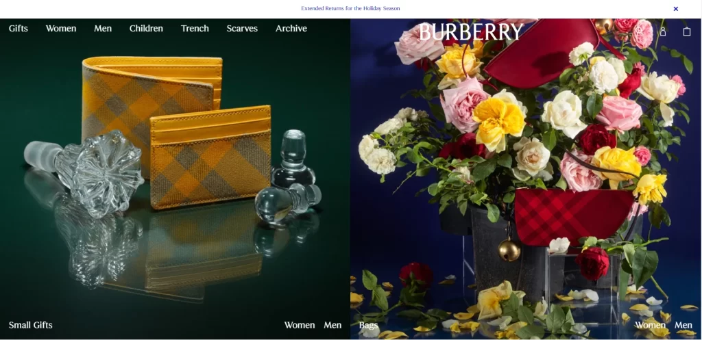
Their website perfectly embodies their brand’s vibe, with its dark, deep tones, and exquisite articles and accessories, that are perfect to attract their desired clientele. Plus, the full-sized imagery is a great tool to convert consumers to the brand.
Cropp
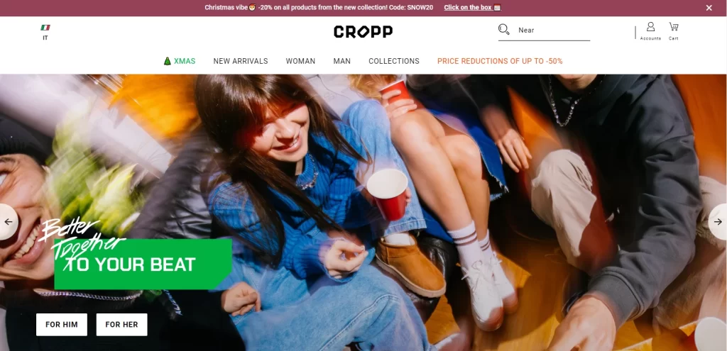
Cropp is a Polish fashion brand headquartered in Gdansk, Poland. Owned and operated by the fashion Group LPP, Cropp is one of five distinct clothing brands operated by the group. With a focus on streetwear-style European fashion, the company targets generally younger crowds, especially those between the ages of mid-teens to late twenties.
Keeping with its brand vibe, the website has a dynamic, colorful, youth-friendly style, with generous use of colorful images that pop up off the neutral white background. Scrolling down, you are exposed to a number of different options, including a slide featuring their most popular items at that time, as well as details about various upcoming sales and more.
Overall, this is the perfect fashion website design one would expect from an up-and-coming, yet highly effective fashion brand.
Jimmy Choo
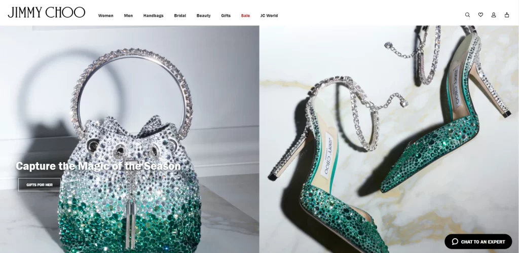
Jimmy Choo is a popular fashion brand that specializes in footwear and accessories. Established by Malaysian shoemaker Jimmy Choo, and ex-Vogue Britain accessories editor Tamara Mellon, the company was formed in 1996. Driven by Choo’s success as a shoemaker at London Fashion Week in 1988, as well as gaining the favor of Diana, Princess of Wales in early 1990s, Mellon brought up the idea to form a fashion company.
Since then, the brand has been featured in the media extensively, from movies to the Oscars’ red carpet. Keeping up with that luxury aesthetic, the brand’s website is designed exquisitely. The hero of the page is somewhat subtler; however, scrolling down just a little would show you amazing Jimmy Choo creations, from handbags to shoes. The pops of color set against the white and slate background give off a luxury vibe perfect for the fashion brand.
Lacoste
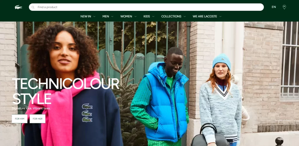
Lacoste is a French fashion brand that was established in 1933 by French tennis player Rene Lacoste, and his business partner Andre Gillier. Today, it sells anything related to fashion and apparel, from clothing, footwear, sportswear, shades, leather goods, even perfumes and watches.
One of the most prominent things about the brand is its logo. Most fashion houses try to incorporate elegance to create various types of logos, from lettermarks to plain wordmarks or symbols. However, Lacoste’s brand logo of a crocodile is one that is rarely seen in mainstream fashion.
Coming back to the website, the design is simple, upbeat, and youthful. The hero of the homepage features a full-sized image of a group of youngsters, attired in brightly colored apparel, from jackets to jerseys, hats, and scarves. Scrolling down, you are greeted with a mix of text, images, and even video, set against a bright backdrop, and highlighting the various options offered by the brand.
Ralph Lauren
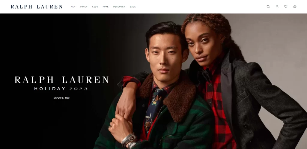
Ralph Lauren is an American fashion brand started by designer Ralph Lauren. Specializing in apparel that ranges from mid-range to high luxury, the brand has been catering to a wide variety of customers since its inception in 1967.
More than apparel, Ralph Lauren also deals in cosmetics, fragrance, eyewear, loungewear, bedding, fabrics, and even wallpaper. However, for most of these items, Ralph Lauren has licensed the brand name to other big companies in the industry, such as L’Oréal, Luxottica, Kohl’s, and more.
Their website is quite elegant, yet manages to perfectly blend that image of high fashion and familial style. The website uses high quality imagery, with each scroll down revealing a new offering by the company, helped by amazing visuals and highly converting copy.
Revelry
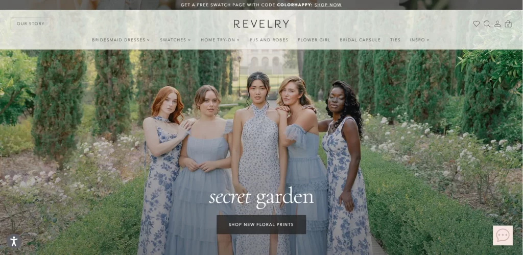
Next up we have Revelry. Revelry is a completely online, eCommerce fashion store that specializes in body-friendly bridesmaid apparel. Catering to all from size 0 to plus-size figures, the company offers an innovative solution to women who often find it difficult to shop off the rack.
The website for the company features a light and joyful vibe, which is emphasized by the use of well-lit and full-sized images of happy bridesmaids looking comfortable and confident in their dresses. The general backdrop of the website is a light pastel pink, which makes for an appealing fashion website design.
Versace
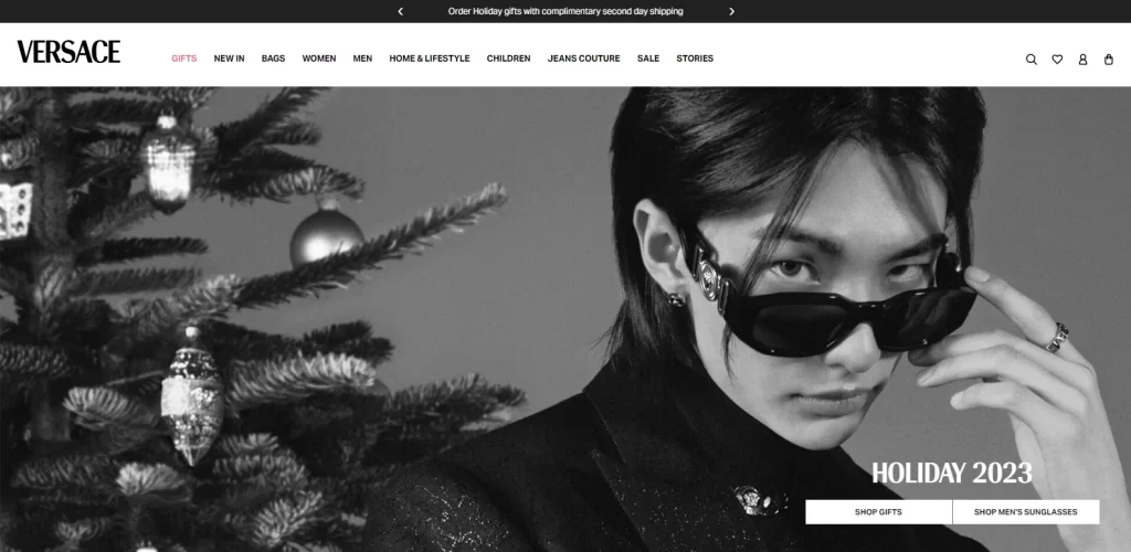
Versace is one of the top names in the fashion world, spanning both the ready-to-wear and the haute couture market. Started by Italian fashion designer Giovanni “Gianni” Versace in 1978, the brand quickly rose to fame, becoming known for pioneering some of the greatest trends in fashion, including the era of supermodels.
Known as one of the top fashion houses from Italy, as well as for its longstanding rivalry with fellow Italian brand Armani, Versace is the brand you desire when you want chic elegance in avant-garde style. Versace was the brand that changed the face of Italian fashion, and firmly established it as the face of a modern, non-conformist, sexy fashion, by introducing bold prints and bright colors to his design. This was a major departure from previous Italian styles, where muted tones and flat prints were popular.
The website for the company represents those same values to its visitors today. While the backdrop of the website is monochrome, it is occasionally interspersed by pops of color that offer a sharp contrast. That, combined with one of the more popular high-fashion clothing logos that features a Medusa head as its symbol, only serves to make the brand stand out. Moreover, the high-resolution imagery used, as well as an overall minimalist design, allows the company to showcase its wares effectively.
Conclusion
To sum it up, there is no single formula to create an effective fashion website design. That means that in order to have a successful fashion website, you need to evaluate and understand what styles work best for you.
Using that, you would be able to find the perfect fashion web design ideas to implement according to the web design styles suited to your brand. And when combined with the right web design guide, you would be able to ensure that your fashion website is a massive success.

Logopoppin
Logopoppin is a graphic design agency that specializes in logo designing, web development, video production and advanced branding services. We love to innovate businesses with new age technologies, allowing them to improve their visual reputation.

