Table of Content
How to Identify the Good Fitness Logos from the Bad to Inspire a Great Logo
Fitness and health has been coming into the limelight in the past few years. With new diet trends like paleo, Keto, and even lifestyle changes like veganism catching on like wildfire, many of us see a new fitness logo every day.
Since the pandemic in 2020, many people such as coaches and fitness trainers were out of jobs. However, using technology and catchy fitness business names, many found new and innovative ways to earn while at home, and doing the job they loved. They started virtual fitness classes using tools like Zoom, Skype, and even YouTube, which soon turned into profitable businesses. Businesses who need logos.
Now, not everyone has the funds to hire professional logo design services to create a symbol for their new venture. So, if you too are planning on creating a logo for your fitness studio, then read on to get inspired.
Why is a Strong and Effective Fitness Logo Important for Your Business?
When we talk about fitness logo ideas that have a positive impact on your business, there is often a little confusion about how to identify such logos. More often than not, it’s the subtle things that separate the great from the mediocre, meaning that its difficult for the layperson to identify the difference between the two.
However, that is what we are here to help you with. After a few years in the industry, we have identified that there are three hallmarks of a great fitness logo. And if you want to evaluate whether your fitness logo design fits the bill, then it needs to fulfil these tenets.
But what are these tenets, you may be asking. Well, let’s look at three factors that determine whether your fitness business logo is a success or a failure.
It Exudes Professionalism
One of the most important jobs for your fitness logo is to establish a sense of professional business in the industry. You need to establish your credentials in the market, setting your business apart from the amateurs in the industry. Your logo should be effective at establishing a sense of professionalism at a glance.
To do that, it is important to study your industry, and see what it would take to establish such an image. Now, a professional identity does not mean a corporate identity. Many industries often do not require a corporate identity. In fact, it can downright affect the business negatively in some cases. A professional identity on the other hand, helps establish your credentials for your consumers as well as the competition.
It Inspires and Establishes Trust among Consumers
The perfect fitness logo can help your business form a strong bond with your consumers. And its obvious why. Your consumers have a problem for which they are looking for a solution. Now, if your logo is expressive enough that it instantly seems like it would have the answer to their problems, you can rest assured that they are going to choose you over your competition.
Moreover, it is also about the consumers’ expectations. Some design elements, including your color combinations, can help evoke the right emotions. So, that too can help you get a leg up on your competition in attracting consumers to your brand and establishing a trust-based relationship with the consumers.
It Showcases Your Brand Values and Message
Finally, the most common reason for having a great brand logo – highlighting your business’s values and brand message. In a saturated market, competition can be tough. And with consumers today more conscious about patronizing businesses that hold values and principles similar to their own, its important to have a brand symbol that can portray all of that.
Now, you might be wondering, how can a business manage to condense all that into a single design? Well, if you look at it, you do not need to encompass everything into your logo. For example, if your gym is all about powerlifting, and heavy testosterone-fueled fitness program, then a logo that exhibits a strong masculine energy with overblown elements will help you convey your message effectively.
Just look at Planet Fitness’s logo and you will see how they managed to incorporate their commitment to fitness with a lesson on enjoying the journey to fitness too.
Three Rules That Dictate the Design of a Memorable Health and Fitness Logo
Now, whether you are a personal trainer, a gym or health studio owner, or even a fitness equipment manager, there are a few rules that dictate how to create good fitness logos, no matter the niche.
Essentially, there are three basic design rules that ensure that your fitness business symbol has a design that not only works well, but also is memorable. Let’s take a look at what they are.
Ensure that Your Fitness Logos Portray the Right Message
Considering that the fitness industry is based on dynamic activity, your fitness slogan and logo should match that vibe. The design on your logo, and the visual elements you add to it like logo fonts and color palettes should match the theme of your logo.
Your ideal logo should evoke the right emotions with every visual entity in its design. That means you have to choose the right fonts, a suitable color palette, and complimentary imagery to make a good fitness brand logo.
Remember KISS – Keep It Simple Stupid
Next, you need to ensure that the overall design itself is simple and easy to remember and recognize. However, simplicity does not mean omitting necessary design elements that enhance or portray your brand message and story.
Your fitness logos are supposed to embody your brand essence, the story behind their origin, and your USP. To fit all of that within a single design, many businesses who are new to the design world tend to overcomplicate their fitness logo ideas.
However, rather than helping, it ends up muddling the message, and makes the logo too complicated for many consumers to remember. And that is not something you would want.
However, that tends to muddle the message, rather than provide the clarity you desired from your gym logo.
Incorporate Popular Design Trends that Can Help Your Logo Stand Out
Third, you should only add the design elements that are not just relevant today, but are in essence timeless. Every year, new trends become popular in the logo design industry, mostly due to the constant evolution of design as well as the consumer aesthetics. However, many of these trends soon go out of fashion, leaving designs that used them looking outdated.
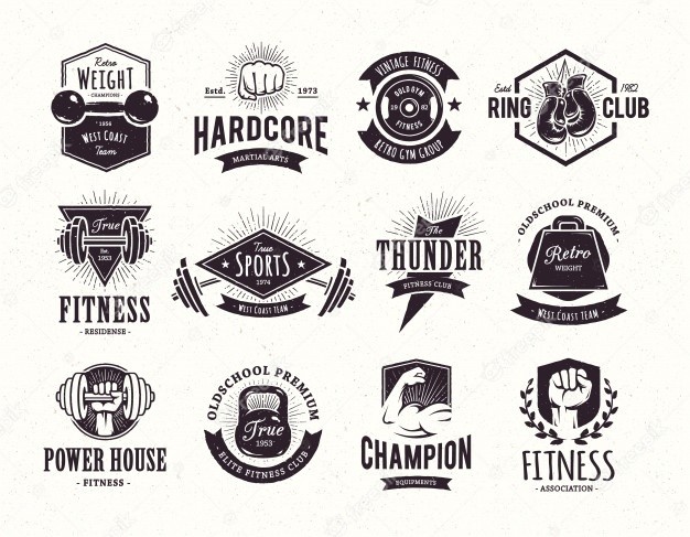
Now, there’s a huge difference between plain, outdated designs, and fitness retro or vintage logos. Many old-school bodybuilding gym logos tend to embody the muscle pumping raw style of the decades past. They are considered timeless, or vintage, such as the logo for Gold’s Gym.
For example, the style of slime logos popularized in the 1990s by Nickelodeon is now often considered gauche and too outdated. That is what it means to utilize logo design elements that are stable enough to last a long time.
Now, if you follow these three steps, you will see that the resultant logo will fulfill the hallmarks of great logos we described earlier, even if the design isn’t conventionally good-looking.
Creating A Unique Fitness Brand Logo for Your Gym
Whether you run a fitness studio or are an independent coach and trainer, you need a suitable fitness website and a gym logo for your business. That gym logo should be well suited to attract customers, motivate them, and portray an essence that helps people work harder.
Most importantly, consider that people today are often too busy to go the gym, especially since the COVID-19 pandemic. If your fitness logo represents an online training regimen, your symbol should have the ability to motivate people to get off their couches and workout in their own homes, despite lesser accountability.
Today, fitness studios and gyms take a lot of different forms. From CrossFit, to HIIT, Spin classes and Zumba to contemporary dance classes. These are all styles of fitness businesses that we see around us. Let’s look at a few of these categories and find out what identifies each group.
Fitness Logos for Fitness Studios and Gyms
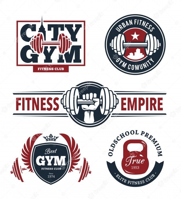
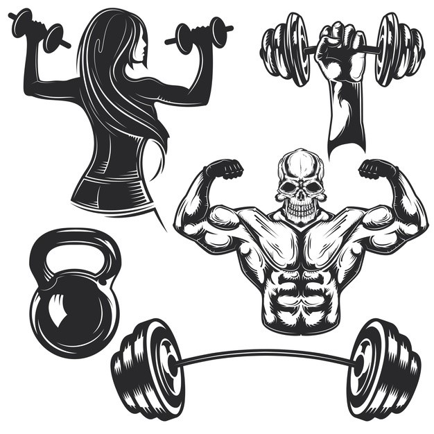
Gym logos and fitness studio symbols are some of the most common designs that people in the industry ask for. These brand identifiers are generally categorized by a few key styles of imagery. Take a look at the five fitness logos given above, and understand the iconic style of these symbols.
Weightlifting Equipment
These gyms and centers are mostly focused on a combination of weightlifting and cardio. Yet they tend to emphasize the aesthetic appeal of a fit and chiseled body with prominent musculature. That is why the emphasis is on the consumers who want to grow stronger by offering them a better life as a fit, muscled individual.
Image of a Strong Arm or Hand
Often, these logos also include the image of a flexing bicep or a pumped arm and fist with veins popping due to sheer effort. Humans are highly visual creatures, and most of us aspire to have a trim and well-muscled physique. By associating such imagery with your log, you can easily entice those looking to gain a better body towards your fitness business.
A Manly Typeface
Third, thee logos are often accompanied by bold and masculine fonts spelling out the brand name. While gyms and fitness centers are in no way exclusive to males today, yet still this relic is carried over from the past to give these fitness logo ideas an image of strength and durability.
Often, such symbols will be sporting blocky or thick lettering in their names. However, the trend is slowly changing to include a more neutral typeface to welcome fitness aficionados from all genders.
The Expression of Iron Will – The Epitome of “No Pain, No Gain”
Finally, the entire image is meant to give off an essence of strength, stability, and sheer will. Coaches and trainers have always been fond of the famous saying, “No Pain, No Gain.” However, as fitness centers are now starting to include other types of exercise regimens like Soul Cycle or Yoga, that trend too is slowly giving way to a more neutral vibe.
Fitness Logo Ideas Yoga and Meditation Studios
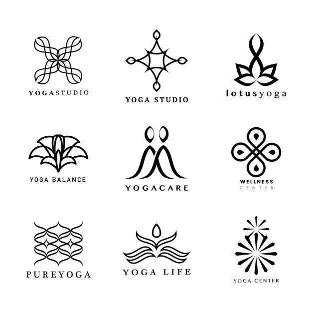
Yoga and meditation has gained a mainstream acceptance and availability within the past decade. Before that, this branch of the wellbeing and fitness industry was often ignored, due to its seemingly less impactful training regimen.
However, recent studies and real-life example shave shown that Yoga and meditation are far more powerful than previously believed. By caring for the mind as a muscle just like the rest of the body, its practitioners find it quite relaxing yet demanding.
Let’s have a look at the design elements that characterize these nine meditative and yoga brands’ fitness logos.
Geometric and Flowing Designs
Yoga is all about the flowing human body and mind. That means that most of these fitness brand logos consist of a design that keeps the eye flowing from line to the other without pause. This mesmerizing display is meant to relax the mind of the viewer. So instead of consciously moving your eye from one place to the other, the design gently guides it all around the logo itself.
That is also a great meditative technique, by allowing your body to perform a specific task without having to involve any additional brainpower. This helps people unwind in a way that would be only possible if the mind is truly relaxed.
Lotus Flower Imagery
Again, lotus has a dual purpose here. It has a sloping and smooth design that appeals to yoga aficionados. Moreover, as the concept of Yoga and meditation is mostly found in the eastern cultures, primarily Asia, the flower is commonly associated with the religions and beliefs of these areas.
They are commonly found in and around India, China and other eastern countries with Hindu/Buddhist population.
Inclusion on Other Nature Symbols in the Gym Logo
Taking further cue from these Asian cultures, other nature symbols like the sun, moon, and other sounds and imagery associated with these cultures are also common in these designs.
The depiction of a sun is often added to give a sense of purity and energy. The Sun is believed to be the source of all power, and as it affects the food we eat, the weather we live and as well as other factors of our lives, it is often added to the design.
Design constitutes of Curves to Add a Softer Feel to the Design
If you look at the nine different styles of fitness logos, you will see that none of them contains sharp or blocky designs. The entire purpose of Yoga and meditation is to create an environment of calm and peace. However, sharp corners tend to jar the experience of the viewer.
By employing curving lines into the design, the logo itself tries to portray the USP of this kind of fitness studio.
Fitness Brand Logos for CrossFit, HIIT, and MMA Gym Logos
These gyms are meant to be completely dynamic. CrossFit, HIIT and MMA are all about mixing styles to maximize and improve not just the looks of your body, but the functionality as well. These styles of training regimens are based on dynamic movement, and are meant to build working muscle instead of just for show.
That is why these symbols often incorporate design elements that include speed and agility along with strength. For example, classic bodybuilders often have a hard time with their flexibility. Yet CrossFit and HIIT athletes, no matter how big they get, still work on improving their flexibility and agility. This style of imagery also helps you portray the perfect vibe in your gym websites too.
The four fitness logos above are meant to incorporate that style of imagery in its design.
A Variety of Exercise Equipment
These fitness symbols often include images of exercise equipment such as giant tractor tires, thick swinging ropes, as well as classic items like dumbbells, kettlebells and other strength building items.
The purpose is to portray that this style of fitness regimen is not conventional, but relies on the strength of a variety of different techniques and equipment.
Strength and Agility
The purpose of these logos is to depict a style of exercise that balances explosive strength without sacrificing agility or flexibility. That is why you will often see the imagery of people swinging, jumping, or doing flips as part of these fitness brand logos.
Multi-Gender Imagery
Finally, this style of fitness is targeted towards all genders. That is why you will often see designs incorporating the images of one or both genders within the logo. This can be seen in the logos above, which show both the silhouette of a man as well as a woman.
Fitness Logo Ideas for Sports and Health Coaches, and Personal Trainer Logos
Finally, fitness logos used by coaches and trainers for their personal brands often incorporate similar imagery as the categories above. That style of the fitness logo depends on the niche which that individual fulfills.
Yoga trainers tend to use logos similar to the meditative symbols described above. Trainers for specific sports such as boxing and wrestling often use their iconic imagery like fighting gloves and wrestling mats as parts of their personal logos.
How to Get a Well-Designed Fitness Logo for Your Brand?
There are a variety of ways you can get a well-designed logo for your fitness brand. That includes hiring a designer to create a logo for you, or you may even use one of the best free logo makers available online.
Try an Online Logo Maker App for Your Gym Logo
Now, one of the first options most new businesses go for is to use an online, AI logo design tool to crea their fitness logo. However, while it is a quick and easy process, there are a few offsets too. First, these tools create new logos using a library of pre-designed logo symbols, which are combined together according to your instructions.
However, the result is a logo that is often too generic, due to the same elements being used in other designs too. And a generic logo is not much better than not having a logo, because it will not help your brand establish itself in the consumers’ minds.
Wix Logo Maker
Wix logo maker tool is one of the most famous tools online. You can create a beautiful logo for your business by using their extensive template library, or add your own imagery to customize it accordingly.
Canva Logo Maker
Canva is another popular option to create a variety of graphics online without spending a lot of money. The options available on Canva are quite extensive, allowing you to create beautiful fitness logos without much design experience.
Hire a Professional Design Agency or a Freelance Designer
The best option you can opt for, is to hire a professional branding agency for your project. However, if your budget doesn’t allow for that, you can go for the next-best thing, which is to hire a freelance logo designer to create your fitness logo.
Now, the reason these options are better than an AI design tool, is because they allow you to have unique, tailor-made logos perfect for your brand. And while they may cost more than your average fitness logo maker, you can rest assured that the logos they create would embody your brand essence.
Frequently Asked Questions
| 1. How to design a fitness logo? In order to design a fitness logo, you need to be aware what style or niche of fitness symbol you need to design. Once you know that, you can get started on how to create a logo. |
| 2. What does the planet fitness logo mean? It is the symbol for acceptance and universality of judgement. The Thumbs-up is a universal sign of acceptance and motivation. |
| 3. Why is planet fitness logo a gear? It is meant to portray the circle of life, the gear meant to represent the exercise machines as well as the daily grind of life, where people take the time to better themselves. |
| 4. What is planet fitness motto? Their motto is, “Be Free”. |
Conclusion
Now that you know what goes into making a great fitness logo, you can get started to create your own personal trainer logo. If you follow the three cardinal rules of logo design mentioned above, you will be sure to create a truly iconic symbol that would help you stand out in the market.
Want to have your fitness logo professionally designed? Our expert designers will create the perfect logo that would embody the essence of fitness as along with your brand message.
Latest news you want to know!
Subscribe for cutting-edge design inspiration at Logo Poppin! Elevate your brand with updates on logos, branding, web design, and video animation.
Note that by clicking “subscribe,” users may agree to our privacy policy and consent to Logo Poppin to use your contact data for newsletter purposes.
Logopoppin
Logopoppin is a graphic design agency that specializes in logo designing, web development, video production and advanced branding services. We love to innovate businesses with new age technologies, allowing them to improve their visual reputation.