Table of Content
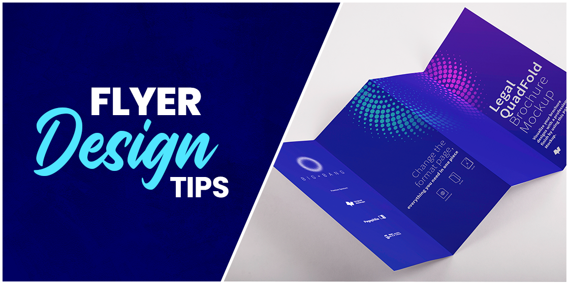
Have you ever wanted to spread the word about your business but couldn’t find a cost-effective solution? Look no further because flyers are an excellent way for any company to create promotional materials and spread the word about their business. The use of flyers is widespread across the globe, as it is easier to pass them around among potential customers and can help you gain a massive return on investment.
Flyer Design Ideas
Here are some flyer design tips and ideas to remember for making your flyer stand out from all of the rest.
Know Your Audience
Flyers are one of the favorite marketing tactics for small businesses. As they operate within a particular geographical area, it is crucial for them to know their potential clients first and then design accordingly. Thus, before you begin the design process, you should know your target audience’s requirements, preferences, likes, and dislikes to convince them to use your product or service effectively.
Budgeting Your Campaign
Setting a budget for your marketing campaign is determined by several aspects, i.e., the target audience, the geographical areas you wish to target, etc. In posh localities, the competition is higher. So you may want to go through a competitor analysis to learn what your competitors are doing. They may be using glossy textured, high-contrast, multi-colored flyers. To win a customer, you must leave a good impression not only with the brochure’s content but also with its quality.
What is the Best Size for a Flyer?
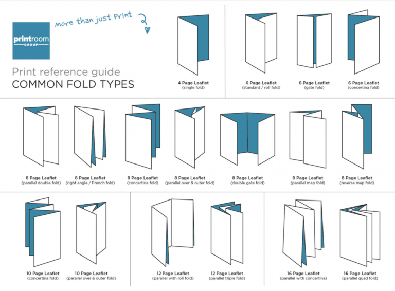
Flyers come in many shapes and sizes, and their format can depend on the number of details you wish to add. Thus, before brainstorming about anything else, choose a flyer size to know how much space is available on the canvas. The best and most commonly used flyer design sizes are A5 and A6. Although, these may not be large enough in some scenarios wherein more text and content needs to be shared on the flyer. In that case, half or tri-folded flyers can help you place more content without cluttering the canvas. Thus, for handouts with more detailed content, folded ones do excellent in guiding your readers through the different sections of text. These can help enhance the readability of content for readers, increasing engagement times. The more exposure your flyer receives, the higher the conversion rates.
Choosing the Right Paper Quality
As discussed earlier, once you set a budget, decide what kind of paper you would like to use for your print marketing campaign. As more and more people become conscious of environmental pollution, it is our responsibility to do our part by using biodegradable material. The thicker and glossier the flyer is, the longer it would take to decompose. It’s best if such flyers are not thrown away and utilized. For example, if a book store intends to advertise themselves, they can create a thick, high-quality door hanger flyer that can be used as a bookmark. So it all boils down to how you make use of the paper, and for that you must know the types of materials and finishes used in different flyer papers.
Kraft Paper
For businesses that want to take a more environmental friendly approach towards their flyer design, printing them on Kraft paper is the best option since it is recycled paper and 100% biodegradable. Kraft paper, thus, looks naturally brownish having no additives in it, which gives it an old-school, rusty look.
Bond Paper
Bond paper is produced from rag pulp instead of wood pump. Owing to its good repute for durability and a finish that looks luxurious, it is commonly used for legal documents, as using ink on it does not leave any blotches. For flyers that contain a form that has to be filled for promotional purposes, this type of paper is a perfect choice.
Gloss paper
A paper coated in gloss, flyers made with this material never fail to make them look shiny. The images and text color pops out on gloss paper because of the sharpness that it provides, which makes it the most commonly liked paper for making flyers. However, its downside is that the paper is not anti-glare and reflects light making it a not so ideal choice.
Silk Paper
Silk paper brings the best of both worlds with it. It has a finish that’s both gloss, and matte. The tactile feel of the paper gives it a smooth texture similar to gloss paper, however, visually it is far less shiny, like matter.
Uncoated Paper
Commonly used in offices and educational institutes, uncoated paper is good at holding ink. As it does not reflect light and is easy on the eyes, text on uncoated paper can be easily read without any discomfort. Of course, the paper quality can vary based on the texture and brightness of the pages. So the options are myriad with different pricing.
Color Scheme
The color scheme of flyers is crucial to grab the viewers’ attention. Brighter shades of red, yellow, orange and green are the most commonly used colors on flyers, as human eyes are more inclined to pick on shiny objects. Each color evokes a reaction in us and has multiple meanings associated with it, varying from person to person. A single color can thus evoke different emotions in different people.
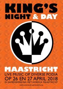
Knowing how to use colors to your advantage can massively help your promotional campaigns. The choice depends on the message you want to convey through colors and how you can portray that in combination with color codes. The above flyer demonstrates how this can be done. Its designer reflects the ‘King’s Night and Day’ headline with the use of the complementing black and white colors in contrast with the orange background, helping the objects pop out. Thus, understanding colors can teach you to create a hierarchy among all elements. setting apart each object from another, preventing text and small details from becoming illegible or unnoticeable.
Following is a short guide to using colors in flyers:
Red

Popular among fast-food chains, red color is best for attracting attention. In marketing, primarily, it is used to represent excitement and passion. Passion for food – KFC. Passion for movies and series – Netflix. However, this is not the only meaning associated with red. It can also symbolize love, or in some contexts, danger. Anyone distributing flyers to spread awareness about environmental pollution wouldn’t want to use red as the primary color. In this scenario, red will most likely invoke a sense of danger and anxiety in the reader. Indeed, fear-mongering adds to the list of global issues and does not help in reducing them.
Yellow
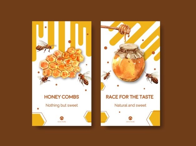
Yellow is also a dynamic color. It is usually used to imply cheerfulness and optimism or even caution. If you own a kids’ store and want to promote an upcoming sale, the color yellow would be best for effective marketing. Another way of deciding a color combination for your flyer is to match it with your product. Look at how the flyers make good use of the yellow and orange colors to reflect the product itself.
Blue
Blue is often used to indicate trust, stability and confidence. Thus, several tech brands use blue color to reflect these qualities. Moreover, a flyer’s color can also represent the product you are selling. For a water supply business, the go-to option would be blue. Sounds like a cliché? Well then, try using two to three colors to bring out the best from your design. In this case, the use of blue with green or white color can help you create a more dynamic flyer. All three colors share a similar meaning of eco-friendliness in this context, harmoniously evoking a set of positive emotions in the reader. When using more than one color, it’s important to note that printing costs are higher when producing multi-color designs, so be sure to use only two to three colors if you are on a low budget.

Over the internet, if you look up flyers of cleaning services, you’ll notice how more than 70% of these flyers use blue as its primary color. Why you ask? That’s because blue is also associated with cleanliness. A clear blue sky, and clear blue water indicates a pollution-free environment.
Flyer Fonts and Typefaces
Knowledge about different fonts & graphics comes in handy while designing a flyer because every designer has a different style when using fonts and placing pictures to add effect to their design. When choosing a font, you need to consider your brand’s tone and the target audience. Does it need to be formal or informal? Do you want them to be aware or interested?
Fonts are essential in any design form, but they become even more crucial when creating flyers, as they can make or break an image.
When designing a flyer, it is common to look up and use the ‘best’ fonts without putting much thought into the process. No font is best in itself. The way you match a font with the tone of your brand or the message you wish to convey with it is what differentiates between a good and bad font. The only rule that you must follow is keeping things simple yet unique without the use of fancy fonts. Easy readability for readers is the most critical aspect of your approach towards choosing fonts, and you must not compromise on it.
Keeping it simple also means that you should not use more than two to three fonts on a flyer. The Headline usually uses a more prominent and bolder font than the body text. Also, using different fonts from the same typeface family is preferable. In the case of established brands, they can either use the typeface of their brand logo as the primary font or use one of its typeface variations.
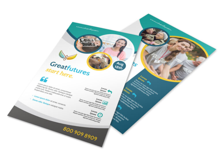
Have a look at the above charity flyer as an example of how headline can reflect your brand identity. In this case, the tagline reflects the logo colors, blue and yellow, representing Trust and Optimism respectively.
Images and Graphics
One of the most important aspects of flyer designing is the use of images on it. It’s important to only use high-quality photos with good aesthetics. Any compromise on it can cost you a potential customer. The images used in your flyer reflect your company’s professionalism. Amateur images give the impression that it is coming from an amateur business.
Moreover, as flyers come in different shapes and sizes, the background image has to be stretched in order to fit the canvas. Be sure to take high-quality images that won’t pixelate upon zooming to avoid facing pixilation issues during the flyer design process.
Flyer Design Layout
One of the primary reasons for an unsuccessful flyer is that it looks cluttered and messy due to excess usage of content, be it text or images. More information on a particular topic can confuse rather than inform your audience about your services. So remember to simplify a brochure design, only using the elements that help you convey your product or service efficiently, without bothering the readers with a cluttered look.

Whether working on a flyer or on any other kind of graphic design, as a foundation to work on, designers often use composition methods, such as the rule of thirds, diagonal method, or Gutenberg diagram. These help artists produce neat artwork by creating a hierarchy among its elements. Such order of elements also helps create a focal point in your artwork, allowing things to pop out in a way that guides the reader’s eye through the essential information. Also, it never hurts to say that white space is necessary for making good designs. Often, less is more because the easier it is for the readers to skim through a flyer, the quicker the message will come across.
Speaking of keeping things simple and neat, if you are limited to a single small sized flyer, without much real estate to work on, layering objects can offer the readers with rich visuals in a limited space. Have a look at the below image and see how the designer has placed the photograph at the very back of the canvas, layering the headline and other design elements on top of it. This strategy makes good use of most of the available space without making the flyer look cluttered.

Flyer Must Have a Call to Action
The placement of a call to action varies in different scenarios. In the case of some flyers, it is best to place the call to action on or near the top two focal points of a rule of thirds grid. For instance, this is ideal for a flyer informing potential buyers about a “Buy One Get One Free” offer. The focus here is on gaining conversions by incentivizing people.

In a different scenario, when the flyer’s purpose is to advertise and spread the word about your new business, placing the CTA at a focal point would not make much sense unless you educate your audience on why they should choose you over your competitors. The placement of the CTA text will thus dictate the type of font you should use for it.
10. Optimize for Digital Screens
For making the most out of your marketing campaign, you can use the flyers on social media platforms to spread the word around free of cost. Especially if you are on a low budget, and can’t afford to transport your design in its best quality on print, publishing it online will allow you to share it in high-quality. All you need to do is color optimize your flyer design differently for both print and digital mediums. CMYK and RGB are two color formats used in different scenarios. When rendering it for print, the color formatting for your artwork is best suited in CMYK format. Whereas Digital Screens work best with images formatted in RGB colors.
Conclusion
We hope that the article has helped you bring out the best from your flyer design ideas. From the technical to the creative side of the design process, this article attempted to cover all the important flyer design tips that are essential for making an attractive flyer design. In case this seems like an intimidating procedure for a DIY project, don’t worry, feel free to reach out to us, and our expert graphic designers will gladly help you create a customized flyer design as part of our branding services.
Latest news you want to know!
Subscribe for cutting-edge design inspiration at Logo Poppin! Elevate your brand with updates on logos, branding, web design, and video animation.
Note that by clicking “subscribe,” users may agree to our privacy policy and consent to Logo Poppin to use your contact data for newsletter purposes.
Logopoppin
Logopoppin is a graphic design agency that specializes in logo designing, web development, video production and advanced branding services. We love to innovate businesses with new age technologies, allowing them to improve their visual reputation.