Table Of Content
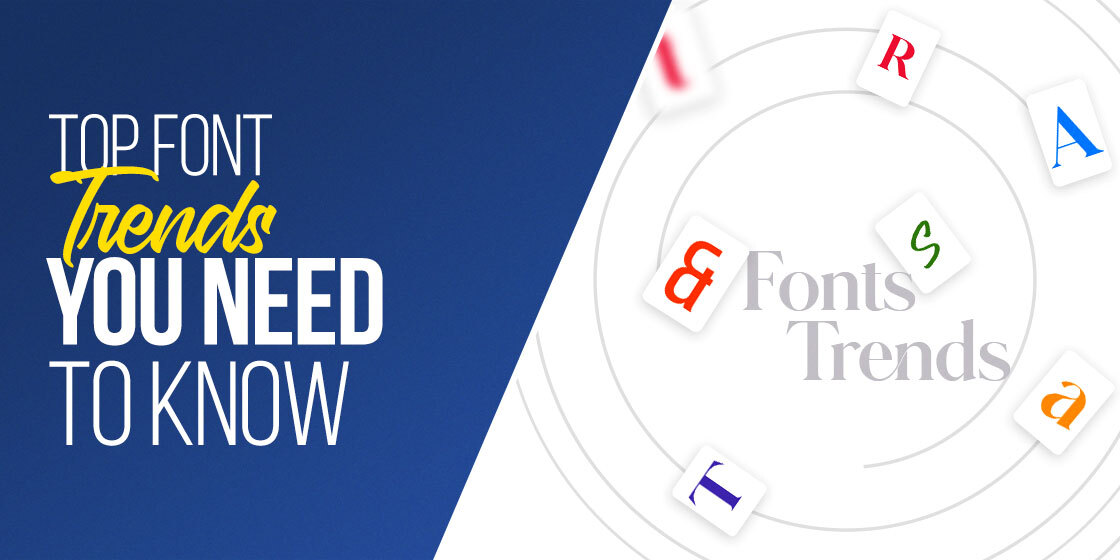
Discover the Most Popular Fonts and Typefaces Designers are Using
As designers, its common for us to slip into habits and preferences when it comes to specific design elements like fonts, styles, and more. they kind of become our signifiers, which allows us to identify our designs quickly. But when it comes to certain things, tried-and-true or dependable might not be exactly what you are looking for.
For design elements, trends come and go. While most are just seasonal, and are forgotten after a little while, some leave a lasting impact. And for those who know the industry, they herald the imminent arrival of something exciting. Today, we will be discuss fonts and typefaces, specifically font trends 2023.
Post-COVID, the design aesthetic for a lot of things as changed, as people are aching for the nostalgic days when life was more carefree. Therefore, we are seeing that in many things, people are going back to old and proven elements.
So what new things have this year’s font trends got for us? Let’s find out.
1- The Importance of a Great Typeface for Your Design
When you hire a professional design team from a branding services agency, you get access to a variety of other services than if you had just hired a freelance designer. At a branding agency, they focus on turning your business into a complete brand.
For that, you require more than just a logo or a website. You need a uniformity across all channels and mediums. And when it comes to design elements that are among the first things a potential customer looks at, its important that those elements are exactly what the consumer expects of us.
Just like a great color scheme can make a simple design look out of this world, your choice of typeface can also be a great help in giving your design a much needed boost. in some instances, it may be used as the calming element of the design, drawing the eye with its clean lines amid a wild background. in other cases, an enticing script-like font or an elegant typeface may be what uplifts a somewhat plain design.
In short, the right fonts can help round off your design, balancing the various other elements and turn it into a cohesive whole in many different ways.
2- Top Font Trends 2023 Driving Designs Today
Now that you know why a good typeface can be important for a design, the question is; what kind of fonts would work according to the aesthetics of 2023? If we talk about it, font trends 2023 are a little different than the ones we have been seeing in the past.
In the years past, modern, minimalist fonts had been in vogue. But now, in the past couple of years, there is a rise in the serif style of fonts and elaborate typefaces with swirls and other visual elements. We have observed there are five major trends that all the popular fonts this year seem to be following.
Let’s take a look at them.
Visual Accessibility
Visual accessibility is a big factor when it comes to fonts and typefaces. That is because no matter how good the font, if people are unable to decipher and understand it, it will be of no use in your designs. For example, if your signboards are designed to be highly visible even at a distance, with great contrasting colors, but your font is illegible unless someone stands close to it, then the overall design fails.
Its highly important that your fonts are clear and legible, especially if they are signage or logo fonts.
The Timeless Legacy of Geometric Sans
Geometric Sans is a highly-beloved typeface that was inspired by the everlasting circles and squares. Originally created as a font in the 1920s, its variation was built by Paul Renner that is still loved and used by designers everywhere. But seeing as the aesthetics have changed for the people, the question is whether this font group still has a place in designs today?
Experts believe that despite brands moving away from long-standing typefaces in search for individuality, the geometric sans typefaces will find an excited audience in 2023. That is because it is visible, approachable, easy to use, and unfussy enough that it offers designers a flexibility when deciding to use it as a fallback.
There’s Nothing like Nostalgia
The post-COVID 2020s are the years of nostalgia, with people longing for a better, more enjoyable time. Retro and vintage design aesthetics reign supreme, from art to fashion and more. Moreover, designers and their audience are now looking for decades other than the soft and floofy 70s, with millennials and Gen-Z now looking towards the funky 80s or the cool 90s for their aesthetics.
Take for example, the logo for last year’s Thor: Love and Thunder. The logo was distinctly different than anything Marvel had done before. And gave off a funky 80s vibe with the neon disco lighting and retro arcade-style graphics.
Designers are embracing the great stylistic elements that made the art of that era so iconic, and have jazzed it up a bit for today’s audience. With the older generation of today being that of the millennials, born in the 1980s, it’s the perfect decade to start the next retro design evolution.
The Rise of Typographic Branding
Another new trend we are seeing is that of the importance of relying on a font or typeface to unify the brand image across multiple platforms. And one of the most common ways that brands are doing so, is using a bespoke typeface made specifically for their use.
According to design and branding experts, companies today need to focus on every element of their design in order to ensure that everything included in the design resonates and speaks to your audience. That is because depending on the style of your font, you can convey a variety of messages to the audience on its own.
Custom Bespoke Fonts Are the Way to Go
Continuing on from the previous point, as more and more brands are relying on fonts as an essential branding element, its becoming increasingly important that brands have their own custom typeface designed for their use.
The reason behind it is quite simple. In today’s age, access to digital assets is quite easy compared to the decades earlier. Moreover, there are more and more brand popping up each year, making it harder to have a unique visual identity using commercially available design elements like fonts and imagery.
Therefore, in order to be unique and one-of-a-kind, it is important to have a custom-built font for your brand.
3- Ten Best Typefaces to Use in Design According to Font Trends 2023
Now that we have seen the popular font trends 2023, there is a question of how they will look when we consider actual typefaces themselves. For example, how can we say that a specific font complies with the design trends of today, something that a classic font like Times New Roman or Verdana doesn’t?
Let’s take a look at some of the top fonts and typefaces that embody everything that the 2023 aesthetic has to offer.
Bull-5
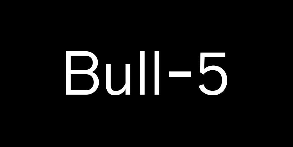
Released in the April of 2022, Bull-5 is a font that is reminiscent of the classic typewriter font that was common in the 1960s. Designed by David Einwaller, it is made in the style of typefaces generally associated with one specific brand of typewriters, namely those made by Olivetti.
The designer digitized samples of these no-nonsense masculine fonts from photos of old newsprints and manuscripts, turning it into a great font that is both simple, classic, and has great readability.
Cosmica
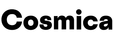
This is a fun and carefree sans typeface that was originally released in 2018 by designer Chester Jenkins. It follows a distinctly geometrical construction, but not too closely as to be associated with that specific style.
The designer is generally known for creating original, unique fonts and typefaces, and Cosmica is no exception. Released after a 5-year hiatus, the new font is the perfect representation of new world aesthetic combined with the simple charm of old. And the best part is that it was developed by Jenkins as a personal project.
Wallop

This font is inspired by the likes of Gill Sans and Johnston, and is discernible by its vertical terminals. That specific design style makes the overall font look sharp and aggressive. However, the lighter weight of the Wallop font, combined with the rounded characters and elements, balances it out to make it look friendlier.
The designer, Martin Vacha, originally designed it for an independent magazine called Wallop, which gave the typeface its name, and its characteristic legibility. This makes it one of the best fonts for business cards and other stationary media where visual legibility is important.
Boogy Brut
Boogy Brut may not look like it, but it is a font that is a calligraphic typeface at its heart. its sharp lines and character structure makes it perfect for highlighting each character individually, as well as combining it into a whole as a word too.
The digitization of the font removes the slight imperfections common in handwritten scripts, without making it lose its charm. Originally, it was an experiment on the existing design by designer Julien Priez, it turned into a highly functional and aesthetically pleasing design that is hard to miss.
Plus Jakarta Sans
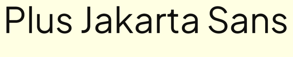
Another geometric font on this list, Plus Jakarta Sans is a sans serif font that looks like a modern take on a classic font. The font is perfectly balanced, with the x-height increased so that there is a legible difference between x-height and caps. Moreover, the design of the characters is such that even at different sizes and weights, the font is easily understandable.
Originally, the font was designed for the provincial government of Jakarta’s program, as a way of giving it an identity. And since then, it has been representing the government entity perfectly as their font of choice.
Niveau Grotesk
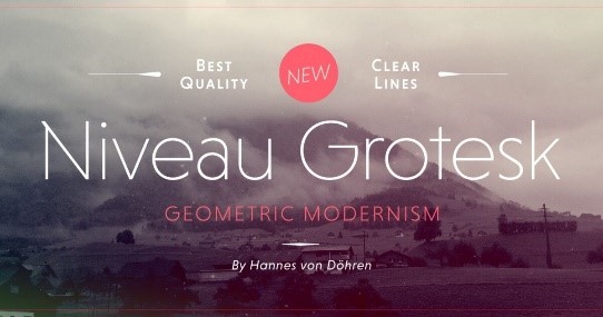
Inspired by the classic vintage fonts of the 19th century, this typeface is based on the idea of geometric shapes and designs. The result of its straight architecture means that it is a great hit at bigger sizes. Bu that doesn’t mean that the font doesn’t work at smaller sizes.
Niveau Grotesk works equally well in small sizes and long passages, where its unique architecture makes it legible no matter the medium; digital or print. The masterpiece was designed by Hannes von Dohren in 2013, and offers a variety of weights to choose from, based on your needs.
Frutiger

The Frutiger font is an interesting one on this list. Designed and released by legendary Swiss font artist Adrian Frutiger, it was originally commissioned for Charles de Gaulle Airport in Paris, as their official font of choice for signage. Due to its intended original purpose, the typeface was designed for ease of legibility, and is a decidedly human-centric font design.
It is equally impactful at small and large sizes, a prerequisite for a signage font, and has a simple, no-nonsense design, showing that there is nothing wrong with efficient simplicity.
Saol Standard
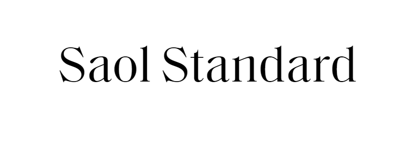
The Saol Standard is a modern interpretation of the classic 19th century typefaces like Caxton Old Style or the Old West Style. A serif font, it runs against the conventional ideas of a sober and modern font, however, it still works great.
Retaining the wild spirit of the old, this new font is perfect for a variety of uses, even as one of the successful logo fonts due to its attention to detail to even the smallest visual elements of the characters. The typeface offers a variety of font weights and a comprehensive language support, making it perfect for your designs.
Kisba Nova
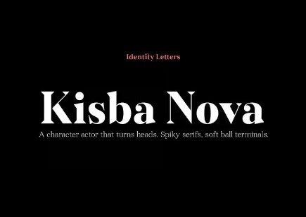
The Kisba Nova font is another great addition to the list of iconic typefaces for 2023. Packed with a whole lot of personality, it pairs sharp and wedge-like serifs with a distinctive stroke contrast; spikes and spurs with soft and rounded terminals.
It comes in two different styles, namely headline and text, and is available in seven different weights, offering designers a wide variety of choices to select from if they need to.
Archeron Pro

Ending this list on another serif font, this typeface has a lot of charm and personality, mixing elements from both classic and futuristic fonts into a unique offering. It offers a mix of straight lines and curves, as well as a high contrast set of serifs that set each character apart from the other, making it perfect for a variety of design and artwork.
Released in 2019, the font is designed for high visibility, and offers a set of small capitals that are distinctly different from uppercase letters, allowing you to emphasize whatever you desire.
Conclusion
To sum it up, the font trends 2023 are an eclectic mix of modern and vintage styles of typography that combines the best of both worlds. From the revival of serif fonts, to the popularity of simple yet highly legible typefaces is what defines the direction that the modern design world is taking.
So, if you don’t know what fonts and typefaces to choose in your upcoming projects, why not try one from the list above?
People Also Ask (FAQs)
| 1- What types of fonts are hot right now? Some of the most common styles of fonts popular nowadays include: – High contrast serifs – Script-based fonts – Retro-style fonts – Modern geometric sans – Neue Nouveau |
| 2- Is serif coming back in 2023? Recently, there has been a rise in the resurgence of serif fonts, which are considered more friendly and playful, compared to sans serif typefaces. This is inspired by the rise of nostalgic elements from the 70’s and 80’s that has taken the design industry by storm. |
| 3- What fonts are considered outdated? Some of the common fonts that are now considered outdated include: – Comic Sans – Arial – Times New Roman – Helvetica – Courier New – Papyrus – Vivaldi |
| 4- What is Google’s new font? The new font being used by Google for its products is called Roboto Serif. Designed in collaboration with Greg Gazdowicz from Commercial Type, it is a more readable compliment to the Roboto Sans typeface, with the addition of serifs. |
Latest news you want to know!
Subscribe for cutting-edge design inspiration at Logo Poppin! Elevate your brand with updates on logos, branding, web design, and video animation.
Note that by clicking “subscribe,” users may agree to our privacy policy and consent to Logo Poppin to use your contact data for newsletter purposes.
Logopoppin
Logopoppin is a graphic design agency that specializes in logo designing, web development, video production and advanced branding services. We love to innovate businesses with new age technologies, allowing them to improve their visual reputation.