A food product can taste extraordinary, but if its packaging blends into the shelf, most shoppers will walk straight past it. Food packaging design is the silent salesperson that communicates quality, flavor, and brand personality before a customer ever reads the label. Research from Ipsos suggests that roughly 72 percent of consumers say packaging design influences their purchasing decisions, making it one of the most high-leverage investments a food brand can make.
Whether you are launching a new snack line, refreshing a legacy brand, or looking for food packaging design ideas to pitch to a client, this guide breaks down the principles, trends, and real-world examples you need. By the end, you will have a clear framework for creating food product packaging design that stands out, sells, and earns repeat purchases.
Why Food Packaging Design Directly Impacts Revenue
Before diving into specific ideas, it helps to understand why good food packaging design carries so much commercial weight.
Packaging is the first brand touchpoint for most food products. In a grocery aisle with hundreds of options, consumers spend an average of just a few seconds scanning each item. The package has to communicate the product category, value proposition, and brand identity in that tiny window. A well-executed product packaging design does all three simultaneously through color, typography, imagery, and structure.
Beyond shelf appeal, packaging also shapes perception of taste. Multiple studies, including work published in the journal Food Quality and Preference, have shown that consumers rate identical food samples higher when presented in premium-looking packaging. In other words, the package literally changes how people experience the flavor. This psychological effect makes packaging design one of the most cost-effective levers for improving brand perception without reformulating the product itself.
Finally, packaging drives repeat purchasing. When shoppers recognize a distinctive package instantly in a crowded display, they skip the comparison phase entirely. That recognition shortcut is what turns first-time buyers into loyal customers, and it is built entirely through consistent, memorable packaging design.
Core Principles of Effective Food Package Design
Great food packaging design is never accidental. The brands that dominate shelf space follow a set of principles that balance aesthetics with commercial strategy. Here are the foundations to get right before exploring creative ideas.
Clarity Over Cleverness
The package should communicate what the product is within the first second. If a consumer has to study the design to figure out whether it is granola or dog food, the design has failed. Lead with the product name, a clear visual cue like a food photograph or illustration, and the variant or flavor in a readable font size. Creativity should amplify clarity, not compete with it.
Color Strategy That Signals the Category
Color is the fastest-processing visual element on a package. Consumers associate certain colors with specific food categories: greens signal health or organic, reds trigger appetite and energy, and earth tones suggest artisanal or natural ingredients. Choosing the right color combinations for your packaging can mean the difference between blending into the shelf and standing out from it. The key is to balance category conventions with brand distinction. Go too far from category norms and shoppers will not recognize what the product is; stay too close and you become invisible.
Typography That Does the Heavy Lifting
Fonts on food packaging carry meaning well beyond legibility. A hand-lettered script suggests artisanal craftsmanship. A bold sans-serif projects modern confidence. A geometric typeface communicates precision and clean ingredients. Choose a typeface family that reinforces the brand story, and keep the hierarchy tight: brand name first, product name second, and descriptive copy third. Avoid using more than two font families on a single package.
Structural Design as a Differentiator
The physical form of the package, its shape, material, opening mechanism, and texture, is just as much a part of the design as the graphics printed on it. A die-cut window that reveals the actual product inside builds trust. A resealable pouch communicates convenience. A rigid box signals premium quality. Structural choices should align with both the brand positioning and the practical needs of the consumer.
Food Packaging Design Ideas That Stand Out on the Shelf
With the fundamentals in place, here are specific food packaging design ideas drawn from brands that are getting it right. Each example illustrates a broader design strategy you can adapt for your own products.
Dunkin — Bold, Maximalist Color Blocking
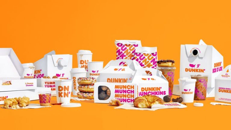
Dunkin has mastered the art of using saturated, high-contrast color blocks to create instant recognition at speed. Their packaging uses bold orange, pink, and brown combinations that feel energetic and playful without being chaotic. Each color zone has a clear function: the brand lockup sits in one block, the product name in another, and a pattern or texture fills the remaining space.
This approach works especially well for fast-food and quick-service brands that need their food package design to register from a distance, whether on a drive-through counter or in a delivery bag. If your brand personality leans toward fun, youthful energy, this maximalist color strategy is worth exploring. It pairs naturally with a strong food branding strategy that carries the same visual language across menus, signage, and digital channels.
Mirzam Chocolate — Artisan Illustration and Storytelling
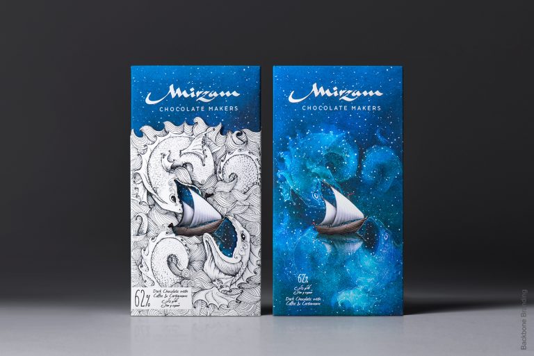
Mirzam Chocolate, a bean-to-bar brand founded in Dubai, uses hand-drawn illustrations across its rectangular boxes that tell the story of the cacao journey. Each bar features a different scene inspired by the origin of its ingredients, turning the package into a collectible piece of art. The illustrations are rich in detail, printed on textured stock, and use a color palette that feels elevated without being unapproachable.
This is one of the most effective food packaging design ideas for premium products that need to justify a higher price point. When consumers can see the craftsmanship on the outside, they are more willing to believe in the craftsmanship on the inside. The strategy works for small-batch chocolates, specialty coffees, artisan preserves, and any product where provenance is part of the value proposition.
Chocolocuras — Character-Driven Personality
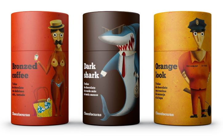
Chocolocuras, known for its chocolates and truffles, takes a completely different route by printing playful, cartoonish characters on every package. There are no conventional product photographs or ingredient close-ups. Instead, the packaging feels like opening a toy rather than a food item. This character-driven approach creates an emotional connection that transcends the product itself and makes the brand instantly memorable.
Character design on packaging works well for brands targeting younger demographics, gift-oriented products, or any category where delight is more important than sophistication. Many bakery brands use a similar playful approach to differentiate in markets saturated with generic, template-style packaging.
RightRice — Minimalist Monochrome with a Twist
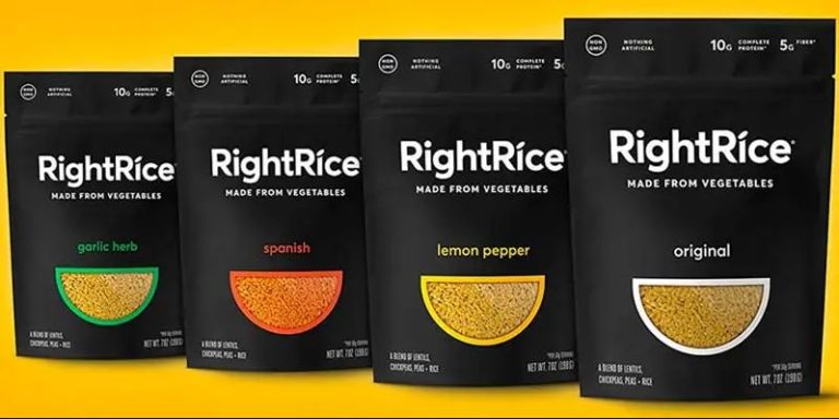
RightRice flips the typical expectation of colorful food packaging by using a stark black-and-white color scheme with a small die-cut window revealing the actual product. The window serves double duty: it builds transparency and trust while adding a burst of natural color to an otherwise monochrome design. The result is a package that looks premium, clean, and health-conscious, perfectly aligned with the brand positioning as a high-protein, vegetable-based grain alternative.
This minimalist approach to food product packaging design is gaining traction across health food, supplement, and wellness categories where consumers associate visual simplicity with ingredient purity. The key to making it work is restraint. Every element on the pack must earn its place, and the negative space does just as much communicating as the printed elements.
Gritz — Light, Approachable Illustration
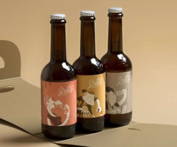
Gritz, an Italian craft beer brand, dresses its bottles in delicate, pastel-toned illustrations of family characters: a grandmother, a mother, a father, and a wife. Each character corresponds to a different flavor, creating a visual shorthand that helps consumers remember their preference without reading the label. The muted color palette gives the bottles a handmade, boutique quality that stands apart from the aggressive branding common in the beer aisle. This same light-illustration strategy translates beautifully to tea packaging, juice labels, and other food and beverage packaging design where approachability matters more than intensity.
Market Pantry — Vibrant Rebrand with Category Ownership
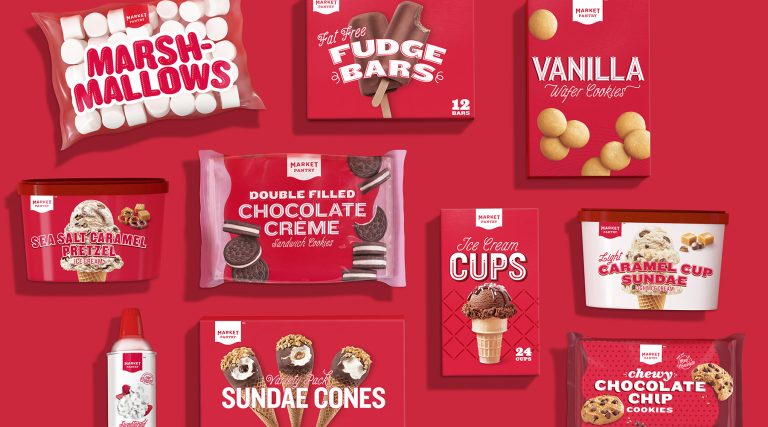
Market Pantry overhauled its entire packaging line by committing to a dominant red-and-white palette that now acts as a category beacon across store shelves. The earlier packaging was generic and forgettable, blending into the sea of private-label products. The redesign introduced consistent typography, bold product photography, and a unified color system that makes every Market Pantry item instantly recognizable regardless of the category, from frozen meals to canned goods.
For brands managing a large product portfolio, this consistency-first approach is essential. A documented brand style guide ensures that every new SKU reinforces the same visual identity rather than diluting it.
Emerging Trends in Food and Beverage Packaging Design
The food packaging landscape evolves quickly. Staying ahead of trends does not mean chasing every new aesthetic, but knowing which shifts reflect genuine changes in consumer behavior helps you make smarter design decisions.
Sustainability as a Design Language
Eco-conscious packaging is no longer a niche selling point; it is a baseline expectation for many consumer segments. Kraft paper, compostable pouches, soy-based inks, and minimal-material structures are appearing across every food category. The design challenge is making sustainable packaging look intentional and premium rather than cheap or unfinished. Brands that integrate sustainability into their design language, rather than slapping a recycling logo in the corner, earn more consumer trust.
Transparent and Honest Labeling
Modern consumers, especially in health-conscious markets, want to see what they are buying. Die-cut windows, clear pouches, and front-of-pack nutritional callouts all support this trend. The design implication is that the product itself becomes part of the visual composition. If the actual product looks appealing, lean into transparency. If it does not, use illustration or photography to set flavor expectations honestly without relying solely on the physical appearance.
Retro and Nostalgia-Driven Aesthetics
Vintage typography, muted color palettes, and hand-drawn illustrations inspired by mid-century design are making a strong comeback, particularly in craft and specialty food categories. This trend works because it signals heritage, authenticity, and care, qualities that mass-produced competitors struggle to project. The trick is referencing the past without looking dated. Pair retro elements with modern structural choices like matte lamination or soft-touch finishes to keep the design feeling current.
Wrap Your Brand in Brilliance - Explore Our Signature Packaging Designs Today!
Contact Now
Localized and Cultural Design Elements
As food brands expand into international markets, packaging that incorporates local artistic traditions, patterns, and storytelling outperforms generic global designs. Mirzam Chocolate is a strong example of this, blending Middle Eastern visual motifs with contemporary layout techniques. For brands selling across multiple regions, creating region-specific packaging variants can significantly improve shelf performance compared to a one-size-fits-all approach.
How to Approach Your Food Packaging Design Project
Start with a brand audit. Before sketching anything, document your brand positioning, target consumer profile, competitive landscape, and the retail environment where the package will live. This context shapes every subsequent design decision. If you are a small business working on packaging for the first time, this step is especially important because it prevents costly redesigns later.
Define the hierarchy of information. List every element that needs to appear on the package: brand name, product name, flavor variant, weight, nutritional information, certifications, barcodes, and legal copy. Then rank them by importance from the shopper’s perspective. The design should give the most visual weight to the top-ranked elements and progressively reduce emphasis down the list.
Prototype in context. A packaging concept that looks stunning on a designer’s screen can disappear entirely on a crowded shelf. Print mockups at actual size, place them alongside competitor products, and photograph them from typical shopping distances. This contextual testing reveals issues that screen-based reviews consistently miss, such as poor legibility at arm’s length, color clashes with adjacent products, or structural details that do not translate from render to physical form.
Test with real consumers. Even a small round of qualitative feedback from five to ten target shoppers can surface assumptions you did not know you were making. Show them the package for three seconds, then ask what product it is, who it is for, and whether they would pick it up. Their answers will tell you whether the design is communicating what you intended.
Common Mistakes in Food Product Packaging Design
Even experienced designers fall into traps that weaken packaging effectiveness. Here are the most common missteps to avoid.
Overloading the front panel with information is one of the most frequent problems. When every claim, certification, and selling point competes for attention on the primary display panel, none of them register. Prioritize ruthlessly and push secondary information to side panels or back-of-pack.
Ignoring production constraints is another costly error. A design that requires eight-color printing, metallic foils, and custom die-cuts might look beautiful in a mockup, but if it pushes unit costs beyond what the product can support, it will never reach the shelf. Design within your production budget from the start.
Designing for the brand instead of the buyer is subtler but equally damaging. The founder might love navy blue and serif fonts, but if the target consumer is a millennial parent shopping for healthy snacks for kids, those preferences are irrelevant. Every design choice should serve the consumer first and the internal team second.
Neglecting the unboxing experience for e-commerce products is an increasingly important oversight. More food products are sold online than ever before, which means the package must perform in two contexts: on a retail shelf and inside a shipping box. Design for both.
Making Your Food Packaging Work Harder
The best food packaging design does more than look attractive. It communicates instantly, differentiates decisively, and creates an emotional response that pulls the product off the shelf and into the cart. The ideas and principles covered in this guide give you a foundation to build on, whether you are designing for a single product or an entire portfolio.
Start with strategic clarity about who your consumer is and what they need to see. Ground your creative decisions in the core principles of hierarchy, color strategy, and structural design. Draw inspiration from brands like Dunkin, Mirzam, RightRice, and Market Pantry, but adapt their strategies to fit your unique brand positioning. And most importantly, test your packaging in the real-world contexts where consumers will actually encounter it.
The difference between a package that sells and one that sits is rarely about talent or budget. It is about discipline: the discipline to design for the shopper, not the boardroom, and the discipline to refine until every element on the pack earns its place.
People Also Ask (FAQs)
| 1. Why creative packaging for food products is important? Innovative food product packaging helps to grab consumers’ attention. It is a general concept that works for all types of products, especially food items. People generally show interest in those products that are smartly presented to them in a good-looking package. |
| 2. Why food branding depends on quality packaging? It is said that food branding depends greatly on packaging. This is certainly a right concept because packaging is the first thing that comes into the notice of consumers. Hence, it should be created wisely to offer a strong impact in their minds. |
| 3. How to design a food product package? To design a food product package, you have to first understand the theme of the company. Then, you have to pick the best colors and styles according to that. Blending all of them will help you to come up with a great design that can get consumers’ attention. |
| 4. Which color combination should be picked for food product packages? You can pick different types of color combinations for food product design. Ideally, the selection should be made based on your brand’s theme, as product packages are precisely meant to represent them. |
| 5. Which food packaging design examples are best to follow? If you are a beginner, you can follow different packaging examples that fits to your food manufacturing niche. There are various examples available on the web, so try to take some inspiration from them to design one for your product. |
Final Words
That sums up our entire article in which we have discussed different food packaging design ideas in detail. As a brand owner, you must need to know which package will suit best for your product branding. You cannot just launch food products with any random design, as that will not help to grab any sales or market attention. The best way to encourage consumers to buy your products is by showcasing them a package design that looks unique among all. This article has defined some great food packaging design ideas that will help you to come up with catchy product designs as per the latest market trends.
Meanwhile, if you are looking for a branding agency that could help you to create these packages, contact us today. We will help you to design quality food packages according to the given custom demands.
Latest news you want to know!
Subscribe for cutting-edge design inspiration at Logo Poppin! Elevate your brand with updates on logos, branding, web design, and video animation.

Note that by clicking “subscribe,” users may agree to our privacy policy and consent to Logo Poppin to use your contact data for newsletter purposes.

Logopoppin
Logopoppin is a graphic design agency that specializes in logo designing, web development, video production and advanced branding services. We love to innovate businesses with new age technologies, allowing them to improve their visual reputation.