Table of Content
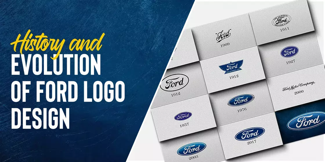
Take a Look How Ford Logo Design Evolved Over the Years
When it comes to talk about American car manufacturing industry, no one can neglect the illustrious name of Ford Motor Company. It is a highly popular automobile brand not only among the Americans, but also in the global market. People love the Ford logo whenever they are asked to rate the best automobile brands in the world. That is because Ford has always offered quality in the cars, precisely according to the requirements of every customer. Their status in the market largely rides on this particular fact, which is indeed their main scoring point as well.
Besides the current prominence, the history of Ford company is also very rich. It is one of those famous American car brands that came into the market during the early 1900s. This makes the company one of the oldest in US without any doubts. Their long history also describes the hard work they have done all these years to survive in the automobile world. That is what makes the Ford symbol a sign of quality in car manufacturing. People trust on the Ford cars due to a variety of reasons, such as low insurance rates, long-term reliability, less depreciations and more others.
In this blog, we will take a brief look into the history of Ford logo. We will discuss the evolution of this great brand logo right from the beginning. But before that, let’s have a quick view about the origins of this company, as where and by whom it was founded during the early 1900s.
Origins of Ford Motor Company
The history of Ford Motor Company is quite long and rich. It came into the market when only automobile industry was just starting to develop in the world. This means that Ford is one of the pioneers of the automobile sector that started its operations way back in 1903. It was the time when technical advancements were not that much rapid in the world. This era was particularly more hard for the car manufacturers, as they didn’t had much in hand to go with in the production. It gave a lot of obstacles to those companies, yet they didn’t give up and fought hard to overcome the technical challenges very smartly.
Ford Motor Company was one of them that always strived hard to come up with the best car manufacturing solutions. Their introduction in the industry paved a way for others to join as well. The founder of the company i.e. Henry Ford didn’t initially have the vision to take business to a much larger scale. However, after seeing immense success and gap in the industry, he decided to make the company even bigger in the world. This led him to take innovative decisions and propose new branding ideas in the just nascent car manufacturing industry at that time.
Ultimately, Ford started to rise as a leader in the automobiles industry. The new lineups of Ford quickly gained huge attention in the market, allowing it to go global within just a few years. Since then, the company didn’t look back and kept on moving forward by regularly introducing new cars. Today, it is one of the most successful car brands in the world having footprint in different regions. From Asia to Americas, you can find Ford automobiles in various countries, showcasing its high class status in the industry.
Ford Logo History and How it Came to Be
The Ford logo history is quite diverse because the company has taken various logo design services to introduce different versions over the last few years. These styles have been changed and introduced to keep the branding of the company fresh according to the latest standards. Many people do not know about the fact that the current Ford logo with the blue oval was not the original emblem of the company. It came up in the market with an entirely different logo that we will discuss below in the article.
Let’s take a look at the different Ford logo renditions in detail below.
Old Ford Logo – 1903
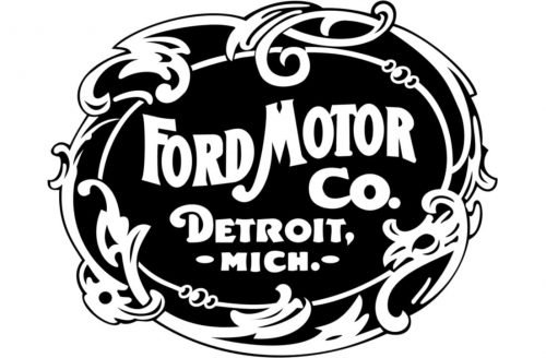
The first Ford Motor Company logo was introduced in 1903 with a conventional stamp like design. This logo was based on a traditional black and white color combinations, having no other shade or gradient whatsoever. It is also said that this logo was the most complex one the company ever had. Though it was like a stamp design, but its outer layering looked a bit complicated. This made the overall appeal of the logo a little complex and difficult to understand.
To rectify, the company quickly decided to come up with a new logo that can offer a more simplistic view. It led them to introduce a new Ford emblem in 1907 which looked a bit better from its previous peer.
Ford Logo – 1907
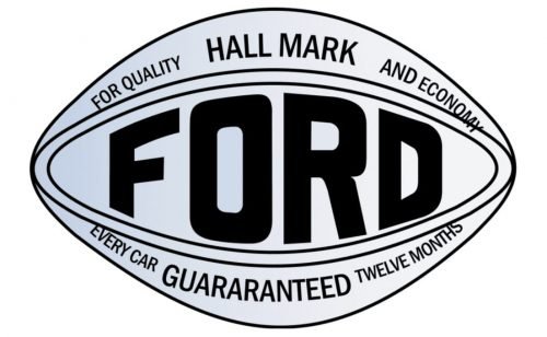
A new Ford logo was introduced in the market to cover up the mistakes of the previous one. This Ford logo with white background was based on a baseball style; hence it only did a little to properly market the theme of the company. Though it was better from the earlier one, but not entirely correct due to the wrong selection of shape. Some notable things that looked good included the bold usage of typography. The company name i.e. Ford was written boldly in the center to highlight it strongly in the design. A short slogan was also written beneath it to give the overall logo a resounding look.
However, these little things were not enough to make the logo a better catch for the people. Its unrelated baseball like design didn’t do much to elevate the theme of the company. Hence, it was decided again to change it and come up with a new style that can portray a correct image of the company.
Ford Logo – 1909
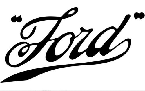
In 1909, the company once again introduced a new logo to refresh its branding. This time, they came up with a simple but right concept. The logo was created with just a subtle wordmark to showcase decency in the design. It worked perfectly for the branding of the company, as people liked this new concept to display the company emblem in a way that gave the Ford logo meaning. This new wordmark looked like a signature, hence it offered a very stylish appeal as compared to the car logos used earlier.
It could also be said that this logo precisely laid the path of keeping consistency in the future Ford logo designs. If you will see the current logo, you can easily spot the similarity of wordmark present in it. Though it is a little more modified, but the bases are still well connected with the style of 1909’s Ford logo.
Ford Logo – 1912
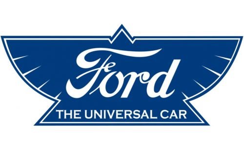
In 1912, the company decided to bring something new in the logo. After many revisions and analysis, they came up with a concept to introduce a bird-like shape in the design. They kept the styling of the wordmark same as it didn’t require much change. People really liked the typography of last version, which is why company only opted to for the modification of the outer shape of the Ford logo illustration.
This logo version was received with a mixed response in the market. Some people like the new design, while some didn’t show much support to this modernistic rendition. This logo was also a bit unique from the early ones because of its new tagline i.e. The Universal Car. It was basically a statement describing the growing global status of the company. This particular idea was somehow right, because at that time, Ford had just started to get footprint outside of United States, and it went seamlessly with the Ford logo redesign at that time.
Ford Logo – 1917
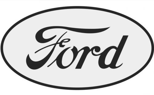
To give the company branding a new look, Ford logo again met with a creative modification in 1917. This time, the logo was made more holistic by creating a spherical design. The iconic Ford wordmark was put inside this design, showcasing a great class of subtleness in the design. This logo really looked classy, as it didn’t had any type of complex style. Furthermore, the usage of whitespaces in the logo gave it a new touch rightly according to the trending standards.
Unlike the version of 1912, this logo was once again designed with a monotone color combination. The typography was also reduced to a much lighter font, so that the overall logo can look neat to the eye. For consumers used to the modern Ford logo, try imagining the Ford logo with white background and a lighter font weight.
Ford Logo – 1927
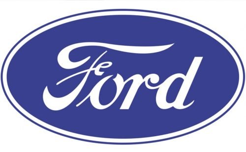
From 1920s, the trends of logo designing started to change. Businesses opted to create more colorful designs to get attention towards their logo. Ford also chose to move in the same way by creating a new colorful logo design. This time, they didn’t change the whole logo created in 1917, as it looked still perfect to them. They just modified it by adding new colors (blue and white) which later on became main part of their branding theme.
It could be said that the 1927 emblem was a remodified form of the 1917’s Ford logo design. It just looked a bit fresh due to the addition of colors, with the Ford logo font now in white over a blue background. This idea changed the whole branding concept of the Ford company, perfectly according to the latest standards.
Ford Logo – 1957
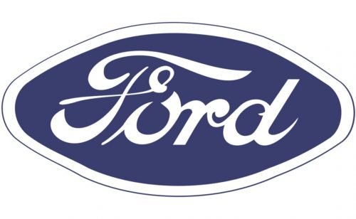
Ford Motor Company introduced various logos between 1957 and 1976. They didn’t changed much in those variations except for few in typography and oval shape. They experimented with various Ford emblems to keep their branding fresh according to the changing standards. This describes the proactive approach of the company that precisely helped them to stay updated regularly.
Ford Logo – 1976
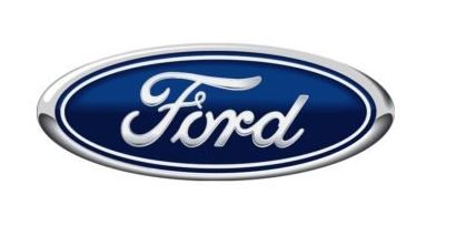
The modern Ford logo that is known till to date was introduced in 1976. It kept the same design of the previous 1957 version besides changing the gradient of the colors. The blue color was made more vibrant while the oval shape was redesigned adding a solid silver border at the outer end. This gave the logo a more realistic look without changing much in the original theme.
The logo was also modified in the style of a gradient logo design, with a metallic chrome sheen over the entire logo to make it seem as if made out of polished metal. Despite that, there was nothing special behind the meaning of Ford logo blue oval with double outside border, except to give it a contrast that made the simple design pop and stand out easily.
Ford Logo – 2003
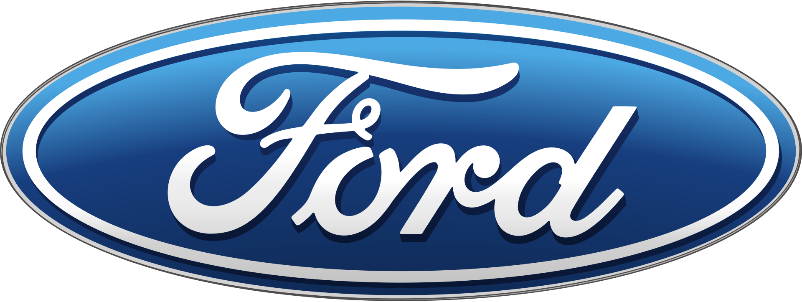
For 2003, the Ford Motor Company logo featured a changing design aesthetic of the 21st century. The new logo had a simpler, flatter design, which eliminated much of the shading and metallic gradient around the logo design of 1976.
Moreover, the lines of the design was further simplified, which made the design pop in digital mediums, and the dimensions of the logo were also changed to give the logo a fresh feel. Over time, especially during the later 2010s, the design aesthetic moved towards flatter logo designs, with iconic logos like the Kia logo, BMW symbol, and more choosing to go flat and subtle.
The Modern Ford Logo – 2017
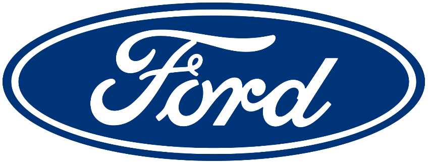
In n the late 2010s, the trend of 3D logo design was slowly waning, with either companies diving completely into the three-dimensional vibe, or eschewing it entirely. The latter was the case that many automobile manufacturers with 3D elements in their logos decided to adopt.
In 2017, Ford released a new iteration of their brand logo, which featured a completely flat design, with no color gradients at all. Moreover, the color blue was deepened to a darker shade, which made the new design more aesthetically pleasing and allowed for better visual acuity. And today, it is this version of the Ford logo that graces a variety of mediums.
Unlike the previous two versions of the logo that featured 3D elements and color gradients, this design is better suited for uses such as Ford logo apparel and other merchandise, and even Ford logo wallpapers.
Ford Logo Meaning – Deciphering its Individual Design Elements
As we discussed earlier, there was and is no special meaning behind the Ford logo design. As an old company, and in fact one of the pioneering companies in the US to manufacture automobiles, Ford decided to capitalize on the impact and brand worth of their initial wordmark logo, and revamp it for the design trends of different eras.
Overall, the company has played with various renditions of their brand logo, emphasizing the wordmark in each version regardless of the overall design. So if you want to know what to focus on when learning how to draw Ford logo, remember that the wordmark is the most important element of the design.
Ford Logo Fonts
When we talk about the logo fonts used in the Ford logo, the fact of the matter is that there are no known variants of fonts used for the design. Barring the first two versions of the logo, which used a blocky serif font and a sans-serif blocky uppercase typeface respectively, the logos used from 1909 onwards have used a stylized version of the word “Ford”.
According to a much-held belief that design is meant to mimic the signature of Henry Ford himself. And whether the company officially accepts this as true or not, one look at the archived signatures of Ford Motor Company’s founder will lend credence to the premise.
Therefore, we can say that the Ford logo fonts are a custom script that is designed to mimic the handwritten signature of Henry Ford.
Ford Logo Colors
When it comes to the Ford logo colors, the company has historically been known to use a simple color palette, as is the case with most pioneering and vintage American car brands. Since its inception in 1903, till 1912, the company used a simple black and white color scheme. However, in 1912, the brand introduced a blue and white color scheme, designed to uplift the brand with a spot of color.
Moreover, the use of logo color meanings to add meaning to the design, by using blue to associate confidence with Ford, was a great move on Ford’s part, helping them stand apart from the competition.
However, despite the popularity of the color scheme, the company went back to a black over white color scheme in 1917, along with a new design, one that we are accustomed to nowadays. A decade later, in 1927, the company tweaked the new logo a little bit, bringing back the white over blue color scheme to resounding support from the consumers.
Since then, the company has been tweaking the Ford logo with blue oval every few years, adjusting the design to the changing design aesthetics of the time. However, they ensure that none of the primary elements are modified, or have their impact diluted by anything else.
People Also Ask (FAQs)
| 1. Why is Ford Logo famous? Ford Motor Company is one of the biggest automobile brands in the world. Its emblem has now become a symbol of quality in the car manufacturing industry. This is the major reason why it is quite popular among the people. |
| 2. What was Ford’s original logo? The original logo for Ford Motor Company was an elaborate emblem released in 1903. It featured the full name of the company in a modified, blocky serif font with slight curves at the extremities. Moreover, the design also featured the company’s hometown and state, along with an intricate outline that went all around the logo. |
| 3. Why did Ford change their logo? From time to time, Ford has modified its logo to keep the company branding fresh. This is usually considered a great strategy to keep the branding intact according to the latest trends. |
| 4. Why is Ford so popular in Britain? Ford is very popular in Britain due to its vast range of car lineups. It understands the needs of the English people; hence produces a great list of vehicles according to their demands, especially fuel-efficient family and compact cars. Moreover, Ford has also a long manufacturing history in the UK, which provided jobs to a lot of people, and have an association with the people there. Similarly, their association with British engine manufacturer Cosworth for a successful career in motorsports also lends value to the brand’s popularity in the country. |
| 5. Why is the purpose of using blue color in Ford logo? The blue color in Ford logo showcases the excellence of the company. It also gives a flare of elegance, which is what the branding theme of the company is all about. |
Final Words
That takes us to the end of this blog in which we have discussed about the history of Ford logo in detail. It is undoubtable that the Ford symbol is one of the most trusted emblem logos in the automobiles industry. People rely on the Ford logo due to its quality offerings in car manufacturing. Considering the history, it could be safely said that Ford has always remained a top choice of car lovers. That is the reason why its iconic emblem is not only popular in United States, but all over the world.
If you are also looking to design an automobile logo that can perfectly represent your business, get in touch with us today. Our professionals will assist you to get the best branding logo, rightly as per the custom requirements.

Logopoppin
Logopoppin is a graphic design agency that specializes in logo designing, web development, video production and advanced branding services. We love to innovate businesses with new age technologies, allowing them to improve their visual reputation.


