
Table of Content
Discover the Mustang Logo That Spawned an Entire New Automobile Genre
The American automotive market has held its own against tough competition from the Europeans and the Asians, and it has been doing so for a long time. Catering to a clientele that had vastly different needs compared to its European counterpart, there had been a clear distinction between the directions taken by these industries.
While the Americans preferred big cars with massive engines such as those featuring the likes of the Chevrolet logo, the Europeans, for the most part, preferred smaller, more manageable automobiles. However, as imports started, and people started to look towards the smaller, manageable European and Japanese options, it called on the American automotive industry to offer something similar.
Thus the iconic Ford Mustang lineup was born, represented by its iconic galloping mustang logo. This symbol heralded an innovation in the American automotive market, one as important as the minivan boom started by Chrysler later.
So how did the Ford Mustang change the American car market? And how has it influenced the direction of development that American automakers have taken in the subsequent years? Discover the answer to these questions and more as we take a look at the history and evolution of the Mustang horse logo, and understand how it was achieved without using a professional logo design agency.
History of the Ford Mustang – A True American Symbol of Freedom
Ford has been one of the most iconic automakers in the history of American automotive market. It has been a driving force behind many of the industry’s practices, including the push to electric and hybrid vehicles over fossil fuels.
With the invention and selling of the first mass-produced American automobile, the Model-T, Ford had established itself as force to be reckoned with, something its competitors understood clearly. In the early 1960s, automakers like Plymouth, Ford, and AMC had started to notice customer trends leaning towards small, sporty automobiles, especially among the younger generation of consumers.
Thus, under the direction of one Lee Iacocca, Ford started development of a 2+2 sporty car with the ability to handle powerful engines. Their prototype was based on the popular Ford Falcon platform, in order to keep the production and maintenance cost low for the consumers, dealers, and the company itself.
Now, the Plymouth Barracuda was the first car to be released in this new category, dubbed the pony car due to it being a smaller version of the larger muscle cars like the Dodge Charger or Impala. It beat the Ford Mustang by two weeks.
However, the Mustang’s uniqueness, compared to the Barracuda that was identical to its base Valiant platform, resulted in the Mustang having greater success in the category, becoming its poster child. People loved it because it offered two variants, a convertible and a two-door coupe, both offered with a unique style of long hood paired with a short deck. This style of the pony cars is still well defined even to this day, with additional options like fastback expanding the line.
The car sold over 400,000 units its first year, and that was largely because it offered a number of trim levels based on user needs. The base variant came with a 2.9 L straight six engine, a floor-mounted three-speed manual transmission, bucket seats, a sporty steering, padded dash, and an AM/FM radio. However, customers could customize their car as desired from the factory, with options for larger V8 engines, air conditioning, greater sound dampening, and more available.
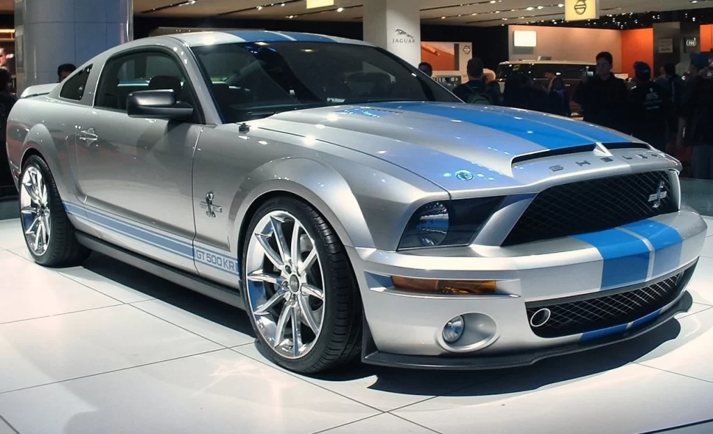
In later years, the company also introduced pre-made higher-level trims of the car, such as the Mach 1, Boss 302, Boss 429, Cobra, GT, and more. Similarly, American auto tuner Carroll Shelby launched a series of modified, high-performance variants of the Ford Mustang called the Shelby Mustang, between 1965 and 1967. From 1968 to 1970, the Shelby Mustang was released under the Ford Motors umbrella.
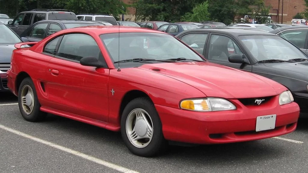
Today, the Ford Mustang is about to reveal its seventh generation of automobile, besides the all-electric Mach-E line. From fox-body platform of the 80s and 90s, to the retro-futuristic designs of the 2000s, the car has become symbolic with the pony car category, and outlasted all of its early rivals. Today, neither Plymouth, nor AMC, two of the three earliest pony car manufacturers, are still in business, yet the Mustang is still going strong. That is testament to the quality and innovative thinking behind the car, which still has people flocking to it six decades later.
Understanding the Mustang Logo – Why a Horse?

Coming to the design of the Mustang logo, the question many people ask is – why a horse? Before the mustang was chosen as the car’s name and image, two highly popular automakers featured a horse in their logo already. The Ferrari logo was the more prominent one, with Porsche a distant second when it came to defining iconography using a horse.
Now, under Henry Ford II’s tenure as company manager, Ford was already looking to beat Ferrari in motorsports by the early 1960s, after Enzo Ferrari snubbed Henry. And while some people may think that the Mustang logo has something to do with that, the fact is that the name and idea for the symbol came from within the Mustang team itself.
There are two major theories as to its inception. One origin story states that chief stylist John Najjar suggested the logo, inspired by the P-51 Mustang fighters of World War II. The other idea states that a Division market research manager called Robert Eggert, who bred American quarter horses, added the name to list of potential options, to great response.
Whatever origin story you may believe to be true, the fact is that in either case, the logo and name is a symbol of American freedom and power, symbolized by the wild prairie horses of the USA. The cars, made to mimic those powerful horses, with a sleek profile and powerful hindquarters, is quite symbolic, giving rise to the pony car name, and one of the most iconic horse car logos today.
Horse Symbolism in Automobiles – From Ferrari and Porsche to the Mustang Logo
When it comes to the automobile industry, there have been many instances of animal imagery making its way into different automotive symbols. From popular car brands like the French Peugeot, the American Mustang, or the Italian Lamborghini, or the German Porsche, to smaller brands like Skoda, or Abarth, animals are used to represent values.
Take, for example, the logo for Porsche. The Porsche logo shield for the German performance automaker features a horse right in the middle of the design. Now, for some people, this may seem like an arbitrary choice. However, there is a lot of thought behind that symbol.
As history goes, the founders of the Porsche Motor Company belonged to Stuttgart, an area in old Germany’s Weimar province famed for its horse stud farms, hence the name of the city. To pay homage to their hometown, they used a modified shield for the area’s royal house, which also featured a horse. Thus, for Porsche, the horse represents their regal origins, and the shield a way to remember it.
Now, for Ferrari, the name and symbol is quite different. Starting out as a works teams for the Alfa Romeo Company in Formula 1, it was known as Scuderia Ferrari. Named after Alfa Romeo employee and the team’s manager at the time, Enzo Ferrari, it was one of several works teams fielded by the Italian automaker.
Now, in Italian motorsports, teams are generally given the title of a Scuderia, or a horse stable. With that in mind, as well as taking the symbol of a dead First World War ace pilot, Ferrari came up with a rearing horse logo over a red background. For Ferrari, it represents their rich legacy of automotive performance and excellence.
Finally, we come to the Mustang. The Mustang uses a unique kind of horse, one native to the American prairie, called the mustang. Roaming wild in the plains of Colorado and other areas, before the arrival of the Europeans to the Americas, the horse had a rich ad noble history for the Native Americans. At the time of the creation of the Ford Mustang, the Mustang logo is said to be inspired by a senior member of the company being a horse breeder on the side.
They needed a symbol that was unconventional, yet decidedly American. The result was the choosing on the Mustang, which represented immense coiled power in a small body, freedom, and nobility. As a wild horse, the element of freedom was forefront on this design, as even the Native Americans tended to leave them wild rather than corral them.
In short, the significance of horses or animal imagery in general, is quite massive in the logo industry, whether it’s for car logos, or even the insurance industry.
Evolution of the Mustang Horse Logo over the Decades
When it comes to famous car symbols, a few American brands top the list of some of the most memorable automotive symbols in the world. Symbols like the Chrysler logo and more, are some of the most well-known symbols of American automotive companies, even outside the US. And one of those is the Ford Mustang logo.
Talking about the Mustang horse logo, people may wonder – what is it about that symbol that makes it so iconic? Frankly, using a symbol that competes directly with two of the world’s oldest and well-known brands isn’t a great branding choice. Yet despite that, the Mustang car logo has managed to establish itself as a unique car symbol.
Let’s dive in and take a look at the inception and evolution of the logo, and see how the symbol has transformed over the years to connect with changing customer dynamics over six decades.
Old Mustang Logo
The oldest mustang logo represented one of the best and most iconic American car brands. Its design was unique at that time, especially for the American market, and represented a car that was unique in its design and even category.
The galloping chrome horse represented the car’s brand, displaying speed with its tale and mane streaming behind it. This plain symbol was usually displayed on the front grille. At the back however, was a more elaborate design. The horse was overlaid over a triple-stripe vertical band, with a red, white, and blue color scheme. The chrome contrasted well with the color bands, and stood out as a certifiable American car, taking the theme from Italian car brands who often use the Italian flag colors in their design.
All in all, this is one of the most iconic car symbols, and one that represented one of the most impressive automotive marquees that an American car company had produced.
Fuel Cap Mustang Horse Logo
In the 60s, Ford was highly focused on beating established European automakers, specifically Ferrari, at a prestigious motorsport event like endurance racing. Ferrari had dominated the endurance circles for a long time, with expertise and experience gained through their Formula 1 racing.
Ford’s CEO at the time, Henry “The Deuce” Ford II, was notoriously angry at Enzo Ferrari’s snobbish attitude towards the Ford Company, and commissioned the creation of a Ferrari beater. The program, which resulted in the iconic Ford GT40 car, also resulted in a change in styling and performance ideology in the company. The result was the creation of car aesthetics that resulted in the creation of some of the best sports car logos in American automotive history, such as the Corvette logo, or the Mustang fuel cap logo.
This design took the Mustang’s main logo, and surrounded it with a stylized chrome ring, which featured the name of the company in bold, lightly raised letterings in the style of sports cars. And the result was fantastic, albeit a little hard to keep as clean as the rest of the car’s exterior.
2009 Mustang Logo
In 2009, the design for the Mustang logo was given a slight update. The most obvious change was that the tricolored bar behind the logo was gone, as it was firmly established in the minds of the consumers that the Mustang was an American brand.
The next most visible change was the color scheme. Unlike the previous iteration which had a bright, shiny chrome color scheme, the new design featured a more mercurial look, with darker shadows and highlights. This made the design somehow subtler, but more visible to the consumer.
Finally, the design itself was touched up. The lines, especially around the head, hooves, and the mane were made more realistic, with the design now visibly that of a somewhat smaller, yet powerful and fast horse.
These design changes, especially the changes to the color combinations and the styling of the horse, meant that the company saw that consumer aesthetic had superseded brand nostalgia. People now expected more from the brand, not just a reiteration of a beloved, yet still outdated car brand.
2010 – Present Ford Mustang Logo
Finally, the latest iteration of the logo was designed and revealed in 2010. Getting good response from the slight changes made to the logo in 2009, the company decided it was a good time to bring the Mustang logo into the design dynamics of the 2010s. This era also shows us many other car brands who sported legacy symbols update their designs, including the likes of the Nissan and Honda logo.
With chrome slowly being phased out of the automobile industry, considered an element of a bygone era, the company needed to update their logo accordingly. Their first change was to color the design a darker, smoky gray chrome, which gave the logo a dark, mysterious, and aggressive look.
To complement that aesthetic, the lines of the design, especially around the head and the mane, were made sharper and more aggressive; resulting in a logo that perfectly represented the Mustang of today.
Other Logos and Badges Associated With the Ford Mustang Logo
Many American automotive brands have a history of offering trim levels for their cars that are then spun off into established brands of their own. Take the Dodge Demon and the Hellcat that, while being trim levels and special iterations of the Dodge Charger, are often talked about as independent entities.
In the case of the Ford Mustang, the car has been offered in various trim levels by the company, while there are some independent versions of the car that are arguably at least as famous as the original. So let’s take a look at some of these other Mustang logos that denote special trims or variants.
Shelby Mustang Cobra Badge
The name Carrol Shelby is one that is near and dear to the heart of every American automotive fan in the world. The man was an automotive tuner and automotive performance guru who is known for many feats, such as helping develop the Ferrari-beating Ford GT40, bringing the iconic AC Cobra to America, and tuning it up into the Shelby Cobra roadster.
And most importantly, he is known for one of the most iconic high-performance version of the Ford Mustang, called the Shelby Mustang. The Shelby Mustang, while great on their own, were known for one other thing – the rearing head of a hissing King Cobra coiled to strike, on the driver-side front fender.
That symbol today has represented many great variants, like the Mustang GT350, and the iconic GT500, great cars that represented both the quality of the Ford brand, and the skills of Shelby.
Mustang Mach-E Logo
The Mustang Mach-E is Ford’s drive towards the development of an all-electric Mustang. In recent years, companies across the globe have been pushing towards the development of environment-friendly, electric and hybrid cars in order to reduce worldwide consumption of fossil fuels.
Now, electric cars today can be made incredibly powerful, with instantaneous power supply to all wheels making them quicker to accelerate, as well as able to achieve a greater top speed. However, for Mustang, the company has made it clear that the Mach-E is independent of the mainstream Mustang, to avoid alienating the hardcore fans who want to retain the legacy of the brand. However, they took cues from many of the modern electric car brand logos and modified the Mustang logo to look like it represents a powerful electric car.
Conclusion
The Ford Mustang logo is an iconic brand symbol, one as well known as its parent Ford logo. And its long history of use in the market, with virtually little to no change for almost five decades, is testament that it is a great brand logo that personifies the values that the car represents, and is able to connect them to the car’s audience.
In a world where American automotive symbols like the Cadillac logo are being simplified due to a minimalist aesthetic, it is great to see a brand logo sticking to its guns and retaining its iconic shape.
Latest news you want to know!
Subscribe for cutting-edge design inspiration at Logo Poppin! Elevate your brand with updates on logos, branding, web design, and video animation.
Note that by clicking “subscribe,” users may agree to our privacy policy and consent to Logo Poppin to use your contact data for newsletter purposes.
Logopoppin
Logopoppin is a graphic design agency that specializes in logo designing, web development, video production and advanced branding services. We love to innovate businesses with new age technologies, allowing them to improve their visual reputation.

