
Table of Content
Discover How the Fortnite Logo Has Evolved Since Its Inception
Today, Fortnite is one of the most popular games out there, with a large user base from various age brackets, despite its relatively young age. It reportedly earned $1.8 billion in revenue for the year 2019, which just goes to show its fame and popularity.
Its fame is such that even those tech-savvy people, who do not play the game, know it from its logo. The Fortnite logo has quickly risen the ranks of fame among the gaming world, due to the simple fact that it is simple and easily memorable.
Often, businesses hire professional logo design services to create logos for them. However, very few of these professionally commissioned symbols achieve the kind of fame the Fortnite symbol enjoys. Let’s find out how this iconic game and its icon came into being.
The Fortnite Logo and Its Embodiment of the Game the Symbol Represents
Fortnite is one of the games that popularized the concept of the battle royale. Alongside games such as PUBG (PlayerUnknown’s Battlegrounds), the Fortnite game has become a phenomenon in the world of gaming.
Now for most people, the Fortnite they are familiar with is the Fortnite: Battle Royale. But that version of the game came into existence quite late in the life of Fortnite. Developed by Epic Games in 2011, the first Fortnite was known as Fortnite: Save the world.
This version of the game offered a mix of shooter and construction elements, and focused on cooperation between the various players, rather than completion. While strong in its own element, the inception and popularity of PUBG became a turning point for the game.
The rising popularity of PUBG was an eye opener for Epic Games, and showed them the benefits of an open world battle royale gaming concept. They quickly got to work, and using the existing assets developed for Fortnite: Save the world, they quickly hashed together the game we all know now.
Fortnite: Battle Royale was released in 2017, and quickly found massive support amongst the people. Initially slated to be released as a standalone mode for their existing game, but soon decided to release it as a free-to-play game, which would earn revenue through a system of microtransactions.
What Was the Reason Behind the Fortnite Logo and the Game Being So Popular?
There is no simple answer if someone asks for the reason of Fortnite’s popularity. Since its inception, many other game developers have tried to horn in onto the battle royale trend, but most have failed. Even those who haven’t failed completely have not been able to achieve the level of fame and usage as Fortnite or PUBG.
This goes to show that both these games offer something that others have not been able to find or replicate. And that is why they still sit atop the charts in-game popularity and usage.
A few things that all researchers agree upon is that the most important factors for Fortnite’s popularity are:
- Their gameplay, which focuses on building and constructing alongside the shooter aspect. This allows for a novel experience which no other battle royale offers.
- Their microtransactions system, which does not affect the core game experience. The items which can be bought are mostly cosmetic skins, which can be used to visually enhance and personalize your character.
- Unlike other shooter-based battle royale games, Fortnite is by far the most colorful and lighthearted in tone. Not every gamer likes load screens that have smoothed-down and rough-built vibes and the dark and gritty overtones of the majority of these shooter games, and this game covers that market really well.
These factors are why such a large number of people love to play Fortnite. The game’s fame has made the Fortnite logo quite famous, with people knowing it far and wide.
Leveraging the Attractive Qualities of the Fortnite Logo to Draw Consumers In
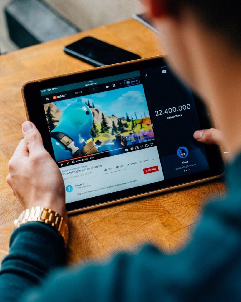
Across the globe, people recognize and identify the logo used in many promotional items, including advertisements on social media, promo videos on YouTube and other digital media, and in many gaming events arranged around the world who use these popular e-sports or digital sports logos to promote their tournaments.
Since the time of its inception, the Fortnite logotype has garnered nearly five million likes on the game’s Facebook page, as well as more than ten million followers for their Twitter account. As their fame in the world of gaming grew, they have modified their elaborate logotype image into a far simpler logo that is more aesthetically pleasing and memorable.
Evolution of the Fortnite Logo – A Brief Overview
There are few games with very famous and memorable gaming logos such as the Fortnite logo. Some of these iconic logos have consisted of imagery that has lasted a long time without change, while others used a logo that could be modified later according to the trends of the time.
Talking about Fortnite, its logo has taken a journey from the temporary yet functional logo, to the current logo that has been in use since 2014. While the current logo has been refined over the years, the basic aesthetic and design has been the same.
The initial logo for the Fortnite: Save the World game looked as if it was a quick and crude effort using makeshift materials and pieces of wood. This was a clear indication of the game’s focus on building and collaborating.
The new logo launched in 2014 was a different story. While it kept the big and blocky font, but refined it for a smoother feel. They also kept the uneven lines and angles from the previous font, which helped portray the same values, albeit enhanced.
The Changing Typography of the Fortnite Logo from Iteration to Iteration
For their logo, the designers opted for an interesting and unique choice. The font they used is called the Burbank Big Condensed Bold, designed specifically for the game. It is considered among modern sans serif fonts, which is executed in bold. Designed by Tal lemming, it is very similar to fonts such as the Niko Extra Condensed Bold, or the Floki Extra Bold. The only difference is that the angle of the horizontal lines is a bit different.
The logo has featured the font in three styles. The first style was used in the logo that was in use for a year, 2011 to 2012. This version featured the font in a very rough format, as if built using scrap wood, and projected the world-building aspect of the game at the time.
The next logo featured a somewhat smoothed-down version of the font, but still keeping the rough-built aesthetic of the previous logo. This simplification of the font and the style allowed for better recognition by the viewers, thus making it more memorable. This version of the logotype saw two years of use, from 2012 to 2014.
Finally, the third iteration of the logo featured the same font, but in a very different style. Gone was the rough-built look of the previous iterations. Instead, they beefed up the font’s size and smoothed it out into clear block letters. The only thing it kept from its previous versions is the off-center lines of the characters, showing its legacy. This version was released in 2014, and has been in use since then.
The new font offered a few benefits to the logotype:
- Allowed the logo to look modern and visually pleasing due to the narrow profile of the characters, which go well with the long and uneven horizontal lines they featured.
- The base monochrome logo looks professional and confident as if it does not require any visual element to complement its simple logo.
- The logo’s ability to work well with other color schemes allowed the game to appeal to various demographics of users, based on what appealed to them visually. This helped bring in a lot of younger users, as the bright color schemes of the secondary types of logos exuded youth and energy.
Exploring the Transformative Timeline of the Fortnite Logo
The famed Fortnite logos have seen themselves modified a few times, before introducing the current style of the logo. In the past decade since its inception, the current version has seen the longest use compared to previous versions. In use since 2014, this logo has been used to portray the game with only minor changes.
Let us take a walk through the logo’s timeline.
Fortnite Logo’s Original Design (2011-2012)
Released in 2011, this version of the Fortnite logo was used to promote the first iteration of the game, called Fortnite: Save the World. The logo fonts were used in the bold style, colored in different shades, and featuring a rough texture. The lines of the logo were uneven, and each character looked a different size. The logotype featured a black background, with a crescent moon over the letter “I”.
This logo was very complicated to remember, especially since it featured a dark shaded logotype over a black background. Secondly, the rough edges, the uneven lines and mixed colors meant that there was too much visual stimulation for a viewer, which tends to make it hard to capture the essence of a brand at a glance. Similarly, this made it hard to replicate the logo for multiple mediums, which is why this logo was phased out just after a year of use.
Fortnite Logo First Redesign (2012-2014)
The next iteration of the logo was released in 2012, in order to address the issues plaguing the old Fortnite logo.
The first and most obvious change was the adoption of a monochrome color scheme for the logotype. The characters were outlined and colored white, with black used as the background and for accents in the designs. This color scheme was used to portray the logo as if built using rough wooden pieces, with bold black screws used to join the pieces together. This design retained the same sense of world-building aspect from the previous version of the logo, but in a far simpler yet elegant design.
The lines of the characters were smoothed out too, which made it easy for the viewer’s eyes to follow and remember. All of these changes helped make the logo and the game more popular, thus proving that simplifying the design was to their benefit.
This design was phased out within two years of use, to make way for the company’s drive for modernism and visual trends, resulting in the introduction of Fortnite’s new logo.
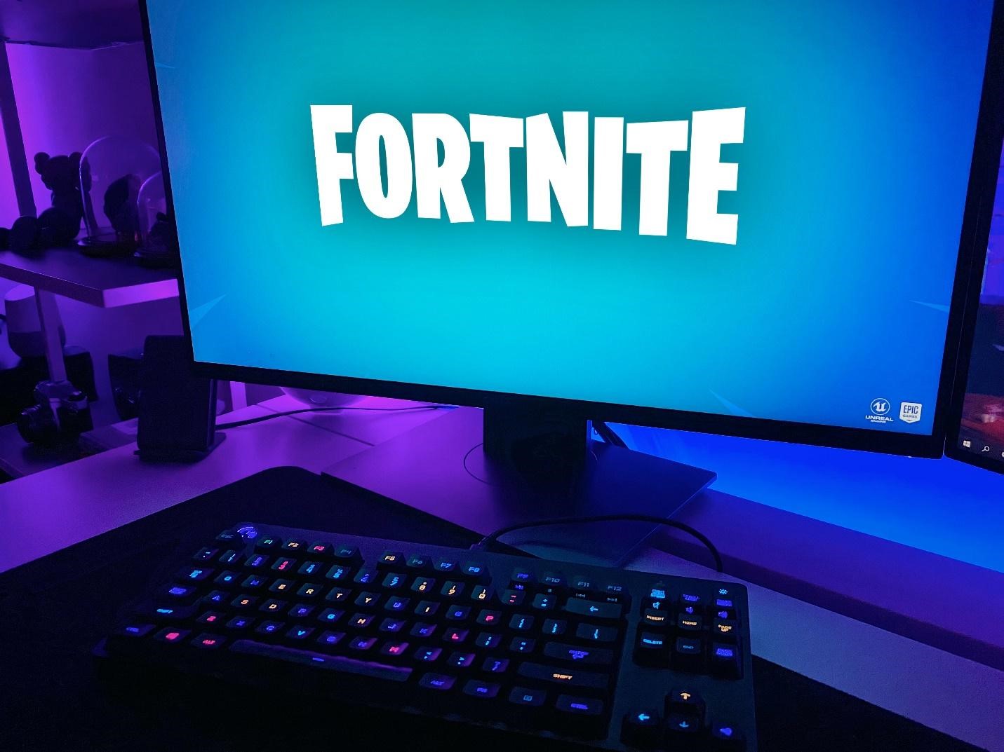
Present Day Fortnite Logo (2014-Now)
Fortnite’s new logo for the game saw its last drastic redesign in 2014. Gone were the massive wood textured characters, to make way for the sleek and modern look of the new sans-serif characters. The new Fortnite logo was commissioned specifically for the game’s logo, but was based upon two existing fonts.
The color palette for the logo was still monochrome but sported various secondary versions colored in different color schemes, such as a blue and white combo, or gold and black combo. This variation in color scheme makes it a very versatile logotype, which allows it to be featured on many advertising and merchandising mediums, without losing its charm and impact.
Overall, the design changes made for the old Fortnite logo were the reason Fortnite was able to stay at the top of the pack offering the battle royale mode. But why exactly were these changes made specifically, can only be learned by studying the elements of design they used for their logo design.
Understanding the Design Elements Used in the Fortnite Logo
Using the right logo design elements can be crucial to a logo’s success. These graphic elements help a designer create a logo that embraces and portrays your brand’s message perfectly.
While it is necessary to use the right design elements, using too many will only overwhelm the viewer. Those who know how to design something as iconic as the Fortnite logo, understand that is something that should be avoided at all costs.
Finding the right balance and mix of visual elements can help evoke specific emotions and feelings in those who view them, which is a great way to get potential consumers to use your product or service.
Now that we know the importance of visual elements in logo design, let’s what elements were used to create the various logos for Fortnite.
The Angular, Rectangular Outline and the Allure of Geometry in Design
Geometric shapes have a way of embodying and exuding certain values and emotions. Rectangular shapes are used to portray a sense of stability, strength, and prominence. This shape has been used to great effect in all variations of the Fortnite logo.
By using a rectangular shape to border and enclose their Fortnight logotype, the company aims to portray dependability and honesty, as well as other values such as stability of service and the air of solidity that comes with plying a well-designed product.
The New Crescent Moon atop the “I”, and the Importance of Graphics in Logo Design
The first logo for Fortnite featured a yellow crescent moon hovering over the letter “I” in the logotype. That was the only symbolic element they have ever used in their logotype, and have not been seen since the first version.
The crescent moon has been used through the ages to exemplify fertility, growth, and the cycle of life. The crescent moon waxes into the full moon, then wanes into nothingness. Then the cycle starts anew.
This can be a useful element to show that the brand is there to stay, just like the moon. The profits will grow, or they might shrink, but the company will always be a place for new beginning and opportunities, just like a crescent moon.
Color Combinations for the Fortnite Logo

emoving them, are both important when looking for the brand’s aesthetic.
Colors, or their absence, can be a great way to add value to an already appealing visual design, thus improving its impact on the viewer. They are a great way to influence how the viewer feels when they look at your logo, and can be used to subliminally influence them towards your brand.
Considering that Fortnite is quite intuitive when it comes to attracting people towards their brand, their choice of choosing two neutral colors for their logotype might confuse a lot of people. So let’s have a look at why they felt that these colors represented their brand’s personality in the best possible manner.
The Black Fortnite Logo
Black is a color that has always been a part of Fortnite’s visual identity. You would either find it as the background of the logo, or you might find it featured within the lettering of the logotype itself.
In fact, all three versions of the logotype feature this color quite prominently. There are various emotions and vibes that the color black embodies, and each of these can be used depending on how we use it.
- On one hand, black can be used to portray elegance and formality, but that is not what Fortnite uses it for.
- It can also be used to portray fear, strength, and the mysterious. This is the emotion that Fortnite wants to portray with its logo.
This is how the color black enhances the way the logotype portrays the game’s message.
The Color White in the Fortnite Logo
White is a very versatile color in terms of its use, and one that has been used since the second iteration of the Fortnite logo.
White, as a color has been associated with many emotions, depending on its use:
- It is the color of purity and the power of good
- It is also the color of faith and holiness
- Simplicity, austerity, and humility are a few other values the color white embodies.
On the other hand, the values it portrays changes according to the color it is being used with. When used with the color black, it symbolizes balance and clarity, while visually it makes it easier on the viewer to see the details of the logotype due to the stark contrast it provides.
The Motivation Behind the Creation of Fortnite – The Game

Fortnite is the brainchild of Timothy Sweeney, a man from Maryland with a craze for programming. Originally enrolled in the University of Maryland for a mechanical engineering degree, he dropped out midway to focus on his passion for game development.
At the tender age of 20, while he was still at university, he started a company named Potomac Computer Systems. Working as a consulting firm, they helped various clients fix their IT issues. But as his passion ran more towards game development, the business failed after some time.
After his failed business attempt, he worked on various games, and has earned a number of awards for them. He won the acclaimed Rave award in 2007, the Academy of Interactive Arts and Science Hall of Fame award in 2012, the Game Developers Choice Awards in 2017, and many other accolades.
This success is why he has an estimated worth of $5.3 billion as of 2020, according to Forbes.
The Road That Led to Fortnite and Its Impact on Global Gaming Culture
The journey that leads to the development of Fortnite starts in 1991 when his IT consulting company Potomac Computer Systems failed. Learning from his failure, he decided to focus on games. Deciding to create computer games and sell them all by himself, he got to work.
The first game he created was named ZZT, which he developed using the PASCAL programming language. Getting feedback from his schoolfellows, he found that the game had a chance to succeed, so he decided to invest his savings into the business.
Now to find out how to sell his game, he met Scott Miller from Apogee Software, who advised him on how to sell his games in the most efficient way possible. With his parents’ help, he sold his games via a mail-order service he ran out of his parents’ house.
Renaming the business to Epic MegaGames, he saw his game sales soar high. Averaging $100 of sales a day, he saw that the game had the potential to be big. While ZZT was going strong, he started on another project, called the “Jill of the Jungle”. Hiring four additional programmers to help him develop it, the game was released in 1992.
In 1998, with id Software’s Mark Rein as his partner, the company released their first major game, called “Unreal”. This 3-D game allowed people to play together on different computers, and was the source of the highly popular game mechanics engine called the “Unreal Engine”.
Finally changing the company name to Epic Games in 1999, they started work on their next big project. “Gears of War” was released in 2006 for the Microsoft Xbox 360, which achieved high acclaim and glory. This masterpiece was followed by “Infinity Blade” series and the “Shadow of Complex” video game.
Creating Fortnite – A Brief Look at Its Journey
Since 2011, Epic Games had been trying to drum up interest for a new open world game they were planning to develop, but it took them nearly six years for the investors to give them the go-ahead. Calling it Fortnite, they released it in September 2017.
Called the Fortnite Battle Royale, it has attracted over two hundred million users on various hardware platforms. Since its inception, its battle royale mode of gameplay has enticed many copycats to try and replicate the fame and popularity enjoyed by Fortnite.
With a simple and catchy name, combined with the attractive Fortnite logo, the game currently enjoys a large pool of avid and casual players who enjoy its interesting gameplay.
Frequently Asked Questions
| 1- Is Fortnite logo copyrighted? The name and logo for the game are trademarked and protected by Epic Games’ content policy. |
| 2- Can I use the Fortnite logo? According to the Epic games content policy, using their logos or any intellectual property without express permission is grounds for legal action by the company. |
| 3- What color is Fortnite logo? The official color scheme for the Fortnite symbol is black and white. |
| 4- How to get Fortnite logo banner? Banners can be obtained by performing or completing various tasks around or in the game. That even includes logging in to the game to get the first banner. |
| 5- What font is Fortnite logo? The font is a modified version of the Burbank Big Condensed Black, designed by Tal Leming. |
| 6- What does the Fortnite logo look like? The logo features a simple black and white color scheme and displays the name of the game in its proprietary font. Sometimes the silhouette of the game’s intro banner is also included below the wordmark. |
Conclusion
To wrap up the topic, video games today are far from just being avenues of entertainment today. Now, they are also a creative outlet, and even a source of income for many enthusiasts. With the inception of live streaming platforms such as Twitch, many gamers are finding it easy to transition into full-time gamers.
These gaming professionals spend hours developing their gaming skills, and either play these games to provide entertaining commentary, or participate in e-sports events.
In recent years, gaming leagues have popped up sporting the Fortnite logo as their mast. These organizations either sponsor talented gamers or host tournaments where players can come together to test their skills against each other.
And while some believe that Fortnite is dying, the game is far from seeing its nadir.
Latest news you want to know!
Subscribe for cutting-edge design inspiration at Logo Poppin! Elevate your brand with updates on logos, branding, web design, and video animation.
Note that by clicking “subscribe,” users may agree to our privacy policy and consent to Logo Poppin to use your contact data for newsletter purposes.
Logopoppin
Logopoppin is a graphic design agency that specializes in logo designing, web development, video production and advanced branding services. We love to innovate businesses with new age technologies, allowing them to improve their visual reputation.

