Table of Content
Know the Complete Transformation of the Fruit of the Loom Logo
The American apparel industry is stacked with many big names. Among the notable ones, Fruit of the Loom is a clothing giant that always stays on top of the charts. It is a company that has built a great legacy in the American market by producing quality clothing products. Being active in the industry for more than 100 years, the Fruit of the Loom logo has become a dependable choice for many people. Though it sounds like a logo of any fruit company, but actually it represents the identity of a highly famous American clothing corporation.
From kids to adults, Fruit of the Loom offers exceptional clothing products for all classes of people. The brand also has different varieties of apparel products, ranging from underwear to casual clothing and more others. Created by professional logo design services, the Fruit of the Loom logo is not just popular in the US, but in the global fashion circuit as well. In this blog, we will take a detailed look at the history of Fruit of the Loom logo, so that you can understand its evolution through the years.
Let’s start from the basics understanding what this company is all about and why its clothing products are popular globally.
Origins of Fruit of the Loom
The story of Fruit of the Loom, a renowned American brand, traces back to the mid-19th century, rooted in the entrepreneurial spirit of two brothers, Robert and Benjamin Knight. These visionaries embarked on a journey to establish a modest clothing production enterprise, driven by their ambition to craft high-quality garments. Their endeavor marked the inception of what would become one of the most enduring and recognizable names in the apparel industry.
At the heart of the Knights’ vision was a commitment to excellence and innovation. By establishing their own production, they aimed to exercise greater control over the quality and craftsmanship of their clothing. The venture began as a small-scale operation, yet it laid the foundation for a brand that would grow to symbolize reliability and comfort in American households. Their initial focus on creating durable and accessible garments reflected the practical needs of the time, resonating with a rapidly growing market.
Over the years, Fruit of the Loom evolved from this humble beginning into a household name synonymous with dependable clothing. The brand’s journey illustrates the power of persistence and ingenuity, as Robert and Benjamin Knight transformed a simple idea into a legacy that has endured for over a century. Their early efforts encapsulate the pioneering spirit of American entrepreneurship, serving as an inspiring chapter in the history of the textile and apparel industry.
History of Fruit of the Loom Logo
Over the decades, the Fruit of the Loom logo has undergone many changes. Interestingly, many people do not know about these redesigns. If you are also one of them, take a look at the complete history of the Fruit of the Loom logo below.
Fruit of the Loom Logo – 1893
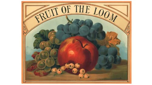
The history of the Fruit of the Loom logo is a fascinating journey of artistic evolution. The brand’s original emblem was remarkably detailed, featuring a still-life composition that showcased an apple, clusters of green and blue grapes, and light-colored berries. Rendered with precision, this initial logo captured the essence of realism, evoking the aesthetic of a traditional artwork.
This early logo reflected a sense of timeless artistry, blending natural elements with visual appeal to create a memorable representation of the brand. The realistic portrayal of the fruits conveyed an authentic connection to the name “Fruit of the Loom,” grounding the brand in its heritage and values.
Fruit of the Loom Logo – 1927
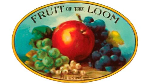
Just like Gucci logo, the original Fruit of the Loom logo remained a hallmark of the brand for an impressive 34 years before undergoing a significant redesign in 1927. This transformation reflected a shift towards modernity and a more refined visual identity. One of the most notable changes was the replacement of the square frame surrounding the fruits with a more dynamic and rounded sphere.
Another key alteration in the 1927 redesign involved the treatment of the background. The lush vegetative elements were minimized, making them far less prominent. However, the blue and white cloud motif remained a central feature, maintaining its importance as a visual anchor for the composition.
Fruit of the Loom Logo – 1936
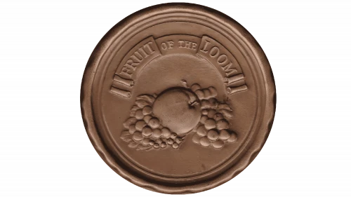
In 1936, Fruit of the Loom introduced a bold redesign of its logo, which adopted the appearance of a coin with rugged, textured edges. This design conveyed a sense of solidity and tradition, evoking imagery of craftsmanship and authenticity. The circular frame was a defining feature, providing a structured enclosure for the brand’s imagery and reinforcing its identity in a visually compelling way.
After nearly nine years, the brand refined this concept further by incorporating a light brown seal as its official identity, lending an elegant and earthy tone to its already illustrated logo. The fruits and the wordmark placed within the circular emblem were rendered with intricate 3D detailing, creating a sense of depth and texture that brought the design to life.
Fruit of the Loom Logo – 1951
The 1951 redesign of the Fruit of the Loom logo introduced subtle yet impactful refinements, maintaining the core visual elements of its predecessor while enhancing their vibrancy and appeal. The iconic fruits remained central to the design, ensuring continuity and recognition for the brand. However, this new rendition brought the fruits to life with brighter and more vivid colors.
In addition to the fruits’ enhanced hues, the background color was made lighter, giving the overall composition a softer and more open appearance. This adjustment emphasized the graphic elements, allowing the fruits to take center stage while lending a timeless, classic feel to the logo.
Fruit of the Loom Logo – 1962
In 1962, Fruit of the Loom undertook its fourth major redesign, reimagining the vintage logo design to reflect a modern and visually engaging identity. This iteration featured the signature colorful fruits that had become synonymous with the brand, but their placement and presentation were updated to enhance the logo’s overall composition.
The frame itself took on the shape of an eclipse, a stylistic choice that added a sense of motion and sophistication to the logo. The interplay of the monochromatic frame with the richly colored fruits created a balanced visual aesthetic. This redesign further emphasized the brand’s commitment to evolving its image while retaining its core elements.
Fruit of the Loom Logo – 1978
In 1978, the Fruit of the Loom logo experienced another round of refinements. The core structure of the logo, including the familiar arrangement of vibrant fruits, remained intact to preserve the brand’s established identity. However, one notable change was the removal of the white highlights on the fruits, which gave the elements a smoother and more uniform appearance.
In addition to the changes made to the fruits, the typography of the logo also received attention. The brand name, “Fruit of the Loom,” was rendered in a cleaner and more legible font style. This modification enhanced readability, making the text easier to recognize at a glance and improving the overall balance of the design.
Fruit of the Loom Logo – 2003 (Present Logo)
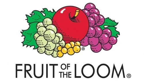
In 2003, Fruit of the Loom unveiled a redesigned logo that embraced a modern and minimalistic approach, reflecting the evolving tastes of a contemporary audience. Departing from its traditional use of frames, the new design eliminated the surrounding structure, creating a more open and approachable appearance.
The redesigned logo also emphasized the brand name, with the wordmark displayed in bold, clean typography beneath the fruits. This strong lettering not only ensured high readability but also reinforced the brand’s identity with a modern flair. The harmonious placement of the fruits above the wordmark created a balanced composition that was both eye-catching and memorable.
Frequently Asked Questions
| Why Fruit of the Loom logo is popular in the world? Fruit of the Loom is globally renowned for its high-quality, comfortable, and affordable apparel. Its enduring legacy, innovative designs, and consistent focus on customer satisfaction have solidified its status as a trusted brand worldwide. |
| How many types of apparel are offered by Fruit of the Loom? Fruit of the Loom offers a diverse range of apparel, including underwear, T-shirts, sweatshirts, hoodies, active wear, and more others. Their product lines cater to everyday comfort, performance needs, and customization options for businesses and events. |
| What does the cornucopia mean in the Fruit of the Loom logo? The cornucopia in the Fruit of the Loom logo symbolizes abundance, nourishment, and prosperity. It aligns with the imagery of vibrant fruits, reinforcing themes of natural goodness and timeless tradition. |
Final Words
That concludes our entire article in which we have discussed the complete history of the Fruit of the Loom logo. It represents the identity of a famous American clothing brand that is active in the industry for more than 100 years. The logo of the brand saw many redesigns throughout all these years. This blog has discussed all those redesigns in detail, giving you a complete picture how the logo started from the scratch. It presents a great example how a company transformed its logo from time to time, precisely to keep its branding and identity fresh in the market.

Logopoppin
Logopoppin is a graphic design agency that specializes in logo designing, web development, video production and advanced branding services. We love to innovate businesses with new age technologies, allowing them to improve their visual reputation.


