Table of Content
How Different Types of Colors Helps to Make Any Artwork Better
We all know about the importance of colors in attracting human eyeballs. It has the power to change perception and drive people towards particular choices. The color theory in this regard is termed very important. Being a designer, you must need to understand the color theory because it allows you to choose the right colors according to the requirements.
Whether you are designing a logo or a simple business card, color theory can help you to craft a perfect art. It allows you to know about the meaning of different colors and how they impact a particular design. Having this knowledge allows you to pick the right colors according to the requirements. You can select the best color combinations by anticipating their visual impact, provided you understand the designs basics well.
Being a graphic designer or branding agency, you need to know what are cool colors and how color theory plays a vital role in your routine work. It lets you choose the right colors according to design requirements. If you don’t know much about color theory and how important it is in graphic design, this article would be a perfect pick for you.
It has defined about the color theory in detail, so that you can pick the best colors accordingly. But, before moving into it, let’s first understand about the importance of color theory. This will also let you know about the significance of color meanings and why they should be considered while designing.
Why Understanding Color Meanings is Important
Color meanings help you to know about the impact of colors. It is a very crucial knowledge that simplifies the process of your color selection. As a designer, you must need to know about the meanings of different colors. It enables you to build a perfect artwork that can compel customers, rightly by attracting their hearts.
Considering human behavior, every triad color scheme brings a specific impact on our minds. For instance, red is thought to be powerful, whereas blue represents calmness and serenity. Similarly, green denotes a bit about nature, while orange means something refreshing.
Besides these, all the other colors represent some specific meaning. Therefore, it is best advised to know about them in the first place. Because if you will pick different types of colors randomly without knowing their meaning, then you could possibly put your design into a big trouble.
As a graphic designer, it is in your best interest to know about the value of each color before using it in a design. It will help you to bring relevance, so that people can understand your artwork better.
What is Color Theory
Color theory meaning is a special concept that lets you understand a variety of things. It enables you to determine which color will suit best in a design or how different colors can be merged together in an artwork. It is just not the understanding of color combination, but a complete concept that defines why specific colors should be chosen.
To understand color theory in graphic design, you must need to know about color wheel. It is said to be the center point of color theory that describes a variety of concepts. It was first created in the 17th century by the great Sir Isaac Newton. At that time, people didn’t have much knowledge about colors and how it could be used in different types of objects.
Newton was the first man who understood its importance and usage practices. Therefore, he demonstrated the color theory concept using a circular wheel. He mapped the color spectrum into that wheel, allowing people to understand different shades of colors.
This can be termed as the first step towards the understanding of color theory. Many designers and artists learned about the concept of color theory by looking at this wheel. It is a perfect demonstration of color classification, letting you know how to use them in different types of logos and other artworks.
Understanding the Color Wheel
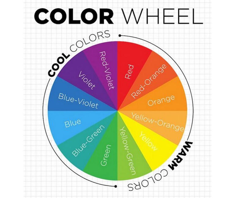
Being a designer, it is highly important for you to understand the basics of color wheel. It is something that allows you to know about the relation between different shades and how they are formed with each other.
It is a visual representation of a wheel that shows arrangement of colors in a synchronous manner. This helps designers to pick the colors precisely according to their requirements. But to do that, they need to understand the connection between different shades. It is very necessary to know about this relation because it allows them to build a perfect color theme for any design.
Without having this knowledge, any color selection would look weird as it will not have any relatability with the design. The knowledge of different types of colors is therefore very important for every designer. It simplifies your color selection process by showing a variety of shades available in one wheel.
By looking at the color triad wheel, you can also differentiate between primary, secondary and tertiary colors. This is a very crucial knowledge that defines various color categories. For instance, in a conventional RYB color wheel, red, yellow and blue are considered primary colors. You can extract secondary colors through these shades by mixing them with one another.
The mix-up of red and yellow brings orange, whereas yellow and blue creates green. This is a technique that separates primary from secondary colors. If you have a proper understanding about the color wheel, then you can easily understand this concept. It is a very handy illustration that gives you a clear knowledge about the origins of every color.
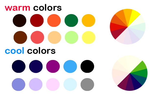
What are Cool Colors?
Cool colors are hues that evoke a sense of calm, relaxation, and tranquility. These shades are often associated with nature, like the blue of a clear sky, the green of a forest, or the soft purple of distant mountains. On the color wheel, cool colors typically include blues, greens, and purples, and they tend to visually recede, making spaces feel more open and airy.
Beyond their visual appeal, cool colors can also influence our emotions and surroundings. They are often used in design to create a soothing atmosphere, whether it’s in a bedroom, office, or spa. Cool colors can help lower stress and enhance focus, making them a popular choice for spaces where you want to feel at ease and refreshed.
Types of Color Model
Generally, color theme can be categorized into two types i.e. RGB and CMYK. Both of these models help to describe a few important things about colors. As an artist, you need to learn about their origins and why they are used in different circumstances.
Let’s take a look at them in detail below.
RGB Color Model
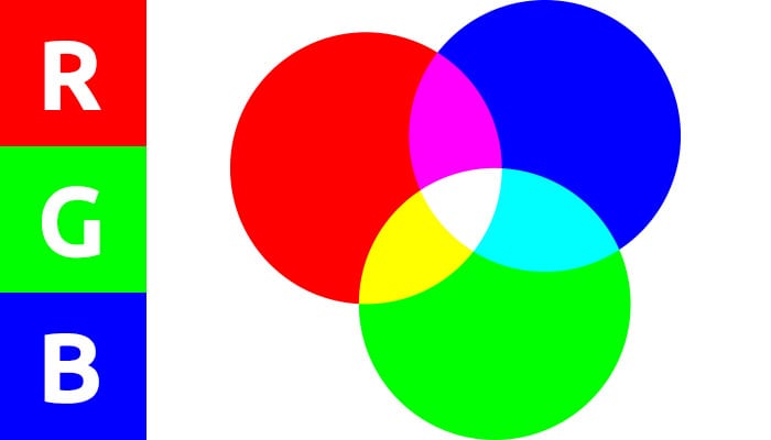
RGB (Red, Green, Blue) is a triad color scheme used to explain a variety of things about colors. It is also called the additive model that lets you know about the changeups in colors. The model is primarily based on three colors i.e. Red, Green and Blue. Using their combination, the model describes how other colors are extracted. It is therefore considered as the root model to understand the color theory and its implications in choosing colors.
By mixing the three colors included in this model, several other colors are formed. This can be termed as the basic color theory of this model. Meanwhile, the model also explains the difference between mixing various color intensities. It describes how same colors with varying intensity can formulate a new color.
Normally, screens and projectors use RGB as their basic color model. They use three primary colors (Red, Green and Blue) to create other ranges of colors. This is the core reason why this model is very easy to understand, and can be used to know the basics of color theory for designers.
CMYK Color Model
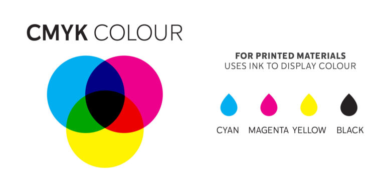
CMYK is the most common and known color model in the world. It is also called the subtractive color mixing model because it subtracts light by adding more colors to the surface. This means that any color you see on printed materials (papers, banners, flyers etc.) is derived from the CMYK model.
Many people are familiar with this model because they interact with CMYK colors every day. All the modern day designing software also uses CMYK color models to create a variety of artwork. It offers a simple approach towards understanding the color theory and its process of classifying different shades.
Earlier, as we know it, the primary colors used for the subtractive process were Red, Green and Blue. But, as the printing norms emerged and industry became more advanced, more colorful shades came into the play.
The unique Cyan, Magenta, Yellow and Black quickly replaced the traditional RGB colors to perform the subtractive process. This gave artists more opportunity to extract further hues according to the requirements. It enabled printers to produce more colors on paper and make the overall presentation highly appealing.
Color Schemes
Now that we have understood the basics of color theory, let us take a look at the concept of color schemes. It is not entirely difficult to understand, but you do have to pay attention towards the key points of every scheme.
To understand color theory in graphic design, you have to again look at the illustration of the color wheel. It makes easy to understand the difference between multiple schemes. Moreover, it gives you an idea how different colors are aligned with each other and form a geometric wheel collectively.
Let’s take a look at the details of these color schemes below.
Complementary Colors
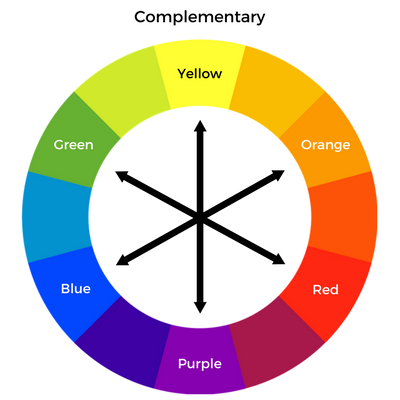
Complementary colors can be found on the opposite ends of the color wheel. The reason for this placement is that these colors look totally different from one another. They show high contrast in hues and shades, which is why they are placed on the opposite sides.
For instance, red and green are two complementary colors that are positioned right in front of each other on the wheel. These types of complementary colors can really enhance the creativity factor in the image. As a designer, you need to identify these colors properly before creating any artwork. They offer great contrast in the image, so that it can look different among others.
Analogous Colors
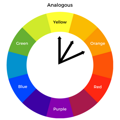
Analogous colors are similar to one another. They are placed side by side on the color wheel due to having resemblance in shades. If you will watch closely at them, you will easily realize the continuation of shades between them. This is the major reason why they look similar to each other, as well as are placed side by side.
The best examples of analogous triad color scheme on the wheel are red, orange and yellow. They look pretty similar to each other due to having a similar blazing shade. The only difference between them is the lightness of hue and variance in color intensity.
These types of colors are precisely picked by the designers to show a flare of continuity in their designs. It not only looks engaging, but also offers a subtle creativity in an image that looks very pleasing to the eyes.
Triadic Colors
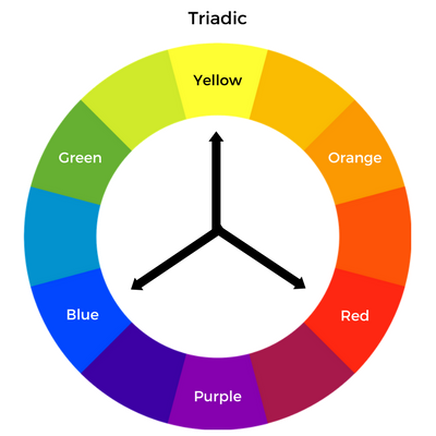
Unlike Analogous colors, the triadic category does not possess any resemblance in colors. Instead, they are evenly positioned on the color wheel due to having contrasting dynamic shades. If you will analyze them closely on the wheel, you will see a pattern of triangle forming between them. This is a standard illustration of triadic colors, allowing designers to identify them easily on the wheel.
For example, maroon, light blue and golden are good examples of triad color scheme. You can find them on the color wheel at particular positions forming a triangle-like structure. These colors provide a great contrast in the overall design, which is why they are preferred more by the artists.
Principles of Color Theory
To understand how to mix and add up different colors, you also need to know about some core design principles. They provide valuable information about the color meanings and how they should be mixed with each other.
Many beginners do not know about these principles. If you are also one of them, here are the three primary principles of color theory that you should know about.
Selecting the Hero Color
Many of us do not know about the term Hero color or what are cool colors. Though it is not commonly used by the designers, but always kept in consideration due to a variety of reasons. The hero color is basically the primary color that fills most parts of the design. It should be picked very carefully because the impact of the overall design visual depends on it.
The best way to pick the hero color is to consider the core theme of the design. It will let you know what type of shade will suit best for the design. Furthermore, you will get a clear idea how to use it in the design to create maximum impact.
Choosing Color Combination
After selecting the hero color, you will then need to pick appropriate color combinations. This is an important job that requires good analysis of the overall design. You will need to think creatively how other colors should be added with the primary color. This should be done by knowing about the right contrast that will suit the hero color. It will give you ample ideas about different color combinations and their relevant styles.
Understanding Color Relations
Lastly, you need to understand the color theory in graphic design properly. It plays a vital role in finalizing different colors for the design. The reason is that the relationship describes the relevance between chosen colors. It lets you know whether the color combination will look good or not, keeping in view the overall theme. This provides a better idea about the required colors and how to use them in the design.
Frequently Asked Questions
| What are the three basic color theories? There are three basic color theories every designer must need to know about. The color wheel, color harmony and context of colors make up the three important theories that are important for designers. They offer basics about color selection and how it should be used in an artwork. |
| Why is color theory important? Knowing about color theory is important for every designer. It describes various types of relations found between the colors. This gives them a better idea how different colors will stack up in a design according to the given shades. |
| What are the most important color schemes? There are different types of color schemes charted out for designers. The most important among them includes monochromatic, complementary, analogous and triadic colors. |
| What is RGB and how many colors are included in it? RGB is an acronym which stands for Red, Green and Blue. It is the first color model that listed out primary colors. This helped artists to extract secondary colors from RGB, rightly by mixing the required hue and tint. |
| What is a monochromatic color scheme? Monochromatic colors are created by enhancing shades and tones from a single base hue. It can also be termed as a color scheme made from different forms of one color. |
Final Words
That takes us to the end of this article in which we have described color theory in detail. It is indeed a very crucial topic that needs to be understood by every designer. Nowadays, many people do not pay attention towards the basics of color theory meaning. They try to create artworks by picking random colors which is certainly a wrong practice.
As a designer, you need to understand different types of colors and how they will look in a picture. It not only helps you to pick the right color, but also gives a better idea how it should be combined with other shades in the palette.
If you are looking for a graphic design agency that can help your brand to enchant with bright colors, contact us today. We will give your business an incredible look, perfectly by integrating lively colors in the branding.

Logopoppin
Logopoppin is a graphic design agency that specializes in logo designing, web development, video production and advanced branding services. We love to innovate businesses with new age technologies, allowing them to improve their visual reputation.

