
Table of Content
The Game of Thrones Logos and Sigils Seen Throughout the Books and Show
Well, we’ve all heard of Game of Thrones. Most of us would know it from its live-action adaption on TV. A few would be familiar with the A Song of Ice and Fire series, which served as the source for the show. However, as the show became wildly popular since its inception, the majority of the viewers, fan or not, are now familiar with the iconic Game of Thrones logo.
Years ago, only a few fantasy series had managed to achieve such fame and fanfare. Franchises like Lord of the Rings, Harry Potter, and Chronicles of Narnia had proved that there was a massive untapped market for adapting popular fiction and fantasy worlds to life. But few were reluctant to spearhead such a project.
However, once Game of Thrones proved this market’s potential, we have seen much new fantasy series pop up on popular streaming platforms, like the Witcher saga. So, without further ado, let’s dive in and discover the idea and meaning behind this eponymous design known to so many of us.
The Original Game of Thrones Logo – Its Meaning and The Idea Behind It
Businesses often hire a logo design company to create a brand signifier for them. However, they fail to consider what actually makes a brand logo great. Us humans are highly visual creatures. As such, we are often attracted by the visual appeal of a design. While there is nothing wrong with that, the issues arise when these people prioritize visuals to determine if a design is good or not.
You see, when it comes to brand logos, visual appeal alone does not dictate the effectivity of a brand symbol. A good logo needs to embody your business’s message and values. That is what makes it effective.
Take a look at the game of thrones logo above. Notice how the imagery and the font compliments each other to give the intended fantasy/medieval style narrative. Now it may not look that good going by traditional logo design trends, yet it represents its brand so well that it has become highly recognizable.
Game of Thrones Logo Font
The font for game of thrones logo sports quite a unique design. It implements design elements from a variety of gothic style scripts and designs, and has a distinct shape that is hard to mistake for anything else.
Moreover, the finished font is available free for use for non-commercial purposes only, just like another common typeface used throughout the series, called Trajan Pro. These custom fonts are very important when it comes to making a brand symbol iconic. That is because new typefaces have no prior associations with anything else.
That makes it easy for a viewer to remember and associate it with your own brand, boosting its memorability. And that is why developing custom logo fonts is always preferable to using existing typefaces.
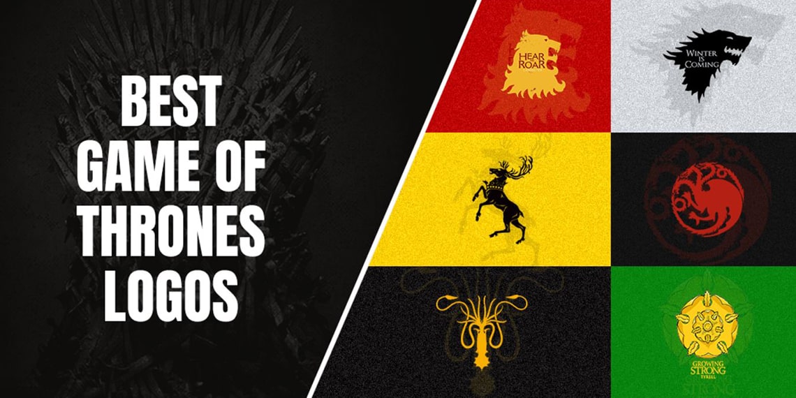
Popular Game of Thrones Logos from The TV Show
The universe of A Song of Ice and Fire is full of Clans, Houses, and associations, each bearing a unique identifying symbol representing its brand. However, only a few of those were bought forward for the live-action adaptation.
Let’s take a look at some of the most popular game of thrones logos on the TV show.
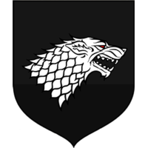
Game of Thrones Logo – House Stark of Winterfell
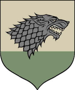
House Stark is one of the primary protagonists in the Game of Thrones. One of the oldest Houses in the universe, Starks had ruled the North of Westeros for a long time. As the descendants of the First Men, they were the true natives of the area, worshiping the Old Gods.
Thriving despite the harsh clime and lifestyle in the cold North, the family is known to be steadfast, resolute, fearless, and most importantly, loyal to a fault. And with their family sigil of a grey direwolf, a pack animal known for surviving and thriving in the unforgivably cold and barren area of the North, the family has held the loyalty of the Northern houses for millennia.
The reason for adopting the direwolf as their symbol could be quite simple. First, the animal is native to the North. Second, the animal thrives despite the life-sapping cold climate of its habitat. And lastly, the direwolf is loyal to its family and those it loves.
Unfortunately, it was these exact qualities that led to the death and near destruction of the House by the Lannister forces. However, the symbol and the inherent qualities it portrays makes it one of the most iconic game of thrones logos of the entire universe.
Game of Thrones Logo – House Lannister of Casterly Rock
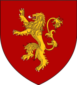
Just like the Starks in the North, the Lannister family has been ruling from their seat of Casterly Rock since the invasion of the Andals. They are descended from Lann the Clever, a legendary hero of First Men who tricked the Casterly Family out of their seat of power, and the invading Andal forces.
The richest House in the entire Westeros, due to the extensive network of goldmines and gemstone mines beneath Casterly Rock, they have always been involved in the politics of Westeros. Years of extreme wealth, power, and incompetent rulers however, had left the family politically weak.
The ensuing massacre initiated by Tywin Lannister, a young lord at the time, was so deadly that it inspired songs meant to warn people of the consequences of crossing the Lannisters.
Just like the concept used in Star wars logo, their emblem is a rearing golden lion over a crimson background. The lion, a majestic animal known as the king of the animals, is the perfect symbol of a House with notions of grandeur and power. It also shows a sense of playful ruthlessness, a phenomenon perfectly portrayed in the song called “The Rains of Castamere”. It is a saga of Tywin’s victory and subsequent decimation of the Reynes, a family that rebelled against his father’s rule.
Game of Thrones Logo – House Targaryen of Dragonstone
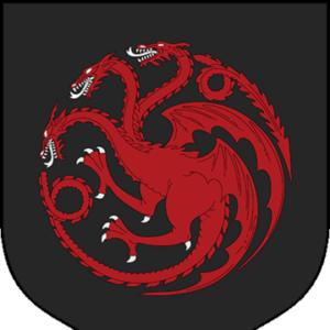
Fans of the Dragon Queen, Daenerys (Stormborn) Targaryen, would be quite familiar with the elaborate sigil of her House – a red three-headed dragon over a black background. The Targaryens are one of the ancient families from Valyria, an ancient yet advanced civilization that had mastered and tamed the vicious dragons.
During the fall of Valyria, a few members from the Targaryen family left for Westeros, troubled by the prophetic dreams of their daughter. Witness to the complete destruction of their homeland and civilization, the family landed and settled at Dragonstone, named thus due to the place having a high concentration of dragonglass, or obsidian.
Sometime later, the Targaryen Prince Aegon and his sister-wives Visenya and Rhaenys rode their dragons for a bloody conquest of Westeros, conquering kingdom after kingdom. Torrhen Stark, the King in the North, knelt to protect his people, saving his domain from ruin like the others. Dorne, however, was the only kingdom to successfully repel the Targaryen invasion, and remained independent.
The sigil for the house is one of the most intricate. It features a red three-headed dragon over a black background, with the dragonheads snarling, and giving a vicious vibe to this game of thrones logo. However, it perfectly represents a House whose motto is the sinister “Fire and Blood”.
Game of Thrones Logo – House Baratheon of Storm’s End
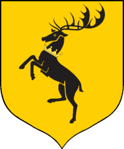
House Baratheon was the family who took over from the Targaryen Empire, after Targaryen heir Viserys was killed in battle against Robert Baratheon, Lord of the Stormlands. After a long and bloody conquest that saw the Targaryens and their allies decimated at many fronts, the Westeros Kingdom was passed over to House Baratheon.
Although it is now considered one of the Great Houses of Westeros, it is also the youngest one among them. Originally, the sigil and motto belonged to House Durrandon, who ruled the Stormlands since the age of the First Men. Taking the title of the Storm King, the ruler would rule from the reach all the way to the borders of Dorne.
After the great conquest, King Aegon I’s right hand named Orys Baratheon slew Argilac “The Arrogant”, the last Durrandon Storm King, and wed his daughter. Taking the House’s motto and sigil for his own, he renamed the House after himself, and took Storm’s End as his seat.
The sigil for the house is one of the most regal of the game of thrones logos, featuring a rearing stag with a magnificent set of antlers, and a crown around his neck. The black image is set over a bright yellow background, suiting the motto of Ours is the fury.
Game of Thrones Logo – House Martell of Sunspear
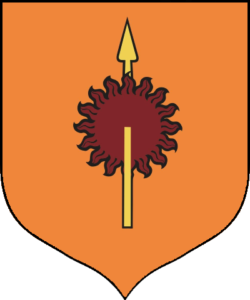
House Martell of Sunspear were formed by Morgan Martell, a warrior of Andal descent who settled in the region after the Andal Invasion. Defeating the local Houses and clans of the First Men, he established a sizable as his domain, although as a vassal for the local Kings.
When the Rhoynar came to Westeros, with them came the warrior queen Nymeria. As a small House compared to the likes of House Yronwood, the head of House Martell, a man named Mors, decided to rise in station and took Nymeria as his wife.
With the combined might of the Martells and the Rhoynish army, they were able to establish themselves as the de facto rulers of Dorne. Since then, the Martells have overseen the Dornish territories, and were the only kingdom to successfully repel the advances of the Targaryens during Aegon’s Conquest.
Their sigil features a spear going through a blazing sun. One of the simplest and expressive game of thrones logos, it is a mix of House Martell’s ancient symbol, and Nymeria’s battle symbol.
Game of Thrones Logo – House Tyrell of Highgarden
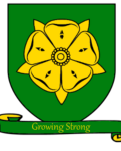
One of the Great Houses of Westeros, they are only second in wealth to the Lannisters. Moreover, they are the House who can call up the largest armies in the entirety of Westeros, including naval fleets that can surpass even the Royal Fleet at King’s Landing.
The Tyrells are the only Great House to never rule as King. Originally, they were stewards to the great House Gardener, a ruling house who ruled the Reach since the Age of Heroes. As High Stewards to the rulers of the Reach, there were a number of intermarriages between the Tyrells and greater houses.
It was during Aegon’s Conquest, when the King of the Reach and his heirs were killed at the Field of Fire, that the Tyrells ruled as Regent. However, when Aegon came for them, they surrendered Highgarden without a fight.
As a reward, they were awarded the castle as well as dominion over the entire Reach, making them Wardens of the Reach. However, many other Houses under them considered them Upstarts, and followed them as a token gesture.
House Tyrell’s passive nature can be seen in their house sigil as well, which features a gold rose on a green field, with the words Growing Strong as their motto.
Game of Thrones Logo – House Arryn of the Eyrie
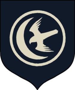
House Arryn is another one of the Great Houses, and are the de facto rulers of the Vale. Situated in the area of Eyrie, their seat is considered near impregnable, both due to its geography as well as other fortifications. Their winter castle situated at the Gates of the Moon, are both located on the Giant’s Lance, the tallest mountain in entire Westeros.
Descended from a noble Andal stock, the Arryns gained control of the Vale after defeating the army under Lord Robar II Royce. The Royce army was made up of houses descended from the First Men, and claimed right of ownership of the Vale. However, the Andals, following Ser Artys Arryn, defeated the army, and crowned Ser Artys as King of the Mountain and Vale.
During Aegon’s Conquest, after a naval battle repelled the Targaryen effort, the Arryns amassed a great army at the Bloody Gates. However, Queen Visenya Targaryen flew her dragon up to the castle and built a rapport with the boy-king Ronnel Arryn. When his mother, Queen regent Sharra discovered this, she was forced to bend the knee. Since then, the Arryns have supported the Targaryens, until they rose in revolt against the Mad King Aerys.
Their sigil features a flying falcon aiming towards a crescent moon, over a dark blue background. The symbol is a great representation of the family, as well as their seat of power, making it one of the greatest game of thrones logos in the show. The falcon is a noble bird, and builds nests at immense heights to easily survey its territory.
Iconic Game of Thrones Kingdoms and Vassal Houses from the TV Show
Besides the sigils and symbols of the Great Houses of Westeros, there were a number of other Family sigils seen throughout the Game of Thrones show. Many of the House symbols in this lists have multiple types of logos designed, with the style varying from the book to the show, and even the game.
However, we will only discuss the version that best suits that family’s aesthetic and values. Let’s begin.
The Leaping fish – House Tully of Riverrun
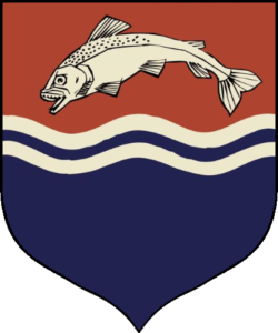
House Tully is one of the Greater Houses of Westeros, and ruled from their ancestral seat of Riverrun. As Lord of the Riverlands, their symbol is a leaping fish over a blue river, against a brown backdrop. This symbol, while simple, is one of the most meaningful game of thrones logo from the series.
The Flayed Man – House Bolton of the Dreadfort
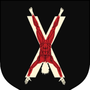
House Bolton, once the enemy and competition to House Stark in the North, was one of the strongest vassals to them after the Starks were named King in the North. Ruling from their ancestral fortress called the Dreadfort, the Boltons were known for their sadistic technique of flaying their captives. Hence, their logo featuring an upside-down flayed man perfectly represents the Northern House.
The Kraken of the Seas – House Greyjoy of the Iron Islands
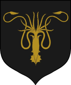
One of the greatest house from the Iron Islands, House Greyjoy ruled over the seafaring people in and around the Iron Islands. Ruling from their seat of Pyke, the leader was called the Lord Reaper of Pyke. A hard and forbidding people, they were known for pillaging and pirating, and were considered the best naval force in the entire Westeros, despite inferior equipment. Sporting a golden Kraken over a black backdrop as their sigil, their motto featured the ominous words We do not sow.
Twin Towers of the Riverlands – House Frey of the Twins
A noble house from the Riverlands, and a vassal of the Tullys, the Freys controlled the passage between two rivers from their seat called the Twins. It was named after a pair of castles on both shores of the fork in the Trident, with a stone bridge connecting the two sides of the river. This strategic location is what helped the Freys rise in power, and the twin castles became the symbol of their house.
The White Wolf – Jon Snow of the North
Jon Snow has a highly contested parentage throughout the TV series. Considered an illegitimate child of Ned Stark in the earlier seasons, it was later revealed that he was the lawful child born to Lyanna Stark and Rhaegar Targaryen. That made him the rightful heir to the iron throne, over his aunt Daenerys. However, before his parentage came to light, he was crowned the King in the North, and took a red-eyed white direwolf over a black backdrop as his sigil.
This inverse-colored sigil was a common practice for illegitimate children, who had a chance to take their own banners instead of their birth family’s symbol.
Famed Game of Thrones Logos for Legendary Houses from The Song of Ice and Fire
Now that we have discussed the best of the game of thrones logos seen on the show, there are a few popular Houses who are quite famous in the books, yet were left out of the show. Let’s take a look at their designs, and discover how well they fit the families they represent.
House Blackfyre of the Crownlands
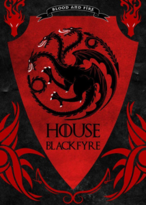
House Blackfyre was a family descended from the Targaryens, and was a cadet branch of the family. Now extinct, they began when King Aegon IV legitimized all his children born out of wedlock. Initially, the family was led by Daemon Blackfyre, considered one of the Great Bastards.
Named after the valyrian steel sword of the same name, the family’s sigil was a reverse of the Targaryen symbol, a red three-headed dragon over a black backdrop. As descendants of valyrian stock, they looked just liked the Targaryens physically, giving rise to the series of Blackfyre rebellions which ultimately led to the house’s downfall.
Their symbol, a reversal of their parent sigil, was the perfect representation of a House that was considered not trueborn, a theme which can be witnessed in Jon Snow’s sigil as well.
House Dayne of Starfall
House Dayne is a noble family from Dorne, with their seat of power situated at Starfall. As vassals to the Martells of Dorne, the family has been at the center of Westeros politics for a long time. Known for their ancestral sword Dawn, the house was known for their legendary knights, the greatest of which were given the title of Sword of the Morning.
The Sword of the Morning was a knight from the family who was deemed worthy of wielding the great sword Dawn, a symbol and most prized item of the family. The last Sword of the Morning, Ser Arthur Dayne, was considered the greatest knight of his era, defeating the Smiling Knight and leading the Kingsguard as their captain.
The House is named after the first Dayne followed a falling star to the site of impact, and raising his hall there. Forging a great sword from the metal found within, the family combined both those symbols into a symbol for their House, creating the most perfect representation found in any game of thrones logo.
House Reyne of Castamere
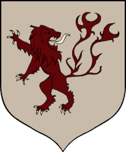
Anyone familiar with the song The Rains of Castamere knows the House the song refers to. One of the oldest families in Westeros, the family made their wealth due to the subterranean mines of gold and silver near their seat of power, just like the Lannisters.
During Lord Tytos Lannister’s rule as their Lord paramount, the Reynes decided to compete with the Lannisters and take over as the richest and strongest of the families in the westerlands. However, Lord Tytos’s son, Tywin Lannister, decided to answer this treachery and decimated the Reynes in a manner so vicious, that it became a message to other houses never to cross Tywin or the Lannisters.
Their symbol, a deep red lion with a flaming tail and a regal mane, is the perfect portrayal of a family with ideas of grandeur and nobility in their minds, and a reminder to their fellow houses that the Reynes were better than them.
House Reed of Greywater Watch
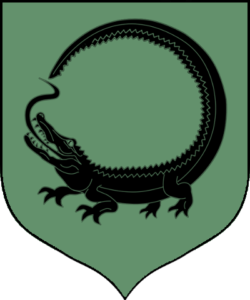
House Reed of Greywater Watch, are one of the most loyal bannermen of House Stark. One of the most ancient families of Westeros, they are called the gatekeepers of the North, protecting them from the southern armies.
The family controls vast stretches of swampland and marshes around the Neck, the lowest part of Westeros near the border of the North and southern states. Descended from the First Men, they adapted to form the crannogmen, people who adapted to live in and near the swamps of Westeros.
Their symbol is a black lizard over a dull-green background, making it one of the most basic game of thrones logos in the series. However, as it represents a people who live near amphibious lands, it is a perfect symbol.
The Phenomenon That was the Games of Thrones Logo – What Made It So great?
When it started, Game of Thrones was a show that fostered a huge fan base. People from different age brackets, cultures, and parts of the world joined together to wait for the next episode of the show. And when it ended, it gave rise to a slew of fantasy TV shows such as Blood and Bone, The Witcher, and many others.
The reason for its fame is quite simple – a rich storyline combined with beautiful cinematography. Moreover, the directors and producers tweaked and changed the source material from the books to make it better suited to a live-adaptation, such as creating a new game of thrones logo that perfectly portrayed and depicted the storyline.
That, and the cast of wonderful actors who did justice to the characters they played, made Game of Thrones a massive cultural phenomenon.
Branding and Logo Design – Role of Game of Thrones Logo in Promoting the Franchise
The design of the original Game of Thrones logo was tantamount to the success of the franchise’s branding strategy. Over the seasons, as the storyline progressed, the logo was tweaked slightly episode by episode, to showcase the changing events in the show.
This not only made the logo central to the show and its storyline, the changing design made it a new and interesting element that kept the fans hooked for more.
Frequently Asked Questions
| 1- What does the Game of Thrones logo mean? The Game of Thrones logo depicts the epic struggle for the Iron Throne between the four major houses of Westeros: – House Stark – House Baratheon – House Targaryen – House Lannister |
| 2- What are the four symbols on Game of Thrones logo? The four symbols on the Game of Thrones logo depict the four major houses vying for the Iron Throne. – The stag depicts the Baratheons – The wolf depicts the Starks – The dragon depicts the Targaryens – The lion depicts the Lannisters |
| 3- What house has the lion as its symbol Game of Thrones? The lion symbol belongs to House Lannister in the TV show. In the books however, the symbol is also used by House Reyne. |
| 4- Who is the deer symbol in Game of Thrones? In the TV show, the deer or stag represents House Baratheon. In the books, the Baratheons took the symbol of House Durrandon when they defeated the Storm King. |
Conclusion
Knowing how to design a logo like the ones we have seen in the show, is far easier said than done. These games of thrones logos, from the house sigils to the main logo, are works of art, complimenting the storyline, and portraying the factions they represent perfectly.
That is something which takes a lot of time and effort, in both coming up with a suitable idea, and then implementing it properly. However, with a little practice, you too can come up with such aesthetic designs.
Latest news you want to know!
Subscribe for cutting-edge design inspiration at Logo Poppin! Elevate your brand with updates on logos, branding, web design, and video animation.
Note that by clicking “subscribe,” users may agree to our privacy policy and consent to Logo Poppin to use your contact data for newsletter purposes.
Logopoppin
Logopoppin is a graphic design agency that specializes in logo designing, web development, video production and advanced branding services. We love to innovate businesses with new age technologies, allowing them to improve their visual reputation.

