

Table of Content
Discover the Secret to Fame for Some of the Most Iconic Game Logos Today
We people have always had a fascination with video games. From simple text-based games like Oregon Trail and Zork, to video games with 8-bit graphics and pixelated gaming logos of early consoles, games have been a mutual pastime for many of us.
However, over the years, better technology and the changing visual expectations of consumers have influenced the graphic styles of these games. Better graphics and elaborate storylines were made possible with the help of dedicated graphics processors, enabling developers to enhance the visual appeal of their products.
And with more and more entrants making their debut in the gaming industry, any logo design agency hired to create an appropriately stylish yet unique logo for these companies was in for a hard time. With each new year bringing new updates and trends, the evolution of these video game logos is an engaging study into the changing design aesthetics.
Let’s find out how to incorporate that aesthetic into your other brand logos.
Why Is Creating a Custom Gaming Logo for Your Brand So Important?
Custom gaming logos, like any brand symbols tailored specifically for their business, help companies establish a distinct identity. Your brand logo is a symbol that sets you apart from your competition while proclaiming your brand message.
For video games today, there can be multiple titles with similar gameplay available on the market. But each of them have a distinct gaming logo signifying their presence to fans and prospective customers.
Take Counter Strike for example. Originally developed as a standalone FPS and strategy game by modders who took the concept from Half Life, it soon gained a following large enough to soon be released as a full-fledged game. And while there were many other FPS games released since then, Counter Strike’s gaming logo is one that is recognized far and wide.
Similarly, many games today and even in the years past, had storylines that were quite like each other. However, using their unique logos at the core of their branding strategy, these game developers were able to market their products, and capture a sizable chunk of prospective gamers.
In exploring the power of unique logos in branding strategies, it’s fascinating to note how game developers, like those behind Posterdle – Wordle, for guessing movie poster games, utilized their distinctive logos to market their products effectively and attract a significant audience, despite similarities in storyline themes across various games
Good Gaming Logos – What Defines Them?
A good gaming logo is one that perfectly represents the core tenet of the video game they represent. Take, for example, the Mario game series. With the titular protagonist named Mario, what could be better as a logo than the name and image of that character. The same can be said for Sonic – The Hedgehog series.
Essentially, the same criteria designed for general brand symbols can be used to judge the merits of a gaming logo, as can be seen in different MLB or NBA logos. If the design suits the brand identity, represents its core values, and embodies its primary message, then it can be called a good video game logo.
Custom Gaming Logos for Twitch Streamers and YouTube Channels
In recent years, the streaming platform Twitch has become wildly popular with gamers, many of whom have turned to streaming their gaming sessions for their fans, and earning ad revenue through them. But with so many of them competing for the potentially limited fan base, how were these streamers supposed to differentiate themselves from each other?
Most of the popular Twitch streamers have developed designs and symbols meant to identify them. These gaming logos for Twitch are designed to pop, attract, and signify the authenticity of its owner to the viewers.
There are many ways that a streamer get a logo designed for their channel. Some hire a logo designer to create one for them, while others who have some skill with graphic design and know how to create a logo design their own brand icon. However, some streamers also have fans that send in designs which they believe might be perfect as a logo.
Top 10 All-Time Great Game Logos for Some of the Most Iconic Video Games Ever
The importance of a well-designed logo is quite well known, and many brands aspire to create such symbols for their products too. However, some are very successful, and their brand logos become iconic, becoming well-known brand identifiers to the world at large.
The gaming logos given below sport some of the most recognizable and memorable designs, that perfectly embody their brand and personality.
Wolfenstein Logo
Wolfenstein is a video game that has had a huge fan following since its inception. The first installment was released for consumers in 1981, depicting the gritty World War II era. The gameplay featured an elaborate storyline involving the struggle and battles between Allied captains and their Nazi counterparts.
Th3e first of the two Wolfenstein gaming logos featured a sharp and edgy design, something which instantly set the game apart from others. It exuded energy, youth, and a certain sinister vibe.
Its design incorporated the letters W, L, F, and T, and even if we look at the new logo for the more recent game installment, these letter can be easily superimposed over each other to form the original symbol for the game. Representing a game so different from the others, with a design considered edgy for the era, the game and its logo were an instant hit.
Tetris Logo
Who here doesn’t know Tetris? This famous game has seen itself ported to nearly all manners of gaming devices, from PC, to consoles, handheld consoles, and even mobile phones. Released in 1984, Tetris is arguably, one of the world’s most famous video game of all time. Developed by Russian Alexey Pajitnov, Tetris also holds the record for being the first game to make it into space.
The original logo was designed in 1997, and used the T-shaped Tetromino (an amalgamation of Tetris and Domino) as its base shape. The letters were angular, as per the design trend of that era, over a light blue background. However, for the game’s 35th anniversary in 2019, the game’s logo was redesigned with a darker blue hue, and the letters made smoother and less edgy. With the basic idea of the design remaining the same, the Tetris symbol is one of the most recognizable gaming logos of all time.
Minecraft Logo
Highly popular for the past decade, Minecraft is a sandbox games which allowed players to enjoy a unique gameplay experience. The game based on collecting and building in an expansive open-world concept. Many gamers have published huge, intricate maps of Minecraft they have built, mimicking famous settings like Harry Potter’s Hogwarts, or the Shire from The Lord of the Rings.
The logo is a stylized wordmark, and has seen three redesigns after the first one failed to attract users. Except for that first iteration, the others were all designed to look like they were made out of cobblestones or mined rocks.
With a simple gray color scheme and a three-dimensional design, the logo was a great way to embody the core spirit of the video game. That makes it one of the simplest yet most expressive gaming logos on this list.
Pokémon Logo
The Pokémon franchise is one of the most recognizable brand in the world today, with many people across the world today familiar with it and its popular characters. Most of us are familiar with the English logo, which is what we have grown up seeing. However, the Japanese logo, while different in both style and color, was still able to embody the same youthful energy and fun of its more popular counterpart.
The project was created in 1995 by Satoshi Tajiri, and their first releases consisted of a couple of games for the Nintendo platform. Developed by Game Freak, those games spawned an entire world of expansions and offshoots, like movies, a TV show, trading cards, video games, and even an AR-capable mobile game.
The popular English logo is designed using a three-dimensional, comic-like font. That makes it perfectly suited as a gaming logo geared towards children. Moreover, the color scheme of bright yellow and blue also embodies a sense of youthful energy and joy, making it so popular with generations of children worldwide.
Street Fighter Logo
With lighter, more kid-oriented games like Mario and Pac-Man serving the gaming community at large, there was a need in the market for a video game that shocked and awed. That was where Street Fighter came in.
Released by Capcom in 1987, the game was an adrenaline-packed and aggressive pastime, perfectly suited to older teens and adults. As one of the most popular and highest grossing franchise on our list, the game essentially established the PvP mode in the fighting genre of video games.
The logo is inspired by a fiery, manga-style of writing, exuding energy, fierceness, and a dynamic feels few gaming logos have managed to replicate. On its eighth iteration, the logo has always featured orange, yellow, and white in its color combinations, mimicking the fiery energy they want to portray within the game.
Sonic Logo
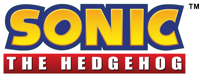
For those of us familiar with the popular titles from Sega, would be familiar with Sonic the Hedgehog’s logo. This fun video game sports one of the simplest yet still iconic gaming logos produced till now. The game, as well as titular character, were so popular with the fans that a live-action movie was released in 2021, bringing our favorite blue hedgehog to the big screen.
The logo for the game is simple. A yellow and blue wordmark of the character’s name, with a slight metallic sheen to the yellow of the logo. The font is a bold, slightly comic-like script, with asymmetrical lines, this logo is giving the vibe of a typical 80’s design. Moreover, the negative space beneath the letter O and C mimics the arc of the character’s iconic Spin Dash.
Doom Logo
Released in 1993, Doom is a favorite for people who liked the FPS style of gameplay. The game narrated the story of a futuristic space soldier, who is battling hordes of vicious zombies and mutant creatures of demonic undead.
One of the first entrants in the first-person-shooter category of video games, it was designed for the PC environment. The game used 3D design for an immersive experience hard to implement due to the hardware drawbacks of that time, and was an inspiration for many video games for decades afterwards.
The logo features a wordmark written in a blocky, sharply angled and edgy font, which was what people considered a sci-fi design element. The intricately designed logo featured a unique mix of mechanical as well as organic design characteristics, which signified the hell-like visual feel of the game itself.
Grand Theft Auto Logo
The first Grand Theft Auto game, or GTA for short, was released in 1997. A unique game for that time, it rewrote the rules on what video games were supposed to be and feel like. Since then, its subsequent installments have upped the ante for video game industry, introducing the choice-based open world concept that many love them for.
At that time, the game was highly controversial for the amount of violence and adult content within the gameplay. However, that criticism was overshadowed by the massive popularity of the game due to its innovative sandbox-model, allowing players to roam around and explore the way they want to instead of going from mission to mission.
The logo is a simple, 90’s style blocky wordmark, with rounded edges. This is an example of negative space logo and also uses lowercase letters for the entire wordmark. The original color scheme featured a white logo, with a thick black outline. Though simple in design, it is one of the most popular gaming logos you will find today.
Counter Strike Logo
Counter Strike is one of the most popular games ever created, which popularized multiplayer gaming. The game pits teams of players against each other, playing either as insurgents or as counter-operatives. Based on timed rounds, the game ends after one team wins the majority of played matches.
The logo for the game series features the silhouette of a loaded out counter-insurgent, aiming his rifle. Used in both Counter Strike 1.6 as well as later variants like Counter Strike: Global Offensive, the logo is simple yet perfectly portrays what the game is about.
Assassins’ Creed Logo
When it first launched in 2007, the Assassin’s Creed video game inspired a lot of anticipation due to its extremely unique gameplay, and a storyline that was extremely new at the time. And with nine titles under its belt, the hype has grown even more.
The symbol used in the logo, called the Assassin’s Insignia in the game series, is a stylized shape designed to mimic the shape of an eagle’s head, viewed from behind. According to the fictional Assassins in the game, it represented courage, fearlessness, and freedom – the hallmarks of an Assassin.
The logo is seen extensively throughout the game, marking the entrances to different Assassins’ hideouts, tombs, headquarters, and bureaus. And its sharp and predatory design perfectly symbolizes the vicious and ruthless nature of the Assassins.
Memorable Gaming Logos from Famous Gaming Consoles Over the Years
Besides the popular gaming logos for video games, there are a few game-related logos that are as famous as the video game titles we discussed earlier. Let’s take a look at a some of the most popular brand symbols among them.
Nintendo Wii
Nintendo Wii was a 7th Generation home gaming console released by Nintendo in 2006, and was designed to compete against Microsoft’s Xbox 360 and Sony’s PlayStation 3. However, unlike Sony and Microsoft, who were competing for the crown of better power and graphics, Wii was designed to appeal to a broader range of consumers looking for something unique and interesting.
The design of its logo was meant to look as if two people were standing alongside each other, with the name enforcing that sense of community rather than the individual. And while the console may not have been as big of a hit as its more competitive rivals, it became another great chapter in Nintendo’s long gaming legacy.
Sega Genesis/Mega Drive
Sega Genesis, known as the Sega Mega Drive in North America, was a 4th Generation gaming console released by Sega. With a large gaming library, and a cartridge-based gaming system, the console was a massive hit, and maybe the most well-known console from that generation.
Now, with two different names based on the region of the console, the company fielded two different logos. Sega Genesis, the name given to the global/EU version of the console, featured a metallic badge-like design that looked attractive and appealing.
The Mega Drive logo, on the other hand, was flatter, and looked more like a computer-generated representation of a logo than a proper badge the global version. However, the design of the gaming logo meant that the name was visible and easily legible.
Nintendo 64
Nintendo’s most famous gaming console, arguably, would be the Nintendo 64. Part of the 5th Generation of home gaming consoles, it was released in 1996. Competing against the likes of Sony’s PlayStation and the Sega Saturn, both of which used CDs as their media of choice, Nintendo 64 still used chunky, retro-style cartridges for its games.
As for its logo, the company kept it simple. A red superscript “64” accompanied the blocky Nintendo logo wordmark. It represented the 64-bit gaming processor used in the console, where the previous generation of consoles used a 16-bit or 32-bit processor. Overall, it was a simple yet effective design.
Nintendo GameCube
The Nintendo GameCube was a 6th Generation gaming console from Nintendo that came after Nintendo 64. Released in 2001-2002, it was designed to sell as well as the predecessor. However, six years later, its sales hovered around 21 million units, much lower than expected, which was why Nintendo discontinued it in 2007.
Its logo was a wordmark that was written using minimalist futuristic fonts, along with a symbol that looked like a capital “G” designed to mimic the outlines of a 3D cube. The overall design was interesting and innovative, a common trope with Nintendo.
Atari Logo
Atari was one of the earliest gaming console manufacturers, and for those who have used their gaming machines, it holds a special place in their hearts. Designed by the company’s in-house designer named George Opperman, the logo has been used with only slight alterations since its inception.
The design is meant to mimic the letter A of Atari, while the design concept also features the visual element from the game Pong. The middle line represents the center line of the screen in the game, while the slightly curved lines on both sides represents the players.
PlayStation Logo
Who doesn’t know the logo for PlayStation, arguably one of the most famous video game console ever developed? A convincing argument in favor of gaming consoles today, PlayStation is Sony’s answer to Nintendo’s gaming machines.
Surprisingly, in the late 1980’s, Sony first decided to enter this industry by partnering with none other than Nintendo, a gaming giant at the time. Releasing a batch of about two hundred prototype consoles named Nintendo PlayStation, the venture failed as the two companies failed to agree on a suitable share of the profits.
Splitting up, Sony decided to go at it alone, and came up with the eponymous PlayStation console series we all know and love today. The logo for the console has gone through various changes throughout its life. However, the current version was revealed in 2009, and features an all-black color scheme. The design consists of the letters P and S, combined to form a design that looks flat and three-dimensional at the same time.
Sega Logo
Originally, the company was called Standard Games in the 1940’s. Moving to Tokyo in the decades later, the company took over the distribution of coin-operated video games. At that time, the company changed its name to Service Games, which was shortened to SEGA in the years to come.
Over the years, Sega has had dozens of gaming logos designed for their company, yet only a few have been officially taken on as their company logo. The version currently in use today, is the fourth iteration of the official logo, and takes design elements from the previous two logos.
The company logo seen on various items such as the famed Sega Genesis as well as games released by the company feature a blue on white color logo in the style of a wordmark. The shape of the wordmark is created using several animated light trails that come together to form the final design.
Xbox Logo
The Xbox was a great way to capture an audience in the console market too, after successfully being the platform of choice for PC gamers. Launching their first console in 2001, the product was an instant hit, competing with the entrants from SEGA and Sony.
Since then, Xbox has remained in fierce competition with Sony’s PlayStation, with fans debating which of them is the better gaming console. The logo representing Xbox consists of a sphere with a huge X-shaped slit at the top.
The idea behind the name and the logo came from Microsoft’s DirectX developers, as this console feature DirectX for its game rendering. Over the years, the logo hasn’t changed much, expect for the addition of letterings for specific editions of the console.
Famous Portable Game Logos from Top Handheld Consoles of All Time
Handheld consoles have revolutionized the gaming industry, providing gamers with the freedom to enjoy their favorite titles on the go. These portable devices have come a long way since the early days of the Game Boy, with advancements in technology and design leading to increasingly powerful and immersive gaming experiences.
One of the key elements of a successful handheld console is its logo. The logo serves as a visual representation of the brand, capturing its essence and appealing to its target audience. Iconic logos can create a strong brand identity and help to differentiate a console from its competitors.
Let’s explore some of the most famous portable game logos from top handheld consoles of all time.
Nintendo Switch
The Nintendo Switch logo features a simple, stylized “N” that is reminiscent of the Nintendo Entertainment System (NES) logo. The “N” is enclosed within a circular frame, suggesting the console’s versatility and ability to be used in various modes, including handheld, tabletop, and TV. The logo’s clean and minimalist design is instantly recognizable, making it synonymous with the Nintendo Switch brand.
Game Boy Advance
The Game Boy Advance logo features a stylized wordmark “Advance” that accompanies the Game Boy wordmark. The “A” is designed to resemble the shape of a game cartridge, symbolizing the console’s primary function. The logo’s color palette is simple and effective, using shades of blue and white to create a visually appealing and memorable design.
Game Boy Color
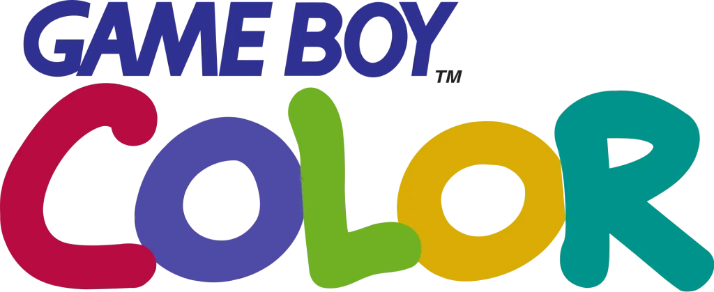
The Game Boy Color logo is similar to the Game Boy Advance logo, featuring a stylized “Color” accompanying the Game Boy wordmark. However, the Game Boy Color logo is distinguished by its use of vibrant colors, reflecting the console’s ability to display a wider range of colors than its predecessor. The logo’s colorful design was intended to appeal to a younger audience and to emphasize the console’s enhanced gaming experience.
Nokia N.Gage
The Nokia N.Gage logo featured a stylized “N.GAGE” that was designed to resemble a modern mobile phone. The logo’s integration of the letter “N” with the phone shape effectively conveyed the device’s dual functionality as both a mobile phone and a gaming console. The logo’s bold and modern design reflected the Nokia N.Gage’s positioning as a cutting-edge device.
Game Boy
The original Game Boy logo featured a stylized “Game Boy” wordmark at the bottom of the screen. The design was meant to appeal to gaming enthusiasts of that era, considering it was a revolutionary device of that time. The logo’s simple and straightforward design was effective in conveying the Game Boy’s core purpose.
PlayStation Vita (PS VITA)
The PlayStation Vita logo features a stylized “PSVITA” that was made to look as if written in futuristic monospaced fonts. The logo was designed to carry over the Play Station’s aesthetic and design style, symbolizing the console’s ability to provide a healthy dose of gaming entertainment. The logo’s bold and modern design reflected the PlayStation Vita’s positioning as a high-end gaming console.
Nintendo 3DS
The Nintendo 3DS logo featured a stylized “3DS” that accompanied the Nintendo logo. The logo’s design emphasized the console’s ability to display 3D graphics, differentiating it from its predecessors. The logo’s use of bold colors and a dynamic layout made it visually appealing and memorable.
PlayStation Portable (PSP)
The PlayStation Portable logo featured a stylized “PSP” lettermark that spelled out the initials for the handheld console’s full name. The lettermark was designed to resemble the shape of the console itself, reflecting the PSP’s stylistic aesthetic. The logo’s bold and modern design conveyed the console’s positioning as a powerful and versatile gaming device.
Valve Steam Deck
The Valve Steam Deck logo features a stylized “D” that is made up of an inner sphere and an outer hemisphere. The logo is designed to resemble the shape of a joystick controller on a mouse-like device, referencing the company’s name and its roots in PC gaming. The logo’s bold and modern design reflects the Steam Deck’s positioning as a powerful and versatile handheld gaming console.
The Best Gaming Logos for Famous Clans and Groups in MMORPGs
Cloud 9
Cloud 9’s clan logo is simple, yet highly memorable. Using a trio of blue-colored nines, the clan has arranged them in a way that makes the design look like a simple, fluffy cloud. And for a logo representing a fairly old gaming clan, it is the perfect representation of old-school simplicity meeting modern design philosophy.
Gorillaz-Pride
The gaming logo for Gorillaz Pride, also called G-Pride, features a snarling, muscular great ape crouching over the cracked stone wordmark of the clan’s name. Aggressive, vicious, and embodying a strong energy within its design, this logo is perfect for a team that is known for its aggressive gameplay, albeit intermixed with intelligent strategies.
Houston Outlaws
Houston Outlaws are a team that specializes in first person shooting games. And their logo is an obvious example of their game preference. However, it is the mix of two different concepts into a seamless design is what sets it apart from many other gaming logos.
Hailing from Houston, Texas, the logo for this gaming clan features two revolvers shown side by side, forming a steer head. The base of the handle of both pistols are small yet vicious curving horns, with a single, five-point star at the top of the logo making it perfect as Texas-style or Houston logo design.
Fnatic
Fnatic is by far, one of the oldest gaming clans still in action today. Playing a variety of games throughout their life, the team features an abstract, somewhat Japanese design within their logo. And though the design is not as on-the-nose as some of the other gaming clan logos, the pale orange design with its smooth strokes and a minimalist wordmark are perfect for such a gaming clan with such legacy.
Astralis
With a name like Astralis, the ideal logo would feature an astral body or entity. And that is the case with this gaming clan logo too. The design features a single white star, bound within three interlocking red triangles. The shape and geometry of the triangles is made to mimic the rays of light emitting out of a bright star, representing a comparatively young gaming clan who strives to shine bright.
How to Design Custom Gaming Logos?
Now that we have looked at some of the best custom gaming logos we can see around us, the next step is to know how to design such a branding symbol for your product. There are multiple ways for a company to get a great logo designed within their budget.
Let’s take a look.
Using an Online Gaming Logo Maker
Online logo maker tools are quite common nowadays, with many brands offering their own version of logo maker for those who want to create a simple and economical logo. However, as these online gaming logo makers create a design using pre-drawn images and elements, there is a chance that your final logo might not look that great. However, if you want a logo quick, they are your best option.
Hiring Freelance Gaming Logo Designers
If online logo makers are not what you prefer, then you can hire freelance designer to create your logo for you. Freelance gaming logo designers are individuals who offer their logo design services online for those looking to hire one. Unfortunately, the biggest drawback of hiring a freelancer is that the quality of the services can vary hugely from individual to individual making it hard to ensure good quality.
Opting for a Professional Gaming Logo Design Company
Finally, if you have the budget for it, you can hire a professional logo design agency to create your logo for you. These agencies have teams of professionals who specialize in designing high quality logos for their clients, making it easy to gauge the quality of their work.
Which of the Gaming Logos Listed Above Do You Think Is the Best?
Creating the perfect logo that represents your brand properly can be a hard task. Look at the various superhero logos we see around us on clothing, toys, and even onscreen. With hundreds of comic book characters out there, there is a reason that only a few have reached a cult status with their symbol.
That is because those characters have a symbol that represents their true essence, and are now synonymous with their identity. That is what defines a great logo, and that is exactly what the famous gaming logos we have discussed embody.
Frequently Asked Questions
| 1- How do I make a logo for my YouTube gaming channel? There are many ways you can create the perfect gaming logos for your YouTube gaming channel. – Look online for inspiration about what to include in your gaming logos – Create a design brief listing your idea, your vision for the finished design, and everything else you feel would help you create the perfect logo. – Create your own logo/use a logo maker/hire a logo designer to create your logo. |
| 2- How can I create a logo for free? You can use a variety of online logo makers to create your logo for free. However, for high quality images or design files, you will be asked to subscribe or pay for the service. |
| 3- Is Canva free to use to design your gaming logos? Yes, Canva is free to use for all. However, it does give you an option to upgrade for more features if you require them. |
| 4- How do you make a neon game logo? In order to create neon colored gaming logos, there are many YouTube tutorials online which can help you create the perfect logo you desire. The simplest explanation however, is to use the right color for the neon affect, as well as playing with the shadows and depth at the edges of the design to give it the right look. |
Latest news you want to know!
Subscribe for cutting-edge design inspiration at Logo Poppin! Elevate your brand with updates on logos, branding, web design, and video animation.
Note that by clicking “subscribe,” users may agree to our privacy policy and consent to Logo Poppin to use your contact data for newsletter purposes.
Logopoppin
Logopoppin is a graphic design agency that specializes in logo designing, web development, video production and advanced branding services. We love to innovate businesses with new age technologies, allowing them to improve their visual reputation.

