Table of Content
Discover How the General Mills Logo Has Evolved to Represent Its Brand Over the Years
The General Mills logo stands as one of the most recognizable symbols in the American food industry, representing over 150 years of culinary heritage and innovation. From its humble beginnings as a flour mill along the Mississippi River to its current status as a global food giant, the company’s visual identity has evolved through six distinct iterations, each reflecting the changing landscape of American consumer culture.
What makes the General Mills logo particularly fascinating is how it has maintained its core identity while adapting to contemporary design trends and business transformations. The iconic “Big G” has become synonymous with quality, trust, and family values, appearing on everything from cereal boxes to corporate communications worldwide.
Today’s General Mills logo represents more than just corporate branding—it embodies the company’s commitment to “Making Food People Love,” a mission that resonates with millions of families across the globe and demonstrates the power of thoughtful logo design in building lasting brand connections. Let’s explore its transformation from the lens of a logo design agency today.
The Origins of the Brand and the First General Mills Logo Design
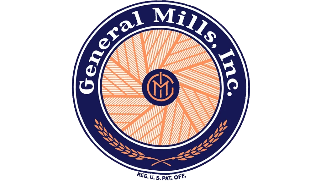
The story of the General Mills logo begins in 1928 when four milling companies merged to create the food conglomerate we know today. The original General Mills logo featured a distinctive blue ring design that directly referenced the company’s agricultural roots and flour milling heritage.
This inaugural logo showcased a stylized mill wheel with orange and white striped “petals” arranged in a circular pattern, symbolizing the company’s foundation in grain processing. At the center, a smaller navy blue circle contained the monogram “GMI” (General Mills Inc.) in orange lettering, creating a balanced and meaningful composition that spoke to the company’s industrial origins.
The design also incorporated two wheat ears at the bottom of the blue ring, reinforcing the agricultural connection, while the company name “General Mills, Inc.” appeared in white lettering across the top. This comprehensive approach to logo design established early precedents for how the brand would communicate its values and heritage through visual elements.
Evolution Through the Mid-Century Period
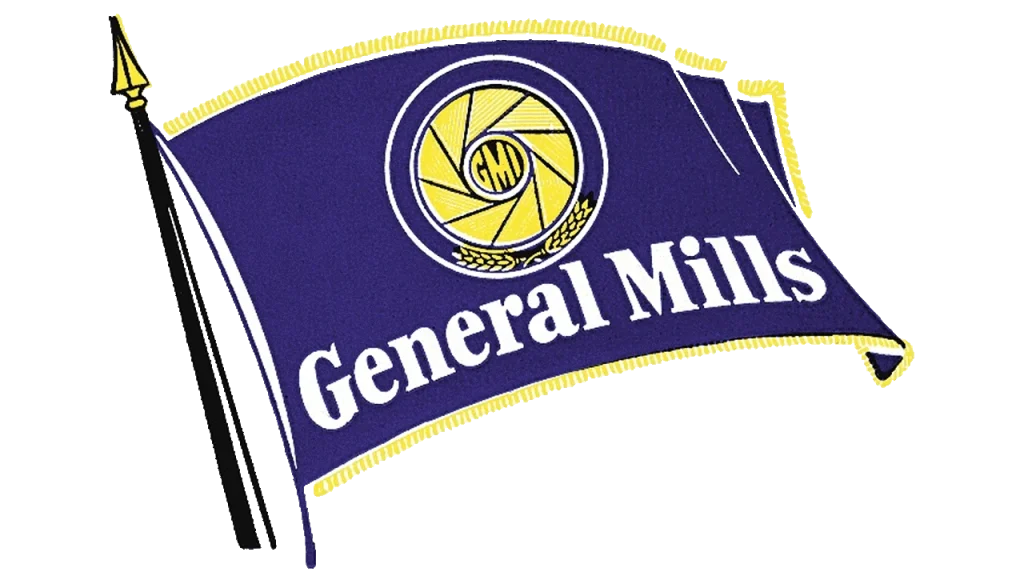
The 1940s brought significant changes to the General Mills logo as the company expanded beyond flour milling into packaged foods and convenience products. The second iteration featured a dynamic blue flag design with gold borders, transforming the static mill wheel into a more animated symbol that suggested movement and progress.
During this period, the orange elements from the original design were replaced with yellow, and the mill wheel components became solid triangles rather than striped petals. This flag-based logo design reflected the company’s growing national presence and its emerging role in American households through products like Bisquick, introduced in 1931.
The flag design served dual purposes: it maintained visual connection to the company’s heritage while suggesting forward momentum and American values. The addition of a flagpole with an arrowhead tip emphasized direction and purpose, qualities that would become increasingly important as General Mills diversified its product portfolio throughout the 1940s and 1950s.
The Television Era and Modern Simplification

The 1950s marked a pivotal moment in American media consumption, and the General Mills logo evolved to meet the demands of television advertising. The company introduced a simplified design featuring a blue rectangle with rounded corners and a thick yellow frame, optimized for broadcast visibility and recognition.
This television-friendly logo placed the company name in bold white sans-serif lettering across two lines, with “General” appearing smaller above “Mills.” The design included an oversized yellow dot above the letter “i,” creating a distinctive visual element that would help viewers identify the brand even at small sizes on early television screens.
General Mills was particularly forward-thinking in this era, as the company owned and produced its own television programming and maintained an entire division dedicated to animated content. This media involvement directly influenced their logo design choices, demonstrating how technological advances in communication can shape brand identity decisions.
The Birth of the Iconic “Big G”

The most significant transformation in General Mills logo history occurred in 1959 with the introduction of the famous “Big G” logo symbol. This stylized, handwritten letter “G” first appeared on Twinkles cereal boxes and quickly became the cornerstone of the company’s visual identity, representing their promise of goodness and quality.
The Big G was developed as part of the company’s cereal marketing strategy, accompanied by the memorable slogan “The Big G stands for goodness.” This logo element proved so successful that it transcended its original cereal packaging application and became the central element of corporate communications and advertising campaigns.
President Edwin Rawlings recognized the power of this simple yet distinctive symbol and commissioned the New York advertising firm Lippincott & Margulies to adapt it for corporate use. The agency strengthened the “G” by thickening its blue lines, creating more rounded curves, and optimizing its proportions for various applications, resulting in a timeless design that would endure for decades.
Contemporary Refinements and Brand Evolution

The 1960s through 1980s saw various refinements to the General Mills logo as the company continued expanding its product lines and market presence. The cursive “G” was paired with different typographic treatments, including bold sans-serif wordmarks and various color combinations that maintained brand consistency while allowing for tactical flexibility.

During this period, the logo underwent several subtle modifications, including changes to the accompanying typography and the introduction of red accent elements in some applications. These variations allowed the brand to maintain freshness and relevance while preserving the core recognition value of the Big G symbol.

The 1989 modification brought a softer, more contemporary feel to the logo, with the Big G rendered in a slightly more approachable turquoise color. This change reflected broader design trends toward warmer, more human-centered branding approaches that were becoming popular in corporate America during the late 1980s.
The Pillsbury Acquisition and Visual Integration
A major chapter in General Mills logo history occurred in 2001 when the company acquired Pillsbury from Diageo. This acquisition necessitated a integration of two strong brand identities, resulting in another official wordmark logo design that honored both companies’ heritage while creating a unified visual system.

The post-acquisition General Mills logo adopted the deep navy blue color from Pillsbury’s branding, creating visual harmony between the two companies’ product lines. Additionally, the logo incorporated a series of 24 dots beneath the Big G, derived from Pillsbury’s distinctive “barrelhead” logo, symbolizing the continuing growth and progress of the combined organization.
This strategic logo evolution demonstrated how major corporate acquisitions can be reflected in brand identity while maintaining the core elements that consumers recognize and trust. The integration was subtle enough to preserve brand equity while clear enough to signal the expanded capabilities and product range of the merged entity.
The Heart-Centered Modern Design
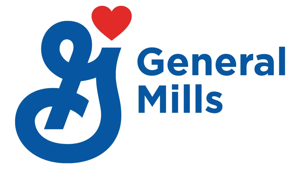
The most recent transformation of the General Mills logo occurred in 2017 with the introduction of the sixth official company logo, featuring a small red heart positioned near the top of the familiar cursive “G.” This addition marked a significant emotional evolution in the brand’s visual communication strategy.
The red heart symbol was carefully positioned to complement rather than compete with the established Big G, creating a design that honors tradition while clearly communicating the company’s renewed focus on love and care in food production. The accompanying wordmark utilizes Gotham Bold typography, created by renowned type designer Tobias Frere-Jones, lending contemporary sophistication to the overall design.
This current logo iteration includes the tagline “Making Food People Love,” which reinforces the emotional connection suggested by the heart symbol. The complete logo system demonstrates how established brands can evolve meaningfully without abandoning the equity built up over decades of consistent use and consumer recognition.
Color Psychology and Brand Significance
The General Mills logo color combinations strategically employs blue and red against white backgrounds, creating a classic tricolor scheme that communicates professionalism, trustworthiness, and passion. The navy blue (#0655A3) establishes credibility and stability, while the red (#E22027) adds emotional warmth and energy to the overall composition.
Blue has historically been associated with trust, reliability, and corporate strength, making it an ideal choice for a company that has been serving families for over a century. The specific navy blue shade used in the current logo was inherited from the Pillsbury acquisition, creating visual continuity while honoring the heritage of both companies.
The red heart element serves multiple symbolic purposes: it represents love, care, and the company’s commitment to family values, while also creating visual interest and differentiation in crowded marketplace environments. This color combination has proven effective across diverse cultural contexts and international markets where General Mills operates.
Frequently Asked Questions
| When was the General Mills logo first introduced? The first General Mills logo was introduced in 1928 when four milling companies merged to form the corporation. This original design featured a blue ring with a stylized mill wheel, orange and white striped elements, and a central monogram “GMI” in a navy blue circle. The logo reflected the company’s agricultural roots and flour milling heritage, establishing the foundation for all subsequent logo iterations. |
| What does the “Big G” in the General Mills logo represent? The “Big G” represents “goodness” and was first introduced in 1959 on Twinkles cereal boxes with the slogan “The Big G stands for goodness.” This stylized, handwritten letter “G” became the cornerstone of General Mills’ visual identity, symbolizing the company’s promise of quality and reliability. The Big G has remained the central element of the logo through all subsequent redesigns, demonstrating its enduring brand value. |
| Why did General Mills add a heart to their logo? General Mills added a red heart to their logo in 2017 as part of their sixth official logo redesign to emphasize their mission of “Making Food People Love.” The heart symbol represents love, care, and the company’s commitment to family values and quality food production. This addition reflects the brand’s emotional connection with consumers while maintaining the recognizable Big G that has been central to their identity for decades. |
| What fonts are used in the current General Mills logo? The current General Mills logo uses Gotham Bold typography, designed by Tobias Frere-Jones. This modern, clean sans-serif font provides excellent readability across various applications while maintaining professional authority. The font choice reflects contemporary design trends while ensuring the logo remains legible at different sizes, from large-scale signage to small package applications. |
| What do the colors in the General Mills logo mean? The General Mills logo uses a strategic color palette of navy blue (#0655A3) and red (#E22027) on white backgrounds. The navy blue represents trust, reliability, and corporate strength, while the red symbolizes passion, energy, and love—particularly evident in the heart symbol. This classic tricolor scheme (blue, red, and white) communicates professionalism, nobility, freedom, and trustworthiness, making it effective across diverse cultural contexts and international markets. |
Conclusion
The General Mills logo represents one of the most successful examples of brand identity evolution in corporate America, demonstrating how thoughtful design can bridge past and present while maintaining strong consumer connections. From its origins as a mill wheel symbol to its current heart-enhanced Big G, the logo has consistently reflected the company’s values and market position.
The journey of the General Mills logo offers valuable insights for other brands seeking to balance tradition with innovation, showing that meaningful evolution is possible when guided by clear strategic vision and deep understanding of consumer expectations. The logo’s enduring success validates the importance of investing in distinctive, memorable brand symbols that can adapt to changing market conditions while preserving their core identity.
As the food industry continues evolving with new technologies, distribution channels, and consumer preferences, the General Mills logo stands as a testament to the power of consistent, thoughtful brand stewardship. Its continued recognition and positive associations position the company well for future growth while honoring the heritage that has made it an American icon.

Logopoppin
Logopoppin is a graphic design agency that specializes in logo designing, web development, video production and advanced branding services. We love to innovate businesses with new age technologies, allowing them to improve their visual reputation.


