
Table Of Content
Discover How to Design Awesome Gradient Logos for Your Business
Many fads, options, and trends are common in the logo design world, and one of them is the gradient logo design. And it isn’t that uncommon either. Brands like Instagram and Tinder both use this technique within their logos to great effect.
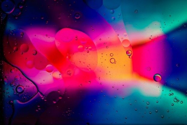
But what exactly are gradient logos? And why are they so popular among brands big and small? Well, a gradient logo is one where the colors slowly transition into one another, whether it depicts the idea using multiple shades of the same color, or different colors altogether.
With many logos out there using the same style of coloring for their brand designs, the businesses that use gradients within their logo have a unique advantage of standing out from the competition. Using their uncommon coloring style, they can attract consumers to their brand easily.
However, it doesn’t work for all kinds of logos. Therefore, it is important to know when and how to use gradients when designing your logo. Let’s take a look at some of the most popular logos that use gradients within their arsenal.
1- What Does Gradient Logo Design Entail?
As we mentioned earlier, these designs have colors that slowly blend into one another, rather than being placed besides each other. Now, we aren’t saying that placing individual colors side-by-side without blending them is bad, because as portrayed by Google, that can work its own charm. However, for most designs, where you want to draw the eye smoothly down a design in a certain manner, gradients have the ability to do so.
Now, it’s a difficult thing to plan and do yourself, especially if you are not a graphics design expert. That is why its preferred to hire a professional logo design agency to make it for you, if that is what suits your brand aesthetic.
But the question arises – what exactly is classified as a gradient?
Gradients – What are they?
The answer to that question is quite simple. In the world of design, gradients are found in many different styles.
We have gradients where analogous or complementary colors blend into each other. We also have gradients that fade into transparency. Finally, we can also find some designs where the subtle change in shade to mimic a metallic sheen is used, which is another way of using a color gradient.
Moreover, there are three main gradient techniques, through which you can structure and stylize your color gradients easily. They include:
- Linear
- Radial
- Conic
Therefore, overall, there are a lot of ways you can use a color gradient in your logo design. The question is, which style suits your logo’s aesthetic, if a gradient suits it at all.
2- When Should You Opt for Gradient Logos?
As we mentioned earlier, gradients are a great way to get noticed by consumers if you want your business to stand out. That is because unlike the traditional flat designs for logos, gradient logo design adds a touch of depth to the design.
Take a look at the logo for Meta’s Messenger above. The gradient at the edges gives it more of a spherical look than a traditional circular look. In fact, it looks more like a bubble than it does a flat, 2D circle.
However, just needing to stand out from the crowd isn’t reason enough to opt for a gradient logo. As we have said repeatedly, you need to be sure that this specific style of logo design suits your brand aesthetic, and has the right impact on your target consumers too.
Lets take an example of corporate law firm that wants a plain and simple logo to match their aesthetic. Their brand has no need for gimmicks and tricks in design to attract customers, opting for a gradient may actually backfire and lose them leads as their clients might think them unprofessional.
On the other hand, a gradient for something like fitness logos or candy shop logos may be just the thing that brand needs to stand out and grow their business. In fact, it is said that a gradient logo design is highly likely to work for you if:
- Your logo is going to be used primarily online
- Your business is part of a highly creative business niche
- The design includes some symbol or other visual graphics
- The design is simple
Even if a gradient suits your brand aesthetic, you need to ensure that it doesn’t take away from your brand message. Color gradients are a visually overpowering element that can take over a design quite easily if not restrained. So its better if they are used as a secondary element, and sparingly, rather than using them as a central element.
Let’s take a look at some of the most popular brands with gradient logos and figure out how their gradient works for them.
3- Top Brands That Use Gradient Logo Designs
Now that we know how a gradient can help your logo designs pop, let’s take a look at some of the top brands whose logos feature color gradients to great effect.
Firefox
The fox encircling the world is a symbol that many from the millennial and Gen-Z have been seeing for a long time now. This logo by Mozilla for its Firefox browser is a perfect example of a gradient logo design executed perfectly. Let’s start with the globe in the middle first.
We call it a globe because the deep purple on one end going towards a redder tint on the other side makes the halo look more three dimensional instead of a flat circle. Similarly, the gradient on the orange fox is designed in such a way that the dark orange melds smoothly into the lighter shades, going so far as to achieve a light and bright yellow at the very tip of the fox’s tail.
This example can be considered one of the most iconic gradient 3D logos.
Instagram’s logo is another great design by the Meta family, who gave us the Messenger logo we discussed earlier. The style of gradient used here doesn’t give as strong of a three dimensional fell as the Firefox logo, however, you cannot say that it looks flat either.
The gradient is designed in such a way as to make the colored elements pop up and above the white background. In fact, we can say that it looks more like an acrylic sticker on a paper, where the top gel encasing gives the design a rounded and pop-up feel.
Overall, this is another great example of using gradients in a unique manner.
Apple Music (iOS 10-13)
The Apple Music icon from iOS 10 to iOS 13 was simple, yet quite impactful. The design of the logo was to color the musical note of the symbol in a soft gradient, which would be overlaid over a soft, silver-white background.
Now, it may seem like it is a very conservative approach to using a gradient, and you may be light. But despite that, the impact of this design was massive. That pop of color over the silvery-white background heightened the visual impact of the logo, and made it easy to discern and recognize among a clutter of apps and icons on display.
We can say that despite using a gradient, they can still be considered one of the most impressive minimalist logos.
Tinder
Tinder’s logo is a study in itself, with a small icon accompanying the wordmark, but one that incorporates a lot of subliminal messaging within it. The flame graphics used here in this dating app logo go from the pinkish-orange on one side to a light red-orange on the other, signifying the flames of passion, making it the best business logo ideas for an innovative dating app.
Unlike the ones we have seen earlier, the gradient here isn’t designed to make the design look three dimensional. In fact, the symbol is surprisingly flat, despite the fact that with a little tweaking, getting a 3D effect wouldn’t have been difficult.
All in all, this uncommon style of gradient ensures that the logo stays unique and instantly recognizable.
Avon
Avon’s logo is another prime example of a well-designed gradient logo that isn’t looking to make itself three dimensional. If you look at the design above, the linear gradient of color going from the darker on the left with the purple to lighter on the right with a reddish-pink, the overall design is one that immediately guides the eye from left to right.
Moreover, the contrasting sharp angles and soft curves of the wordmark design makes it the perfect visual element to uplift the impact of such a great skincare logo. And with Avon being a major player in the cosmetics and beauty industry, the logo is a great example of beauty in simplicity.
4- Four Tips to Create a Gradient Logo Design Your Brand Needs
Now that you have looked at how some of the top brands use gradients to increase the impact of their logos, you need to know how to design a logo that uses a gradient effectively.
Listed below are four of the most important tips you should follow when looking to create a gradient logo design.
Focus on the Contrast
Contrast is very important when it comes to creating a gradient. Your colors need to be legible and pop over the rest of the design. Otherwise, if your colors all meld into one another, it would fail to draw the viewers’ eyes to the focal element of your brand symbol. Moreover, they should match the intent of your business based on the logo color meanings generally considered in the design industry.
Choose Your Color Palette Carefully
Secondly, you should choose your color combinations carefully. Choosing a contrasting shade isn’t a difficult task. But choosing one that contrasts with your primary color, yet still manages to combine the design into a cohesive whole without taking away from the logo’s message; now that requires careful attention.
Test out Your Design in Black and White
Another important factor when looking to create your gradient logos, is to check if the design still works using a black and white palette. The reason for that is quite simple. There are still some mediums that require a monochromatic color scheme, often that of black on white or vice versa.
Now, your design should be robust enough, and not rely on the gradient so much so that if you use a black and white scheme, it loses its impact altogether.
Ensure that it is Legible
Finally, it Is very important that your overall design of the logo be completely legible, and that your gradient of choice doesn’t make it hard to see and understand. The logo fonts you use should be clear and easy to recognize, your color scheme should be one where all elements are viewable easily.
Moreover, you need to ensure that the minute elements of your design are still visible and legible after you use your color gradient. Also, it should match the aesthetic of your overall design and business.
Conclusion
In short, creating a gradient logo design for your brand symbol is not a difficult task, if you know how to make the process work for you. However, you need to ensure that your brand needs it for the right reasons, and that a gradient matches the aesthetic of your company.
If you fulfill both scenarios, then you can use the tips given above to create a great gradient logo easily, just like the many logo examples above.
People Also Ask (FAQs)
| 1- How do you make a gradient logo? In order to make a good gradient logo, you need to ensure that: – The design is simple – The contrast is just right – The design works as a solid and in black and white – Choose the right color palette – And represents your brand aesthetic perfectly |
| 2- Are gradients okay for a logo? Yes! Gradients are great for logos, especially if you know exactly how to use them to your advantage. Many brands including the ones above use gradients to great effect in their logos. |
| 3- Are gradients still trendy? Gradients are still a trendy design style, especially since there are so many ways to employ a gradient within the design of your logo or other graphics. In fact, they are a great way to incorporate some style into an otherwise plain design. |
Latest news you want to know!
Subscribe for cutting-edge design inspiration at Logo Poppin! Elevate your brand with updates on logos, branding, web design, and video animation.
Note that by clicking “subscribe,” users may agree to our privacy policy and consent to Logo Poppin to use your contact data for newsletter purposes.
Logopoppin
Logopoppin is a graphic design agency that specializes in logo designing, web development, video production and advanced branding services. We love to innovate businesses with new age technologies, allowing them to improve their visual reputation.

