Table Of Content
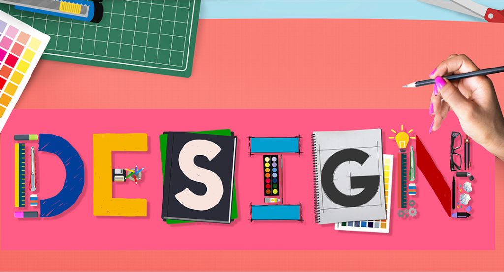
Discover the Top Design Terms and Phrases That You Should Know as a Marketing Specialist
In today’s fast-paced and competitive world of content creation, it is paramount that marketers are up to date on the latest design lingo. And there are multiple reasons for that. First, marketers and brands today collaborate with a variety of content producers and influencers who know design, and it helps communicate with them better if you understand what they are talking about. Secondly, designers are an important resource in marketing nowadays, and being able to communicate with them in their own terms helps get the point across quicker.
And there are several other reasons why knowing these graphic design terms can be of a huge advantage to a marketer. Many digital marketers are content creators as well, as it is a common practice nowadays that such professionals try and build their own personal brands in their down time. Therefore, being adept at graphic design tools and understand the language that goes with it goes a long way towards helping them grow.
So now that you know the importance of knowing these design terms, let’s take a look at some of the most important terms that anyone in the marketing and branding services industry should know.
1- Why is Knowing Graphic Design Terms Important?
Before we get to the list of terms and phrases that you should know when working with designers, let’s try and understand why are these graphic design terms so important. Today, its more common for small, cross functional teams working together on specific projects that independent departments, especially in the marketing and branding industry. A usual team may consist of a number of marketing professionals, some designers, and other relevant resources needed to fulfill a project.
In such scenarios, the ability to communicate and understand each other is paramount to the success of the project, which would be difficult if the team lead doesn’t know something as simple as the difference between jpeg vs png. Generally, it is up to the team lead or project lead to facilitate this communication, which in the aspect of marketing is usually the senior marketer on the team.
Therefore, it is very important that the marketer is able to convey the project needs to the designers successfully, and the marketers are able to communicate with the rest of the team clearly.
So what are the actual design terms that you should know as a marketer? Let’s take a look at some of the more popular ones you’ll come across in your everyday business.
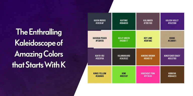
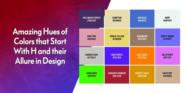
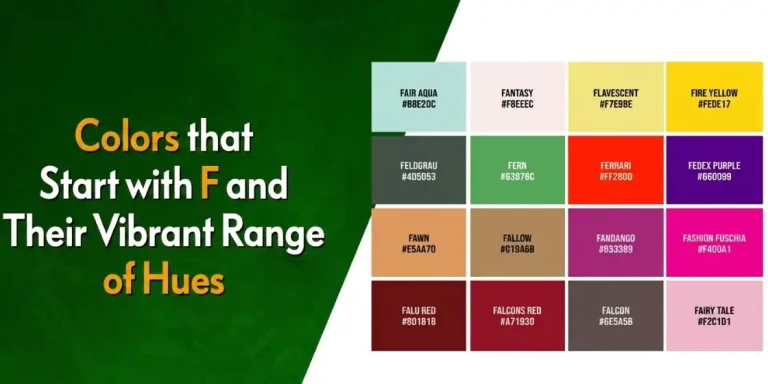
2- 20+ Graphic Design Terms You Should Know
Let’s start out with some of the most common terms that a non-designer might have to use and understand when regularly working with designers or design deliverables. The list below contains terms that refer to general design domains like art, typography, color theory, and more.
Let’s take a look.
Rule of Thirds
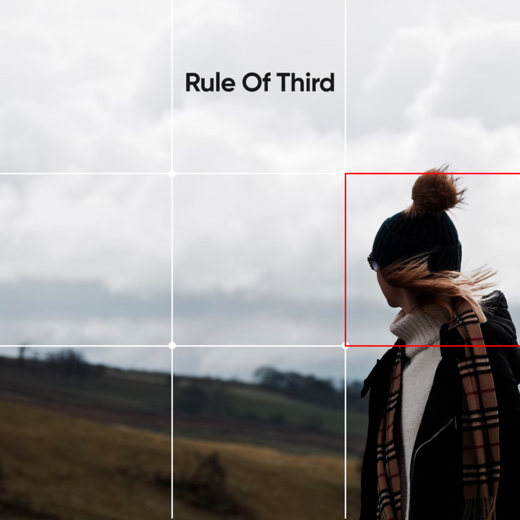
The first one on this list is the rule of thirds. In design, and in nature too, we will see that the number three has a significance. From three dimensional and faceted items around us, to the creation of art with elements that come in groups of threes, we see a lot of that number around us.
So what is the rule of thirds? Basically, it means to use a three-by-three grid overlaid over a design, which allows the placement of various design elements easily and properly within the confines of the canvas without overcrowding. The intersection points of the lines are your prime focal points where the viewers eyes will go, and where tour primary elements need to be.
Typography
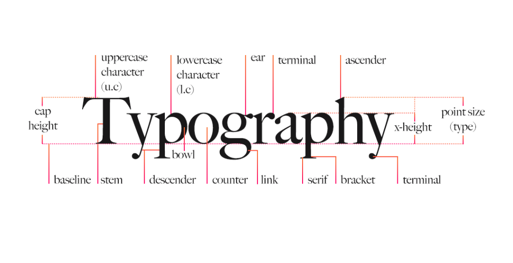
Next up, is typography. To put it simply, typography is the visual element of any kind of text you see around you, whether it is in print, digital screens, billboards, merchandise, or more. Wherever a designer has added text, they will have used a font. The visual aspect of that font, is what’s known as typography.
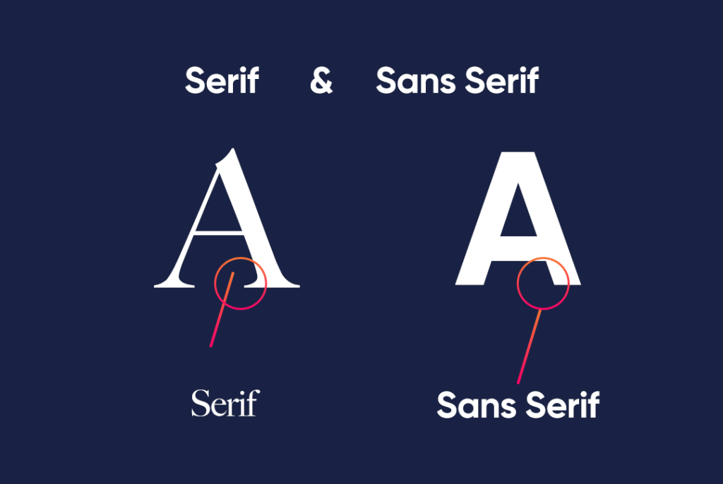
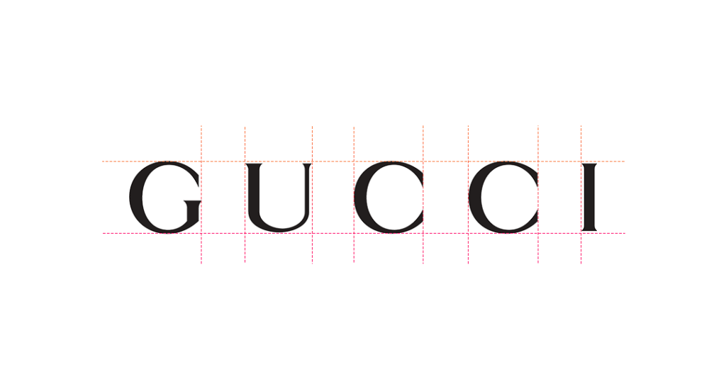
Serif & Sans Serif
Serifs are extra strokes or curves that continue the stroke of the letter or character being drawn. Usually found at the ends of the characters, their presence and absence can make a sizable impact on the message and tone a designer is trying to portray with their typography.
For a long time now, sans serif, meaning without serif, fonts have been in vogue with designers and consumers alike. However, in recent years, serif fonts have seen a resurgence in many different avenues, such as for logo fonts, merchandise fonts, and even billboards and signage fonts.
Monospace
A monospaced font or script is also known as fixed width or non-proportional font. Its characteristic style consists of each individual letter or character of that font occupying the same horizontal space in their design, meaning that while the vertical coverage changes from character to character, the width is uniform.
These fonts are great for applications where you need to know the horizontal space required within a design for your text.
Slab Serif
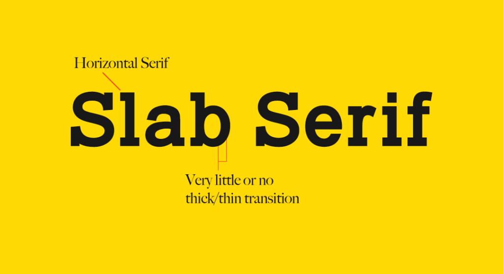
Slab serif fonts are a type of serif fonts, but have a unique look that separates them from the traditional serif or sans serif fonts. What makes it so different is that unlike the classic examples, slab serif typefaces are more geometrically inclined, and are thus more prominently bold or rectangular.
This results in them having a higher rate of legibility, making them a great choice for applications where quick identification and comprehension is required, such as signage and billboards.
Kerning
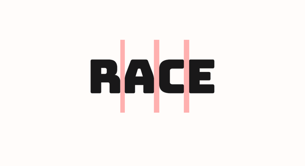
Kerning is another important term related to fonts and typography. It refers to the empty space between two specific letters or characters within the text. The purpose of adjusting the kerning is to make the text more legible.
Often the more ornate fonts or ones with lighter strokes have a design that is hard to decipher at a glance. By adjusting the kerning, a designer can tune how quickly someone is able to recognize and read it.
X-Height
The X-height is a term that is often thrown around by designers when discussing the aesthetics of a design and the text on it. But most marketers or non-designers are not aware of its meaning. Basically, the X-height is the distance between the baseline, or bottom of the line for your text, and the mean line for the lowercase letters of your font.
Lorem Ipsum
Who in the design and marketing world doesn’t know the wonder that is lorem ipsum? For those who aren’t aware, it is a simple dummy text that is used in place of actual text in design mockups. Its purpose is to show how the text would look in terms of the complete design, so that the necessary tweaks can be made before getting on with crafting the desired text copy.
What makes it so popular over other dummy text examples is that its words have a natural distribution of characters and letters, which makes it quite similar to actual English. This makes it look more natural to the eye than for something like [Text here] sprinkled throughout the design.
RGB
RGB stands for Red-Green-Blue, which are considered the three primary colors needed to make any other shade in the visible color spectrum. By mixing various concentrations of each shades, this color scheme can come up with some amazing color combinations.
The specific color mix for each shade produced has a unique hex code, which can be used to replicate that same exact shade in any other computer or design setup. That is why digital designers generally prefer RGB over other schemes like CMYK or Pantone, which are more suited to the print world.
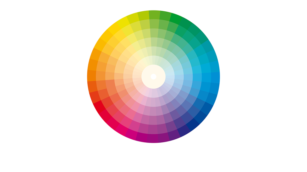
Color Theory
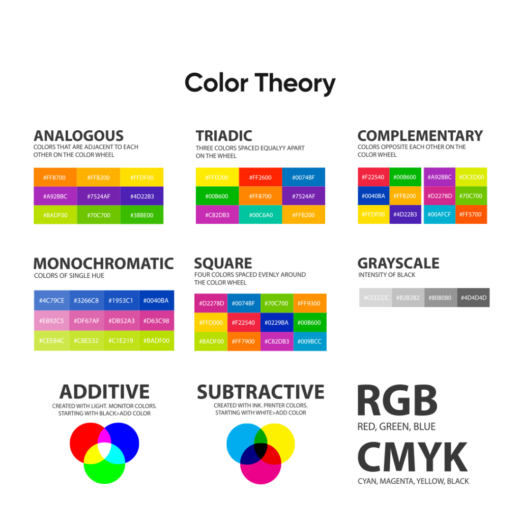
Color theory is a fundamental part of the world of graphic design. They provide us with a logical, structurally sound reason for why we should or should not use a color in a design. And considering that definition, we can see how important a tool it can be for marketing too.
The design of your art is important, there is no doubt about that. But the elements that support it, such as the fonts, the colors, and even the placement of the elements plays a huge part in how viewers perceive that design. Therefore, in order to ensure that the right brand message is portrayed, we need to use the tenets of color theory.
Hex
As we mentioned earlier, a hex code is a six-character code that is used in the digital world, especially in web and graphics design including HTML and CSS. Its purpose is to denote specific shades of color generated using various color schemes, most popular of which are RGB and CMYK. There are many graphic design websites where you can find hex codes for specific shades of color, or look up color names against hex codes, which makes the process easier for everyone.
Monochrome
Monochrome is a common terminology, not just in the design world, but in life generally too. the term is quite simple to understand, considering that it is a portmanteau of two words; mono and chrome. Mono means single, while chrome refers to a color.
So essentially, it means one shade. So how does that work in design? Well, monochrome color palettes use a single color in its design, or even multiple shades of the same color, in order to give a depth and uniqueness to the design.
Palette
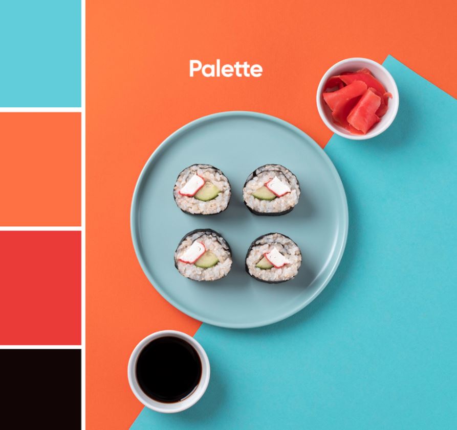
The color palette refers to the set of colors a designer chooses for their specific design project. it usually consists of a group of colors chosen based on one of the many contrasting techniques such as analogous, complementary, and triadic etc.
The purpose of a color palette is to have a set of colors and shades that work well with each other, and are suited to the aesthetic of your design based on their color meanings in order to highlight your brand in the best light.
Analogous
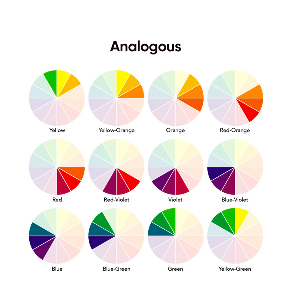
When we mentioned color theory, we also saw terms like analogous, triadic, complementary etc. But what does that mean? Well, to put it simply, analogous technique is a color palette choosing technique where colors are chosen based on their adjacent shades on the color wheel.
For example, if we choose the color yellow, we can only choose the shades that are right beside it, either to the left or to the right of it. The beauty of this technique is that it is simple, and allows designers to create comfortable designs easily.
Complementary
Complementary color choosing technique is another one used by designers to select their color palette. it is based on the theory that colors opposite to each other on the color wheel complement each other, and that their color meanings can be used to enhance the overall impact of the design.
Gradient
A gradient is often a source of confusion between designers and non-designers. People generally consider a gradient to be consisting of an abrupt change in colors of a design, with many people even considering the color scheme for Google’s product logos to be a gradient.
However, a true gradient is far from abrupt. It is a gradual and soft change of shade or color, or the lightening of a shade into transparency. They are usually found as two variants; linear, or radial. And they are one of the popular logo design trends of recent years.
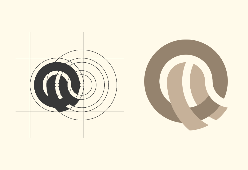
Logotype & Logomark
A logotype is simply the stylized form of the brand or company that is often unique to that specific business. The company to represent their business, especially when the logotype itself is the brand’s primary logo generally uses it.
A logomark on the other hand is simply the icon-based representation of a brand. It does not have the name of the company as part of its design, and can be used alone as the brand signifier. A great example of this is the Nike swoosh, which can be connected to the brand with or without the name of the business accompanying it.
Style Guide

A style guide is an extremely important tool that helps marketers and designers follow a single creative direction within a project. It details the standards, best practices, and preferences for all design elements in your project that are going to help with other brand designs.
Designers can use these guides foe unique website or flyer design tips to ensure that they match the rest of the brand aesthetic.
Grid
A grid in design is the division of the canvas in equally spaced rows and columns, such as the rule of thirds grid we discussed earlier. It purpose is to ensure that that designers are able to arrange the elements in a consistent and eye-pleasing manner.
Using a grid to structure your art is one of the tenets of the principles of design taught to every budding graphic designer. This helps center the focus of the viewer onto the essential part of the design, while letting everything else fade into the background.
Scale
In the world of design, the scale of an object refers to its size in relation to another element. So if the two elements are the same in size in relation to each other, they have a 1:1 scale. However, if the second element is twice as big as the first one, we can say that the two have a 1:2 relationship.
Scale can be an important tool when it comes for an artist to find the balance in design. Often, an element stands out after tweaking it a little. And changing its size is one of the easiest and most visually apparent method you can use.
Vector
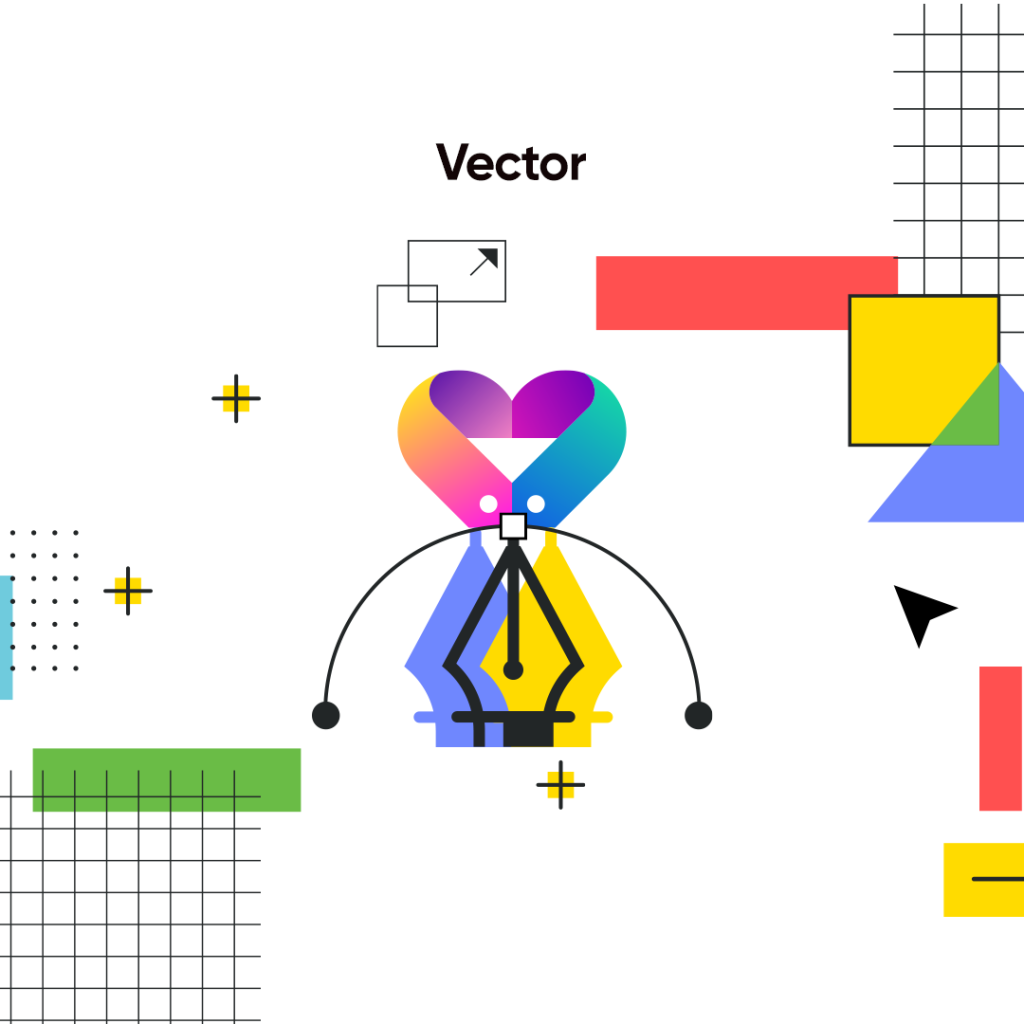
Vector graphics are one of the most common forms of design files that are used by designers today. Unlike raster images, vector files are designed to scaled up or down without losing their quality. That is because instead of being up of pixels, they are made up of angles, points, lines, and curves.
With a strict geometrical mathematics behind it, they are perfect for use as design source files.
Raster
Raster images are made using a set of prefixed pixels. They are generally used in the digital and print world, and usually at their preset resolution. That is because unlike vector images, they cannot be scaled without affecting their quality.
Conclusion
In short, a non-designer will come across many unfamiliar terms if they search how to design a logo or any other type of design in order to understand it. However, if you know the terms given above, you will be able to understand and use the majority of the most common design jargon quite easily. From the common terms related to typography, to popular words regarding colors and design basics, the list above covers it all.
People Also Ask (FAQs)
| 1- What are the different types of graphic design? There are many different types of graphic design, with some of the most popular being: – Logo design – Website design – Product design – Branding design – Animation design – Environmental design |
| 2- What are some of the elements of graphic design? Some of the commonly used elements that designers use in their design include: – Points – Lines – Shapes – Textures – Color – Fonts and typography – Balance |
| 3- What is a design vocabulary? Design vocabulary is a set of terms and phrases which relate to everything within a graphic design project, including how to complement one another, and how to create a unified brand identity. |
| 4- What are the three C’s of graphic design? The three C’s of graphic design include: – Consistency – Clarity – Content |
Latest news you want to know!
Subscribe for cutting-edge design inspiration at Logo Poppin! Elevate your brand with updates on logos, branding, web design, and video animation.
Note that by clicking “subscribe,” users may agree to our privacy policy and consent to Logo Poppin to use your contact data for newsletter purposes.
Logopoppin
Logopoppin is a graphic design agency that specializes in logo designing, web development, video production and advanced branding services. We love to innovate businesses with new age technologies, allowing them to improve their visual reputation.