
Table of Content
Discover the Evolution of the Green Bay Packers Logo over a Century of Gameplay
The NFL is a great sport, with hundreds of thousands of fans and millions of dollars’ worth of brand endorsements. And while for the majority of professional sports associations in the world, making as much profit as possible is the ultimate goals, there is one NFL franchise that goes against this norm.
That franchise is the Green Bay Packers, and they are the only franchise in the NFL that is community owned and managed as a non-profit. And, the Green Bay Packers logo is one of the simplest ones in the entire league.
However, when we consider the fact that it is the third oldest franchise in the entire NFL, and has been actively playing for more than a century, a simple, vintage-style logo makes sense.
But the question is, how? How has the team that is owned by thousands of shareholders instead of a single entity or group of investors, manage to connect with their audience using such a plain brand symbol?
And how is it, that this logo, has managed to outlive many of its more elaborate counterparts representing the other teams? These questions and more will be answered in this article, and we will see how a professional logo design services can give you an unbeatable edge when designing minimalist logo designs.
The Green Bay Packers, NFL’s Oldest and Only Community Owned Team
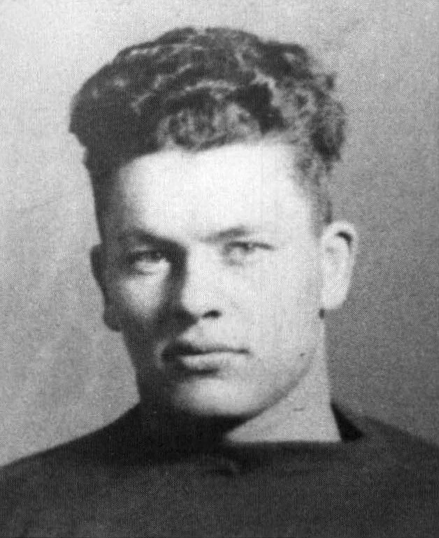
The team was founded 1919 by football players Earl Lambeau and George Calhoun. However, it wasn’t until 1921 that they were awarded an NFL franchise. In the early days, playing professionally was a difficult job, something the Packer’s new owners knew very well.
Now, in order to play, the team needed equipment such as uniforms. With no money to their names, Lambeau decided to ask his employer, the Indian Packing Company, if they would sponsor the team’s equipment. They agreed on the condition that the team would be named after them, and gave Lambeau a sum of $500.
This relationship between the sponsor and the team was a good one, and the team thrived under their patronage. So fruitful was the relationship that when Acme Packing bought the Indian Packing Company a few years later, the new owners honored that agreement and continued sponsoring the team.
This resulted in the Green Bay Packers becoming the team who played the longest out of their home city, in the entire NFL. However, financial troubles plagued the team in the early years despite the sponsorship, and it wasn’t until a few local businessmen known as “The Hungry Five” took control of the team and formed the Green Bay Football Corporation.
These businessmen were responsible for keeping the team afloat in the early years, setting it up as a non-profit, raising funds when needed, setting up the board of governors, and more. This paved the way towards the Green Bay Packers becoming a community-owned team, and a success in the world of professional football.
Before the AFL-NFL merger in 1970, the Packers had one eleven championships, their first title coming in 1929, and their last in 1967. Moreover, they also have four Super Bowl wins, with the first two wins being in the same years as their last NFL Championship wins.
Despite following an unorthodox model of operation, or perhaps because of it, the team saw massive success in the early years, especially up until the early 30s. Their record of winning 29 consecutive home games is a record that is still unbeaten to this day.
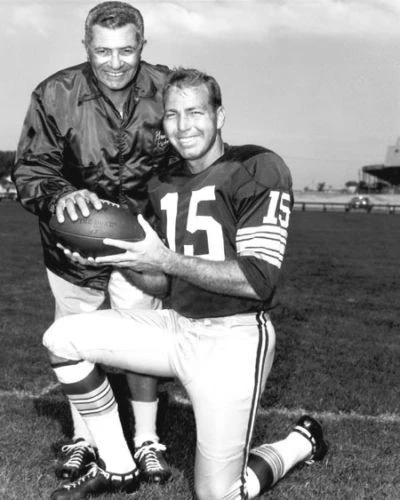
Then, the team also had the honor of being coached by legendary football icon Vince Lombardi, from 1959 to 1967, which incidentally led to the Green Bay Packers winning the first two Super Bowls back to back.
However, the next two and a half decades after Lombardi’s departure in 1967 were some of the worst years in the franchise’s career, garnering only five seasons where the Packers recorded a winning record in that entire time.
It wasn’t until 1992 that the Packers acquired QB Brett Favre and defensive end Reggie White in 1993, that the team’s fortunes started to turn. The following decades were generally a mix, with the team winning two more Super Bowls in 1996 and 2010.
As the third oldest team in the NFL, the Green Bay Packers have a rich history that shows the resilience of the people who believed in the team and its mission. Over the years, the franchise has fielded teams that have yielded multiple hall of famers, showing that the franchise has always been one with massive potential.
A Look at the Modern Green Bay Packers Logo
If we look at the Green Bay Packers logo today, the design is quite innovative, and arguably one of the most unique one before the release of the new Washington Commanders logo. Unlike the majority of teams on the NFL, the logo for the Packers doesn’t sport a unique logo symbol. Rather, it relies on its tweaked lettermark design to stand out.
The logo for the Green bay Packers today is an oblong letter G over a green background, and the entire oval design encircled by a thin golden band. The shape of the design is meant to mimic a football, as it was one of the most prominent element of the team’s logo in its earlier iterations.
The simplicity of the logo makes it one of the most expressive minimalist logos we can find in the NFL today. The addition of the green and gold make it highly visible to the eye, even at a glance. Moreover, as the dark green and vibrant gold colors have a long legacy with the Green Bay Packers, the addition of this color combination to the logo design helps combine the history of the franchise with the team image today.
The wordmark used along with the team is written in the style of classic sports fonts. This style of blocky typography can often be seen sported by varsity teams, especially since serif fonts are slowly being phased out of the athletic typography industry.
Overall, the logo is an interesting study in design for sports teams who want to create minimalist, yet visually appealing logos for their teams.
Evolution of the Green Bay Packers Logo, From the Early 1920s to Today
Now that we have taken a look at the history of the Green Bay Packers, as well as an in-depth look at the Green Bay Packers logo, let’s dive in and study the evolution of the Packers brand symbol through the century.
For a smart brand, adapting to the market’s changing dynamics is important, especially when it comes to their logo, as in the case of the Philadelphia Eagles logo. However, sometimes, a brand finds a logo that is so good that it becomes timeless. A great example of that can be found in Coca Cola, whose iconic wordmark has been in use with only slight modifications for decades now.
Therefore, let’s find out how the Packers came up with a design that has remained virtually unchanged for the past four decades.
1921 – 1936
Although the team was formed in 1919, the first logo they revealed was in 1921, when they were awarded the right to join the NFL as a franchise. Originally named “The Packers”, the name was soon changed to Acme Packers when Acme Packaging bought the Indian Packing Company a little while later.
This design was more similar to monogramlogo design, giving the team a subtle, professional look. The round design another circle within it, with the border and the inner circle forming a band that featured the team’s name and the year they were founded.
The color scheme was royal blue and gold, with the outer and inner circles being different shades of gray as contrast. Overall, this iteration was the simplest the Green Bay Packers logo had ever been, and it was a success.
1937 – 1950
In 1937, the team decided that a logo revamp was required. With Acme Packaging folding up a few years after building the team, the franchise found that they needed a new logo, now that they were Green Bay Packers and not Acme Packers.
Rather than go for something elaborate, they decided to make a small lettermark logo that represented the team initials. The result was a set of two characters, the letter G and B, which were overlaid each other. The color scheme was the same blue as used previously, and the dark lettering made the design stand out beautifully.
The new design was quite different, and stood out among other NFL logos at that time. The letter G was elongated horizontally, while the letter B was stretched vertically. The resultant lettermark was something that you would see on a handbag or a jacket for a highschooler. This letterman-style design of the lettermark was perfect for viewing on players’ jerseys, and was a great placeholder until the team decided to create a proper brand logo.
1951 – 1955
1951 saw the introduction of a new Green Bay Packers logo, which now featured a funky-looking wordmark, as well as a pair of goalposts and a football. This wordmark logo design was one of the shortest-lived ones in the team’s history, lasting for only five years. The purpose of this logo was to design something that represents the connection between the Packers and the sport they played.
The wordmark now looked as if the words were going away from the reader. The letters was written in an uppercase, bold font, with the letter P significantly larger than the rest of the wordmark. In the background, you could see that a the two opposing goalposts at an angle, and the football cleared for a click.
This was the design where the team phased out the royal blue color previously used, and replace it with a dark green shade. That was accompanied by a shade of orange, which made the overall design very peculiar.
The wordmark was colored in the dark green, while the football and the goalposts were colored in orange. The color combinations, while an interesting one that many would’ve thought was going to be a disaster, still managed to last for a five years.
1956 – 1961
In 1956, the idea behind the previous logo’s design was brought around full circle, and different types of logos were pitched to represent it. The team unveiled a new Green Bay Packers logo that featured an upright football that looked as if prepared for a kick. The football showed the dark green map of the team’s home state, with the Green Bay area marked with a white circle. Over the map stood a football player in full team regalia, holding a football.
The football player was standing at a dynamic stance, and had their hand pulled back into a throw, with the hand holding a football. With this dynamic pose, the logo was colored in a medium brown/ dark green color palette, accented by white.
The base football and the player were colored a medium shade of brown, while the map was colored a dark green. The football player’s helmet, jersey number, and socks, along with the location of the Green bay area on the state’s map were colored in white, which stood out instantly on the dark design. This was a clever way to use logo symbols without going overboard with the design.
1961 – 1979
With the arrival of Vince Lombardi on the Packers squad as coach, the team was slowly rising up. Their pool of talented players was rising, and the team was slowly achieving wins and an overall successful record.
The result was that the franchise decided that in order to honor and commemorate this new chapter of the Green Bay Packers’ career, a new team logo was what’s required. And with the new dynamic and adaptable team, they needed a design that represented that fact to the max.
Taking into mind the concept of minimalism, as in the case of the modern 49ers logo, the team decided to go for a stylized lettermark rather than incorporate symbols into their design. The previous iterations of their brand logo had featured some obvious logo symbols, but despite that, their designs had failed to have the intended impact.
The new logo unveiled featured a giant, bold, sans-serif letter G, which was horizontally stretched and shaped into an oval, fitting into the dimensions of a football-shaped green oval in the background. The combined designed was a subtle way of incorporating their previous football imagery, into a clean and simple design that was timeless.
1980 – Present
Despite the 1961 logo being a masterclass in clean and expressive logo design, it still lacked something in order to make it stand out. And it wasn’t until 1980 when the team revealed the redesign that we found out what it originally lacked.
For one thing, the green band surrounding the letter G was made slightly thinner at the edges. The reason for that was to add a border to the design that made it stand out by helping the edges of the design stand out.
The result was a bright golden band encircling the entire logo, with the band being od medium thickness, and just visible enough to make the edges of the logo stand out clearly when viewed.
This type of carefully crafted outline is similar to what we have seen with the Detroit Lions logo, where the medium gray outline made the design stand out from the canvas.
FAQs
| What does the Green Bay Packers logo mean? The oval design was revealed in 1961 for the first time, and was delivered by the team’s equipment manager George Braisher. Its purpose was to mimic the design of the football in as simple of a way as possible. And the result was this logo. |
| Did Georgia copy Packers logo? Their logos may look similar, however, there are subtle differences which help Georgia circumvent the Packers’ logo trademark. |
| Who actually designed the Green Bay Packers logo? It was actually designed by Braisher’s assistant, a St. Norbert College art student by the name of John Gordon. |
Conclusion
To sum it up, it is very important that a brand logo is simple enough to be easy to identify and recognize, yet expressive enough that the viewer captures your brand’s essence. And that is something that the modern Green Bay Packers logo has managed with its design.
In essence, very few teams on the NFL roster have mastered this art, with the New Orleans Saints logo being one of those few examples. In any way, if you want to know how to create simple yet memorable sports logos, then studying the design of the Packers logo is a great place to start.
Latest news you want to know!
Subscribe for cutting-edge design inspiration at Logo Poppin! Elevate your brand with updates on logos, branding, web design, and video animation.
Note that by clicking “subscribe,” users may agree to our privacy policy and consent to Logo Poppin to use your contact data for newsletter purposes.
Logopoppin
Logopoppin is a graphic design agency that specializes in logo designing, web development, video production and advanced branding services. We love to innovate businesses with new age technologies, allowing them to improve their visual reputation.

