Table of Content
Discover How the GrubHub Logo Has Transformed Over the Past Two Decades
For online food delivery services, brand recognition and visual identity play a crucial role in capturing consumer attention and fostering trust. Among the industry titans we know today, GrubHub has carved out a significant niche in the US, connecting millions of diners with a vast network of local restaurants and eateries.
Over its journey from a small startup to a publicly traded food delivery giant, GrubHub’s visual identity, most notably the GrubHub logo, has undergone several transformations. More than mere aesthetic tweaks, these strategic refinements reflected the company’s growth, its evolving market positioning, and the changing dynamics of the digital food ordering experience.
In this article, we will dive into a detailed exploration of the GrubHub brand logo’s transformation, tracing its key design changes and the potential rationale behind them from the lens of a professional logo design agency. Let’s begin.
What is GrubHub? A Comprehensive Overview of the Food Delivery Giant

GrubHub is an online food ordering and delivery platform that connects diners with local restaurants. Founded in 2004 by Matt Maloney and Mike Evans in Chicago, the company initially focused on providing a digital version to paper menus, allowing users to browse restaurant offerings and place orders online.
Over the years, GrubHub has grown, expanding its reach across the United States and, through acquisitions, into other international markets. It has become one of the leading players in the food delivery industry, facilitating millions of orders daily. This has made it a household icon, along with its competitors like the DoorDash logo.
The core functionality of GrubHub revolves around its user-friendly platform, accessible via web browsers and mobile applications. Diners can search for restaurants in their area, browse menus, customize orders, and pay securely online. GrubHub then transmits these orders to the selected restaurants, which prepare the food for pickup or delivery.
While GrubHub initially focused on providing the ordering platform, it later expanded its services to include its own delivery network in many markets, employing independent contractors to pick up food from restaurants and deliver it to customers. This expansion allowed GrubHub to cater to a wider range of restaurants, including those that did not have their own delivery infrastructure.
The GrubHub Business Model Explained

GrubHub’s business model relies on commission fees charged to restaurants for each order placed through its platform, as well as delivery fees and service fees charged to customers. The company has also strategically acquired several competitors over the years, including Seamless, Eat24, and OrderUp, further solidifying its market position and expanding its network of restaurants and users.
GrubHub’s success can be attributed to its extensive restaurant selection, and its ability to streamline the food ordering and delivery process for both diners and restaurants. The platform has become an integral part of the modern food and restaurant landscape, offering convenience and accessibility consumers and businesses alike.
Exploring the Evolution of the GrubHub Logo
As we mentioned earlier, the GrubHub logo has undergone several distinct transformations since the company’s inception in 2004, each reflecting the brand’s evolving identity and market presence. Let’s take a look at these amazing food logos in detail.
2004-2011 GrubHub Logo
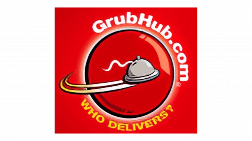
The initial GrubHub logo, used from its founding until 2011, presented a more literal and illustrative representation of the company’s name and core service. The wordmark “GrubHub” was usually presented in a simple, sans-serif typeface. The colors used in this initial logo often included earthy tones like maroon, dull yellow, and white.
The overall feel of the logo was somewhat playful and less corporate, reflecting the startup nature of the company during its early years. The emphasis was on clearly communicating the brand name and its association with food through a direct visual metaphor. As the company grew and the online food ordering market matured, the need for a more sophisticated and scalable visual identity likely became apparent.
2011-2016 GrubHub Logo
In 2011, GrubHub underwent a significant logo redesign, moving away from the literal grub illustration towards a more abstract and symbolic representation. The new logo featured a more dynamic wordmark design that captured the attention instantly.
The dark red-maroon color scheme enticed the viewer, making it perfect as a food delivery app logo. The wordmark “grubHub” was updated to a bolder, sans-serif typeface, conveying a sense of strength, reliability, and modernity.
The color palette shifted to a more vibrant and energetic combination, often featuring a bright orange or reddish-orange hue. This change in color palette signaled a shift towards a more confident and established brand identity. The overall aesthetic was cleaner, more contemporary, and better suited for digital platforms.
The redesign aimed to create a more sophisticated and scalable visual identity that could better represent the company’s growing reach and ambition. The bolder typography conveyed a sense of stability and trust, while the brighter color palette added energy and dynamism to the brand.
2016-2021 GrubHub Logo
The 2016 logo represented a further refinement of the 2011 design. While the core elements of the wordmark remained, the execution became even more streamlined and simplified. The color scheme also underwent subtle adjustments.
The new all-uppercase “GrubHub” wordmark becoming thicker with adjusted letter spacing to enhance legibility and visual appeal. The core color palette of orange/reddish-orange replaced the older maroon-red one, reinforcing brand recognition with a more modern look. The emphasis continued to be on a clean, bold, and easily identifiable visual identity.
2021-Present GrubHub Logo
The most recent evolution of the GrubHub logo, introduced in 2021, represents a significant departure from the previous wordmark icon. The new logo features a stylized house with a knife and fork upright, accompanied by a revamped wordmark.
The overall lighter and brighter color palette is clean and simple, often featuring the orange icon and the wordmark. This shift towards a lighter and more vivid design aligns with contemporary design trends and tips for food branding, aiming for a more casual and accessible brand image.
FAQs
| Is Grubhub owned by Google? Grubhub is currently owned by Wonder Group Incorporated since 2024. Before that, it was owned by Dutch company Eat Takeaway between 2021 and 2024. |
| Who is bigger – Grubhub or Doordash? As of 2023, Doordash and its subsidiaries had a 65% market share in food delivery services in the US, and 25% for Grubhub and its subsidiaries. |
| Is Grubhub still popular? For the past three years, Grubhub has seen a decline in its business, while rivals UberEats and Doordash have seen an increase in their business. |
Conclusion
The evolution of the GrubHub logo from its literal depiction of a grub to its current abstract orange circle with a white line reflects the company’s significant growth and the changing landscape of the online food delivery industry. Each redesign has aimed to create a more sophisticated, memorable, and digitally adaptable visual identity.
Throughout these changes, the consistent use of orange has provided a thread of visual continuity. The journey of the GrubHub logo underscores the importance of visual identity in building brand recognition and adapting to the evolving needs of a dynamic market.

Logopoppin
Logopoppin is a graphic design agency that specializes in logo designing, web development, video production and advanced branding services. We love to innovate businesses with new age technologies, allowing them to improve their visual reputation.

