Table of Content
Discover the Top Gym Website Design Ideas & How to Use Them for Your Site
In today’s rapidly evolving age, where people are becoming more health conscious and appreciative of taking time for oneself, the fitness industry has witnessed a paradigm shift. In this new era, gym websites have become an important tool for fitness clubs and gyms to engage, attract, and retain clients.
But how do they manage that? Fitness is hard, and unless highly motivated, people tend to avoid it. So how do some of the top gyms manage that? Let’s dive into the world of gym website design and explore some great ideas to make your gym sites not just informative but also dynamic and inspiring. We will also take a look at the necessity of gym websites, as well as the key elements that set the best designs apart.
Finally, we will uncover the secrets of professional web design services providers behind creating gym sites that draw leads, by looking at some amazing gym website designs that stand out. So. Let’s begin our journey to see how we can create inspiring gym sites that elevate our gyms online presence.
Why are Gym Websites a Necessity for Fitness Clubs and Gyms?
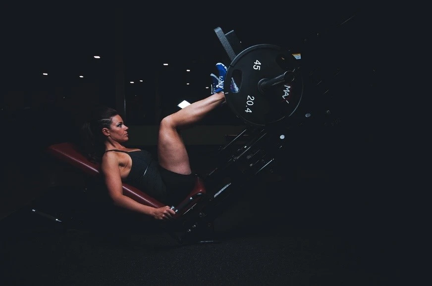
Gym websites have transformed from static online brochures that showed gym timings, fees, and trainers, to dynamic hubs that cater to the needs of busy fitness enthusiasts. Most people today prefer to exercise on their own time, meaning that the classic social element of going to the gym and working out with your buddies is now mostly gone. That’s where gym websites come in, offering everything from information to virtual classes for people who prefer to work out at homes.
From sleek, minimalist designs to interactive elements, modern design trends play a crucial role in shaping gym websites. With the right trends incorporated within your gym website, you can manage to stand out in the fitness industry, as well as provide a great user experience for visitors.
One important element, that is fast becoming an unspoken rule in website design, is mobile responsiveness. As smartphones become an extension of our lives, gym websites must be responsive to various devices. A responsive website enhances accessibility and user engagement, ensuring clients can access their fitness resources at any time or place.
Let’s take a look at some of the most common reasons that gym websites are becoming popular today.
A Digital Storefront
In this digital age, a gym’s website serves as its storefront. Just as having a well-designed and aesthetically pleasing storefront is a necessity in brick-and-mortar store, having a digital presence is now a necessity for fitness clubs and gyms. And their purpose is to provide insights into how websites act as the first point of contact for potential clients.
eCommerce, Online Classes, and Fitness Consultancy Booking
With the meteoric rise of virtual fitness since COVID-19, gym websites have become hubs for online trainings and eCommerce. Gyms today sell various items, from active wear to supplements, and more. Similarly, they are also promoting various virtual training regimens for people, offering a complete gym experience from the comfort of your home. In fact, many of the bigger brands with their own merchandise managed to establish themselves as great options to traditional sports websites examples, offering consumers with more variety
These functions, while unorthodox, enhances functionality and user convenience, making it easier for clients to plan their workouts, buy fitness products, and consult a professional with just a few clicks.
Membership Information and Sign-Ups
Getting people into the physical gym can be a difficult task. That means that getting them to sign up and subscribe to your gym’s services can be a problem too. Gym websites serve as comprehensive information centers for potential members.
They make gym subscriptions and plans more accessible for the masses, offering seamless sign-up processes as well as the ability to compare facilities, thus making it easy to turn them into gym goers.
What Describes the Best Gym Website Design Ideas & How Do They Stand Out?

Now, you know that gym websites are a necessity if you want your fitness center to succeed in a competitive market. But you will often come across a site that has a weird feel to it. And you might wonder – what is it about the popular gym sites that make them so great?
Well, in each industry, some specific trends need to be followed in order for your website to be considered great. However, some trends are universal when it comes to creating a great website. So, let’s take a look at some of the most useful web design trends you need to make your website a success.
Visually Appealing Imagery
It’s often said that a picture is worth a thousand words, and on gym websites, you see this quote come into play. In the fitness industry, high-resolution images and video plays a crucial role. With a carefully curated collection of visually captivating imagery that conveys a gym’s atmosphere, culture, and fitness offerings, you will have an easy time attracting and converting leads.
Intuitive Navigation
Generally, a good website is one that has an intuitive, easy-to-use layout. Similarly, navigating a gym website should be as smooth and intuitive as a well-coordinated workout routine. At a time when someone is focused on their fitness goals and regimen, a well-structured menu and easy-to-find information will lead to a positive user experience.
Integration of Social Proof
Gym culture is still relies on close-knit communities where people follow the recommendations of seniors they know. Client testimonials, success stories, and social media integration provide social proof of a gym’s credibility, as well as allow for social media engagement. With social proof’s careful integration within your website, you can build trust and influence potential clients.
Top Tips to Create Amazing Gym Websites That Will Help You Draw and Convert Leads
So far, we have seen why gyms need websites in the first place, as well as the hallmarks of effective gym websites. However, the process of webs design starts way before the actual launch of that site. The actual start of a well-designed gym website begins at the design and ideation strategy.
So what can we do at that point to ensure our future website is a success? Let’s discuss a few web design tips to ensure the success of your gym websites.
Understand Your Audience
Knowing your target audience is crucial to creating a successful gym website. In order to do that, you need to investigate the market, including your competitors, for insights. Moreover, you will also conduct audience research, and using all the information gathered, tailor your website content and design to appeal to specific demographics.
Highlight Your Unique Selling Proposition
Every gym, or business in general, has something special to offer its customers. That is how they manage to survive and thrive in the market. However, in order to be a success, you need to clearly define and display your gym’s unique selling proposition on its website, setting it apart from competitors and attracting the right clientele.
Incorporate Calls-to-Action Smartly
A good gym website should drive visitors toward specific actions, whether it’s signing up for a trial class, contacting the gym, or joining a membership. When used correctly, calls-to-action can encourage user engagement and lead conversion, leading to overall business success.
11 Gym Websites That Will Pump Up Your Clients & Get Them Moving
So, now that you know how to create great gym websites, you might think that you are ready to begin your own web design project. However, not so fast. What you need is some inspiration about where to start. And for that, you need to see some of these great gym website design ideas in play.
Let’s dive in and take a look at a few of the top gym websites, and discover what it is about them that makes them so amazing.
Fitlab

Fitlab is a Netherlands-based fitness studio and gym that has a friendly, wellness-oriented design to it. The text is bold and highly visible, yet doesn’t overshadow the other elements in the slightest. In fact, each element works well with the other to form a harmonious design.
At a glance, the website offers a sleek and modern design that emphasizes a diverse range of fitness offerings, from strength training to yoga. That perception is made due to the addition of high resolution imagery that is offset by soft pastel colors in pink and gray. Overall, this is one of the best gym websites on this list to emulate.
Yogamaya

Most gym and yoga websites tend to go for strong, highly impactful imagery. They feature people at the peak of physical fitness performing acts and poses that would be unimaginable to the average Joe. And its completely understandable too, as it serves as a sort of proof that the gym owners and instructors know their stuff. However, Yogamaya’s approach is an interesting one too.
Although Yogamaya too does feature some of these images of its instructors in advanced yoga poses, it does do so right from the start. The homepage of the website features beautiful abstract line art, that puts you at ease instantly. Using a pastel color theme, it adds a sort of serenity to their imagery that combines well with its innovative navigation panel.
Overall, the impact is one of a yoga-focused website that uses calming colors, striking imagery, and intuitive navigation to create a serene online space.
SoulCycle
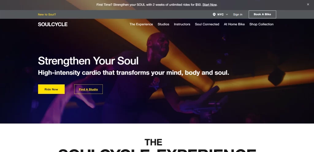
SoulCycle is one of the top fitness websites known to people, even those outside the US and Canada. It offers a membership-based model that is made easy to use for both experienced riders and newcomers to the activity equally.
At a glance, the site is a visual masterpiece, highlighting a video of various riders spinning as hard as they can, while having fun. You will be hard-pressed to find an upsell or distraction, despite the fact that such things are common in the fitness industry.
Overall, known for its energetic vibe, SoulCycle’s website mirrors the dynamic and lively atmosphere of its in-person classes, which is a hard feat to achieve.
yfitnesslab
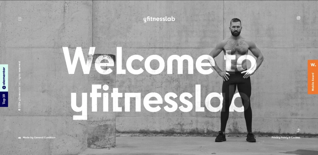
yfitnesslab is a great example of how expert web developers can make use of tools like WordPress and Elementor page builder to create an amazing, light website that feels premium. The website for this gym utilizes visual effects like parallax scrolling, and a rough textual texture to give an impact of strength and grit.
A modern design, the site also uses a grayscale color scheme, which adds to the tough-guy persona of the website and the gym’s trainer. Interestingly, the website only has three pages, yet still manages to convey all the information it needs without it overwhelming the reader. And that is because of the extensive use of whitespace and images to balance out that text. Overall, it is a great gym website that combines vibrant visuals with easy navigation, making it a go-to for fitness enthusiasts.
Equinox Fitness Club

If there was a way to incorporate a luxury vibe into gym websites, then there is none better than Equinox Fitness Club to portray that. Equinox’s website exudes luxury and sophistication, with high-quality imagery and a focus on premium fitness experiences.
Unlike many other fitness-themed sites, the website for Equinox knows that the setting of the gym is as important as showing the people working out in it. Taking advantage of its top-tier facilities, amazing architectural style, and the top-of-the-line fitness equipment, the brand showcases all that in its hero section.
In fact, elegance and style in fitness is somewhat of Equinox’s unique selling point. What you won’t see are people sweating hard while working out. However, scrolling down, you will come across a section called “Where Luxury and Fitness Meet”, which is one of the best fitness slogans, by the way. It displays a full-width video showing all the luxurious amenities offered by the gym, including elegant lounges, modern juice bars, rooftop swimming pools, and even a luxury spa.
In short, what the Equinox brand sells isn’t a fitness service, but rather a luxury fitness experience.
Planet Fitness

Another popular gym, Planet Fitness is known for its fun and upbeat vibe. The homepage of the website is fun and sports bright color combinations, with various shades of purple and yellow. The web copy of the website is quite fun too, with the headlines often featuring something humorous. Taking a different approach to the Equinox Fitness Club, it uses calls-to-action right within the hero of the homepage, as shown above.
The layout is quite user-friendly, and offers the option to find the nearest Planet Fitness to the user, making it convenient to visit for the consumer. Overall, with a user-friendly design and a clear emphasis on affordability, Planet Fitness’ website caters to a wide audience.
Gold’s Gym
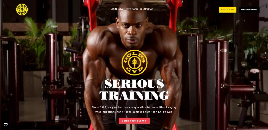
Gold’s Gym has one of the most iconic fitness logos of all time, associated with starting the bodybuilding and aesthetic physique craze across the world. Known as the “Mecca of Bodybuilding”, the chain of fitness studios has been associated with bodybuilding greats like Arnold Schwarzenegger and Dave Draper.
Today, decades since its inception in 1965, the gym’s website as well as the facilities boast a modern look that embodies dynamic movement and strength. The site features high quality images of people pumping iron, showing off amazing physiques that are sure to attract consumers.
The easy-to-use navigation of the website is a great, offering access to all the information desired quickly and conveniently. Overall, Gold’s Gym employs a bold and motivational design that reflects the high-energy atmosphere of its iconic fitness facilities.
CrossFit
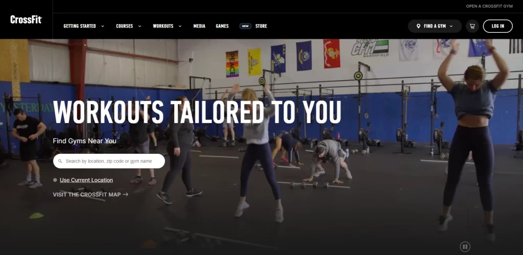
CrossFit is somewhat of an anomaly on this list of gym websites. While not technically a gym, but rather an approach to fitness, the design of the CrossFit website would beg otherwise. The website uses high quality, dynamic images that work well with the web copy of the webpages, delivering their message with a strong impact.
The brand messaging is perfect, and a tour of the website will have you raring to try a CrossFit circuit, at least once. Overall, the CrossFit’s website is all about community, with user-generated content, event information, and a strong sense of inclusivity.
F45 Training
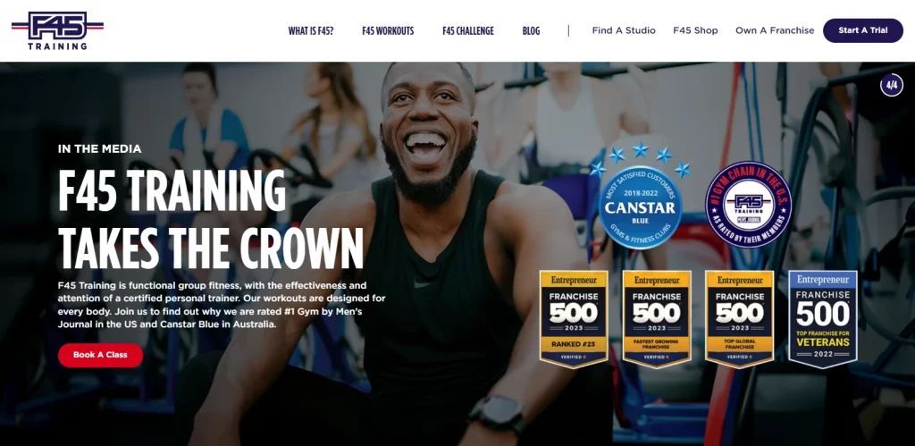
F45 Training’s website features a clean and modern design, offering a glimpse into its innovative and high-intensity workouts. The header section of the website features a set of badges and certifications, that serves as social proof of the gym and its trainers’ expertise.
The color scheme is full of bold shades, which add a visceral edge to the design. Similarly, the navigation is designed to be simple, yet comprehensive, going for a white navigation bar with dark blue text. Overall, the website design perfectly embodies the gym’s promise of offering dynamic training that will have you up and moving in excitement.
Pure Barre
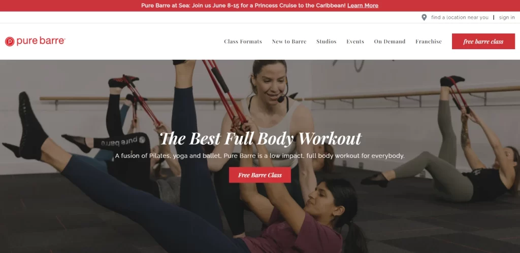
The Pure Barre website is perfectly representative of its core values of graceful power. The design is elegant, with a visible feminine influence, and features a simple and straightforward design that is backed by beautiful imagery.
The color palette is a soft pastel, with extensive white space and beautiful typography that adds a certain elegance and softness to the design, Overall, it is a website that mirrors the grace and strength of Pure Barre’s workout approach, with a strong emphasis on community.
Anytime Fitness
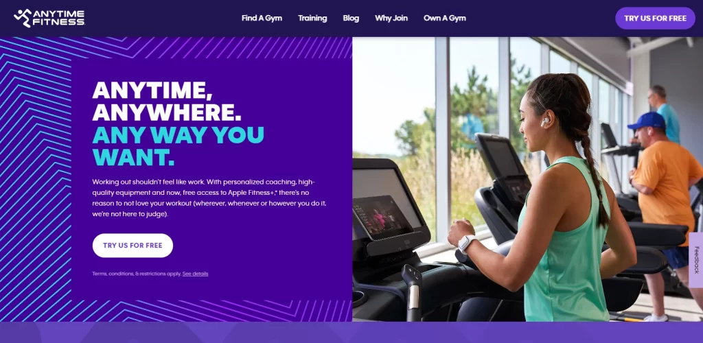
Anytime Fitness is a gym know for its modern vibe, a sentiment that is mirrored in its website’s design. At its core, the gym works to provide accessibility and convenience to their clients, with a vibrant tri-color palette featuring purple, white, and blue.
The navigation of the website is clean and easy to use, with consistent calls-to-action driving visitors towards certain actions. Overall, known for its accessibility, Anytime Fitness’ website focuses on simplicity and ease of use, allowing users to quickly find relevant information.
FAQs
| What is a gym website? A gym website, or a fitness website, is a place that offers people some incentive to get moving, offers advice and knowledge about fitness, or focuses on specific forms of wellness and fitness. |
| What are some great gym websites for working out? Some great gym websites that offer amazing fitness plans include: Bodybuilding.com Peloton The Sculpt Society Fit Fusion |
Conclusion
In the fitness industry, dynamic and engaging gym websites offer more than just a digital presence—they act as powerful tools that can attract, retain, and convert clients. From incorporating modern design trends to ensuring mobile responsiveness, good gym website design ideas have evolved to become indispensable in the fitness industry.
By exploring the top gym sites and drawing inspiration from their successes, your fitness business too can embark on a digital journey that not only showcases your brand but also motivates clients to get moving.

Logopoppin
Logopoppin is a graphic design agency that specializes in logo designing, web development, video production and advanced branding services. We love to innovate businesses with new age technologies, allowing them to improve their visual reputation.


