Table of Content
Discover How to Develop a Great Beauty or Hair Salon Website Easily
Salons come in plenty of shapes and sizes. From the small corner shop that is a mainstay for the local community, to the large boutiques managed by celebrity stylists, there is one for everyone. Now we always say that any business that wants to grow needs a strong digital presence, often in the form of a well-designed website. But let’s face it, the small community business has no need for any salon website ideas, as their history brings in more business than they can handle. Or do they?
Today, a business is only as good as the brand that represents it. And in recent years, even community mainstays have been seeing the need to expand their customer base outside of the local community to sustain their businesses. And unable to match the allure and celebrity status of the big names in the business, they have been looking towards lower cost options to boost visibility, such as websites and social media.
The question is – how to come up with the right beauty and hair salon website to suit your business aesthetic? What are the elements that define whether your website would be a hit with your potential clientele? Let’s take a look at some relevant examples to see what makes a salon website good, and see how you can work with your web design services to incorporate those elements into your design.
The Need for Salon Website Ideas – Why Are They Important?
Like all service-oriented business, salons need to reach new customers in order to sustain and grow their business. Traditional marketing methods cost more than a pretty penny, and are not as effective nowadays. Things like print ads, TVCs, billboards, and more are slowly losing out to digital marketing techniques, such as digital media ads, promo emails, influencer marketing etcetera.
In such a scenario, it is important that salons looking for a sustainable and scalable marketing strategy opt for a website over other options. Some people argue that going for social media first is better than going for a website, which may cost more in terms of effort and money.
However, choosing social media as your primary avenue may be quite problematic. For one, there is a higher chance of copycats using the traction you have gained on the platform to direct your traffic to their pages. And its often quite difficult to deal with them. Moreover, the relative competition and ability to optimize your profile for better visibility is considerably difficult compared to that of a website, especially with today’s site builders.
Besides that, websites allow for a greater exposure to your target market, and allows you to generate a community trust that is very difficult on social media. That is why it is recommended that salons look towards developing websites for their businesses.
Elements That Define a Successful Beauty or Hair Salon Website
Traditionally, some common elements define whether a business website, no matter the industry, is going to be a success. And depending on the industry or niche, some additional elements may be added to that list. However, even if you address the major common elements, you can ensure that the beauty and hair salon website you develop for your business is a hit with your target audience.
To make it easier for you, we have compiled a list of the five main elements that define whether your salon website would be a success or not. And while some of these may seem counterproductive to each other, a look at the salon website ideas will help you understand them better.
These core design elements include:
- Simplicity is key
- Display your mission/vision and USP prominently
- Choose imagery that enhances your brand message
- Go for dynamic over static design
- Make it easy for visitors to view your schedule, ask questions, and book appointments
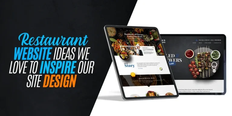
Top 8 Amazing Salon Website Ideas to Inspire You
So far we have taken a look at the reasons why a salon, hairdresser, or barbershop may need a website, as well as the core elements that dictate whether such a website is going to be a success or not. However, a question now arises. As there are many different styles and types of websites for salons, which ones would be better for your website’s design inspiration?
Different brand vibes dictate the use of different web designs and layouts. So how to find the right one? Let’s take a look at some of the amazing salon website ideas we have compiled below, and see if you can find a suitable style of website for your brand. This will also help you in brainstorming a clean design if you are planning to sell your website design services to SMEs.
Ginger and Maude
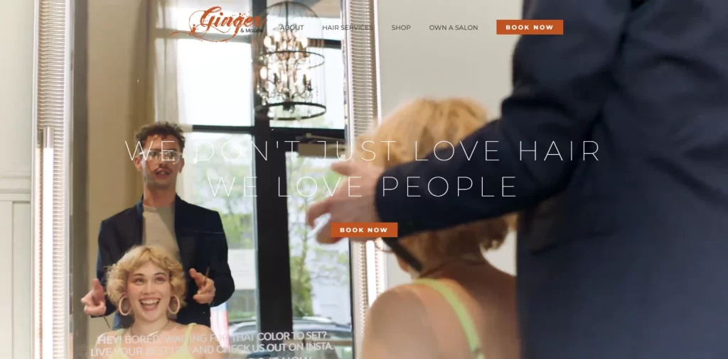
The first website on our list is for the aptly named Ginger and Maude Salon. This salon originally started out as a specialist boutique focused on people with red hair, colloquially called gingers. However, over the years they have expanded that vision to include all colors and shapes – straight, wavy, or curly.
Based on their vision, visiting their page opens you up to a full-page sized GIF, often displaying a new person with well-styled hair to suit their specific aesthetics. A subtle heading is overlaid the image, which displays the salon’s brand message – “We don’t just love hair, we love people”.
Scrolling down, the visitor is greeted with a two-liner company mission, which gives way to the page footer. Visitors looking for more information would have to use the navigation menu at the top of the page. However, this overly simple design is due to one simple reason, related to an element we mentioned earlier – making it easy for the visitor to book an appointment.
The thing that stands out on this page after the visuals is a small yet highly visible button with a simple, two-word call-to-action – BOOK NOW. This shows that the brand is convinced and sure that their visuals and the accompanying message is enough for a hot lead to convert. And judging from the fact that the salon has been around for more than a decade and has four locations, this strategy surely seems to be working.
WEN by Chaz Dean
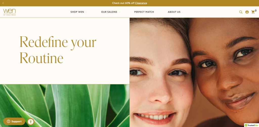
Next on our list is another chain of beauty salons called “WEN by Chaz Dean”. The owner, Chaz Dean, is a celebrity stylist whose aesthetics have been embodied in the salon’s website. The design is quite different compared to the one for Ginger and Maude, as WEN combines both a salon site and an eCommerce store in one.
The result is a unique, visual-focused website that keeps other design elements to the minimum. To view either of their two locations, visitors can navigate to the salons page via the navigation menu at the top, or the map widget at the bottom of the home page.
The color combinations used here for this website is a dark mustard-gold, over a very light, pinkish-brown backdrop. The text is kept to a minimum, and the overall look is quite stylish. As far as beauty and hair salon websites goes, this may not seem like much of stylistic icon. However, if you look at the elements needed for a salon website to be successful, the first thing you need to do is keep it simple.
For any creative business, it is important to let the visuals of your work speak for you. And for a stylist or a salon, what better testimonial can there be than aesthetic images of your happy clientele? Therefore, if you are a salon that also sells its own products online, this is a good site to emulate.
Fringe Salon NY
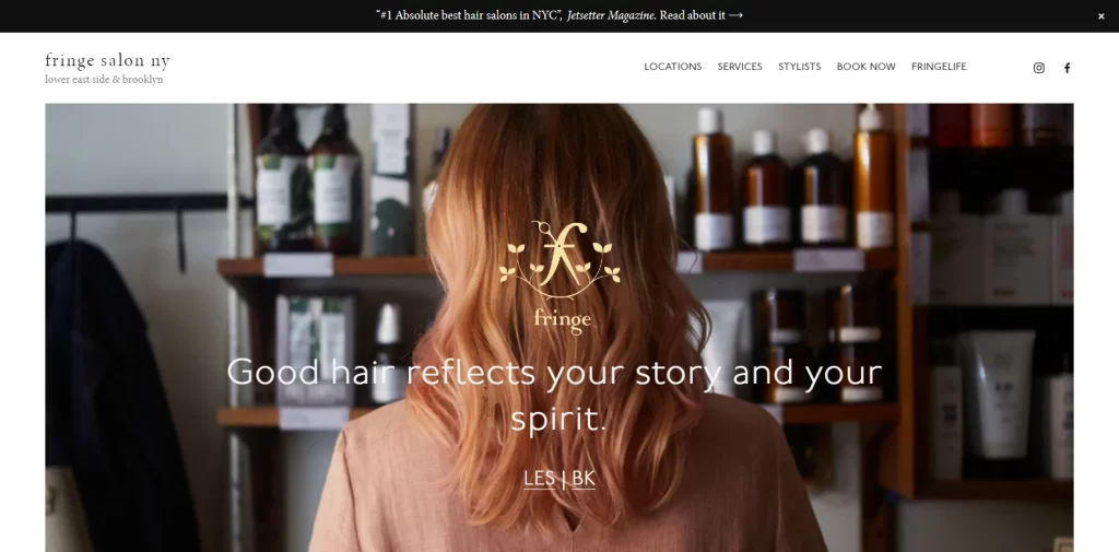
Fringe Salon NY is a New York institution, with a branch each in Manhattan’s Lower East Side, and Brooklyn. The salon is owned and managed by master stylist Amy Schiappa, who has been featured as one of New York’s top stylists in multiple publications, including the New York Times.
Based on her business and stylist ethos, the stylists at Fringe collaborate with their customers to come up with amazing styles that suit each person’s personality perfectly. Keeping up with New York’s eclectic vibe, the salon specializes in coloring techniques like balayage and lived-in hairstyles, curls, and vibrant shades and hairdos.
As far as letting your work speak for itself goes, its rare that a hair salon website does it better than Fringe. The homepage opens up to a simple, plain white background with a large-sized image of a woman with copper locks and blond highlights. The company’s core ideal, of good hair being a reflection of your identity, is centered on that image, with the user having the option to choose their salon branch of choice from the clickable option below it.
Scrolling down, you see that the entire homepage is centered more on imagery rather than text, with a clear indication of minimalism in play. The clear white background, broken only by thin lines that separates the various folds of the page, and one of the best hair salon logo ideas on this list, are subtle and pleasing and the overall look is one made to portray a high-end experience.
Crows Nest Barbershop
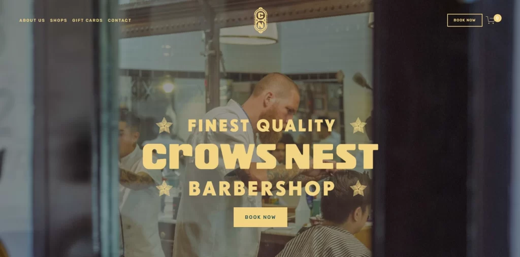
Next up we have a barbershop, but not just any run-of-the-mill barbershop. Crows Nest Barbershop is a high-quality barbershop based in Canada and Hawaii with an old-world vibe to it. That is because for those who remember, barbershops were often local community institutions, where generation after generation people would go for a shave and a haircut.
There is something special about going to barbershop. The white-clad barbers, the sharp smell of disinfectant and aftershave, and the feel of a hot towel on your face before a shave – there is something about it that even the top salons cannot match.
And that feel is embodied within the website for Crows Nest. From the small logo on top of the website, to the vintage fonts used for the title and other text on it, and even the visuals on the website, it is all about reviving and honoring a lost tradition.
The dark, sea green backdrop of the website is a perfect contrast to the lighter-colored text and the visuals. The text is kept to a minimum, and at the bottom of the page, there is a small signup form where people can enter their emails to get news and promotions about the business.
This design may not seem like much compared to the previous three options we have seen. That is what the simplicity of barbershop culture was all about – having a place for men to relax, unwind, and get a sharp cut and a shave while doing that.
Toni & Guy
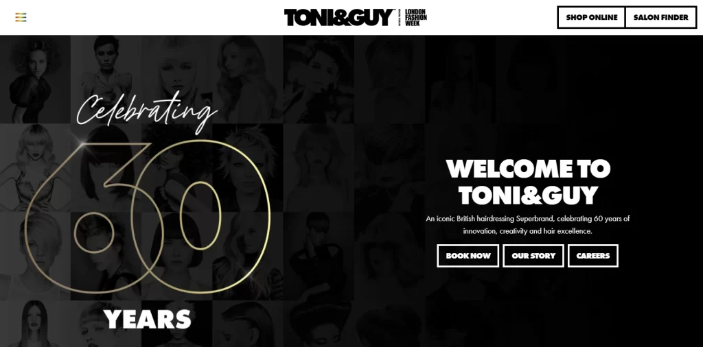
Many of us would know about Toni & Guy as a haircare brand from their vast range of haircare products. Some of us may even have used their products one time or another. But let’s talk about them in terms of a hair salon website.
Toni & Guy have a long history in the styling industry, with the company celebrating its 60th anniversary as of 2023. Just like WEN earlier, this store manages to mix a salon website and an eCommerce store into one. However, while WEN’s focus was more on their products, Toni & Guy focuses more on its hair salon side.
When a visitor goes to the website, the first thing they see is going to be a brand message, currently the announcement of their 60th anniversary, and a short welcoming call-to-action besides it. From here, the customer can navigate into three distinct directions.
For customers who know what they want and want to book an appointment, they can click the “BOOK NOW” button. For those who are still on the fence and want to know more about the brand, can view the brand story by clicking “OUR STORY” button. Finally, prospective stylists looking to work at one of many Toni & Guy salons can click the “CAREERS” button to find a suitable opening.
Overall, as far as salon website ideas go, this one is a great example to follow for those looking for something stylish and chic.
FOURTEENJAY
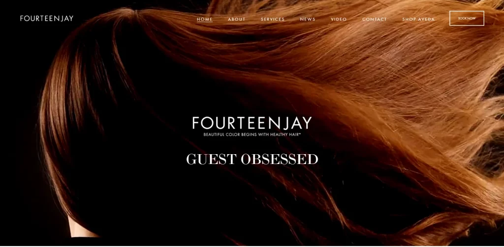
FOURTEENJAY is a New York based salon and stylist, that specializes in helping its customers retain and regain a healthy head of hair. Their coloring and styling philosophy is grounded within the idea that healthy hair is the best hair, one that reflects the best colors and hairstyles.
That philosophy is visible in the design of their hair salon website. Visiting their website, you are greeted by a full-paged GIF of a flowing mane of auburn hair, thick and healthy, reflecting dark copper highlights. Spread across the image is the name of the brand, and a title that reflects the company’s philosophy – GUEST OBSESSED. This is a website style that would go well with any type of high end wellness and beauty services, flanked by some chic hair salon or spa logos.
Scrolling on, you are greeted by large, quarter-page sections of page divided into four buttons, with the top two allowing the visitor to book an appointment, or view their services. Once again, this follows the tenets of the elements we mentioned earlier, about making it easy for your customers to book an appointment.
After that, the website keeps with the overall theme of the website, with simple yet expressive visuals, short sections of text, and a clean page design that is minimalist without lacking anything important.
Tori Did That
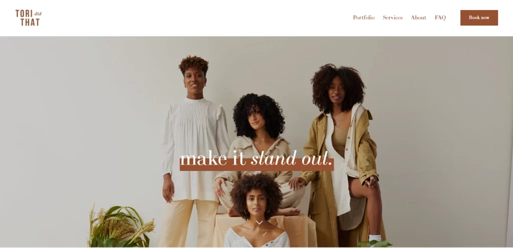
Tori Did That might sound like the title of a Disney show, but the name represents a hair salon that specializes in catering to the African-American diaspora. African hair is quite different compared to the hair of people from other descents, and require special treatments, hairstyles, even an entirely different hairdo philosophy. Despite that, these clients are often underrepresented in the mainstream hair industry.
With such a clear niche to operate in, Tori Did That has a hair salon website that represents its USP front and center. Visiting the website greets you to an image of a group of African-American women with different hairstyles looking fabulous. Across the image is a simple line mirroring the salon’s overarching philosophy – make it stand out.
Scrolling through the website, the visitor can see that the rest of the homepage is simple, with the user journey properly mapped out for easier conversion. The design is colored in shades of light purple-pink and cocoa brown. At the bottom, the full version of the salon’s symbol displays a design that is one of the more aesthetically pleasing afro and braid logos.
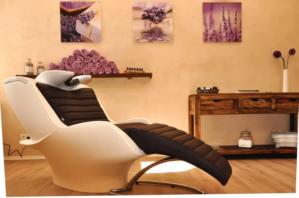
Bella Lago
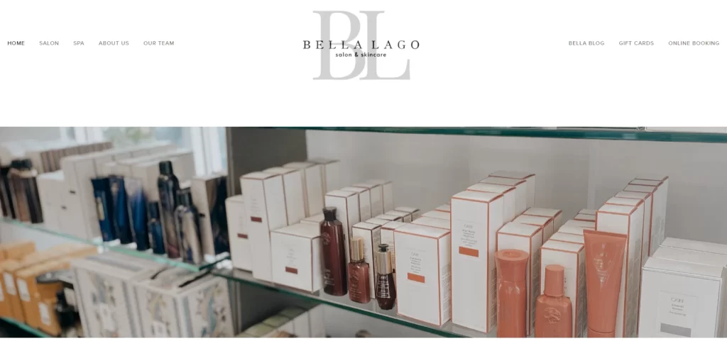
The final entry on our list is for the website of Bella Lago salon. Bella Lago is a salon and spa, which specializes in hair and skincare. Like many of the other salon website ideas on this list, the design is simple, clean, and minimalist. This shows that when it comes to successful salon websites, minimalism seems to be a big part of that equation.
At the top of the webpage, the visitor is greeted by a gray and black logo of the store over a white background, which looks something you would expect of skincare or nail salon logos. Although minimalist in design, what sets it apart though is a color palette of pastel shades of blue and pink, over a white background, and contrasted with black.
Overall, this is one of the best all-around salon and spa websites, and one that does not lean towards one category or another in its design.
Conclusion
To sum it up, you may find a number of salon website ideas to inspire you when creating your own website for your salon. However, finding the right beauty and hair salon websites that suit your brand aesthetics and message can be a far harder job. However, if you understand what makes each of your inspirational website’s design special, then you would be able to incorporate those characteristics within your own design’s vibe, thus enhancing its impact.
However, if you have been finding it hard to find the right salon websites, then the list of sample sites, as well as the elements for a salon website’s success given above can help you start on the right path.
Latest news you want to know!
Subscribe for cutting-edge design inspiration at Logo Poppin! Elevate your brand with updates on logos, branding, web design, and video animation.
Note that by clicking “subscribe,” users may agree to our privacy policy and consent to Logo Poppin to use your contact data for newsletter purposes.
Logopoppin
Logopoppin is a graphic design agency that specializes in logo designing, web development, video production and advanced branding services. We love to innovate businesses with new age technologies, allowing them to improve their visual reputation.