Table of Content
Here’s How the Iconic TV Channel Logo Evolved Through Time
History channel is considered a great source to know plenty of things about earth’s history. Not just kids, but adults also like to watch different shows on this channel. Apart from documentary shows, the channel is also popular due to its stunning dramas and movies based on historical events. That is what makes it different from the other channels. It has a unique way of telling historic events that looks both fascinating and interesting to the users. The history channel logo is therefore popular among many as it takes a very thrilling approach to describe various events.
Unlike other channels, History was not launched in early 60s or 70s. It was launched in 1995 with a vision to educate people about the history of the earth. Earlier, it had only few shows, but that started to change in the mid-2000s. The channel stakeholders realized to add more shows to the lineup, so that History channel logo can get popular in the market. Since then, the channel found immense success in the media industry by becoming a top source to watch history shows.
In this article, we will take a brief look into the evolution of History channel logo. The iconic emblem that we know today was not the first one launched by the company. Instead, it was changed from time to time by taking logo design services from the professionals. Let’s first take a quick look at the history of this channel to understand its classical importance.
Introduction of History Channel

The History channel was launched in 1995 when there were no such platforms available in the media industry. The American audience instantly took interest in its shows, as they were quite properly documented with the right history information. Besides kids, adults too liked the brief approach of the channel which was quite new and holistic at that time. This gave a steady rise to popularity of History channel that only got bigger and bigger with the passage of time.
Coming to 2000s, the channel became more proactive in terms of adding new shows based on historical events. This further enhanced the popularity of the History channel logo, making it more famous among the people. The History channel logo has also been changed from time to time to refresh the branding of the company. The initial theme in all of those versions remained the same, however, little changes were done in color gradient, styling and more other elements.
Today, History channel is home to some of the most watched shows on TV. This includes many names such as Vikings, Knightfall, The Crusades and more others. These shows have been developed with a really good content, detailing great stuff about the history of different generations.
Evolution of History Channel Logo
The History channel logo has been modified at different intervals to optimize the channel branding according to the modern standards. If you do not have much knowledge about them, take a look at the list defined below.
Prelaunch Logo
 Just like all the professional media channels, History also introduced a promotional logo before its official launch. This was a very simple logo, designed with a black and white color combination. The basic purpose of launching that logo was to let the people know that a new channel is about to launch having some good content about earth’s history. It brought some curiosity among the people which precisely helped in elevating the sustainable branding of the company.
This logo was largely used for promotional activities that company had planned to put out in the market. People got to know about the brand which eventually built the hype for actual launch of the channel.
First History Channel Logo – 1995

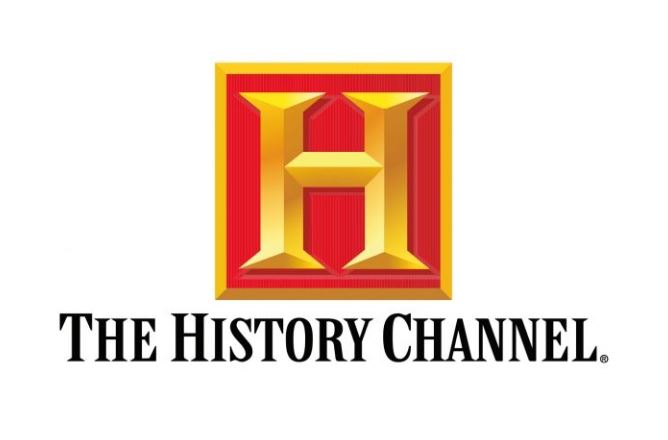
The History channel was officially launched in 1995 with a new logo. This logo also had the same “H” shaped design, but it was redesigned with a 3D look. It gave the whole logo a very stunning presence, allowing its design to grab eyeballs instantly. This style was also very unique because brand logos during that era were not created with the 3D design. So, it basically set a new trend in the market, enabling others to follow the practice as well.
The color chosen for the “H” letter was golden with a bit of greyish contrast in some places. The background of the letter box was selected red as it created a perfect combination with the golden. Beneath the box, the history channel was written in bold using masculine fonts. It further gave the logo a holistic touch, enhancing its overall catchy looks.
Second History Channel Logo – 2008

The first emblem logo was so popular that company didn’t thought to change it for years. However, in 2008, the company finally decided to redesign the History channel logo again. They didn’t altered the whole appearance of the logo in this second take. The logo was redesigned with minor changes, as most of the elements were kept same. It was done to retain the core identity of the logo because it had already become quite famous among the people.
Some of the notable changes in this new design included the removal of background square box. The new version only had the “H” letter on a transparent background. It offered a very modernistic touch to the logo, making it more appealing in looks.
Third History Channel Logo – 2015

The latest History channel logo was introduced in 2015 with some new modifications. This version was made in a more simplistic manner. The earlier used red arrow in the logo was removed in this take to make the designing a bit subtle. A new thick red underline replaced this arrow with History written in bold beneath it. The thick red underline had a more strong color gradient as compared to the previous version. It creates a perfect contrast with the golden shade of the “H” letter above, making the logo designing highly stunning.
Since 2015, this illustrated logo hasn’t seen much modifications at all. However, the channel has used some specific versions other than this to celebrate special events from time to time. This includes occasions like Christmas, Halloween, Earth day and more others. It is certainly a nice strategy to keep the channel branding up to date, and History channel has tremendously mastered it to get more market attention.
Meaning of History Channel Logo
The History channel logo doesn’t have any specific meaning. It represents a sense of luxury in the style, which is indeed one of the main qualities of the logo. This has been the major factor why company has also not opted to redesign the logo completely. Even with three rounds, the core identity, color and styling of the logo is still the same. It looks decent and subtle, showcasing a great elite class of channel’s personal branding.
People Also Ask (FAQs)
| 1. Why is History channel famous? History channel is famous because it produces shows centered around earth’s history. It is a great source to know how our world evolved and what challenges it faced during different centuries. |
| 2. When was History channel logo launched? The first History logo came out in 1995 when the channel was just launched. It became an instant hit and people really liked its overall design. The combination of red and golden looked perfect that it became the main branding theme of the company. |
| 3. Why was the old History channel logo changed in 2008? In 2008, the company decided to give its logo branding a new style. However, they also wanted to keep the old theme as well. This led them to the slight modifications in the old logo, so that it could look right according to the trends. |
| 4. What is the color of the new history channel logo 2022? The color of new History channel logo is similar like of the 2015 version. However, there is a little difference in the contrast of red and golden colors. This has been smartly done to illustrate slight changes that have been done in the logo. |
| 5. Did the History channel change its name? There are some rumors on the web that History channel had changed its name. This is certainly not true, because the channel has kept the same name since day one. They have not changed the name, neither have done any big overhauling in the logo. |
Final Words
That takes us to the end of this article in which we have discussed about the famous History channel logo in detail. It represents an iconic identity of a popular channel that is loved by millions around the world. This channel has produced not only quality documentaries, but also several shows based on earth’s history. It has further enhanced the popularity of the channel, making it more likeable among the movie buffs.
If you are also looking to design a logo similar to the class of History channel, get in touch with us today. We have got plenty of experts having sound knowledge about logo designing. They can help you to build quality brand logos, rightly according to the given demands.

Logopoppin
Logopoppin is a graphic design agency that specializes in logo designing, web development, video production and advanced branding services. We love to innovate businesses with new age technologies, allowing them to improve their visual reputation.


