
Table of Content
How was Spiderman created?
In an interview, Stan Lee revealed the inspiration behind Spiderman’s creation. Before Spiderman, all the conventional comic book superheroes were adult men with demigod perfections. Stan Lee wanted to create a more relatable, humanistic superhero: someone who could really be like that young teenager from your friendly neighborhood. The studio initially opposed the idea, believing that such a character would not resonate with their brand of superheroes. Besides, the studio considered teenage superheroes only as sidekicks.
Eventually, when Stan Lee introduced Spiderman in 1962’s 15th edition of “Amazing Fantasy” comic series, the character became an instant hit. The dual lives that Peter Parker lived made his character more dynamic. On the one hand, he was a college nerd and an orphan who lived with his uncle and Aunt. On the other, he was someone who had gained superpowers that demanded him to use them responsibly. His initial response to that power was to use it for making money. Something that any other teenager would have done. But after his uncle’s death, Peter Parker finally understood his purpose, that is, to fight crime.
History and Meaning Behind Famous Spiderman Logos
Over the years, the Spiderman logo has had a lot of changes. With each new series, the Spiderman logo design and the spider emblem changed over the years. Sometimes, to refresh its look for a new series or modernize the logo. Whereas sometimes, because it depicted Spiderman’s evolving nature. Nevertheless, the character remains an enduring comic-book superhero. It’s safe to say that Marvel Studios’ success with Spiderman is unprecedented. With that said, let’s have a look at the different versions of the logo.
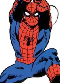
Steve Ditko’s Spiderman: The Original Spiderman Logo
The first Spiderman emblem in comic books and cartoons was quite bulky, depicting a round-shaped eight-legged spider that Peter Parker drew himself in the story. Given that self-help guides on how to design a logo weren’t readily available back then, Peter surely did a great job! As the design became the most memorable for the youngsters who had their first encounter with Spiderman in their childhood.
While Peter takes the credit for the design in the reel world, it was actually designed by Steve Ditko. Both Steve and Jack Kirby were given the opportunity to design Spiderman’s costume. But only the former succeeded in materializing Stan Lee’s idea of what Spiderman was supposed to look like. Stan Lee rejected Kirby’s version because it was too muscular, like Captain America. But instantly liked it when Steve Ditko came up with his design.
Although, since then the Spiderman logo and costume has had several iterations over the years, the original Spiderman costume remains the most iconic. The colors red and blue were chosen because they were brighter colors that registered well on paper. More importantly, they made the character easily recognizable against the grey concrete jungle that New York is. This is also the reason why so many of Spidey’s early foes wear colorful costumes, too.
Romita’s Spiderman Logo
In 1966, after Steve Ditko left working on The Amazing Spiderman, he was followed by John Romita Sr – as his successor. He was a creative artist who defined the Silver Age and laid the foundation for the Bronze age of comic books. Romita’s contributions were pivotal in taking the series to new heights. During his extended stay as an Art Director at Marvel, Romita gave the series its most memorable characters, including MJ, The Kingpin, Hobgoblin, etc.
Soon after he started working on Spiderman, Romita created a new iteration of the Spiderman emblem, marking the beginning of his pivotal role at Marvel Studios. The 1966’s latest iteration of the Spiderman symbol was much narrower and seemed befitting for the front side of Spiderman’s suit.
Post Gwen Stacy Symbol – The Beginning of Bronze Age Comics:

The following significant change made to the Spiderman logo was after Conway came on board as a scriptwriter for amazing Spiderman, succeeding Stan Lee. In 1973, he was asked to produce a groundbreaking episode of Spiderman. His task was to make sure that he wrote an event that would shock all Spiderman fans.
After deciding to create such an event, the question arose, how would the team achieve the desired effect? They did so by reinforcing the theme of loss and grief, which is one of the defining elements of Spiderman’s character. Consequently, they had to kill someone dear to Peter Parker to achieve this effect.
Thus, Conway contemplated killing Aunt May or Gwen Stacy, deciding to kill the latter. Gwen Stacy’s perfect relationship with Peter led the story nowhere other than a happy marriage. But taking their relationship a step further would “betray everything Spider-Man was about.” And letting that happen could mean the end of Spiderman. Moreover, no matter how they tried to write Gwen Stacy’s character, the readers found MJ the most interesting character. Moving forward, we see how patching MJ with Peter Parker indeed did create a more exciting relationship with its ups and downs.
On the other hand, killing Aunt May would have meant that Peter’s only remaining family, his Aunt, would die, leaving him without a guardian. Again, this would make him look much older, which may cause him not to resonate with the young audience. Besides, whenever Peter thought of the repercussions for his actions, his Aunt’s safety was his primary concern. Her death would have brought a massive change in the character. Thus, Conway attempted to kill two birds with one stone by deciding Gwen Stacy’s fate.
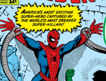
What entailed became historical as issue #121-122 of The Amazing Spiderman series created the most infamous controversy in the history of comic books. In the issue, Peter did not know whom to blame for Gwen’s death. He wondered if she was already dead when Goblin hurled her off the bridge, or was it he who accidentally killed her.
Later on, in one of the columns of a later issue, comic editor Roy Thomas revealed “that the whiplash effect [Gwen] underwent when Spidey’s webbing stopped her so suddenly was, in fact, what killed her. In short, it was impossible for Peter to save her.”
In light of these events, the Post-Gwen Stacy Spiderman emblem not only denotes a new phase in Spiderman’s life but also the end of the Silver Age of comics. During this era, in 1954, the Comics Code of Authority was created by the Comics Magazine Association of America. This code was a reactionary move to the allegation that comic books promoted juvenile delinquency. The code allowed US publishers to self-regulate the content of comics as an alternative to government regulation in the industry. In contrast, with the Bronze Era just around the corner, comic books became more realistic, and the superheroes were no longer regarded infallible. Gwen Stacy’s death further asserted this realism in the mainstream comic world, for inevitably, Spiderman played a role in Gwen’s death.
White Emblem, Black Suit – The Symbiote Spiderman Logo:
1984’s Black Spiderman costume was an obvious departure from the original suit and had a new emblem. It reflected the darker side of Spiderman as his powers became augmented with the symbiotic life form attached to his original suit. The Black one’s logo is unlike any previous ones, white in color and with two visibly large fangs; it contrasts perfectly with the full black suit.
Symbolically speaking, the white spider seems to be engulfed in darkness because of the symbiotic life form. And, it depicts the inner struggle of Peter against the darkness that the suit tries to bring forth from within him. Relatively, its emblem was also larger than any of the other emblems and was placed on the chest to give it a more intimidating feel.
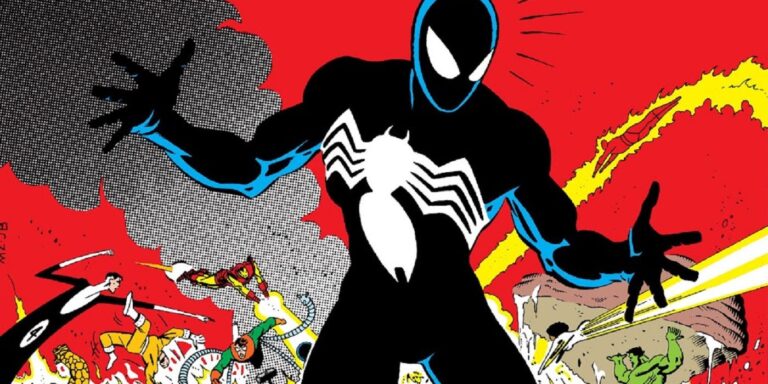
Interestingly, this logo idea was actually contributed by a fan, Randy Schueller. Marvel loved the idea and purchased it before putting their artists to work. It became so popular that the white emblem itself had several iterations. When Spiderman rejected Venom, his betrayal turned Venom against him. Eddie Brocks and Venoms’ hatred towards Spiderman made Eddie the perfect host for the symbiote. Thus, Venom retained Spiderman’s black suit logo because of his attachment with his host.
Another theory suggests that when Peter drew the spider emblem, his inspiration was Julia Carpenter’s suit. A secretive government agency, called The Commission, transformed Julia into a Superhero. Julia’s suit and the codename Spider-woman were given to her by one of the agency members. If that were true, it suggested that Knull’s followers had been planning something dark for a very long time.
Recently, however, Venom’s writer, Donny Cates verified a fan theory, which says that Venom copied Spiderman’s look and merged it with the emblem of the symbiote god, Knull. So, the venom logo represents his conflicting love and hate relationship with Knull and Spiderman.
Spiderman 2099

Moving forward to Spiderman 2099, we’re introduced to a New York geneticist Miguel O’Hara. When one of the test subjects dies at the laboratory, Miguel resigns after confronting his boss, Tyler Stone, for forcing him to conduct an experiment that he deemed unethical. As Stone wanted Miguel to keep working for Alchemax, he gave Miguel a drink mixed with a hallucinogenic drug called Rupture that bonds to the victim’s DNA. Miguel accepted the drink unknowingly, making him dependent on a drug solely manufactured at Alchemax.
Stone believed that the drug would force Miguel to stay at the laboratory. However, in an attempt to rid himself of the hallucinogen, Miguel planned to conduct on himself the genetic procedure that had killed Sims. Miguel used his original genetic code as a baseline for this procedure. However, his supervisor, Aaron Delgato, attempted to kill him by disrupting the process, yet Miguel survived it. Although his DNA spliced with the genes of a spider and gained several powers.
Any emblem that significantly departs from the original is the Spiderman 2099 emblem. O’Hara’s suit wasn’t a homemade costume; instead, it was bought for the Day of the Dead Festival. Like most Marvel superhero costumes, his suit is made of unstable molecules. Unlike Ben and Kaine, O’Hara is not Peter Parker’s clone. Instead, O’Hara’s DNA is genetically infused with Peter’s. That’s why Spiderman 2099 sports a spider-like talon-cladding skull emblem that represents this infusion of two DNAs. Spiderman 2099 was set in a time when science and technological advancements were being used to create monsters.
Scarlet Spider

In 1975’s Clone Saga, Miles Warren also known as the Jackal, created his first clone to defeat Spiderman. The cloning was unsuccessful and caused the degeneration of Kaine’s body. The second clone that Miles Warren created was Ben Reilly. Ben was also a clone made from Peter Parker’s DNA. The memories Ben had made him think that he is Peter Parker. In a fight between Ben and Peter, Ben is defeated and believed dead. However, later on, Warren brings him back to life and attempts to master a new cloning technique. After being killed and cloned several times again, Ben escapes to save himself from the agony of Jackal’s experiments.
As Ben had Peter Parker’s DNA and memories, he named himself after Peter’s Uncle and aunt’s maiden name. Sharing Peter’s memories also caused Ben to have an innate urge to become a superhero. He followed his inner voice and got hold of a red bodysuit and a blue hoodie. The makeshift costume made him resemble Spiderman. And when Ben went on to defeat Venom. The news channels dubbed him The Scarlet Spider.
Conway did not intend to use the cloned Spiderman further after his death in the 1975 issue. However, he introduced him again to the comic world during the “Clone Saga”, which ran from October 1994 to December 1996. The Editor of this series, Danny Fingeroth wanted the character to have an unconventional suit and asked the artists to design a simple costume with simple functionality. The artists worked on costume ideas independently. Later, Tom Lyle’s “hoodie” design won unanimous approval, according to Mark Bagley. Scarlet Spider’s character showed so much potential that it took center stage between November and December 1995. All five of the Spiderman comic titles were renamed during this time, replacing Spiderman with Scarlet Spider in The Amazing Scarlet Spider, Web of Scarlet Spider, Scarlet-Spider Unlimited, and The Spectacular Scarlet Spider.
In 1996, Bagley recreated the original costume with a new logo design, quite different from Peter’s Spiderman. The hoodie was gone for a more conventional-looking superhero suit. By now, it was clear that Scarlet Spider was here to stay, as the writers did their best to utilize the distinct styled Ben Reilly’s version of the Spiderman.
Spiderman Unlimited

It was rumored that the Spiderman Unlimited Series was originally meant to be Spiderman 2099. This was because of some of the resembling characteristics of Spiderman Unlimited with Spiderman 2099. Both the characters have a similar kind of large emblem and an inverted color scheme of the blue and red suits. According to Will Meugniot, they did consider creating a Spiderman 2099 animated series. Still, since that year Batman Beyond was releasing, they decided not to move forward with that idea and instead work on Spiderman Unlimited. Nevertheless, it’s hard not to think that the inspiration for the new suit did not come from the suit of Spiderman 2099.
Tobey Maguire Spiderman

One of our favorite Spiderman logos is from the 2002 movie. Its smaller body and its sharp, claw-like legs set the emblem apart from all previous ones, looking less cartoonish and more realistic. In comparison, the second installation of the series sports a similar symbol, which eventually changes as our beloved symbiote enters the scene.

This new black suit emblem, similar to the cartoon series, represents a change in Spiderman. After the symbiote attaches to Peter’s suit, his thoughts become crooked, and he begins to behave unlike himself. Therefore, the twisted front legs of the spider depict the growing aggression in Peter’s personality.
The Superior Spider-man

Superior Spider-man is a series that continues the storyline from The Amazing Spiderman issues #698 – #700. In the last issue, Dr. Octopus kills Peter Parker. Upon Peter’s request to give New York City a new Spiderman for its protection. Octavius agreed to the dying wish of Peter Parker and, after swapping his consciousness with him, takes on the mantle of Spiderman for himself.
The logo design of Superior Spider-man brilliantly depicts the merged identities of Dr. Octopus and Spiderman. The Spider emblem now seems to have eight wide spreading limbs that resemble an Octopus’ tentacles.
Andrew Garfield’s Spiderman

We remember Andrew Garfield’s Spiderman symbol for its elaborately long legs. It resembled the one from the previous movie series, with its realistic look. The series became highly criticized for multiple reasons. It was certainly difficult to top off Sam Raimi and Tobey Maguire’s depiction of Spiderman, and the amazing spider-man did a bad job at depicting Spiderman in an unrelatable way. Recently, however, Andrew Garfield raved praise for his role in Spiderman No Way Home. Finally, people are realizing how good of an actor he is!
Iron Spider

The name says it all, among these mechanical suits there are several versions, the first of which Tony Stark made during the Civil War Storyline. As the first ever mechanical Spiderman suit it was vastly different from the original one, both in appearance and in features. The Colors of the suit resemble the red and gold from the Iron Man suit, and the spider emblem has angular limbs unconnected with the diamond like body giving the spider emblem a robotic look that depicts the suits rich and modern technology.
Future Foundation Costume

In 2011, Marvel introduced the successors to Fantastic Four, called the Future Foundation. One of its members is Spiderman, who dons a new white suit as part of the team. This suit can change back and forth between white and the original costume due to its unstable molecule fabric. The emblem with its long wire-like limbs of the spider is a prelude to the one on the Stealth Suit.
Big Time Stealth Suit

The Big Time Stealth Suit first appeared in The Amazing Spider-man #650. It was a suit that Peter Parker designed himself Horizon Labs.
He created it to combat the Hobgoblin’s sonic screams. Besides that, the suit had many cool features. The Big Time Stealth Suit was the first advanced Spiderman suit made by Peter himself. The logo design perfectly reflects the nature of the suit. It’s unlike the original and has a logo that lights up with the change of modes.
The design works best for its neon lights. The light turns green in the Camo Mode, making Peter invisible and inaudible to the enemy. Another mode, called Anti-Sound mode, turns the lights on his suit red protecting him against sonic-based attacks. The suit gives him the ability to carry Antarctic Vibranium, which can melt metal objects, and it is also self-healing, and fireproof because of being made with unstable molecules.
Miles Morales / Into The Spider-verse

A very unique take on Spiderman was Miles Morales version of it. Promoting inclusivity through cartoons, Miles Morales is the only Spiderman that’s not black by costume, but by skin. Speaking of inclusivity, into the Spider-verse includes multiple Spiderman’s in the animated movie. As the name suggests, it depicts Miles Morales a young kid, gaining Spiderman power and meeting alternate versions of the superhero as he engages in epic battles to save the multi-verse. The logo perfectly encapsulates this idea of a multi-verse by simply using a circle around the Spider symbol. Moreover, unlike the other symbols, the spider is made in the style of spray-can art, reflecting the roots of Morales who lives in Brooklyn, a city known for its graffiti and street art culture.
Spiderman No Way Home

The classic look of the Spiderman suit worn by Tom Holland was perhaps made in reverse order. A very simplistic, short limbed emblem of the classic suit changes with the iron suit into a large body and even larger limbs that fill Tom Holland’s entire torso. The Angular design and the wide gold outlined thunder-like limbs give the emblem a mechanical look, which is nothing like Steve Ditko’s oval shaped version. It’s amazing to see how logo design experts can revamp a logo to give it new meaning with a modern look.

Conclusion
Throughout the history of Spiderman, his suit’s chest insignia has changed for multiple reasons. While we looked into many of the logos that have a history behind them, some were made due to a change of ownership. In an interview with CBR, Romita Sr discussed how the change in the ownership of a comic series brought a drastic shift in the creative process with new storylines and artwork. Thus, the logo evolution, in its entirety, is an homage to all the Marvel artists for the efforts and hard work they’ve made with a constant need to innovate for keeping the audience interested and engaged.
Latest news you want to know!
Subscribe for cutting-edge design inspiration at Logo Poppin! Elevate your brand with updates on logos, branding, web design, and video animation.
Note that by clicking “subscribe,” users may agree to our privacy policy and consent to Logo Poppin to use your contact data for newsletter purposes.
Logopoppin
Logopoppin is a graphic design agency that specializes in logo designing, web development, video production and advanced branding services. We love to innovate businesses with new age technologies, allowing them to improve their visual reputation.

