
Table of Content
Discover How the Honda Car Logo We Know Today Came to Be
The Honda car company is one of the most widely known automobile brands in the world, with a variety of options for consumers from different market segments across the globe. Today, it competes for the top position with older Japanese brands like Toyota and Nissan, despite coming into being in the early 1960s.
With the Honda logo gracing some of the most beloved consumer vehicles in the US and across the world, how is it that a company that formed in post-war Japan managed to make such an impact? While Toyota is known for its reliability and longevity, Honda is considered synonymous with performance.
With a rich motorsports history, it is no wonder that Honda was also able to develop a true motorsports icon like the NSX, a wonderful and affordable supercar in every way.
So, considering that it is such an iconic company, have you ever wondered how the logo for Honda came to be? The inspiration behind the design of the primary logo, and the meanings for the different variations we see around us?
Let’s find out how the simplistic Honda car symbol managed to achieve such success, one that businesses that use professional logo design services often fail to accomplish.
1- The Formation of Honda & Its Rise to Fame

The Honda Motor Company, known simply as Honda, is a Japanese automotive company headquartered in Minato area of Tokyo, Japan. It was founded in late 1940s, when Japan was trying to recover from the post-WW2 impact. Initially, the company started out as an engineering research company, which sold modified motorized bicycles using wartime-surplus engines.
However, once they ran out of those engines, Honda reverse engineered their own version of the 50cc engine used previously, and sold it as an aftermarket kit to people to fit onto their bikes. However, with the company aspiring to be a part of the automotive world proper, the company got incorporated and Soichiro bought on a talented engineer as well as an experienced businessman.
Together, the trio worked to establish Honda as an automaker, and worked towards creating a consumer vehicle. Their first success was in the form of the Honda D-Type motorcycle, the first vehicle completely built by the company. Continuing with their success in motorbikes throughout the 1950s, the company also started work on a true automobile, and launched the Honda T360 pickup truck in 1963.
By that quite successful in building race-winning engines and vehicles, courtesy of their motorbike division, Honda decided that their next automobile would be a sports car. Thus, the company released the S500, a sports car that served as the second car the company ever produced.
Over the years, Honda worked to develop vehicles that wouldn’t just be received well in Japan, but also in the US and Europe. Besides their automobiles, Honda also kept producing a variety of two-wheelers, like the iconic Honda Super Cub, a motorbike that changed the way USA perceived motorcyclists, and challenged big American and British motorcycle manufacturers.
Honda also broke new ground when it became the first auto maker to release a new brand for its luxury options, when it launched Acura in the USA, which beat established marquees like BMW its first year. And while it was technically a Japanese brand, the fact that Acura has no presence in the Japanese market and the company is headquartered in the US, it can be considered one of the newer American car brands.
Moreover, the success of this strategy led to Toyota releasing the Lexus brand, and Nissan the Infiniti brand.
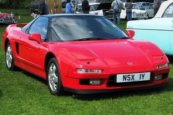
Then, during the late 1980s, Honda came up with the NSX, the first all-aluminum monocoque supercar that was designed to be lighter and more economical than its European counterparts were. Such was its popularity that Gordon Murray, the automotive designer who created the McLaren F1, said that he tried to emulate the NSX’s design for the McLaren after driving the car.
Today, Honda is one of the biggest producers of automobiles, motorbikes, and outboard motors. Moreover, the company still has a focus on performance research and R&D for new technologies, with the reveal of the ASIMO autonomous robot.
Overall, with Honda’s experience in high-performance hybrid technology courtesy of Formula 1, and their focus on consumer vehicles, the company looks to be on an upward and successful trajectory.
2- The Genius of Soichiro Honda – The Man behind the Vision

Soichiro Honda was a not just the founder of Honda Motor company – he was a visionary who guided the company by balancing his engineering acumen with a shrewd business sense. After all, establishing a new brand from scratch and competing with established players, especially in the post-war era, was no easy task.
However, his drive for perfection, and his innovative ideas like “no family in the company” were just some of the reasons for the company’s success. Moreover, if we look at how he rose and established his company, it shows the story of how determination and a vision can help achieve anything.
Born in a village, Soichiro left for Tokyo to search for work at the age of 15, with no formal education. However, after working as an apprentice at a garage for six years, he returned home at the age of 22 to start his own auto repair business.
It was in late 1937 when Soichiro founded a company called Tokai Seiki, which was chartered to create piston rings for Toyota. However, quality control issues plagued his early work, which he soon rectified. However, the war effort really forged the way for Soichiro, who ended up making many connections and learning a lot.
From a little business with around a dozen people working in a little shack, Soichiro made Honda a multinational billion-dollar company in his lifetime, an impressive achievement. Not only that, he beat motorcycle companies Harley-Davidson and Triumph in their own countries, despite the prevailing anti-Japanese sentiment post the war.
Overall, when people call Soichiro Honda the “Japanese Henry Ford”, they aren’t wrong. In fact, it wouldn’t be wrong to say that in some ways, Honda exceeded what Ford managed to accomplish.
3- The Inception of Honda Logo and Its Meaning – What Does the Honda Logo Represent?
The Honda logo is one of the most simplest logos you will ever witness. Currently, the Honda car logo features a chrome letter H, which has longer arms at the top that taper to the edge of the surrounding trapezium. The lower limbs are shorter, and the design is sometimes accompanied by the company’s wordmark, which uses a thick and short serif typeface to write the company name.
Overall, the design of the Honda logo today is very simple, with the company focusing on a clean and instant recognition over intricate design work that just looks good. With that in mind, the company does produce a few different variations of the logo, with minor changes like changing the background color or adding a supporting badge to the design to signify special categories or automobiles.
3.1- Honda Logo Fonts and Symbols
The logo fonts used for the Honda car logo is a custom typeface, which is not available commercially. However, it is a strong serif font with thick lines and contours. The design is quite close to the Colt font family and Clarendon Bold.
The primary feature of the logo design that draws the eyes are the huge serifs, that, contrary to popular belief, do not take away from the design’s visual impact. It does however, add to the overall look of the logo, managing to combine the elegance of old-style design with the stylings of the modern times.
3.2- Demystifying the Honda Logo Design and Colors Used in Them
Most of the time the logo for Honda – i-e the letter H in a trapezium colored chrome, is the most common symbol used by the company. In that instance, the logo is colored a bright chrome with a transparent background.
However, there are a few instances where the colors are different, and the choice of colors in that instance are mostly according to the color theory principles. For the high performance variants of their cars, also known as the Type-R category, often feature the same primary logo, albeit with a red background instead of a transparent one. As speed and aggression are often represented with the color red, which makes it the ideal shade for the Type-R logos.
Similarly, there are a few Honda vehicles that sport a logo with a blue background or a blue-colored line that follows along the inside of the surrounding trapezium. The vehicles sporting these logos, such as the new Honda CR-V, are often eco-friendly cars like hybrids or all electric.
These color combinations of chrome with one color or the other are designed to go well with a variety of shades of automotive paint without taking away from the car’s styling or visual impact.
4- Honda Logo and Its History – Looking at Honda Car Logos through the Years
Now that we have taken an in-depth look at the Honda company and how it came to be, let’s take a look at the evolution of the Honda car logo, and see how this automotive icon has evolved into its present form today.
However, here we will discuss the logos that were primarily used to represent the automotive division, as the automotive and motorbike divisions used distinctly different logo symbols.
Let’s dive in and discover the Honda logo evolution.
4.1- The First Honda Car Logo (1961)
The first Honda logo was debuted with the Honda T360 Kei pickup truck featuring a huge-looking dark-red logo at the front of the truck. The design of this logo was a highly skewed version of the letter H, with long, thick and outward angled and tapered upper arms and minute lower arms. The wordmark for the logo was placed below the design, which made for a compelling logo design with high visibility, one of the biggest problems that many types of logos face when used in small.
4.2- Revamping the Honda Car Symbol (1969)
With the first logo for the company seeing use until 1969, Honda decided to release a new version of their logo in 1969. The changing aesthetics of the consumers, along with the sleeker automotive styling that was becoming more common in the era, were two of the major reasons for this redesign.
The new design now featured a logo that was thinner and longer, compared to the quite wide logo previously. The new logo had the arms of the letter quite thinner, and the overall logo was stretched vertically for a longer, more elegant looking logo.
4.3- Changing the Honda Logo Design for Modern Aesthetic (1982)
With the advent of the 80s, the company needed to revamp its logo once more. The company cleaned up the lines and the aesthetics of the logomark to make the now iconic Honda logo, which is one of the few truly minimalist logos in the automobile world. The height of the logo was reduced to give the trapezoid outline more balanced dimensions.
The new logo now also featured a more subtle brand symbol, which was about the same size and height of the company wordmark.
4.4- The Modern Honda Logo (2000 – Present)
By the start of the new millennium however, the design aesthetics demanded that the logo, while minimalist, needed to be more obvious visually. To address that, the company decided to make the logo symbol larger, thus making the design more prominent, and the logo more visually striking, by finding the right balance in design.
5- Different Variations of the Honda Logo We Know Today
As we discussed earlier, the Honda logo has a few variations that differ slightly from the primary logo. The reason for their creation was to identify special models or trim levels for the vehicles the company produces, or in the case of the Honda motorbikes, the winged Honda symbol. So, let’s take a look at the different variations for the Honda symbol that we may see around us.
5.1- Red Honda Logo Design
The Honda car logo with a red background is one that JDM aficionados would be most familiar with. The Honda badge with the red background was usually seen featured on the high-performance spec cars, like the Civic Type-R or the Type-R variants for the Acura brand.
The reason behind this was simple. If we consider the different logo color meanings, darker shades of red like the one seen in the logo denote power and aggression. That is perfect for a car that has similarly styled lower end variants, and wants to subtly portray that it isn’t like the others. However, for the better part of the last decade or so, the red badge has been reserved for the Civic Type-R only.
5.2- Blue Honda Vehicle Logo
Unlike the warm and passionate color of the red Honda car logo, the blue colored Honda logo is designed to portray itself as the modern, more sustainable option. The 2022 Honda HR-V was the first one to feature stock blue accents to the logo, like the one shown above. Otherwise, this option does not come stock, but is one that many people with a hybrid/EV Honda car or those who want to color-match the logo with their car’s theme opt for as aftermarket modification.
This practice is quite common with owners of consumer cars, with many people often swapping out their older Toyota or Kia logo and badge for the newer versions of the automotive badges.
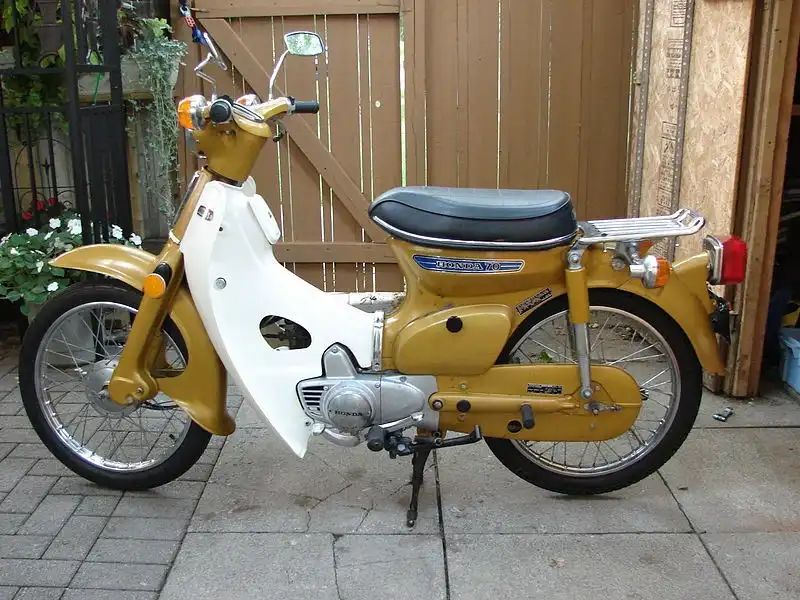
5.3- Gold Honda Car Symbol
The gold logo for Honda is one that has not been used since the early 2000s. This type of logo and naming trim was used for Honda’s top-of-the-line luxury cars, like the highest trim variant for the Honda Accord.
The logo was designed to stand out among the common chrome designs of that time, and give the car a sense of regal value and aesthetic. However, today, the gold Honda logo is one that can only be seen on carefully preserved older models, or on cars where people have swapped out the original logos for aftermarket golden variants. And as we can see from the luxuriously golden Porsche logo, the color of the badge can have a great impact on the car’s luxury value.
5.4- Winged Honda Logotype
Unlike companies like BMW that produce cars and motorbikes and use the same badge on both, Honda does things a little differently. For this Japanese automotive company, the H-symbol logo is for the cars and other four-wheel options, while motorbikes, ATVs, and more use this winged Honda logo.
An iconic symbol made famous in the US for the first time with the introduction of the Honda Super Cub, the logo today can be seen everywhere from consumer options to racing-spec motorbikes for professionals.
6- Popular Badges We See Accompanying the Honda Automotive Logo
Now that we have seen the different variants of the Honda logo itself, all you need to know about is the different badges and designs that often accompany the primary Honda logo on the cars. Most of the time, these additional badges are designed to denote specific variants of the base car, such as special edition or trim levels.
Let’s look at a few of Honda’s most popular non-logo badges.
6.1- Mugen Power Logo Design
Mugen is an aftermarket tuning and performance company started by Soichiro Honda’s son. A mechanical prodigy like his father, and following the elder Honda’s philosophy of not having family members within the upper levels of the company hierarchy, he decided to form his own company.
And just like the primary Honda company started by his father, Mugen was a huge success. The company was so good at what they did, that they managed to tune up and increase the performance of Honda cars that were already made to be on the limit by Honda itself.
A huge testament to their success is that even Formula 1, considered the pinnacle of automotive racing, used Mugen Motorsports first tuned engines for Honda in 1991-92. However after Honda withdrew from Formula 1 in 1992, Mugen Motorsports continued supplying engines to teams up until the year 2000.
Mugen-tuned Honda cars are said to be some of the best performing Honda vehicles you can drive, with an emphasis on performance and experiencing the true driving pleasure.
6.2- Spoon Car Symbol
Spoon is another Honda tuning company that was formed by ex-Honda test driver Tatsuru Ichishima. Formed in 1988, the company produces aftermarket parts for engine and suspension tuning, specifically designed to tune Honda vehicles to racing spec.
Over its history, the company has collaborated with Honda to tune many sports cars fielded by the company for different automotive events, like the 24 Hours Nürburgring GT car race. With an emphasis on naturally-aspirated power upgrades over forced induction, Spoon is known for its aggressive upgrade methodology designed to make a low-powered Honda car more powerful in all aspects.
Featuring cars like the Honda Civic, S2000, and the Integra Type-R, the company is known for its iconic powder blue and yellow paint jobs, which make a splash with fans that see it on a top-tuned racecar.
6.3- Type-R Honda Logotype
The Type-R logo you often see on Honda Civic cars is a badge that is used by Honda itself, and designed to denote the higher-spec variant of the Honda Civic. These badges were designed to separate the more powerful variants of the cars from its less powerful cousins, who were often styled the same.
While the Type-R badge was often seen on multiple vehicles in the mid to late 2000s, like the Acura Integra Type-R and the Civic Type-R, today the badge is exclusively used for the Civic Type-R.
6.4- Si Honda Car Mark
Like the Type-R badge, the Si badge is a stock Honda badge that denotes the car is one of the top-tier of performance options offered by the company. With the letters standing for Sports Injection, the cars that feature this badge have been highly tuned for maximum performance from the Honda Company.
Conclusion
In conclusion, the Honda logo is one of the most iconic and well-known car logos of all time. Despite its design being so simple, the company has managed to establish itself as one of the top automotive marquees around the world, with an established presence in both the 4-wheel and 2-wheel market.
And with a focus on delivering performance, the Honda Company is a prime example of perseverance and hard work paying off in the long run, especially if you stick to your roots and business values.
People Also Ask (FAQs)
| 1- What does the Honda logo represent? The Honda logo is representative of the last name of the company’s founder, Soichiro Honda. |
| 2- What does the wings on Honda logo for motorbike mean? At the time of the company’s inception, Soichiro Honda was looking to make his company a success. He was inspired by the Greek Goddess Nike, the patron god of victory, and adopted their winged symbol for his company’s logo. |
| 3- Is the Acura logo just a modified form of the Honda logo? Although Honda claims that the logo for Acura is representative of a pair of calipers used to measure fine dimensions, a look at the logo shows that the design can also be construed as the letter A for Acura, or an elongated H for Honda. |
Latest news you want to know!
Subscribe for cutting-edge design inspiration at Logo Poppin! Elevate your brand with updates on logos, branding, web design, and video animation.
Note that by clicking “subscribe,” users may agree to our privacy policy and consent to Logo Poppin to use your contact data for newsletter purposes.
Logopoppin
Logopoppin is a graphic design agency that specializes in logo designing, web development, video production and advanced branding services. We love to innovate businesses with new age technologies, allowing them to improve their visual reputation.

