Table of Content
Discover How the Hot Wheels Logo Has Transformed Over the Decades
The Hot Wheels logo, a dynamic icon featuring stylized flames coming from the rear racing wheels of a car, has become an instantly recognizable symbol of speed and excitement in model cars. Representing Mattel’s iconic line of die-cast cars, its evolution over the decades mirrors the brand’s own journey, reflecting shifts in design aesthetics, marketing strategies, and the expanding universe of Hot Wheels. Which incidentally, now also includes TV media, video games, and a vibrant collector culture.
Understanding the history and symbolism embedded within the Hot Wheels logo provides a fascinating lens through which to examine the brand’s remarkable success and its lasting impact on popular culture. And as the brand grew in popularity and diversified its offerings, the logo underwent several transformations, each iteration refining the visual representation while retaining the core themes of speed and excitement.
Let’s explore this logo through the lens of a professional logo design agency, and discover the strategy and creative genius that cemented this symbol as an enduring icon of the brand’s identity.
The Inception and Evolution of Hot Wheels as a Scale Model Car and Media Brand
The inception of Hot Wheels in 1968 marked a pivotal moment in the model car industry. Elliot Handler, co-founder of Mattel, imagined a line of toy cars that were not just miniature replicas, but stylized, high-performance models with a distinct “California custom car” aesthetic. This vision led to the creation of the sixteen original Hot Wheels cars, known for their vibrant Spectraflame paint finishes and redline tires.
What made them stand out compared to their competition from Matchbox, who at the time dominated the market, was Hot Wheels’ revolutionary low-friction, hard plastic wheels that allowed them to achieve high speeds on the company’s orange plastic tracks. This focus on speed and eye-catching design immediately set Hot Wheels apart from existing die-cast car brands, capturing the attention of children and sparking a cultural phenomenon.
The initial success of these die-cast cars paved the way for the gradual expansion of the Hot Wheels brand beyond mere toys. And over the decades, Hot Wheels continued to innovate with new car designs, play sets, and features, constantly evolving to maintain its relevance and appeal to new generations. This commitment to innovation and excitement solidified Hot Wheels’ position as a dominant force in the toy car market.
The Entrance of Hot Wheels in Other Forms of Entertainment
In more recent times, Hot Wheels has strategically extended its reach into various forms of media and entertainment, transforming into a multifaceted brand. This includes animated television series, video games, live-action movies, and a significant presence in digital platforms. Moreover, Hot Wheels has given birth to a thriving collector culture, with rare and vintage models demanding significant prices in the secondhand market.
This phenomenon shows the enduring appeal and cultural significance of the brand, solidifying its status not just as a toy but as a cherished piece of pop culture history. The evolution from a line of fast die-cast cars to a comprehensive media and collector brand demonstrates Mattel’s deep understanding of its audience and its ability to adapt and expand the Hot Wheels universe while staying true to its core identity of speed, style, and excitement.
Transformation of the Hot Wheels Logo Over the Years
The Hot Wheels logo has undergone several distinct transformations since its inception in 1968. And as is the norm with such evolutions, each one reflects subtle shifts in the brand’s image and brand sensibilities, while still staying true to the core themes of speed and excitement.
Let’s take a look at these various types of logos in greater detail.
1968-1969 Original Hot Wheels Logo

The original Hot Wheels logo, introduced in 1968, was a bold and dynamic design that immediately communicated the brand’s focus on speed. It featured the words “HOT WHEELS” rendered in a stylized, elongated sans-serif typeface that conveyed a sense of motion. Above the text was a graphic element depicting a stylized, elongated flame emanating from a central point, further emphasizing the speed and “hot” nature of the cars.
The overall impression was one of energy, perfectly aligning with the revolutionary fast-rolling nature of the toy cars themselves. This initial logo was impactful and clearly set Hot Wheels apart from other toy car brands. The use of bold lettering and the prominent flame graphic established the brand’s high-octane identity right from the start.
1969-1970 Hot Wheels Brand Icon
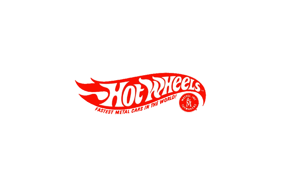
Around 1969-1970, Hot Wheels introduced a more distinct and enduring brand icon that began to solidify the visual identity we recognize today. This iteration retained the “HOT WHEELS” text, in a slightly different, more rounded sans-serif font. However, the flame graphic evolved into a more abstract and iconic representation of stylized flames, often depicted in vibrant red.
1970-1973 Simplified Hot Wheels Logo

The logo underwent a simplification in the early 1970s, retaining the core elements but streamlining their execution. The “HOT WHEELS” text became even more prominent and was often rendered in a bolder, more blocky sans-serif typeface. The flame graphic was simplified further, often appearing as a more solid and less detailed representation of stylized flames.
1973-1990 Hot Wheels Symbol
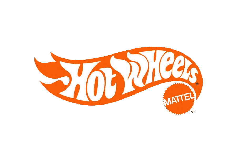
The mid-1970s saw the emergence of a logo that further emphasized the symbolic representation of the brand. The stylized flames became even more prominent and were often integrated more directly with a representation of a wheel. This era saw variations where the flames appeared to be erupting from or surrounding a stylized racing wheel, directly linking the “hot” aspect with the automotive theme.
1990-2000 Hot Wheels Logo at the Turn of the Millennium
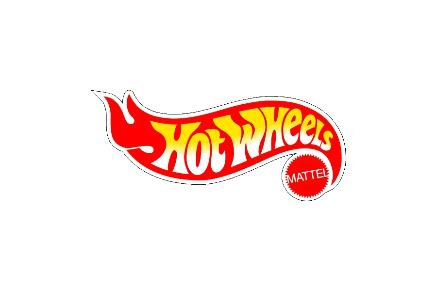
The 1990s ushered in a more dynamic and three-dimensional feel to the Hot Wheels logo. The flames often took on a more sculpted and layered appearance, suggesting depth and movement. The wheel was also frequently depicted with more detail, sometimes incorporating elements like a chrome rim to enhance its visual appeal. The “HOT WHEELS” text often featured a more stylized and italicized font, further emphasizing speed and action.
2000-2004 Early 2000s Hot Wheels Icon

The early 2000s saw a further evolution of the Hot Wheels icon, often focusing on a more streamlined and impactful representation of the flames and wheel. The flames often became more abstract and fluid, sometimes appearing as a single, powerful burst of energy emanating from a stylized wheel. The color combinations often featured vibrant reds, yellows, and oranges to convey heat and excitement.
2004-2010 Hot Wheels Logo
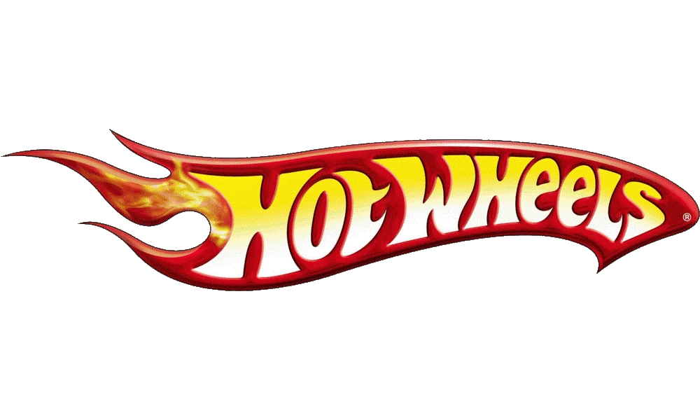
The mid-2000s introduced a logo that further refined the integration of the flames and the wheel, often placing the “HOT WHEELS” text directly within or closely associated with the graphic. The flames maintained a stylized and energetic form, frequently depicted in vibrant, gradient colors to add depth and visual interest. This logo and its variations have also been featured on many different Hot Wheels games through the years.
2010-2014 Modern Hot Wheels Symbol
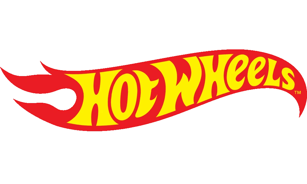
The logo from 2010 to 2014 embraced a more streamlined and impactful modern aesthetic. The stylized flames emanating from the racing wheel became the central focus, often depicted in a bold and dynamic manner with clean lines and vibrant colors. The “HOT WHEELS” text was typically placed prominently alongside the symbol in a strong and legible sans-serif font.
2014-Today Slightly Revamped Modern Hot Wheels Logo

The current Hot Wheels logo, adopted around 2014, represents a subtle but effective refinement of the modern symbol. The core elements of the stylized flames and the racing wheel remain central, but the design often features slightly sharper lines and a more defined sense of motion. The color palette continues to utilize vibrant reds, yellows, and oranges to convey energy and excitement, making it one of the most iconic toy logos today.
FAQs
| What is the ideation behind the design of the Hot Wheels logo? The Hot Wheels logo design depicts the essence of blazing speed with it’s vibrant and fiery red yellow flaming motif. |
| Who owns the rights to the Hot Wheels logo and brand? The Hot Wheels brand and it’s various brand artifacts are owned by Mattel Incorporated. |
| Why are Hot Wheels as popular today as they were in the decades earlier? The popularity of Hot Wheels through the past decades stems from one simple element – the cross-generational appeal of car culture. |
Conclusion
The history of the Hot Wheels logo is a compelling visual chronicle of a brand that has consistently captured the imagination of generations with its promise of speed, style, and thrilling action. From the bold and energetic original logo to the refined and impactful modern symbol featuring the iconic flames and wheel, each iteration has played a crucial role in shaping and reinforcing the brand’s identity.
The evolution of the logo reflects not only changing design trends but also the strategic efforts to maintain relevance and resonate with new audiences while staying true to the core essence of Hot Wheels. The enduring power of the logo lies in its ability to instantly communicate the brand’s high-octane spirit and its deep connection to the world of fast cars and imaginative play.
As Hot Wheels continues to expand its reach into new media and cultivate a passionate collector base, its dynamic and recognizable logo will undoubtedly remain a powerful and enduring symbol of its legacy as a true icon of popular culture.

Logopoppin
Logopoppin is a graphic design agency that specializes in logo designing, web development, video production and advanced branding services. We love to innovate businesses with new age technologies, allowing them to improve their visual reputation.


