
Table of Content
Explore the Steady Evolution of Hulu Logo from the Beginning
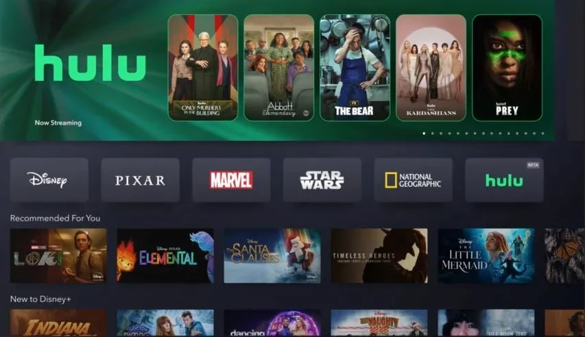
If you are looking for a Netflix alternative that houses tons of movies and shows of celebrated stars, Hulu is the best option. It is a famous online video streaming platform that allows you to browse and watch different movies and shows. The Hulu logo is therefore quite popular among the masses, as it represents a platform where people can enjoy a variety of shows on demand. Created by professional logo design services, the emblem of Hulu is quite simple, illustrating how a clean humble wordmark can be designed with perfection.
Talking about the origins, Hulu emerged in 2007 when the space of online video streaming was relatively empty. Other than Netflix, there were not much names active in the market, hence the opportunity was grabbed by Hulu to make a strong name for itself in the market. Today, it is among the top online streaming platforms in the market that is used by thousands of people around the world. The logo of the platform is also quite popular as it has a very rich history of innovation in the industry.
If you do not know much about the history of Hulu logo, read this blog in detail. It is a perfect source for you to know how the Hulu logo changed and evolved over the years. Let’s start from the basics understanding why Hulu is loved by the masses in the US, Europe and elsewhere.
Popularity of Hulu in the World
Hulu is popular around the world primarily due to its vast and diverse content library, which includes current TV shows, original series, classic programs. One of Hulu’s strongest advantages is its ability to stream episodes from major broadcast networks like ABC, NBC, and FOX often within a day of airing. This makes Hulu particularly attractive to viewers who want quick access to the latest television content without relying on traditional cable services.
Another reason for Hulu’s popularity is its flexible subscription model, which offers different pricing tiers to suit a wide range of viewers. Users can choose a lower-cost plan with ads, an ad-free experience, or even bundle Hulu with other services for a comprehensive entertainment package. This flexibility, combined with features like cloud DVR and support for multiple devices, allows Hulu to appeal to both casual viewers and dedicated binge-watchers.
Lastly, Hulu has built a strong reputation through its original programming, which includes critically acclaimed shows. These original series have attracted new subscribers and earned the platform industry awards and recognition. As a result, Hulu continues to compete effectively in the global streaming market by blending mainstream appeal with exclusive, high-quality content.
History of Hulu Logo: A Recap from the Beginning
Hulu has not changed much since its inception except for embracing different green shades. The company decided to keep the wordmark logo same, as it is quite popular among the people. Here is quick overview how the Hulu logo evolved over the years.
Hulu Logo – 2007
The original Hulu logo was designed with a distinctive and modern appearance, using a stylized lowercase wordmark. Each letter was carefully crafted in a custom typeface that fell within the geometric sans-serif family, characterized by clean lines and symmetrical shapes. This design choice gave the logo a sleek, contemporary look that aligned with Hulu’s identity as a forward-thinking digital streaming service.
By opting for a geometric sans-serif typeface, the vintage logo conveyed simplicity, innovation, and accessibility—values that were important to the brand from the beginning. The lowercase presentation added a friendly and approachable tone, while the custom design helped distinguish Hulu from other media platforms. Overall, the first logo successfully captured the essence of Hulu’s brand as a modern, user-centric streaming provider entering a competitive digital entertainment space.
Hulu Logo – 2014
The 2014 redesign of the Hulu logo maintained the original structure and typography of the wordmark, preserving the familiar shapes and clean, geometric lines of the original inscription. The designers chose not to alter the typeface, allowing the logo to retain its recognizable and consistent visual identity. This decision helped reinforce brand continuity, ensuring that viewers could still easily associate the logo with Hulu’s established image in the streaming market.
However, while the typography remained the same, the update focused on modifying the logo’s color scheme. The previous shade of green was refreshed and slightly brightened, giving the media company logo a more vibrant and modern feel. The updated color palette was more in line with contemporary design trends and digital platforms, helping Hulu stand out more effectively across screens and devices.
Hulu Logo – 2017
In 2017, following Warner Media’s acquisition of a stake in Hulu, the streaming service underwent a subtle yet noticeable update to its visual identity. This acquisition marked a significant moment in Hulu’s corporate evolution, as Warner Media became one of the key stakeholders alongside other major media companies. In response to this shift in ownership dynamics, the Hulu brand team opted to refresh the logo to reflect the platform’s growing industry presence and evolving brand direction.
The redesign did not involve a complete overhaul of the logo but rather a series of minor modifications intended to modernize its appearance. These changes were aimed at aligning Hulu’s branding more closely with its new corporate affiliations and the broader aesthetic design trends in digital media at the time. The refined logo maintained the recognizable green hue and clean typography but was adjusted for improved clarity and adaptability across various digital platforms and devices.
Hulu Logo – 2018
In 2018, Hulu undertook a significant redesign of its logo, marking a pivotal moment in the brand’s visual identity. One of the most notable changes was the introduction of a fresh, vibrant shade of green that replaced the previous color scheme. This new hue was chosen to convey a more modern and energetic feel, aligning with Hulu’s evolving image as a dynamic and innovative streaming platform. The decision to update the color was also aimed at enhancing visibility across digital interfaces and various media platforms.
In addition to the color change, the logo redesign intentionally moved away from using any gradient effects. The flat design approach gave the logo a cleaner, more streamlined appearance, which aligned with contemporary graphic design trends focused on simplicity and minimalism. By eliminating gradients, Hulu achieved a more versatile and easily recognizable logo that could be consistently reproduced across different formats and screen sizes without losing visual integrity.
Frequently Asked Questions
| What is Hulu? Hulu is a US-based streaming service offering on-demand access to TV shows, movies, and original content. It features both ad-supported and ad-free subscription plans, including live TV options. |
| Can I watch movies on Hulu? Yes, you can watch a wide variety of movies on Hulu, including new releases, classics, and Hulu Originals. Availability depends on your subscription plan and region. |
| What is the color of Hulu logo? The Hulu logo features a distinctive green color known as Hulu Green. It symbolizes growth and innovation, showcasing the true streaming idea of Hulu. |
Final Words
That concludes our entire article in which we have discussed the complete history of Hulu logo. It is one of those emblems that is highly popular in the circuit of online video streaming. Hulu certainly holds a strong repute in digital movie streaming, which is why it is loved by many people in the US and other countries. The logo has not seen much modifications during the last few years, except for few tweaks in the color shades. It is indeed a perfect example of wordmark that looks clean yet stylish as per the modern logo design trends.
Logopoppin
Logopoppin is a graphic design agency that specializes in logo designing, web development, video production and advanced branding services. We love to innovate businesses with new age technologies, allowing them to improve their visual reputation.
