Table of Content
Take a Look How the IKEA Logo Changed Over the Course of Time
IKEA is one of the top names in the global furniture manufacturing market. It is a brand that has built a strong footprint all around the world by manufacturing high-quality furniture. The company has also a legacy of decades, as it was first founded way back in 1952. Since then, the company has done various types of changes in the logo styling, so that their branding can remain fresh. IKEA has a simple illustrated logo that has been experimented multiple times with different types of colors. The history of IKEA logo is therefore very rich, as it has seen many changes from time to time.
IKEA is trusted in the market because of its long standing legacy of decades. It was founded in the era which didn’t had much big names in the furniture manufacturing industry. IKEA came into this field with some unique products that brought great revolution in the overall manufacturing sector. Thus, IKEA is often seen as the pioneer of modern furniture making. The company that started from a small Scandinavian region in early 1950s is now proudly called as the leaders in the elite furniture manufacturing globally.
In this blog, we will discuss more about IKEA and its dominance in the market. We will specifically take a look at the logo of the company, as how it evolved through the years getting different types of re-designs. So, let’s start from the basics understanding what IKEA is all about and why its products are so popular in the world.
What is IKEA?
IKEA is a multinational company founded in 1943 by Ingvar Kamprad in Sweden. The brand is well known for its ready-to-assemble furniture, home accessories, kitchen appliances and other products. The name IKEA is an acronym defining some key attributes related to the Kamprad’s life. The company is globally recognized for its minimalist, modern designs, which are both functional and affordable. Its signature flat-pack furniture reduces production and transportation costs, making IKEA a leader in affordable, sustainable home solutions.
IKEA operates through a unique business model, combining retail stores with an engaging customer experience. It uses a self-service format, where customers browse showrooms to view fully assembled displays and then collect their chosen items from a warehouse section. IKEA’s stores are designed to create a seamless shopping journey, often including cafes serving its iconic Swedish meatballs and child-friendly play areas. Beyond its retail presence, IKEA emphasizes sustainability, sourcing eco-friendly materials and committing to ambitious goals like becoming climate-positive by 2030.
Today, IKEA has over 400 stores in more than 50 countries and serves millions of customers annually. It has also expanded into e-commerce, catering to changing consumer preferences. Known for its commitment to innovation, IKEA continuously evolves its product lines to reflect modern lifestyles and diverse cultural needs. With its focus on affordability, sustainability, and design, IKEA remains one of the most recognizable and influential furniture brands in the world.
Understanding the Meaning of IKEA Logo
Before exploring the evolution of IKEA’s logo, it’s essential to understand the deeper meaning behind the brand’s name. The word “IKEA” isn’t a random arrangement of letters, it holds a significant connection to the company’s origins and its Swedish heritage. As an acronym, each letter represents an important part of the life and background of IKEA’s founder, Ingvar Kamprad, emphasizing the deeply personal and cultural roots of the brand.
Breaking down the acronym, the first two letters, ‘I’ and ‘K,’ stand for Ingvar Kamprad, the founder’s full name. Kamprad was a young entrepreneur with a vision to create functional, affordable furniture that could serve households worldwide. The next letter, ‘E,’ refers to Elmtaryd, the name of the farm where Kamprad spent his formative years. This rural upbringing, surrounded by nature and simplicity, strongly influenced IKEA’s values of practicality and sustainability.
Lastly, the ‘A’ represents Agunnaryd, the village in Småland, Sweden, where Kamprad grew up. Småland’s culture of resourcefulness and efficiency shaped his approach to business, inspiring the flat-pack furniture concept and IKEA’s focus on affordability. Together, the acronym IKEA not only ties the brand to its founder’s identity but also reflects the essence of its Swedish roots. It’s a symbol of the values and vision that have guided IKEA from a small mail-order business to a global household name.
History of IKEA Logo
The history of IKEA logo is quite diverse because it saw various changes and re-designs from time to time. Most of the people do not know about the early logos that came before 1980. If you are also one of them, take a look at the complete list of historical IKEA logos defined below.
IKEA Logo 1951
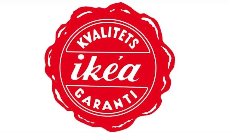
Designed by professional logo design services, the original IKEA logo featured a round emblem with a distinctive red wax-seal design, symbolizing authenticity and trust. At its center was the brand name, written in a lowercase cursive italic wordmark that added a personal and approachable feel. The choice of red as the primary color was intentional, reflecting IKEA’s commitment to offering products at affordable prices, a core value of the brand from its inception.
Adding to its meaningful design was the tagline “Kvalitets Garantí,” which translates to “Quality Guarantee” in Danish. This phrase reinforced IKEA’s promise of delivering dependable, high-quality products despite their competitive pricing. By embedding this tagline into the logo, the company positioned itself as a trustworthy brand, balancing affordability with assurance.
IKEA Logo 1952
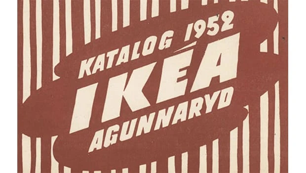
In 1952, IKEA underwent its first major logo redesign, introducing a bold and dynamic new look. The updated logo featured an extra-bold, all-capitals wordmark, creating a sense of strength and confidence. The text was positioned diagonally across the design, adding a sense of movement and energy to the overall composition. This new orientation marked a departure from the more traditional cursive script of the previous logo.
The color palette of this version was understated yet elegant, combining light brown and cream shades. These earthy tones evoked a sense of warmth and approachability, aligning with the brand’s Swedish heritage and simplicity. This redesign not only modernized the visual identity of IKEA but also reflected its growing aspirations as a company, blending boldness with a grounded and relatable aesthetic.
IKEA Logo 1953-1955
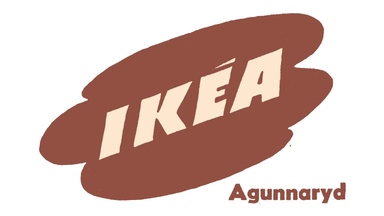
In 1953, the IKEA logo underwent a significant simplification, reflecting a more streamlined and minimalistic approach. The background was updated to a light beige shade, providing a soft and neutral canvas that emphasized the boldness of the brand name. This version also removed the vertical stripes present in earlier iterations, which contributed to a cleaner and more cohesive design.
A notable addition in this redesign was the inclusion of the word “Agunnaryd,” placed in the bottom right corner of the logo. This detail highlighted the village in Småland, Sweden, where founder Ingvar Kamprad grew up. By incorporating “Agunnaryd,” IKEA reinforced its connection to its origin story while maintaining a modern and uncluttered design.
IKEA Logo 1955-1956
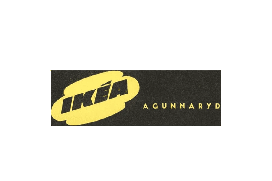
In 1955, IKEA’s vintage logo design saw a striking transformation with a fresh color palette and a revamped layout, signaling the brand’s growing identity. The redesigned emblem featured a bold yellow circle as the primary element, with the brand name “IKEA” displayed in strong black lettering inside. This vivid yellow not only captured attention but also conveyed optimism and energy, qualities IKEA sought to associate with its brand.
Accompanying the emblem was the word “Agunnaryd,” which received greater prominence in this redesign. The inscription was enlarged and placed to the right of the yellow circle, further underscoring IKEA’s connection to its Swedish roots. By integrating the village name more prominently, the logo reflected the brand’s pride in its heritage while appealing to a broader international audience.
IKEA Logo 1956-1957
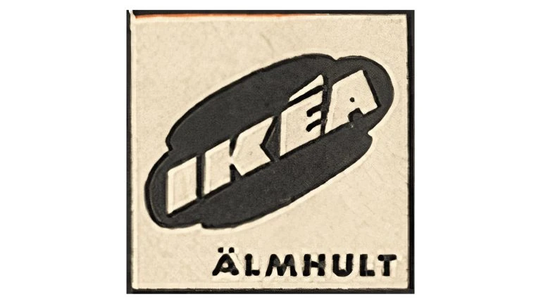
In 1956, the IKEA logo underwent another evolution, featuring a more refined design that aligned with the brand’s expanding presence. The background was updated to a subtle light beige, which lent the logo a clean and understated appearance while maintaining its connection to IKEA’s Scandinavian roots. Central to the new design was a bold black square, which served as the backdrop for the circular emblem.
A significant change in this iteration was the replacement of the tagline “Agunnaryd” with “Älmhult,” a reference to the Swedish village where IKEA officially began its journey. Älmhult, located in Småland, Sweden, is where Ingvar Kamprad opened the first IKEA store, marking a pivotal moment in the company’s history.
IKEA Logo 1957-1958
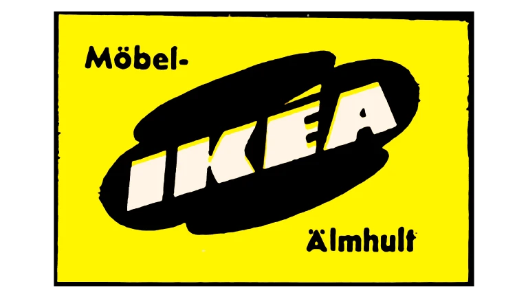
IKEA unveiled its new logo in 1957 to mark the launch of its first furniture line, signaling the brand’s commitment to modern design and quality. This logo introduced a fresh, bold aesthetic that would become synonymous with the company. The emblem featured a clean, minimalist design, emphasizing clarity and legibility.
To enhance its visual appeal, the black logo was set against a vibrant yellow background, creating a striking contrast that immediately drew attention. Furthermore, a new thick black border boldly outlined the emblem, adding a touch of structure and precision in the logo.
IKEA Logo 1958-1962
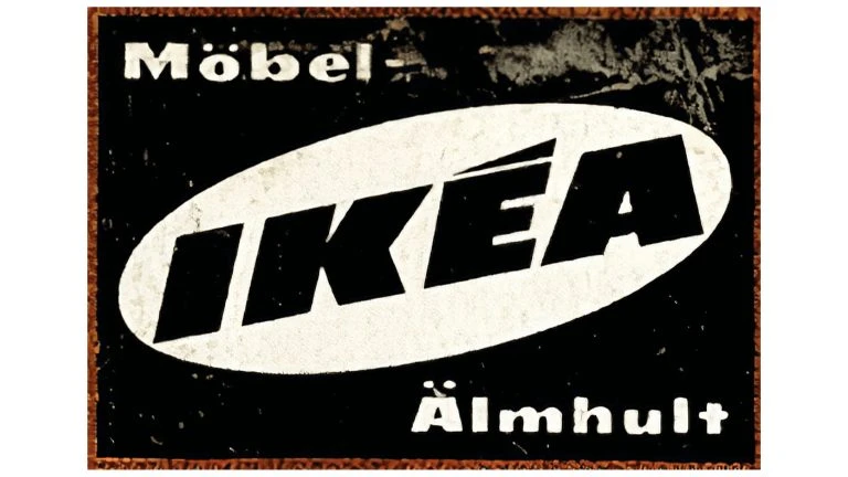
In 1958, IKEA refined its logo design, replacing the previous puddle shape with a more structured and balanced oval. This change marked a step toward a more modern and polished brand identity. The emblem within the oval was now rendered in white, creating a crisp and clean contrast against the bold black background.
Additionally, the lettering within the logo underwent further refinement to achieve a sleeker look. The updated typography emphasized clarity and sophistication, ensuring the brand name stood out prominently and was easy to read. These thoughtful adjustments solidified IKEA’s visual identity, making it more distinctive and reflective of the company’s evolving reputation.
IKEA Logo 1962-1965
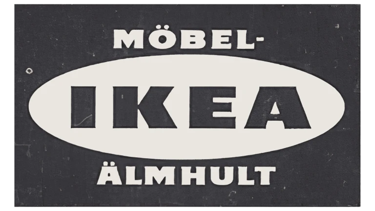
In 1962, IKEA introduced a redesign of its logo that reflected the brand’s ongoing evolution and refinement of its visual identity. One notable change was the removal of the glyph above the letter “E,” simplifying the logo for a cleaner and more streamlined appearance. The typeface of the logotype was also updated, shifting to a more delicate and refined style.
Another significant adjustment in the redesign was the orientation of the inscription. This change created a more stable and balanced composition, reinforcing the logo’s visual harmony. Additionally, the “Möbel” and “Älmhult” text elements were enlarged and brought closer to the oval emblem, integrating them more cohesively into the overall design.
IKEA Logo 1965-1967
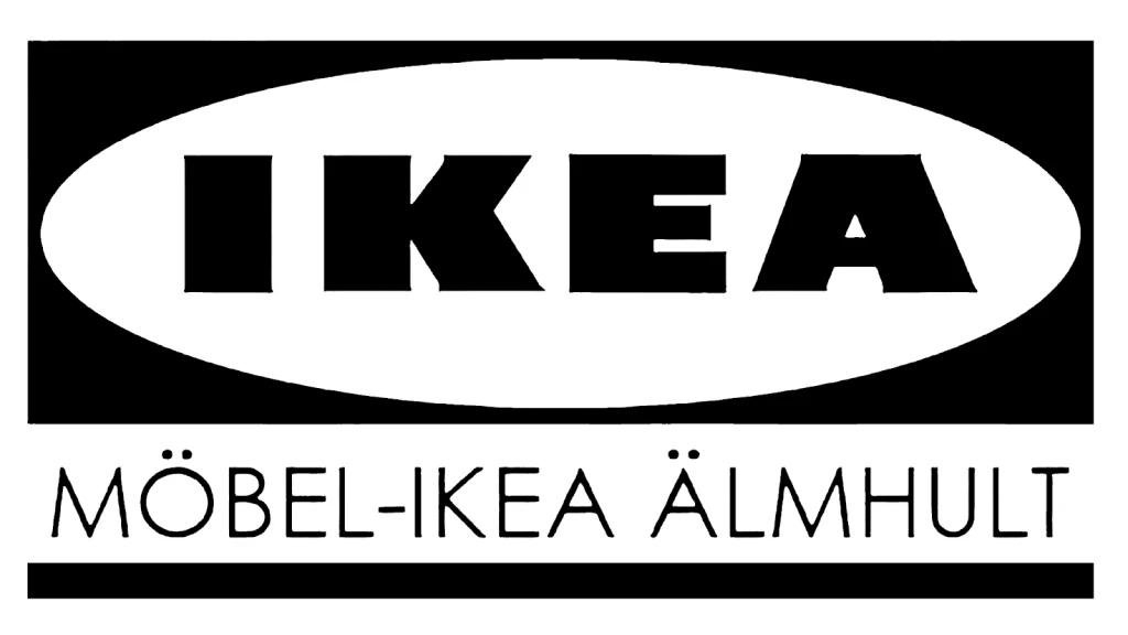
In 1965, IKEA introduced a significant redesign of its logo, adopting a monochrome color palette that exuded modernity and sophistication. The updated design featured a white oval set against a black rectangular background, with bold black lettering inside the oval. This clean, high-contrast aesthetic conveyed strength and professionalism while maintaining the brand’s focus on simplicity and functionality.
Additionally, the supplementary lettering was moved beneath the main oval emblem, creating a more unified and organized layout. The 1965 redesign proved to be a pivotal moment in IKEA’s branding journey, as it introduced a logo that would serve as the foundation for the iconic emblem we recognize today.
IKEA Logo 1967-1981
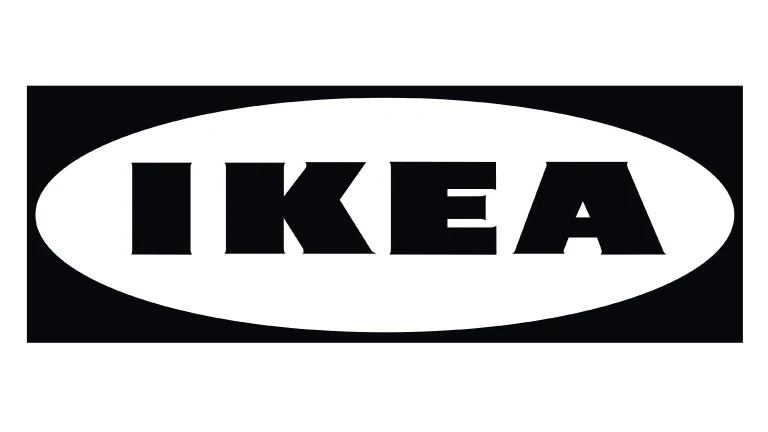
In 1967, IKEA unveiled a simplified version of its logo that marked a shift toward a cleaner and more focused brand identity. This redesign removed the tagline entirely, leaving only the iconic IKEA name as the central element of the logo. By eliminating additional text, the logo embraced minimalism, allowing the brand name to stand out more prominently and speak for itself.
The updated logo also introduced a sharper, crisper font that enhanced its overall refinement. The modern typography conveyed professionalism and confidence, aligning with IKEA’s growing reputation as a leader in accessible, well-designed home furnishings.
IKEA Logo 1981
In 1981, IKEA entered a new chapter in its branding journey by introducing a bold and striking change to its visual identity. The traditional color palette was replaced with a vibrant combination of red and white, marking a significant departure from previous designs. This fresh color scheme was a deliberate choice, symbolizing the energy, passion, and dynamism of the brand as it continued to expand globally.
This transformation was more than a cosmetic update, it was a statement of the brand’s confidence and its readiness to embrace innovation. The red-and-white palette created a visually impactful identity that stood out, reflecting IKEA’s commitment to empowering customers with accessible, stylish, and functional furniture.
IKEA Logo 1982-2019
In 1982, IKEA unveiled its now-iconic blue and yellow logo, a design that would become the enduring hallmark of the brand’s identity for decades to come. This exceptional color combination was not only visually striking but also deeply symbolic. The bold yellow letters set against the deep blue oval background mirrored the colors of the Swedish flag, reinforcing the company’s core roots.
The blue and yellow logo quickly became synonymous with the brand, embodying its values of accessibility, and innovation. Its clean and balanced design ensured instant recognition, while the vibrant color scheme conveyed optimism, and trustworthiness. Over the years, this emblem has remained largely unchanged, standing as a testament to the brand’s consistent vision.
IKEA Logo – Present
In 2019, IKEA introduced a subtle yet thoughtful refresh to its iconic logo, ensuring it stayed relevant in the modern design landscape while preserving its recognizable identity. The update focused on fine-tuning key design elements such as spacing, serifs, and colors to create a cleaner and more polished appearance.
The color palette also saw minor adjustments, with the iconic blue and yellow hues being subtly refined to achieve greater vibrancy and consistency across digital and print platforms. These enhancements ensured that the logo would remain impactful in an era of diverse media formats that often require high resolution settings.
Frequently Asked Questions
| Why is IKEA so popular in the world? IKEA is popular worldwide for its affordable, stylish furniture and home goods. Its wide range of products, convenient store layouts, and strong brand identity contribute to its global success. |
| What type of products IKEA manufactures? IKEA manufactures a wide variety of ready-to-assemble furniture, home decor, and household items, including sofas, beds, storage solutions, and kitchenware. They also offer outdoor furniture, lighting, textiles, and accessories for every room in the home. |
| What is the color of IKEA logo? The IKEA logo uses a bold color combination of blue and yellow. The blue represents trust and reliability, while the yellow conveys energy and optimism. |
Final Words
That concludes our entire blog in which we have discussed the evolution of IKEA logo in detail. Since the foundation of the company, the IKEA logo has witnessed many changes from time to time. The primary reason behind that was to keep updating the identity as per the emerging logo design trends. With this rebranding practice, IKEA kept its identity fresh, making its logo visually attractive in the industry. The current logo also includes some attributes of the classic emblem, meaning that the IKEA has still kept its branding legacy intact in the logo.

Logopoppin
Logopoppin is a graphic design agency that specializes in logo designing, web development, video production and advanced branding services. We love to innovate businesses with new age technologies, allowing them to improve their visual reputation.


