Table of Content
Discover How to bring Your Logo Ideas for Initials to Life Quickly and Easily
Logos come in many different shapes, sizes and styles. Any business owner has the right to choose the kind of logo that best suits their desired brand perception. Some choose elaborate logos that represent the flamboyant nature of their businesses, while others go for something simpler and more elegant, like initial logos.
Many people often consider wordmarks, lettermarks, and initial logos as simpler styles of logos. However, it could not be any farther from the truth. These styles are often used to incorporate the concept of minimalism, which can be difficult to incorporate while still managing to portray the brand’s message.
So how can we incorporate the concept in our brand logos? Let’s take a look at the elements that make up an initial logo, and discover how some of the most famous brands around the world use this type of logo to their advantage.
What are Initial Logos?
Before we get into the science of creating initial logos, let’s first understand what initial logos actually are. To put it simply, the idea behind an initial logo is to incorporate the brand initials into the design of the logo.
So, in many ways, initial logos are a type of lettermark logos. As a designer, you can use those initials any way you desire, so long as the resulting design is pleasingly memorable. By their very nature, these types of logos are often quite minimalistic, with designers rarely willing to lose its charm by being “too creative”.
Nevertheless, you will see these lettermark logos coming in a variety of styles, from simple initial brand logos to intricately designed logos with flowing script-like typefaces used.
How Can You Use Initial Logos for Your Business Effectively?
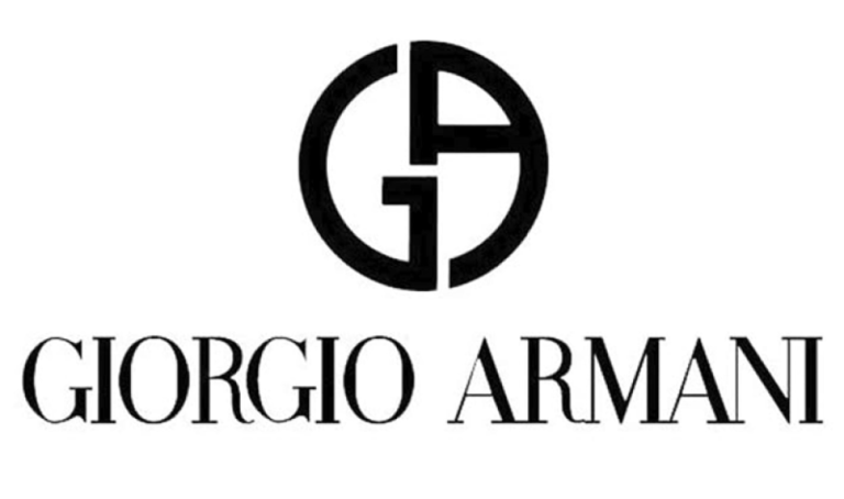
Incidentally, many businesses use one type of logo. Some however, have different variations of their logo to use for different mediums and purposes. Take Giorgio Armani, for example. There are two different logos that are used by the brand, one a full-sized wordmark logo spelling out the name of the brand, while the other a stylized lettermark logo with the brand’s initials.
The company uses them both, choosing one or the other based on the medium of display. That means that initial logos are also a way of making your logo more accessible to the people, by giving you more freedom artistically.
Moreover, considering that Armani is one of the leading Italian fashion brands second only to Prada, when designed by an expert logo design services, even a minimalist lettermark can represent a leader of haute-couture.
However, the key term here is “designed by an expert”. Its true, that lettermark logos and wordmark logos have a tendency to get boring. And it is up to the designers to showcase it in such a manner as to reduce the chances of that happening. So how can we do that?
Let’s study how some of the more popular brands have done so. Hewlett-Packard, or HP, went for a lowercase bold typeface, when generally an initial logo uses uppercase letters. General Electric, or GE, went for a stylized, British-style italic script for the logo, while Louis Vuitton went for a superimposed effect.
That is just the basic design of the logo. There are ways to leverage the impact even more with the right color combinations. Most fashion brands, like Yves Saint Laurent or Armani prefer a single, dark color like black to highlight elegance. General Electric on the other hand, goes for a bright, light blue for their logo, to highlight its heritage as a technology-centric company.
Popular Initial Logos from Famous Brands around the World

Now that you have got a glimpse of how different brands use initial logos to represent their identity, let’s dive in and look at a few examples from top brands from various industries that use their initials for their logo. Here, we will try to understand what their logos represent, and how their choice of logo has helped them be the brand they are today.
Initial Logos in the Tech Industry

In the tech industry, the logos are less formal than the ones you would find elsewhere in corporate businesses or clothing logos. They are designed to look modern, eschewing the classic look to better appeal to their target market.
Moreover, the designs have geometric patterns, visual tricks, bright colors, and more to separate themselves out from the crowd. Yet, despite that, they still manage to retain that sense of minimalism in their logos.
Take PlayStation for example. Their logo is a superimposed letter P, made to look as if its casting a shadow that looks like the letter S. And with the brand’s initials being PS, what better or simpler way could there be to represent them?
Similarly, there is Google with its letter G for the logo. While one of the simplest logos on this list, it utilizes its color palette to define itself, by using all of Google’s colors in a single design.
Initial Logos for the Fashion Industry

When we talk about fashion brand logos, its generally the elite brands or high fashion houses that go for initial logos. And we have many examples of this. From Louis Vuitton and Calvin Klein to Giorgio Armani, many fashion brands use a simple lettermark design for their logo.
These logos often prefer a dark and muted color palette over something bright or garish. Their aim is to embody a sense of elegance and high class, preferring to keep their logo simple and minimalist, using very subtle visual techniques to create perspective and depth.
Take Giorgio Armani’s logo. The lettermark is nothing more than the letters G and A together. Yet the way they are designed, stylized into a perfect circle, it serves as more than a simple logo. The brand uses it like a monogram, designing belt buckles, clasps on accessories and handbags, and even cufflinks into the shape of their initial logo.
Calvin Klein goes for a different visual impact, with one initial quite smaller and lighter than the other, providing a refreshing relief for a design that could potentially have been quite boring. And while both Yves Saint Laurent and Louis Vuitton went for a superimposition effect, they both went a little differently. YSL’s logo looks like the curls of the letter S folds around the letters Y and L, while Louis Vuitton went for a simple, blocky superimposition.
Initial Logos in the Automotive Industry
In the automotive industry, many brands have used initial logos, or are still using it to this day. And just like the design aesthetic found in the fashion logos, these car logos too tend to be minimalistic. However, despite being in business for so long, these brands have reworked their logos for a more modern look, but incorporating modern design trends and aesthetic into their logos.
Take Mazda for example. In the 60s to 70s, their logo featured a lowercase letter M, standing for their name. Today however, their logo features flowing arms that mimic the wings of a bird in flight, as well as a more stylish, uppercase letter M for their logo.
Similarly, Lexus has a clean yet impactful logo that is easily recognizable from a distance. Honda’s logo is a slightly stylized letter H within a four-sided frame, while Suzuki features a letter S for its symbol, but designed with a mix of sharp lines and soft curves to give a pleasing look of duality.
Creating an Initial Logo for Your Brand

Understanding how existing brands have successfully incorporated initial logos into their brand identity can help you plan and create your own lettermark logo in the same style. You can choose from a variety of elements to create your brand logo, based on your brand identity and perception.
Let’s say that your brand is a lighthearted and fun artisanal sweets company, and you want your initial logo to represent that. Some of the ways you can do so is by incorporating a fun script or typeface for the text, as well as a fun color theme for the logo and the brand. And there is a lot more you can do to make the impact even stronger.
Let’s look at the different styles of initial-based logos that you can use for your brand.
Single Letter Initial Logos

When we talk about single letter initial logo, it refers to the simplest form of this letter mark logo, kind of like the one used by brands like Zara, Valentino, or Acura. Now, with a single letter to play with, there is a lot you can do to give your design a little flair.
For the simplest designs, you can go for a blocky or flowing script for your logo, based on your brand aesthetic. Moreover, you can frame it, or add a dual artistic style to its design, such as we see in Vera Wang’s logo or the Suzuki logo.
In short, for a new designer, single letter initial logo is the simplest and best way to practice their basics, as they are generally more forgiving.
Multi-Letter Initial Logos

Multi-letter initial logo is a different beast altogether. There are multiple focal elements that you need to dress up and join in a natural manner, without losing their essence. Some of the simplest techniques to use here is to play with the spacing or perspective of the various elements, as in the case of Dolce and Gabbana.
Similarly, American car brands like GMC and DMC took a simpler approach to designing their initial logos. DMC, or DeLorean Motor Company, created a futuristic logo that perfectly matched the company vibe, considering their stainless steel DeLorean car made famous by the Back to the Future film series.
GMC on the other hand, preferred a simpler, blocky lettermark logo with sufficient space between each letter of the logo for easy legibility. So, there are many different directions a brand can take, depending on how they perceive their brand symbol to look like.
People Also Ask (FAQs)
| 1. How do I come up with the perfect initial logos? There are many ways to get inspired about your initial logo, such as: – Studying your competition – Studying your own brand – Studying initial logos for brands you like – Consulting a professional logo designer |
| 2. Are alphabet logos, initial logos, and lettermark logos the same thing? For most intents and purposes, yes, they are the same. All of them deal with combining the initials of letters representing a brand into a way that makes it attractive to look at for viewers. |
Conclusion
To sum it up, initial logos are a great way to instill a sense of luxury, elegance, and simplicity into your brand image. From haute-couture fashion houses to tech companies, many businesses are benefitting from the subtle impact of this style of brand logo.
And if you too are on the lookout to creating your own initial logo, then the guide above is a great place to start.

Logopoppin
Logopoppin is a graphic design agency that specializes in logo designing, web development, video production and advanced branding services. We love to innovate businesses with new age technologies, allowing them to improve their visual reputation.


