
Table of Content
Discover How the Current Instagram Logo Evolved from its Initial Concept
Attractive brand symbols are a requirement for every business that wants to evolve and grow. Social media platforms rely on them quite heavily to attract and engage users. Today, we will discuss the evolution of one of the most popular social media icons – the Instagram logo.
Part of the Meta family today, the platform bought a unique perspective to existing social media practices. It introduced an image-based social platform that users could use to snap, modify their pictures, and tag other users.
And it was a huge success. Before 2010, no one could’ve ever imagined that a social media platform based on image sharing could be worth millions. But Instagram proved them all wrong.
And do you know the best part? While great companies that become cultural phenomenon often hire professional logo design services to create an iconic symbol, Instagram’s first logo was created in-house by co-founder Kevin Systrom.
So, without further ado, let’s take a look at how the original instagram logo with name has evolved into the social media icon it is today.
History of the Social Media Platform Represented by the Instagram Logo
The social media phenomenon known today as Instagram is an incredible creation out of Silicon Valley. The name is a combination of the words Instant and Telegram, and the Instagram wordmark represents one of the world’s most well-known and profitable brands.
As of mid-2020, the platform had over a billion active users worldwide, with accounts for women slightly higher in ratio than men. But how did it get its start?
The platform resulted from an idea by Kevin Systrom and Mike Krieger, who created an app called Burbn. The app was a check-in app like foursquare. However, soon the developers shifted the focus of the product towards a photo-sharing model, in order to pivot in a different direction.
In March of 2010, the duo attracted a couple of venture capitalists from Baseline Ventures and Andreessen Horowitz. They saw and appreciated the entrepreneurial streak of Systrom and invested $500000 as a seed fund into the Burbn/Instagram project.
And once the project gained funding, it started to attract various talents to it. Josh Riedel joined in October 2010 as a community manager, Shane Sweeney joined in as a technical engineer in November 2010, and Jessica Zollman as the brand evangelist in August 2011.
The Rise of the Hashtag
Now that they had the funding to take Instagram to new heights, Systrom and Co. decided to focus on the consumer experience, a critical factor for any product’s success. To help their users find photos and other users quickly and easily, the Instagram team introduced the concept of the hashtag (#) in January 2011. But that had one small problem – generic tags would muddle up the carefully crafted experience.
To prevent that, Instagram encouraged its users to use specific hashtags that were relevant to the conversation. And when combined with the unique USP of the social media platform, it quickly made Instagram popular. In February 2011, an investment company called Benchmark Capital valued the project at $25 million.
This quick rise in popularity and the valuation put forth by the investment firm attracted private investors. They included the likes of Chris Sacca, Adam D’Angelo, and even Twitter’s Jack Dorsey into investing a further $7 million into the Instagram project.
The Inception of the Instagram Logo
Savvy businesspeople know the value a good logo brings to a brand. It can affect how the viewers perceive your brand and how they interact with the company. That is why businesses need to pay attention to the styles and types of logos that are popular within their niche. That helps to create a memorable symbol that allows the customer to associate them with the right market industry.
In theory, the original Instagram logo was quite suited to the brand at the time, considering the services they were offering. Unfortunately, the design was too complicated and rich in detail to be considered an effective logo by modern design standards. And over the years, the evolution of the instagram logo has had the singular purpose of making the Instagram icon stand out while still conforming to the common design perceptions.
Realizing the fact that their logo was not going to work as expected, the team decided to redesign and simplify it while still portraying the same vibe. And over the last decade or so, the different iterations sport a design that conforms to the design aesthetics of that time, while still paying homage to the original instagram logo.
Instagram Logo Font
Choosing suitable logo fonts is an integral part of the logo design process, especially when the wordmark is quite prominent or appears standalone. In the case of Instagram, the Instagram wordmark is considered a part of the graphics of the symbol.
The cursive script used for the Instagram logo font was custom-designed by the graphics agency Mackey Saturday. This made to-order font was used to create the second Instagram logo, introduced in 2013 and is characterized by a much smoother design resembling well-lettered calligraphy.
The font style used for this new Instagram logo was quite similar to popular typefaces like the Billabong Regular, the Bluestar Regular, and the Avangard Regular. These fonts are known to have rounded letters with smooth edges and soft lines, designed to be elegant, which is something that was quite noticeable in the second logo variation of Instagram.
Instagram Logo Color Palette
The Instagram logo color palette has changed quite drastically over the years. After the first Instagram logo, which featured an elaborate image of a polaroid camera, the subsequent two Instagram icons used a simplified version of the logo. And while it still showed the image of a camera with a rainbow stripe, the new design featured muted shades of brown for the camera’s design.
However, the 2016 redesign changed that completely. It made the Instagram logo brighter. The new logo design ditched the bland browns, and used color combinations from the rainbow stripe, mixing the reds, the yellows, and the blues. A somewhat similar style of logo color combinations was used for the TikTok logo, albeit they went for the red and blue more than the other shades.
The Evolution of the Primary Instagram Logo Through the Years
The evolution of the Instagram logo consists of changes made to its custom and distinctive wordmark, as well as the logo image itself. First, let’s talk about the design of the Instagram icon, and see how it has changed from the original Instagram logo to the current Instagram logo 2022. Over the years, we have seen four different distinct versions of the logo design, with the current iteration being the one which stands out in the most unique manner.
Essentially, the design has always showcased the company’s primary offering – the editing and sharing of images to a social media platform. Today you can post short videos, reels, and even livestream, but the iconic polaroid camera imagery is still perfectly suited to the company’s USP. And that is why the different Instagram logos can be considered some of the most unique photography logo ideas that could be used to represent such a brand.
Instagram’s Original Logo 2010
The first year of the social media platform saw the inception of two different Instagram logo designs. The first one was released at the launch of the platform. This logo featured a detailed image of an instant polaroid camera, a type of camera that prints the photographs immediately once it captures them.
It was a highly detailed design, and a great one too, which showed the front-facing camera with a viewfinder, lens, and the top-mounted flash as its most prominent features. The shutter button and the depth light also accompanied them, and that wasn’t all.
The camera had a well-defined shadow, and the reflection of various elements was visible in the camera’s body. This highly elaborate Instagram original logo, no matter how good a design, was not effective for use as a logo, which is why it was changed shortly afterwards.
The First Redesign of the Instagram Logo 2010
Later that year, in 2010, Kevin Systrom decided that it was time to bring on professional help to recreate the logo. He hired designer and photographer Cole Rise, who created a new logo after getting inspired by the vintage Bell & Howard camera from the mid-1950s.
This redesign came about after realizing that their Instagram original logo was too intricate to be an effective logo. Moreover, as users started coming onto the platform, it became apparent that a more modern-looking design was needed. That is why the designer remade the Instagram icon completely.
Now, the focus was on the camera lens, which was enlarged and centered onto the image. The viewfinder remained at the top right. However, there was no flash to be found now. The platform’s name was abbreviated to the left of the lens, with a rainbow-colored stripe emerging up from it, adding a dash of bright color combinations into the otherwise drab brown design.
Modifying the Instagram Icon 2011
As Instagram’s new logo was viewed and reviewed by the increasingly rising numbers of new users, the feedback resulted in minor tweaks to the design in 2011, to update it for the new design trends. The bright rainbow stripe was now more distinctive, with each color stripe being wider and more prominent now.
The camera lens was made more detailed, with lens flare and depth added to it, as well as coloring it in the iconic blue hue commonly found in such lenses. Finally, the name wordmark too was changed. The new design now said Insta, an abbreviation that was far easier to remember and communicate than the previous INST.
The Completely Redesigned Instagram Logo 2016
In 2016, the company decided to redo its logo for a better design, more in tune with modern design trends of minimalism. The designers hired for this project decided to do away with the detailed camera’s image and instead opted for a colored outline depicting one.
Instagram’s new logo was quite minimalistic compared to the ones before and gave a futuristic vibe. The outlines portrayed the body of the camera, the lens, and the viewfinder. The lines were done in white, while inside and outside, the logo color combinations featured a bright gradient of shades ranging from light to dark colors of the rainbow.
The shape of the logo however, was still square, with rounded edges just like the previous iterations of the Instagram logo.
The Modern Instagram Logo and Its Impact on the Consumers
The modern Instagram logo sports a simple design with a bright color scheme. However, this was one of the most controversial logo redesigns for the social media giant. But what was it that they exactly changed, and why did they do it?
Why Did Instagram Change its Logo?
In recent years, more and more people have been using the platform to share a myriad of images and videos on to the platform. This diverse array of shared media needed something fresh, bright, and youthful as its symbol, something which the Instagram logo at the time was unable to fulfill.
So, the company hired designer Cole Rise to redesign it, and on May 11th, 2016, the new Instagram icon was released.
What Does the New Instagram Logo Look Like and How Is It Different?
The new logo was a massive step away from the previous design. Gone was the image of a brown camera with a giant lens and a rainbow-colored stripe. Now then design featured a rainbow colored outline of a camera, a design idea that alienated many due to its massive difference in looks.
What Other Changes Did Instagram Implement Besides the New Logo?
Now, besides the logo, the company also decided to change the colors of its navigational buttons, making them the same rainbow-colored affair as their logo. besides making the entire app look fresher and brighter, it also helped the company establish a uniform brand design identity.
How Did People Perceive the New Instagram Logo?
Initially, a large number of critics and users didn’t like the new logo. hey felt as if the logo was too different, and too bright. And while many critics have now come around to it, there are still many who critique the design aesthetics of the app, despite using it frequently.
Instagram Live Logo 2016
In late 2016, after Facebook, YouTube and Twitter came up with live-streaming capabilities, Instagram too jumped on the bandwagon and introduced a similar feature called Instagram Live. Alongside direct story messaging, this was one of the two major additions that every social media platform has added to its functions in recent years.
The basic design of the Instagram Live logo is the same as the original Instagram icon, with only an added wordmark accompanying it, spelling LIVE. That is somewhat similar concept to the Facebook logo and its variants.
Instagram Icons
As many businesses today rely on social media platforms like Facebook, Instagram, and more to create their pages and market their brand, the demand for icons representing these platforms is relatively high. As a popular marketing and branding tool, Instagram has also launched various social media icons for business cards and websites.
Instagram Icons White
Some of the Instagram icons through the years have been colored white with simple black outlines. These icons were mainly used on either monochromatic medium or dark backgrounds. As you can see in the image above, one of the variants features the old design, while the other features the new logo design.
Instagram Icons Black
Like the Instagram icons in white, the Instagram logos in black were images designed to be portrayed onto light, monochromatic backgrounds. They were more commonly used for business cards, especially those which used a one or two-shade color palette. The samples above feature the icon in three different styles from over the years.
The Multicolor Instagram Logo Vector
The current Instagram icon is quite simple, just a smaller version of the main Instagram logo. As a modern and straightforward design, the logo translates quite well to various sizes and mediums. At the same time, the bright color palette makes it quite distinctive. These icons are mainly used on modern web pages or digital media to depict that brand’s various social media handles or original content.
Instagram Logo Wordmark and its Design Evolution
Alongside the main logo image, the Instagram logo wordmark has also evolved in the past decade. Let’s look at how the text-based logo has changed over the years.
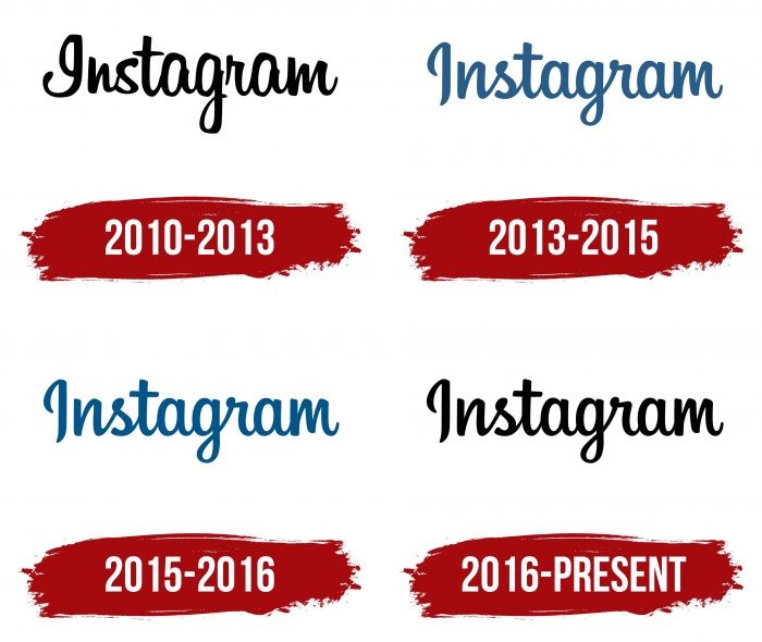
Instagram’s First Logo Black and White 2010

The first Instagram logo wordmark was introduced in 2010, along with the introduction of the platform itself. The first iteration was quite simply made to mimic a handwritten word. The style of the letter m with different heights to its edges, the haphazard shape of the letter s, and the unorthodox form of the initial I was designed to resemble a handwritten word using some script-based vintage fonts.
The Second Instagram Wordmark 2013

The second logo iteration was released two years later, designed by graphics agency Mackey Saturday. This custom-ordered logo was created to smooth out the inconsistencies of the previous wordmark. The result was a far more aesthetically pleasing wordmark logo that still resembled an excellent calligraphic work without the issues of handwritten fonts.
The Third Iteration of the Instagram Wordmark 2015

The third iteration of the Instagram wordmark logo just tweaked the shade of the color blue for the font. The style and the design were the same as the previous logo. However, the shadow of the color blue used in it was now a few steps lighter and, thus, brighter. The reasoning behind it was to color it using a more enhanced blue shade for a more eye-pleasing contrast.
The Current Instagram Wordmark 2016
In 2016, the only change was the shifting of the color palette from blue to black. The rest of the design was the same, including the font and the style of writing. The move was made to create a complementary wordmark to the now quite colorful primary Instagram logo. The new color scheme was a far better contrast than the previous one for this iteration of the primary logo.
Why is the Instagram Logo 2022 so Popular?
The Instagram symbol hasn’t always been famous. In 2016, when the design was last modified into its current form, the company faced a lot of backlash from its fans and the media. The design change was so drastic and unneeded that the fans felt that the platform did them a disservice.
However, six years later, in 2022, the platform and its logo are still going strong. And the critics of the new design have come around to it. Moreover, since it was bought out by Meta, the platform has seen an even more massive surge in its user base.
So much was the Instagram original logo and its creators revered that when Systrom and Krieger decided to part ways with the company in 2018, the world was shocked. And while it was a highly emotional time both for the company and its founders, the announcement and the resultant media frenzy only bought more attention to the app.
Today, after more than a decade’s worth of service, the platform has enjoyed quite an unprecedented user base, especially considering that it was a such a unique concept at that time. Moreover, it has helped established hundreds of thousands of brands and aided them in promoting their business, especially in the past few years.
Instagram Logo for Business Cards and Websites
An increasing number of businesses and entrepreneurs are using social media platforms for their branding today. Many of them are looking to add new and multiple communication channels to their existing websites or business cards. That allows these professionals to cover a variety of ways to reach and connect with their consumers.
You can easily download the Instagram logo SVG for editing in order to add it to your visiting cards or even as an icon on your website. That would allow anyone looking for you to choose the most convenient option to contact you, increasing the chances of becoming a lead.
Frequently Asked Questions
| 1- Is Instagram logo free to use? You can use the logo under their fair usage policy. That means you can use the designated file sizes for use on your website or business cards as favicons etc. |
| 2- Can you use Instagram logo? You can use the icons available online for use on your website. You can download the instagram logo transparent from the web to add to your web pages. |
| 3- Can instagram logo be used on business cards? Yes, you can use the instagram logo png to add to your business card design. it can be used to represent your instagram handle for quick recognition. |
| 4- What is instagram logo font? The font used in the wordmark is a custom designed script. However, the old lettering used the Billabong Regular font for the abbreviation. |
| 5- Where to download instagram logo? The instagram logo svg files are available at a number of online resources. However, they should only be used for activities permitted by the platform that owns the design. |
| 6- Why did instagram change its logo? Instagram changed its logo to incorporate a fresh, more youthful design for their logo. |
| 7- When was the Instagram logo 2022 released? The Instagram logo 2022 was released on May 11th, 2016. |
| 8- What does the Instagram logo look like? The instagram original logo was a knockoff of a polaroid camera, with a rainbow stripe and the company’s wordmark. |
| 9- Who designed the Instagram logo? The first iteration of the instagram logo was designed by Kevin Systrom, while the current version was designed by Cole Rise. |
Related Articles:
Conclusion
In short, the rise and popularity of social media today is partly thanks to Instagram. It introduced using video and images as media to connect and communicate with each other, besides text. But to create and evolve an iconic logo like the instagram logo requires a company to be always on their toes and listen to the trends and their consumers.
Suppose you are looking to have a social media logo created for your brand. In that case, our expert designers are highly skilled in creating the perfect logos to represent the true essence of your brand.
Latest news you want to know!
Subscribe for cutting-edge design inspiration at Logo Poppin! Elevate your brand with updates on logos, branding, web design, and video animation.
Note that by clicking “subscribe,” users may agree to our privacy policy and consent to Logo Poppin to use your contact data for newsletter purposes.
Logopoppin
Logopoppin is a graphic design agency that specializes in logo designing, web development, video production and advanced branding services. We love to innovate businesses with new age technologies, allowing them to improve their visual reputation.

