
Table of Content
Discover How the Top Insurance Websites Manage to Establish an Online Presence
Business websites are a necessity today – there is no doubt about it. From a simple corner store business or a mom-and-pop shop near you, to large businesses operating globally, nearly every business between these two extremes can benefit from a website.
However, there are some businesses, such as real estate of insurance, where some people feel that a website lacks that human warmth that helps close leads. However, with today’s focus on a customer-first approach, that argument is quickly losing ground. But there is a caveat.
How can you ensure that the insurance website design ideas that you use will have a strong and positive impact on your users? Well, to answer that, we will take a look at some carefully curated design ideas that will help your insurance website stand out in a consumer’s mind. We will also take a look at some top insurance websites designed by professional web design services to see what is it about them that makes them so memorable.
Why Would an Insurance Company Need a Website?
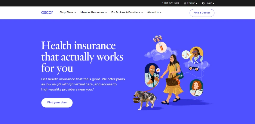
As we mentioned earlier, businesses today need to have a professional website representing their brand online, like that of Oscar Insurance. One of the primary reasons is that consumers today tend to search for the answer to their needs online, whether its buying insurance or a house, or its finding their favorite dish nearby. Having a website allows the business to have an online presence, allowing consumers to discover them when needed. However, for service-oriented businesses like insurance, there are other reasons for it too.
In the competitive landscape of the insurance industry, a well-designed website is not just a digital presence but a crucial tool for engaging customers and driving conversions. That is why your insurance website design ideas need to ensure that your website stands out among the competition, providing a seamless user experience and fostering trust in the brand. Moreover, it serves as a base for your brand’s omnichannel marketing strategy, allowing you to improve lead generation and conversion.
9 Insurance Website Design Ideas that Guarantee Success
Now that you understand what insurance websites are a necessity for insurance companies, you might be wondering how you can create a web layout that rivals the most successful insurance sites. Well, there is no specific guide on creating insurance websites.
However, there are some amazing, time-proven insurance website design ideas that ensure that the business websites you create are going to be a massive success. Let’s take a look at these web design ideas.
Sleek and Intuitive Navigation
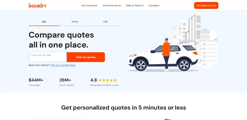
Navigating an insurance website should be as smooth as navigating a well-mapped city, like this one for Insurify. Clean and intuitive navigation is crucial for users to find the information they seek effortlessly, as well as avoiding frustrating and losing the customer. Therefore, it is important to take inspiration from insurance websites that embrace simplicity without compromising on functionality.
Responsive for Mobile Users
With the increasing use of smartphones over the years, ensuring a responsive design for your insurance websites is non-negotiable. There are numerous examples of insurance sites that provide a smooth and visually appealing experience on mobile devices, whether they be smartphones or tablets. Even Google’s insistence on adding responsive design as a metric for SEO highlights the importance of catering to the mobile audience.
Visually Compelling
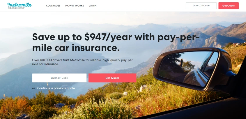
In an industry often associated with complexity and jargon that is hard for many people to know, powerful and expressive visuals can simplify the message. Moreover, it can make something difficult and elusive into a topic that is interesting enough to spend time understanding. This is possible by leveraging high-quality images and graphics to convey trust, reliability, and the humanity of insurance, like Metromile does. However, beware about finding the right balance between professionalism and approachability through visuals.
Clear and Expressive Calls-To-Action
There is a lot more to an effective insurance website than just easy navigation and good visual. There is a structure to the development of any good business website, whether it’s for an insurance firm or a restaurant. A well-designed insurance website should nudge its consumers toward specific actions, be it requesting a quote, booking a call/meeting with an agent, or purchasing a policy. Therefore, you should emulate websites that use clear and compelling CTAs, placing buttons and prompts that drive engagement.
Testimonials That Engender Trust
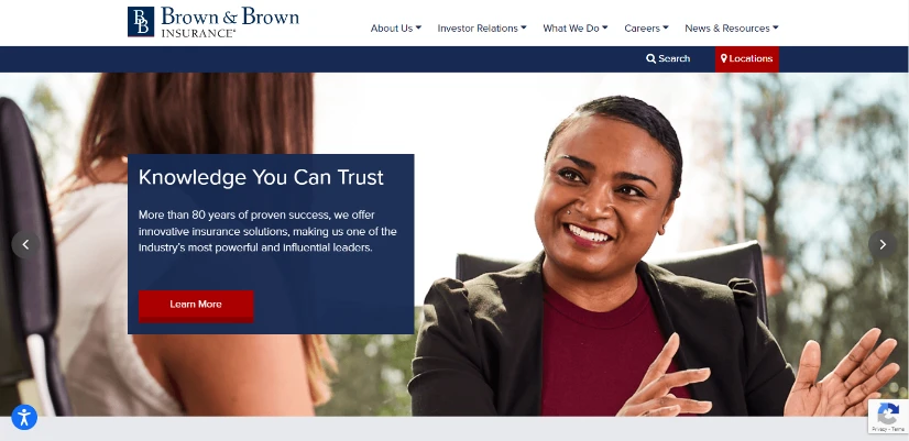
While brand trust is essential in all industries if you want to capture a section of the market, building trust is paramount in the insurance or financial sector. Patronizing businesses in one of these industries can be a big decision, which can make it difficult for new businesses to carve themselves a niche. Evaluating how successful insurance websites incorporate trust-establishing branding elements in their design, from customer testimonials to security badges, can help you navigate this area. The result would be a website that instills confidence through design choices that resonate with your target audience, similar to how Brown & Brown Insurance manages to do.
Interactive Elements Such as Premium Calculators
Interactivity is an essential tool in getting consumers interested in your brand, but one that is often ignored in favor of flashier branding ideas. With the right interactive tools such as premium calculators, you can engage users by offering an interesting way to simplify complex decisions. To find out what elements work for your specific industry, evaluate insurance websites that provide users with valuable tools for estimating coverage needs, premiums, or policy comparisons. Explore the impact of such features on user engagement and satisfaction, and incorporate them if they work for you.
Clean and Professional Layout Using White Space
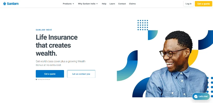
White space or negative space is not just empty space; it’s a strategic design choice, similar to how its used by Sanlam Indie Life Insurance. It allows designers to give their viewers a sort of break from the overstimulation via visuals, this allowing them to absorb more information. You need to explore popular insurance websites that use white space to enhance readability, create visual hierarchy, and reduce cognitive load. This will help you understand the art of using negative space to convey a sense of professionalism and simplicity. Moreover, an iconic design will serve as a source of word-of-mouth marketing for your brand.
A Professional Choice of Font
Typography can impact a website’s visual appeal and message delivery quite significantly. That is because each style of font and typography exudes a different vibe that adds to the overall meaning of the design. In order to find the right font style for your insurance websites, you need to identify and evaluate insurance websites that use innovative typography choices, aligning with their brand identity. This process will help you shortlist fonts that strike the right balance between professionalism and uniqueness, helping you stand out from the crowd by building on your unique brand design.
An Enjoyable and Smooth User Experience
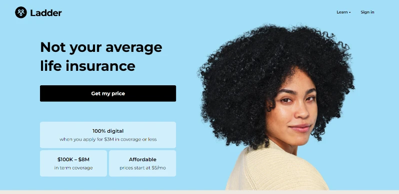
Personalization is the key to standing out in a crowded digital space. Companies today are trying to discover new ways to offer a personalized experience to their consumers, whether its via understanding and targeting their specific needs, or via visual personalization. Look for examples of insurance websites that offer personalized user experiences, tailoring content and recommendations based on user behavior, as Ladder Life Insurance manages to do. This will help you understand how to find balance between customization and user privacy.
3 Examples of Top Insurance Websites That Manage to Stand Apart from the Competition
So now that you have seen the different insurance web design ideas that can help your business website stand out, do you think you are ready to take on the development of an insurance website yourself?
Well, there is one more thing that you should know in order to improve your chances of creating a successful insurance website. You need to take a look at some insurance websites that have successfully carved themselves a piece of the market, in order to identify the elements that helped them achieve that.
So, without further ado, let’s begin.
Travelers Insurance
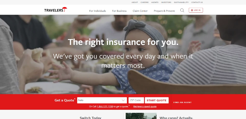
The first website on our list is for Travelers Insurance. The company offers various types of insurance, from personal to corporate and more. With that in mind, the design is surprisingly not as stilted and sober as one would expect from such a corporate business.
Rather, the company factored in the expectations and trust-establishing element for their consumers, and decided to go for a full-sized video as background for the page hero. Over it goes a minimal tagline and description designed to put the minds of consumers at ease, welcoming them into exploring the site further.
Underneath it, colored a bright red, is a simple CTA that allows consumers to request a quote from the company. And it is design mindset like this that allows websites to stand out, via little things like this call-to-action.
Nationwide Pet Insurance
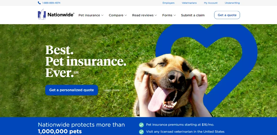
Nationwide Insurance, as the name suggests, is one of the top American insurance services provider, and offers a variety of insurance services to people. One of their innovative ideas is to have separate websites for some of the distinct insurance businesses, such as pet insurance, to market them separately.
Incidentally, their pet insurance is called just that – Pet Insurance. And to make sure that there is no confusion about its intended business, the hero of the page has the image of a happy dog getting rubbed by their owner, with a simple tagline – Best Pet Insurance. Ever.
Its simplicity like this that engenders trust, and allows businesses to establish a foothold in tough markets.
Lumico Insurance
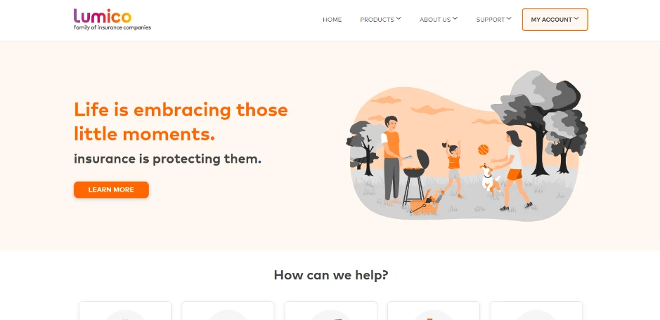
Lumico Insurance is another insurance website with one sweet theme. The design of the website is an eye-pleasing pastel orange, which allows the contrasting gray to stand out better. And unlike the last two websites we have seen, Lumico Insurance has gone for an illustration of a family scene rather than the high resolution photographs used by the former two.
The layout of the website is clean, with the information properly broken down into distinct pages, which keeps each page short and to-the-point. This allows consumers to find the information they need easily, without getting sidetracked from their purpose.
Another interesting point is their call-to-action. They understood that people looking for insurance often have questions they need answered before they are ready to commit and buy. Therefore, rather than going for an upfront, sales-oriented CTA, they have opted for a “Learn More” button right on the hero. Moreover, the addition of a testimonials section just two scrolls down from the homepage hero allows them to establish brand trust early on. All in all, this is one of the greatest examples of insurance web design ideas done well.
Conclusion
In the constantly evolving digital business environment, the nine insurance website design ideas given above provide a roadmap for establishing a strong online presence. By incorporating these ideas and strategies, insurance professionals can not only meet but exceed user expectations, fostering trust and loyalty in a competitive industry.
By embracing the power of design, and letting your website inspire confidence in every visitor, you will be able to convert more leads, and stand out from the competition.

Logopoppin
Logopoppin is a graphic design agency that specializes in logo designing, web development, video production and advanced branding services. We love to innovate businesses with new age technologies, allowing them to improve their visual reputation.

