Table of Content
Discover How to Choose the Best Interior Design Paints and Patterns for the Perfect Vibe
Interior design has long been a profitable business with great demand, especially if you are good at it too. The field of interior design deals with planning the internal layout, furnishing, color schemes, décor themes, and more, in order to portray a certain visual style, for specific rooms or entire properties.
Now, while these elements are all important to interior design, some of them have far more significance than the others we mentioned. And one of these more significant ones is your choice of interior design color palette.
As we all know, colors have a very important role in influencing the visual impact of any design, be it for art or the paint scheme of a room. Not only does it help tie together the disparate elements in a design, but they also help to elicit certain emotions; emotions we want associated with out interior design project.
So, the question is, how can you choose the perfect color scheme and palette for your interior design, one that sets the desired vibe for the room? Let’s dive in and discover the art of choosing the right shades for your interior design, and discover how the principles used by professional graphic design services can help you here too.
7 Elements of Interior Design and Their Influence on Your Interior Design Color Palette
Before we begin the topic of how to choose your interior design color palette, let’s start by understanding interior design in a bit more detail. The process, or rather art of interior design, is predicated on some elements, which, when planned and executed well, result in great interior designs.
So, what are these elements? And why are they so important to your interior design’s success? Well, seven elements cover the various aspects of your interior design. They include:
- Space
- Form
- Line
- Light
- Color
- Pattern
- Texture
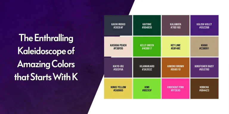
Space
Space refers to the living space, the place that is going to be designed. The concept here is that unless you know and understand the space you are going to be designing, you will end up failing. Often, the size and dimensions of a room are what dictate the limitations imposed on your design idea. After you view and understand the layout of the space, only then can you come up with a design that is suitable for that space.
Form
Form refers to the shapes and style of various elements, such as furniture. This is an important function, as it can help you dictate the vibe of your interior design vibe. For example, let’s say you are looking to give a room a warm, cozy feel. However, the furniture in the room is all stainless steel ad hard surface, which makes the overall form of the room unsuitable for your desired design.
Line
Line is the next element, and one that deals with site. Humans instinctively are designed to find patterns and familiar designs in everything we see. That is why lines are often used in design to draw and direct the gaze of a viewer. In interior design, lines are subtle elements that draw and hold the gaze of a viewer. From highlighting the vertical height or length of the room, to subtler lines that draw our eyes to the room’s focal element, lines are an important interior design element.
Light
Light in another element that is important for interior design, as it ties into nearly every other element on this list. In interior design, two types of light are considered. One is natural light that is the light from the sun, while the other is artificial light, from manmade sources. For aesthetic appeal, you need to consider and address both in your design, so that your design looks good, day or night.
Color
Coming to the most important element, at least for this topic, is the color element. Unlike the other elements, this element can be said to be the biggest influence on consumer emotions and perceptions, as there are different color meanings associated with various shades. With the right color palette, your design would elicit exactly the kind of response you desired, playing on viewer perceptions and beliefs to maximize the impact.
Pattern
As we mentioned when discussing the lines element, we humans are intrinsically wired to look for patterns in everything we see. That is why abstract art did not find the mainstream fame of other arts types. In interior design, the best strategy to design a room is to combine elements of flow or motion, with elements of stagnation. By introducing patterns, a designer can bridge the gap between blocks of color, allowing for a more visually satisfying experience.
Texture
Finally, the last element is texture. Texture is an amazing thing. It has the ability to elevate the impact of a flat design element easily and quickly, providing a relief from the monotony of flatness. The most important thing it does is disperse and diffuse light, which brings out new patterns and lines in your design, turning it into a new experience altogether.
What are Some of the Most Popular Interior Design Color Schemes?
Now that you understand the importance of color in interior design and know how your interior design color palette can interact with other elements of interior design, how can you choose your colors?
Well, before you get to choose your specific shades and colors, you need to consider your color scheme first. What is a color scheme? A color scheme is a term found in color theory, which dictates how you choose a color and its companions for your color palette.
Now, in popular design world, there are three main types of color schemes. However, designers that are more experienced can and do make up their own color schemes as well, based on project requirements, client perceptions, and more. Although, as we mentioned, this customization is only done by the pros, and only in specific circumstances.
They include:
- Complimentary Colors
Complimentary colors are shades that are placed at the opposite edges of the color wheel. The idea behind it is to bring out and harmonize the character, and all colors, whether they are from primary, secondary, or tertiary colors, have their complimentary colors.
- Split Complementary Colors
Let’s say you want something more in your design. However, you need to keep your design the name. What should you do in such cases? Well, one way is to use a split complementary color scheme, which allows the designers to create an interesting visual that is hard to beat.
- Monochromatic Colors
Finally, the last color scheme is monochromatic. While it may seem somewhat counterproductive, monochromatic color scheme have taken the world by storm. What it means is that a single color is chosen, which is then complemented by its various shades and hues. If implemented correctly, the result is one of great visual elegance.
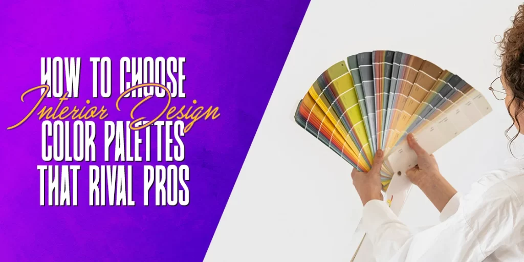
How Can You Choose the Perfect Interior Design Color Palette for Your House?
So, you are now choosing your color scheme for your interior design project. You need to look for an interior design color palette and scheme that conforms and blends well with the other design elements. Just think of it like evaluating your interior design logo and branding style before coming up with the color scheme for your website. This part of the interior design is done after you have an idea of some unchangeable elements of the room, such as the flooring, architectural structures, furniture, and etcetera.
However, the question is; how can you choose the design palette? What factors do you need to consider before finalizing a color scheme for your interior design project? Let’s dive in and take a look at the process of choosing your color scheme and palette.
Look for Inspiration into Your Color Theme
The first thing you need to do is look for inspiration for your color scheme and palette. In order to do that, you need to make something special about the room as your focus. It could be a piece of artwork or architectural masterpiece that the clients really love, or an element in the room that speaks to you. In any case, by making something central to the design, you will be able to come up with the perfect interior design color palette to make it shine.
Utilize the Impressive Tool that Color Values Are
Color values refer to the lightness or darkness of each specific hue. And for an interior designer, they are very important. The mix of colors with different color values within your interior design color palette helps to keep your color scheme from looking haphazard. Moreover, it is said that the best combination in most circumstances, is to choose one light shade, one dark shade, and one bright shade. With different color values, the end result would be a great, highly appealing color palette.
Plan Your Color Choices against Other Design Elements
If planning your color scheme and is difficult for you, then it is a great idea to create a kind of mood board to find what shades would work well within your design. The mood board would have clippings of fabrics, paint swatches or chips for various articles of furnishings, as well as a list of positive and negative attributes for the room.
Moreover, you would also need to factor in how the room would transition into other spaces, such as other rooms, the outdoors, and etcetera. If you are working on multiple connected spaces, such as a complete home, then one great solution is to use the same color palette with different proportions in different parts of the house. For example, if a color is the primary shade in one room, it could be an accent in another.
Factor in the Play of Light on Your Color Choices
Light is one element that can change the perception and vibe of your interior design, if not planned for properly. You need to address scenarios such as how your room would look within the juxtaposition of soft early morning light and your lighting fixtures. By understanding and addressing the impact your décor would be subjected to under both natural and artificial light will help you create a great interior design color palette.
Popular Interior Design Color Palettes You Can Use for Your Projects in 2024
So far, we have seen the elements of interior design and their impact on the color element. Moreover, we have also seen how you can come up with an amazing interior design color palette using a four-step process.
Now, you are quite ready to create an amazing color palette for your interior design project. However, you might not know where to start. Don’t worry, we understand that it can be quite overwhelming. That is why we have compiled a list of some of the best color palettes for different color schemes. So, let’s see what color combinations work well for interior design.
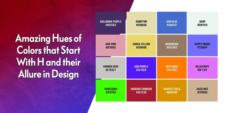
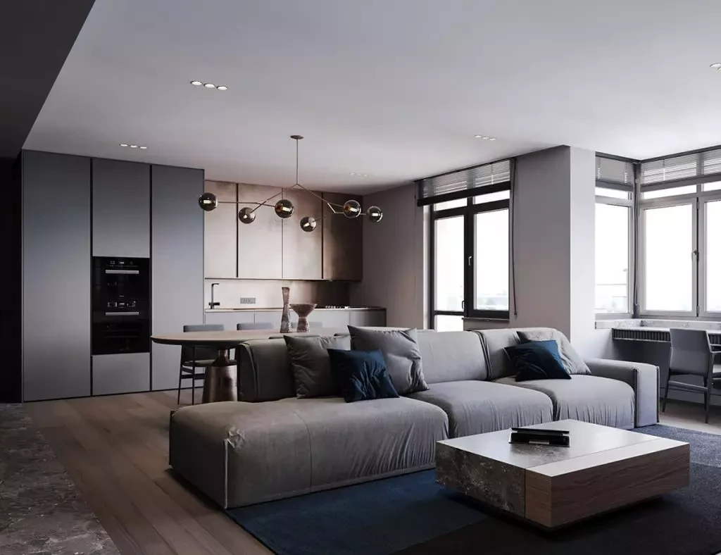
Gray, Sand, and Blues
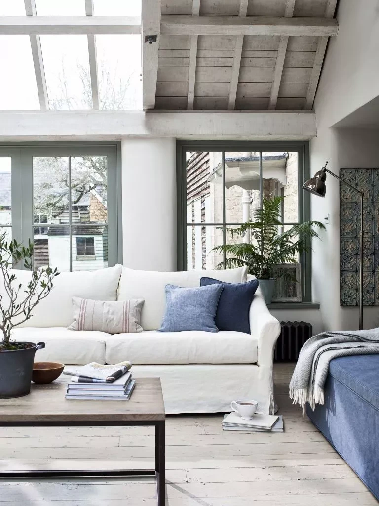
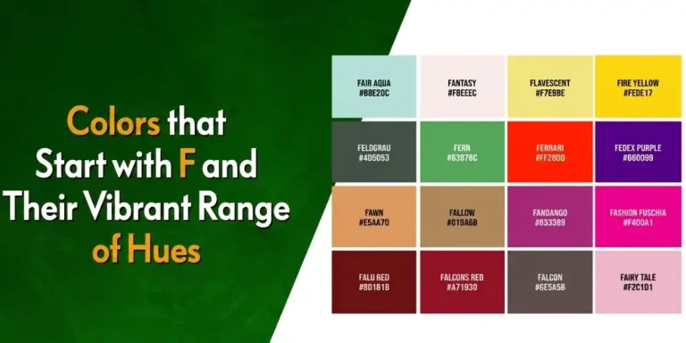
One popular trend is to use a color scheme that matches a theme. This color palette here is a great example of that. The nautical theme of this room’s décor is one that is easy on the eyes, and makes for a relaxing, laid-back design perfect for communal rooms like living rooms. This works especially well for spaces with tons of natural lighting, as that helps bring out the perfect hues in your décor, especially if you show an interplay of light and dark colors. For example, if your palette includes flax flower blue and flint gray from colors that starts with F, you would have two different aesthetics depending on the time of day and amount of natural light
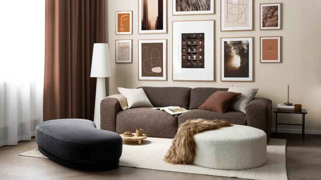
Moss Green, Tan, and Whites
Nature themed like the previous one, this color palette is inspired by woodland colors. The combination of the dark moss green with the lighter tan is great, perfectly contrasting and representing the juxtaposition of light and dark in the forest. While many people often wonder what color goes with dark green, the pairing here aesthetic than what people hope for. Plus, the white adds a welcome bright note the color palette, combining the shades into a cohesive whole. This classy color scheme works well with textures, such as natural fibers and materials like cotton, wool, wood, and more.
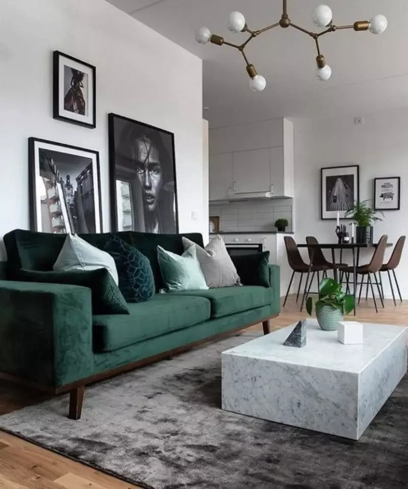
White Background, with Splashes of Bright Colors
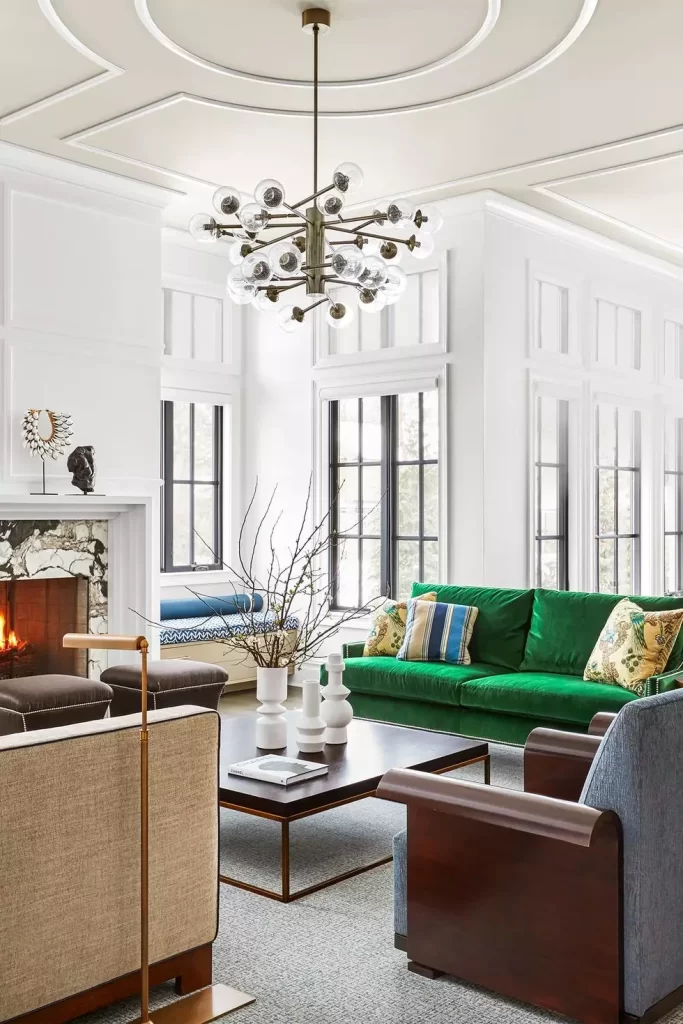
Next up we have an interior design color palette that is, frankly, one of our favorites. White as a background or primary color goes quite well with a lot of colors. “Instead of a traditional secondary or accent color, the designer decided to contrast the white with various splashes of color, such as that beautiful emerald from shades of green color on the couch. From green to brown, blue, and gray, this is one interior design palette that we would love to implement ourselves.
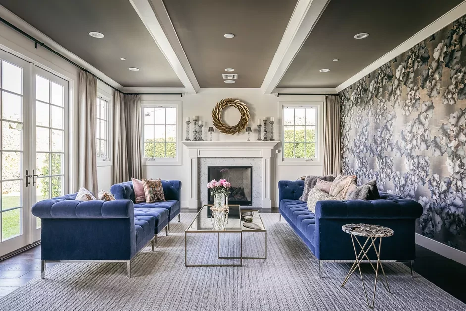
Blue and Grass Green
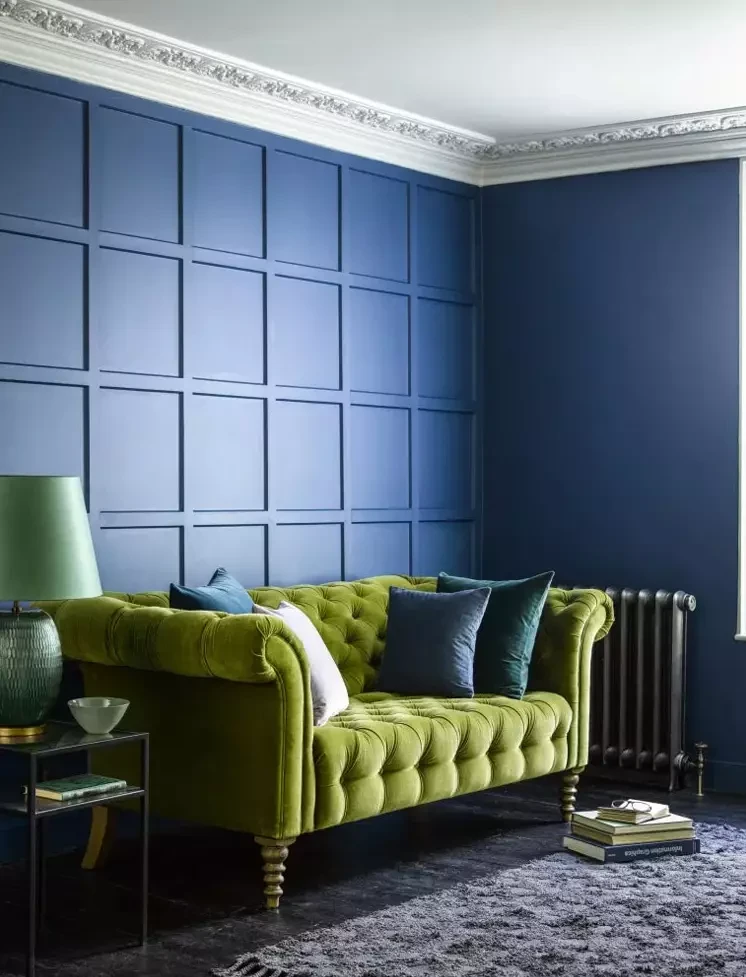
Most people would think that blue would be better paired off with colors like red or brown. However, this color scheme of using a light and bright grass green shows that sometimes, unorthodox pairings work far better than expected. While it may be eclectic for some, the jarring contrast is something that asserts itself without leaving a bad taste. Incidentally, this combination would work well with similarly hued shades of purple color too, as the purple color family also serves as a stabilizing and soothing color tone.
Blue and Beige
By now, you may have understood that blues play a significant part in many of our color palettes. That is because according to color theory, blues have a way of calming the viewers’ minds, making it a color that soothes and relaxes, perfect for your place of comfort. Pairing it with a pastel beige makes it work well for modern aesthetics, as it goes perfectly with brushed metallic surfaces of appliances, as well as classic elements of marble, stone, or polished dark wood.
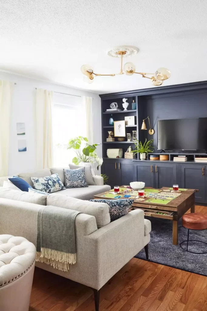
Gray and Brown
For interior design color palettes, the mix of shades of brown color and grays have a distinctly warm and relaxing vibe, and works well with elements like exposed copper or brass fittings. And it fits perfectly for old remodels with vintage elements. Moreover, this color scheme also goes well with hardwood floors, light or dark, as well as light colored rugs and carpets. For example, you can pair dark drapes with light wood tones that throw various shades of yellow color in natural and artificial light, to give your space an amazing aesthetic.
Blue, Gray, with a Touch of Taupe
Now, if you wanted a mix of modern and vintage, with a bright and peppy feel, then this color palette of blue and gray with taupe accents makes for a great choice. Interestingly, this theme works well with smooth, textured, or even mixed surfaces, making it a versatile choice. Moreover, this color scheme shows different but pleasing vibes in both natural and artificial lighting, with distinctly different visual impacts.
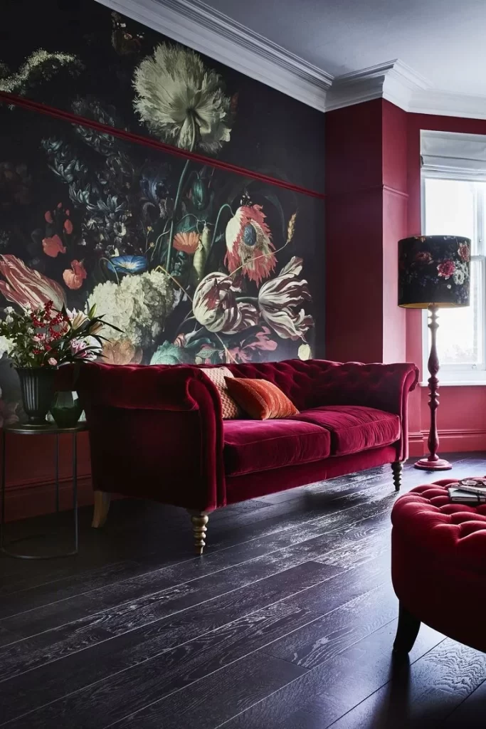
Blush Pink and Black
Now this is another interior design color palette made up of colors that start with B that we would love for a chance to implement. Traditionally, designers pair a dark shade with a lighter one. But sometimes, and only by the very brave, do you see a color palette that features a dark shade accented by another dark shade. And of those few time, only a small fraction are truly iconic attempts. This color scheme is one of them.
The blush pink, which works really well as a gradually darkening gradient in natural light, works wonderfully when paired with black fitments. From small background accents, to larger, furniture-level pairings, this color combo is one that you will have a hard time ignoring.
Pink and Green
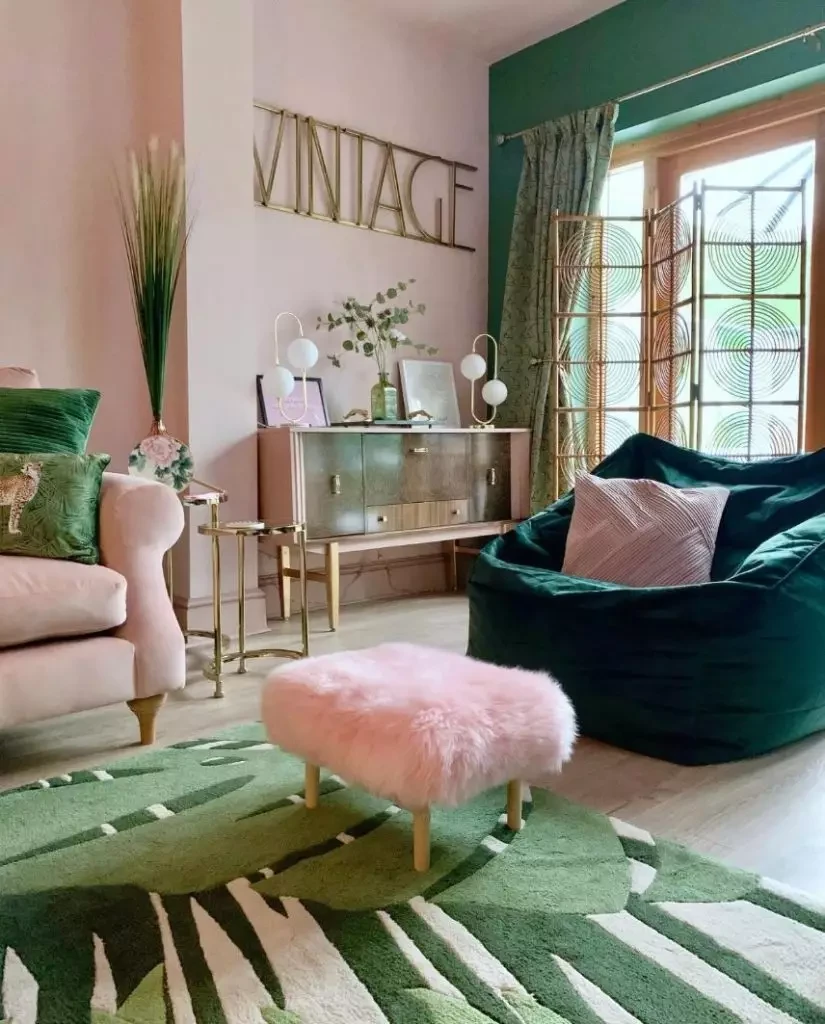
With blush pink having a seductive allure, its lighter shades of pink color works really well with various shades of light and dark green for an awesome, lighthearted effect. The background of pink, paired with a dark, nearly moss-green, and accented by lighter pastel greens, makes for a color combination that would work great for something like a bedroom or workspace.
Black and White
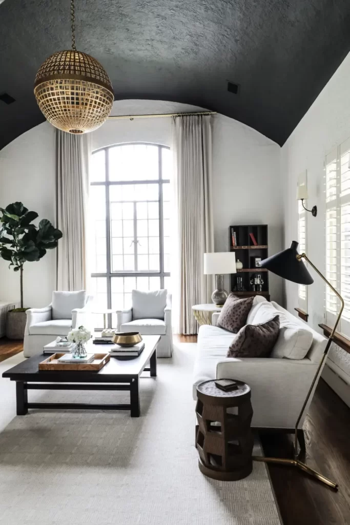
So far, we have seen a number of color combinations. And while all of them are great, nothing can beat the classic of white and black. There is a reason that this color palette is still going strong, despite a nearly infinite supply of different, distinct shades of colors.
The classic juxtaposition of dark and light, and the resulting change in focus when the light shifts from natural to artificial, makes this a timeless interior design color palette.
The Importance of Accent Colors in Making Your Interior Design Pop
Now that you know what type of color scheme and interior design color palette you need for your project, the final thing you need to know about, is the importance of accents.
Accent colors are a great way to ensure that your color scheme doesn’t look monotonous, without adding too many elements to your design. In interior design, accent colors offer a way to highlight and bring out specific elements from the background, bringing them to the forefront in order to make them a highlight.
For example, if your wall has a grid-pattern on it, and you paint it all in the same color, the grid’s visual impact would be lost. However, if you use an accent color to highlight the grid pattern, that would not only highlight that design feature, but also enhance the overall visual oomph of your wall’s paint job.
Using the 70-20-10 Rule to Enhance the Visual Impact of Your Interior Design Color Palette
In interior design, it is said that the best color schemes are those with three colors in it, a light color, a somewhat darker color, and finally, a very dark color. In order to use these shades, designers use a 70-20-10 ratio, with the lightest shade covering 70% of the space, the medium shade covering 20%, and the darkest just 10%. However, that does not mean that two-color color palettes are any less effective, especially in the hands of a master interior designer, used in a 80-20 or 70-30 ratio.
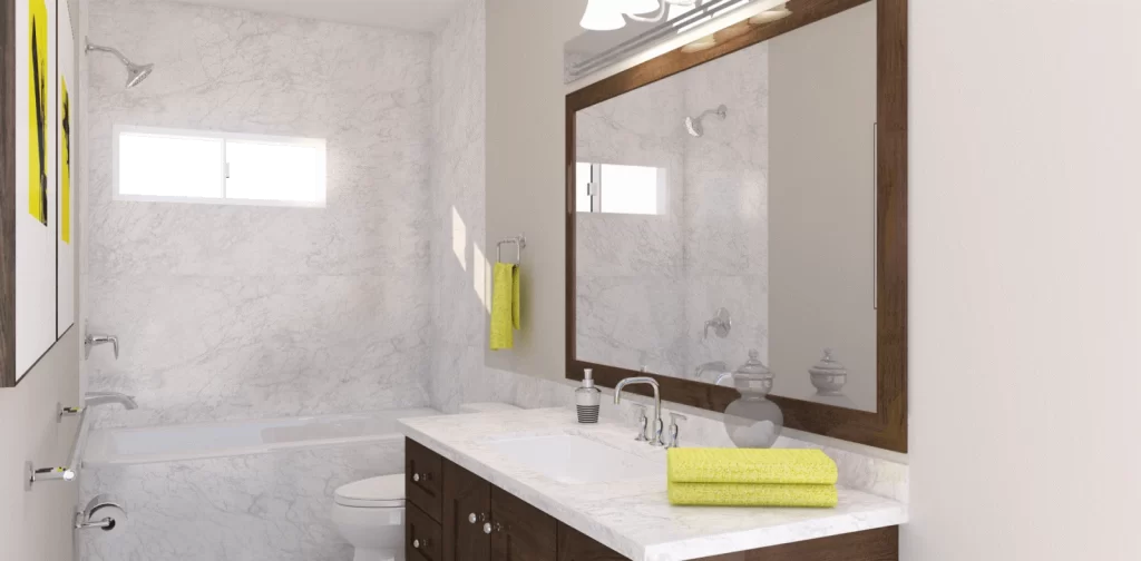
Nevertheless, for the three-color color palettes, without changing the ratio, you can change which colors you use for specific ratios, but beware of going too overboard. A great example is this image of a bathroom above that uses the 70-20-10 ratio in its decorating theme.
The gray-white marble covers the majority of the walls, offering an alluring, yet somewhat plain background covering approximately 70% of the space. Then, we have the dark walnut wood cabinet and mirror frame, which offers a sharp contrast to the background. Finally, the small, bright yellow hand towels and the art on the wall offering a sharp accent that ties the whole room together.
Conclusion
To sum it up, finding your interior design color palette is not difficult, especially if you know what color scheme your space needs, and can predict how the other elements with interact with it. However, what is important is that the designer needs to understand the positives and negatives of the space, so that they can come up with a color scheme that enhances that space’s visual impact.
Overall, while it can be a difficult road, especially for someone new to it, our guide here is a perfect starting point to help them on their journey.
Latest news you want to know!
Subscribe for cutting-edge design inspiration at Logo Poppin! Elevate your brand with updates on logos, branding, web design, and video animation.
Note that by clicking “subscribe,” users may agree to our privacy policy and consent to Logo Poppin to use your contact data for newsletter purposes.
Logopoppin
Logopoppin is a graphic design agency that specializes in logo designing, web development, video production and advanced branding services. We love to innovate businesses with new age technologies, allowing them to improve their visual reputation.