

Table of Content
Discover The Best Examples of Interior Design Company Logos to Inspire Your Own
The field of interior design is a vast and quite lucrative venture, especially if you do it well. People with inclination and the money to spend spare no expense designing their homes and other interior locales the way they desire. But, in order to attract such customers, you need a strong interior design logo representing your business.
Now, for a creative business niche such as interior design, people expect something unique, upscale, and interesting for a logo. A design that looks boring would never be able to attract the right customer. Instead, it would drive them away by the logo’s lack of creative direction and appeal.
However, if you do not know how to create a great interior design company logo, no need to worry. Take a look at what we believe to be some of the best interior design logo examples to help inspire your own unique brand identifier.
Let’s begin.
What Is It That Makes an Interior Logo Design Good?
Before we discuss some of the best interior design logos, we need to understand what truly makes a design representing a decorator logo or an interior designer’s symbol good.
Now, for any business’s logo, its ability to properly portray that brand’s message and aesthetic is absolutely necessary. Moreover, it should convince a potential consumer that your business is the one for them.
For that to be effective however, you need to design your logo in a way that represents your style of work. Do you specialize in creating opulent, rich interiors? Then your logo should be sport a design that screams rich decadence. Or you might specialize in modern, monochromatic minimalist designs. So your brand symbol should complement your interior design style.
Essentially, you need to put yourself, your personality, your style of work, into your logo. If you or your hired logo design services are successful in doing so, your logo will be considered a success.
Your Interior Design Logo in Black and White – Does It Have the Same Impact?
Often, we see that brand logos that look good in their original color palette, tend to lose their impact when done in black and white. Considering that an interior design logo will be printed on many mediums which might not support a varied color palette, you will need to ensure that your design is not affected by this change.
Many monochromatic mediums like newspapers and flyers are often needed to promote and market many businesses. Therefore, designs with high print volumes like real estate logos, builder and contractor logos, restaurant flyers, and others like them often need to be tested for their visual impact in a monochrome setting.
IF your logo design does not its impact even when it uses a monochromatic color palette, then you can say that you are well on your way towards designing a great interior design company logo.
Classic Interior Design Company Logos for a Simple Touch
Some businesses prefer a simpler aesthetic for their visuals. For such companies, classic interior design logos are what they want. Let’s look at some of these timeless logos for Interior Design companies.
Cobalt and Copper Interior Designs
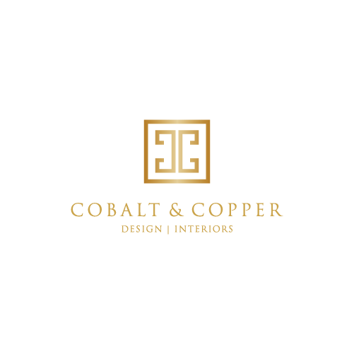
With a name like Cobalt & Copper, the logo design above is not just good – it’s perfect. The logomark features two geometric letters “C”, mirrored back to back. While the design featuring the initials of the company would have been enough, the designers gave it another little twist.
The entire logo is colored in a shimmering metallic copper color, paying homage to the company name with something as simple as its color palette. And for a company that specializes in the warm tones and long-life of metallic interior fittings, it is a great identifier.
LT Interior Designs
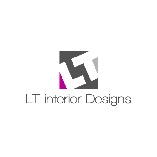
LT Interiors is another business that wanted to use a simple, no-nonsense logo design for their brand identifier. The design features a simple wordmark, over which there is a logomark that features the initials of the company in large, blocky logo fonts.
With its drive to create a simple yet expressive logo, LT Interior Designs ended up with a logo that while very simple, is great for a company who wants a classic style design for their logo.
Sierra Interiors
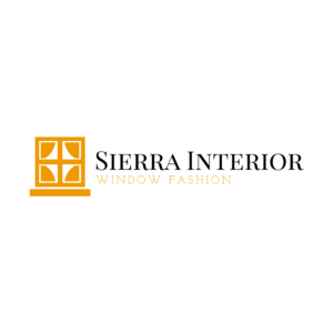
Sierra Interiors is an Interior Design Company that specializes in decorating and accessorizing your windows for a warm, comfortable feel. The logo features a wordmark in a classic, serif typeface, giving a traditional vibe to the logo.
The accompanying logomark showcases a small, four-pane square-shaped window, through which we can see the silhouette of bound curtains on either side. The entire image is colored in a warm, burnished sierra brown color, embodying the classic versatility of this logo design.
Modern Interior Design Logos for Your Decorator Business
Now some businesses prefer a more modern touch for their logo designs, in order to stand out for people who are looking for a unique design aesthetic. From abstract designs, to simple and minimalist wordmarks, let’s look at some modern interior design logos.
7 Curve Design Studio
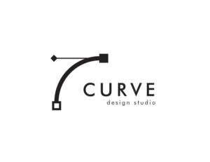
The logo for 7 Curve Design Studio might look a bit innocuous at first. But at a second glance, we can see that they have given it a subtle artistic flair, while keeping the overall design quite minimalist and modern. In order to help the logo design stand out, the number “7” uses a curved line for its longer arm, a subtle nod to the company’s name.
The rest of the wordmark logo features a plain, sans-serif font with clean and distinct lines, and a simple monochrome black color palette. The design of 7Curve’s logo might be simple, yet it is the perfect example of a minimalist logo that balances sheer artistry with simplicity.
Defiance Concepts
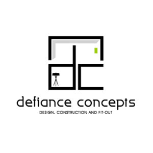
Defiance Concepts are a neo-modern interior design company that specializes in decorating homes for the people of today. Going for an avant-garde look for your home, and Defiance Concepts will be there to help you break the preconceived notions of what traditional home interiors should look like.
The logo for the company is an interesting study. For one, the wordmark in it is written in all lowercase letters. Secondly, the logomark that accompanies it is made to look as if the company initials are part of a room’s structure, with the longer arm of the letter “d” acting as a central pillar for the roof above.
Salt and Sand Interior Design
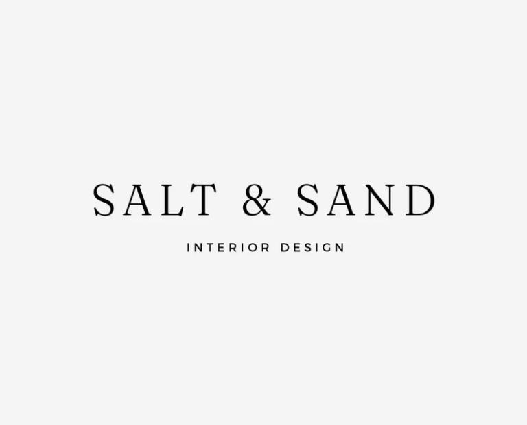
Just like 7 Curve Interior Designs, Salt & Sand too has decided to go for a minimalist look. However, while 7 Curve did add some artistic flair to help the design stand out, Salt & Sand decided to leverage the charm of a truly minimalist logo design.
Their logo is a simple, monochrome wordmark. It uses an elegant serif typeface, which is in the style of some of the most timeless vintage fonts. Each letter of the wordmark is distinct, with clean lines and edges, and a black monochromatic color palette.
Simple Interior Design Logo Inspiration for That Understated Look
Simplicity can take many different forms when it comes to logo design. For the interior logo designs given below, simplicity is all about blending in with the crowd, portraying an understated look that tells its viewers that “What you see, is what you get”.
Let’s take a look at them.
Deco Design Interiors
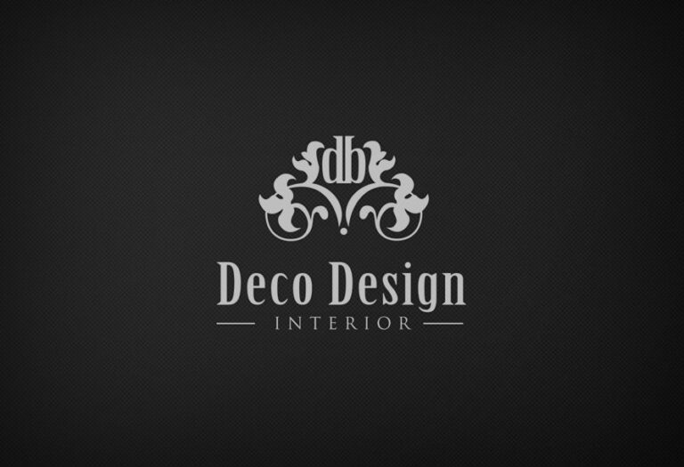
Deco Design Interiors is the epitome of an understated design. Nothing about the logo screams that it represents an interior design company, well except for the wordmark. The logomark design features an intricate abstract design, with the company initials placed at the center of the image.
The only thing about the logo that tells us that it belongs to an interior decorator, is the wordmark that spells the company name in bold, serif font. And the understated look is further rounded off by its gray monochromatic color scheme.
Inhabit Interior Design Studio
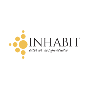
Just like the logo for Deco Design Interiors above, the brand symbol for Inhabit Interior Design Studio is quite simple. Again, there is nothing about the logo that tells its viewers at a glance that it represents an interior design studio.
On the other hand, the addition of yellow to the design that accompanies the wordmark makes this logo a bit more interesting, and helps to make it more appealing visually. That will help the logo attract the gaze long enough for the viewer to read the wordmark stating the company name and business.
Laura Corcoran Interiors
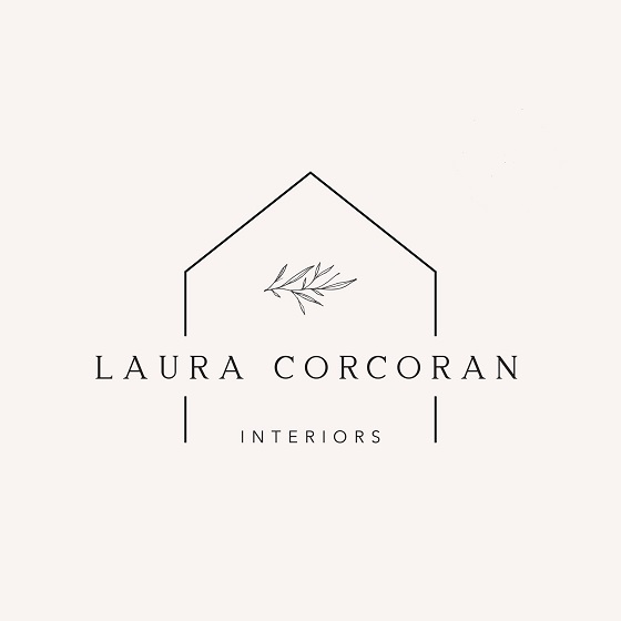
This logo is a bit less understated compared to the former two logo designs we discussed. Representing Laura Corcoran’s interior design business, the outline of a basic house with sloped roofs helps the viewers know that the business has something to do with constructing, fixing, or decorating houses.
As they look for longer though, other details start to pop up. The fern branches in the logo tells us that the logo has something to do with decorating a house. And while the design itself is simple yet not overly understated, the think lines and delicate typography make it a perfect example of understated logo design done well.
Unique Monogram and Interior Design Firm Logo Ideas
Finally, there are some grand and elegant interior design businesses who want their opulent luxury portrayed within their brand symbols. And one of the best ways to do that is to go for script-based wordmarks or monogram interior design logos.
Let’s look at a few examples.
Designs by Priya
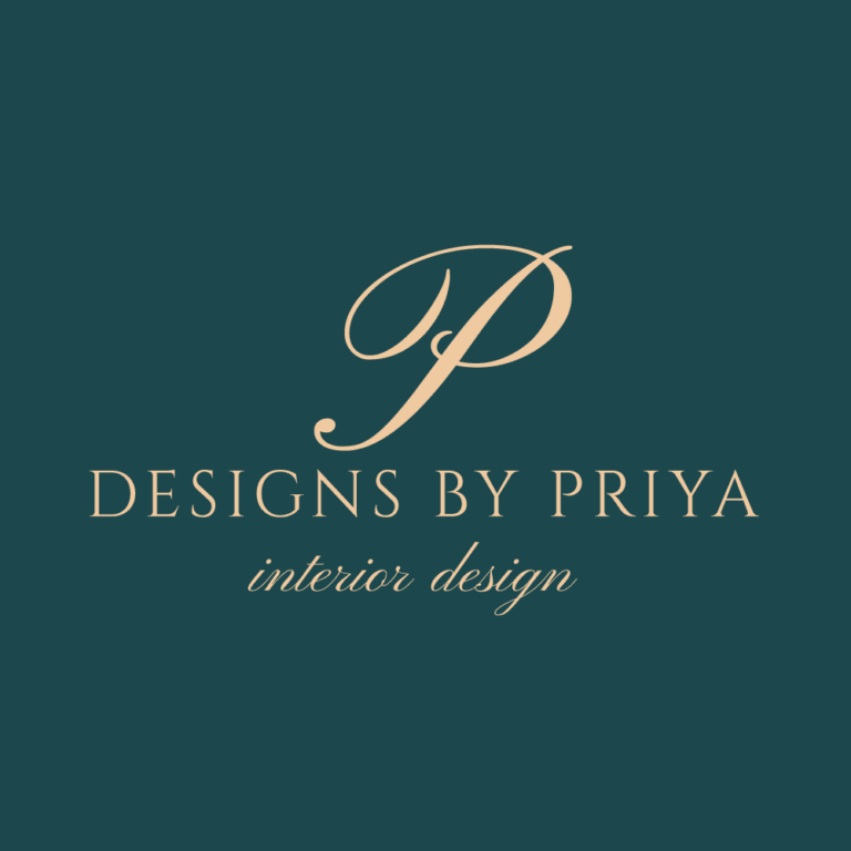
Designs by Priya is all about personalized interior designs with beautifully rich fittings and furnishings. The logo for the company uses a combination of the monogram logo, as well as an elegant script typography for its accompanying wordmark.
Moreover, the color scheme of pale metallic gold over steel blue is a perfect accompaniment that exudes an understated elegance and regality.
Modern Home Designs
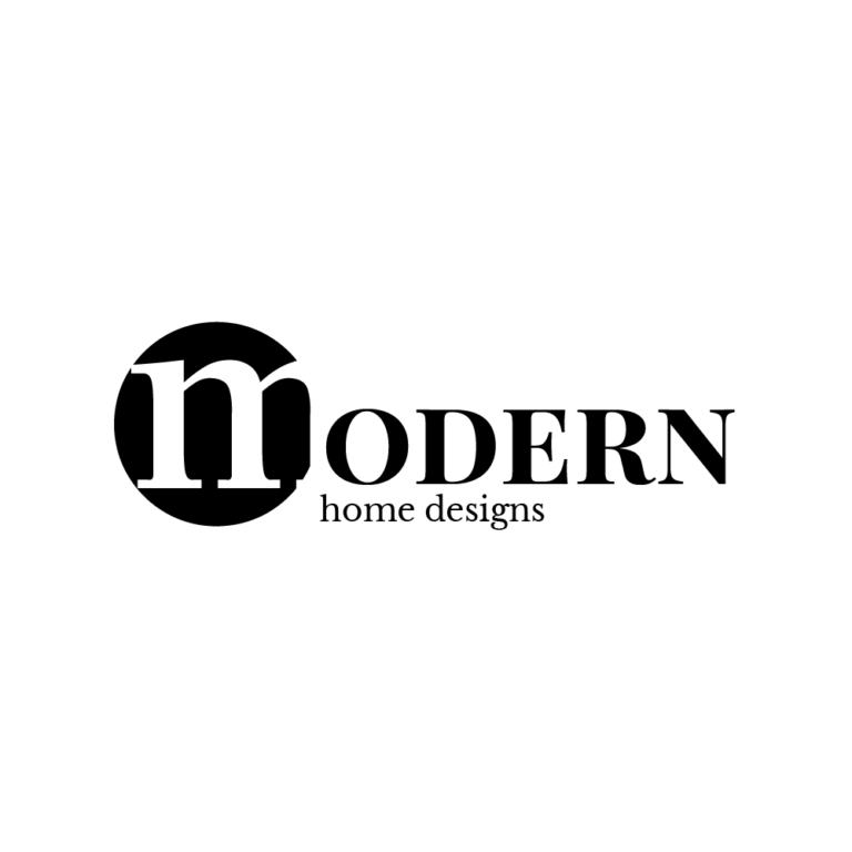
Modern Home Designs on the other hand, opts for a more modern approach to the monogram logo. using a bold digital font, the logo features the company name as its wordmark. The first initial is done in white over a circular black background, while the rest of the wordmark is colored black over a white background.
The mix of uppercase and lowercase letters is also a great addition to the logo, making it stand out despite its otherwise simple design.
Ocean drive Designs
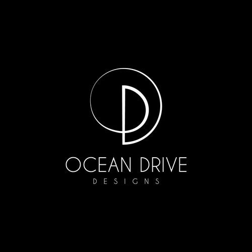
Ocean Drive Designs is another company who takes the idea of innovative yet simple design, and implements it well. The wordmark is a simple, sans-serif and lightweight typeface, which is accompanied by the logomark design.
The actual design has three different elements within it. The design is a single stroke that draws an uppercase “D” which then curves over it in a flourish to form the letter “O” around it. And lastly, the overall design can also be seen as a rolling wave, paying homage to the company name.
Logo Design Fundamentals to Create Awe-Inspiring Interior Design Logos
Your interior design logos may take inspiration from some of the best in the industry. However, if you do not know what factors make a logo truly awesome, your intended logo would end up quite lackluster.
However, if you follow the factors listed below, you will be able to ensure that you brand logos not only look good, but will function flawlessly as well.
Choosing the Right Interior Design Logo Colors
The right color combination can make or break a logo. Choosing the right colors can help your logo enhance its visibility, ensuring that has the right impact on its viewers. Your chosen color palette should complement your brand and its aesthetic.
A woodworking business that deals in natural-toned polished wood furniture should have a logo that represents that, rather than sporting a bright purple or pink color scheme that throws off the viewers’ perception.
The Best Font for Your Interior Logo Design
The best logo fonts are the ones that fit your brand’s aesthetic. If you are a carefree brand, with the youthful market as your primary consumers, you could go for a one of the modern digital fonts that sport a playful design.
However, if your business is about elegance, you need to choose a formal typeface, even a script-like font to embody the right essence.
Create Multiple Proper Interior Logo Design Mockups Before Choosing the Right One
It’s always a good idea to flesh out multiple design ideas before finalizing one for your logo. Often, the ideas we see in our heads seem quite good. But when we draw them out on paper, we find that it might not work so well.
That is why, if you flesh put multiple ideas, it will help you see how each design progresses, before you get to choose the best one that suits your brand.
Innovative Interior Design Logo Trends to Watch Out for in 2022
Logo design trends are constantly changing, as the design aesthetics of their target consumers change. And while many of these trends are seasonal, there are some that have the potential to change the logo industry.
Let’s take a look at some of the trends to watch out for in 2022.
Highly Inventive Designs
While the last decade has been about minimalism in design, today people are finding new ways to make their simple designs more intriguing. These highly inventive designs are a study in balance between intricacy and minimalist design, and is fast becoming a popular trend in the design world.
Elegance as an Aesthetic
In the previous years, brands have been going for a more casual look. However, recently, new brand logos are aspiring to embody an elegant vibe, changing the existing aesthetic to one of rich yet understated opulence.
Negative Space as A Design Element
Negative space has long been a design element that was used quite extensively, yet few people knew how to use it well. Recently, designers have started incorporating it into their logo designs, but rather than as a supporting feature, they use it as a central element of their design. And with minimalism and elegance rising in popularity, negative space usage will only grow in the design industry.
How Can You Get Your Interior Design Company Logo Created?
Now that you know what it takes to design good interior design logos, the next thing you need to know is how to design a logo that represents your interior design business perfectly. Let’s see how a business can get a good logo designed for their brand.
Use an Online Interior Design Firm Logo Maker
The first, and simplest option, is to use an online logo maker tool like Canva to create your logo design. However, these logos often use pre-drawn design elements, making it difficult to create a truly unique brand logo.
Download and Edit a Free Interior Design Logo Vector Yourself
Next, you can download and edit a free vector for an interior logo design company. However, the caveat here is that you should know how to use a vector editing tool, and are aware of logo design fundamentals.
Hire a Professional Logo Designer to Create Your Perfect Brand Logo
The best option, is to hire a professional logo design agency or professional to create your brand logo for you. You can look online for a freelance logo designer, or a professional design agency that fits your budget, and task them with creating your brand logo.
Frequently Asked Questions
| 1- How do I choose my interior design business name? If you want to choose a good name for your interior design business, here are some top tips. – Keep it simple. Long or complicated names reduce memorability. – Your name should represent what you do clearly – Check to see if the relevant domain names are available – Test it out among your friends and family to see how it fits |
| 2- What is a good font for interior design logos? Some of the best fonts for an interior design logo project include: – Adobe Garamond – Graphik – Founders Grotesque – Gotham |
| 3- What are the 6 types of interior designs? The most common styles of interior designs include: – Mid-century Modern – Eclectic Chic – Modern Industrial – Modern Traditional – Modern Farmhouse – Scandinavian |
Conclusion
Creating truly unique and awesome interior design logos can be a difficult process, unless you know what to do. If you follow the trends and tips listed above, you too will be able to design a great brand logo that would embody your interior design business’s aesthetic perfectly.
Looking for a professional design agency to create your logo? Logo Poppin’s professional design team is skilled in creating one-of-a-kind brand symbols that are guaranteed to boost your visual appeal.
Latest news you want to know!
Subscribe for cutting-edge design inspiration at Logo Poppin! Elevate your brand with updates on logos, branding, web design, and video animation.
Note that by clicking “subscribe,” users may agree to our privacy policy and consent to Logo Poppin to use your contact data for newsletter purposes.
Logopoppin
Logopoppin is a graphic design agency that specializes in logo designing, web development, video production and advanced branding services. We love to innovate businesses with new age technologies, allowing them to improve their visual reputation.

