
Table of Content
Discover How the Iron Man Logo Came to Be a Symbol of Marvel’s Tech Genius
Who today doesn’t know the name Iron Man? Since 2008, when the MCU Phase 1 officially began with the release of their cinematic masterpiece Iron Man, the iconic superhero has become a core part of the MCU, as well as the Avengers. And we can safely say that since the character’s death in Avengers: Endgame, Marvel’s newer movies have not been faring as well.
But was it Iron Man that made the franchise so successful? Or was it the dynamic between the original Avengers that made the movies so great? In any case, the Iron Man logo, along with Cap’s shield, Thor’s hammer, and Hulk’s fist are symbols of a great time in Marvel’s cinematic foray.
A major part of this impact, as mentioned above, is the association of these individual superhero symbols with Marvel, at a time when the company changed the entire live-action superhero genre. So what was it about the Iron Man symbol specifically that spoke to the fans? How did it manage to kick-start the new era of superhero movies, turning this industry into a multi-billion dollar affair?
Let’s take a look at the logo’s evolution, and see how the studio utilized the help of a professional logo design company to create a version of the comic book logo with a far greater impact than the original.
The Origin of Iron Man – Rise From a Playboy Millionaire to a Beloved Avenger
In both DC and Marvel, the primary squads of the company have one member who provides for the entire team’s needs, all thanks to their rich alter egos. Incidentally, these members would also be the ones who are plain human among super-powered beings.
For DC, that Batman, AKA billionaire businessman Bruce Wayne. For Marvel, that is Iron Man, AKA Anthony “Tony” Stark. In both cases, to the outside world, the characters of Wayne and Stark are rich, arrogant playboys, which serves well to hide their clandestine identities. However, their journey towards becoming a superhero is quite different.
Today, we will be discussing the rise of Tony Stark, or Iron Man.
Canonically, there are two different origin stories for Stark, one for the comics and other in the MCU. However, we will be discussing the more mainstream one, the one that has been adapted into the MCU and the Marvel Animated Universe.
Tony Stark was born to Howard and Maria Stark. Howard Stark was an industrialist and inventor, who worked with SHIELD during WW2, and was part of the American Super-Soldier program that made Captain America.
Tony, a child prodigy, excelled in the sciences, and got into MIT at just 15 years of age, graduating with Masters in engineering and physics. His parents’ death in a car crash meant that he inherited the company.
With Stark Industries already a part of the American war machine since the Second World War, Tony doubled down and turned his company into one of the top military weapons contractors in the country. However, it is this exact reason that triggered the events that turned him into Iron Man.
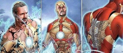
After being injured and captured by insurgents, he discovered that there was shrapnel in his chest that was slowly reaching his heart to kill him. Fellow captive and local Nobel Prize winner Ho Yinsen helped fashion a chest plate with an electromagnet that stopped the shrapnel from moving further.

The insurgents ordered them both to work together to build weapons. However, they both secretly worked to create a suit of armor that could be used to escape. Once done, they prepared to leave, but were discovered before they could make a safe getaway.
Yinsen sacrificed himself so that Tony could escape; urging him to be better man, something Yinsen knew Tony was capable of. After making his way to the American forces, Tony returned to the US, and announced that his company would no longer make weapons, and would instead focus on finding solutions for the world that benefited humanity.
This triggered Tony’s latent desire to invent, and stoked his creative scientific tendencies. Understanding that removing the shrapnel from his heart and chest was downright dangerous to almost impossible; wearing the chest plate was a requirement. However, the need to charge its battery daily meant that Tony was bound in his activities. And after a scare at Congress where the failing battery almost resulted in him having a heart attack, he decided to come up with a more elegant solution
He came up with the chest-sized arc reactor, a power plant that powered the electromagnet in his chest. Once did that, he also started working on improving the suit of armor he had made while kidnapped. The Mark I suit had many limitations, most of all an insufficient power supply. With the arc reactor however, that problem was solved. Slowly improving his suits, and building better versions of it, Tony came up with many iterations of the armored suit, including some truly groundbreaking ones like the Bleeding Edge armor, Godbuster armor, and the Hulkbuster.
Now, the comic book version of Tony Stark has achieved far more than what the MCU version has been shown to do. However, even the MCU Iron Man achieved far more than many of the super powered beings alongside him, including being recognized by Thanos, and figuring out time travel via the quantum realm.
In fact, the most remarkable feat about the latter is that Stark managed to figure out the Quantum Realm enough to accurately time travel to specific points in history and space. And he did it all without the help of MCU’s resident Quantum Realm expert, Dr Hank Pym.
All in all, while all of Stark’s actions throughout the comics would not be considered heroic, there are certain aspects and entire timelines where humanity would have been lost had it not been for Iron Man’s intervention.
What Does the Iron Man Logo Represent?
Mostly, we are used to the wordmark Iron Man logo. However, like all the other heroes on the Avengers, and in Marvel in general, there are certain superhero logos that are assigned to each of these characters.
For example, Thor with his hammer Mjolnir, Captain America with his shield, Hawkeye with his bow, and many more, characterizes Thor. And when it comes to Iron Man, there are two symbols that are used to represent him.
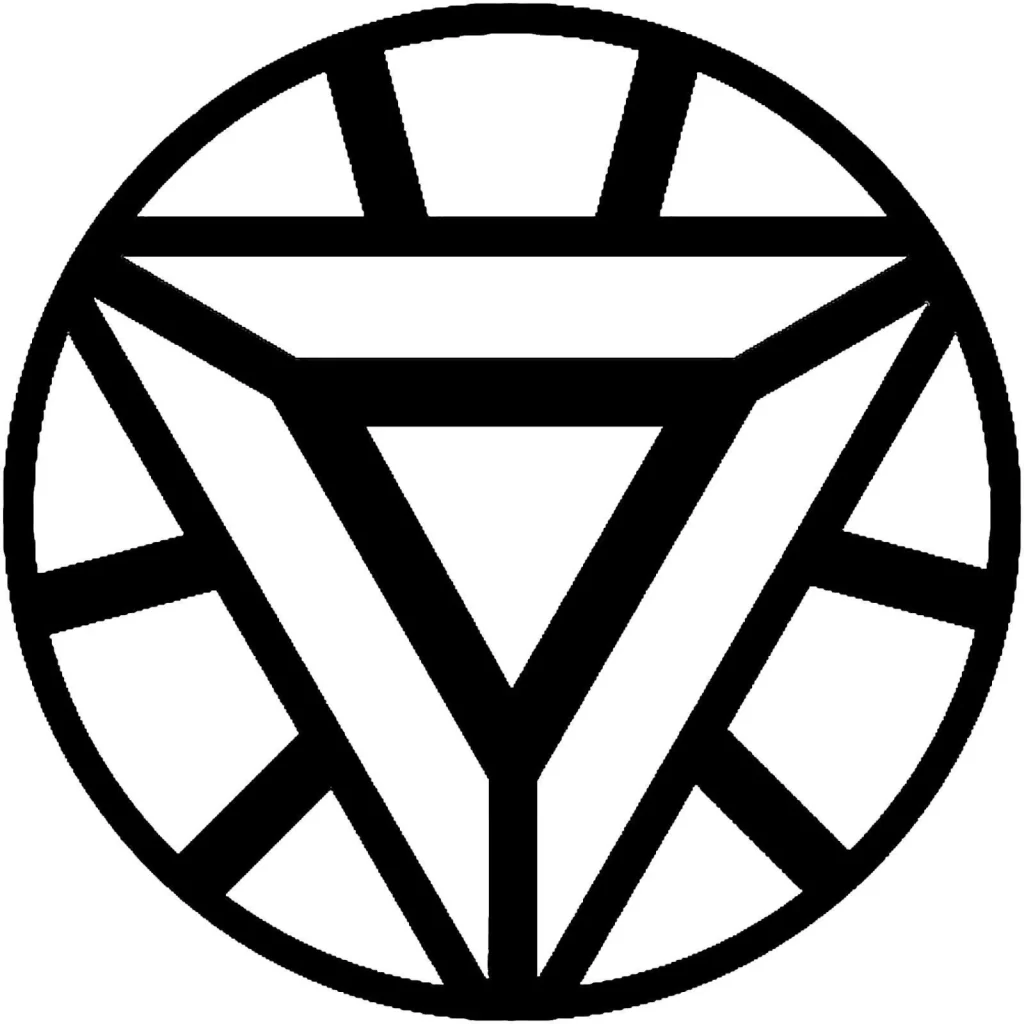
The first one is the image of the arc reactor that powers the Iron Man suits as well as various technologies embedded inside Stark. The original arc reactor design was circular, both inside and out. However, when Tony came up with a new element to replace the palladium core of his arc reactor, which was slowly killing him.
This new core was smaller and more efficient than the previous one, which meant that Stark could make the reactor smaller. Thus, the new triangular design came into being. However, no matter the design, no one who is a fan of either the comics or the MCU can look at this and not think of Iron Man.
And that is why this symbol is so important in representing Iron Man. It represents what makes Tony Stark, a rich genius who is just human, the Iron Man. Someone capable of being on the level of and exceeding god-like beings on a day-to-day basis.
Evolution of the Iron Man Logo
Now that we have looked at the evolution of the character and the idea behind the Iron Man logo, let’s take a look at the evolution of the primary Iron Man logo used throughout Marvel’s Iron Man run. Now, it may seem weird for a character like Iron Man to be represented by a wordmark, but we need to understand that unlike the other mediums, comics rely on easy and recognition of their titles.
And as such, there is nothing better than a wordmark logo design to do that successfully.
Now then, let’s discover the changes made to the Iron Man wordmark through the years, and see how this logo for one of Marvel’s most iconic superheroes has changed over time.
1968 – 1969
It was in 1968 that we first saw a standalone logo for the Iron Man. Now although the character had premiered in 1963, the standard Marvel procedure of introducing new characters in anthologies meant that it wasn’t until 5 years later that the character made their solo debut.
The first Iron Man logo featured a bold, san-serif typeface that was designed for a three-dimensional look, with dark shadows to the side and underneath. This gave the wordmark a certain depth of perception, making it more visually assertive than flat logos. At the top of the Iron Man wordmark were the words “The Invincible” written in all upper-case, and completely flat in design.
1969 – 1984
Just a year later, the company changed the logo. The new logo had a more pronounced three-dimensional shape, as well as a change in visual perspective of the logo. Moreover, some new color combinations were used which were different from the previous iterations.
For one, the perspective now was from the top, meaning the letters now appeared as if viewed at an angle from above the wordmark. Secondly, each individual letter was designed as if cut from individual metal blocks, with the front designed to look like riveted steel, and the back designed like steel blocks cut into the front plate’s shape.
The front plate was colored a dark red, while the back and sides were all colored blue. At the top of this wordmark were the words “The Invincible”, written in all upper case and colored blue.
Incidentally, the color red is quite prevalent in many a related Marvel logo, from The Avengers and related characters, to the mutants of X-Men.
1984 – 1985
With the previous Iron Man logo seeing use for nearly 15 years, the design was in dire need of a refresh in the mid-eighties. Taking a leaf out of the Superman DC Comics logo, the Marvel team decided to incorporate the flying Iron Man with their wordmark.
Now, incidentally, this had colors only in the background or the Iron Man figure. The wordmark however, was back to a front-facing design at eye level. The front plate of the words were done in a similar riveted style as the previous iteration, and the shadows behind it were similar to the first logo iteration.
1985 – 1987
The new Iron Man logo design developed just a year later also featured a different design. This time, the 3-d shape was reintroduced to the fans in 1985. This time, the perspective was a little different. Now, instead of from the top of the wordmark, the view was from the left of the letters, at an angle from the front.
The logo design was colored white at the front, and the sides were colored red. The font was a rounded blocky font, designed to soften the edges and angles of the wordmark for a softer, more aesthetic look. Gone were the rivets from the face of the letters, with they now becoming plain instead.
1987 – 1996
In 1987, the logo was revamped again for a new look to the wordmark. The result were giant, metallic letters written in a blocky, angular font. The front of each letter had rivets in it, which joined the face of the logo to the partially carved steel block at the back.
In previous iterations, each individual letter was made to look as if carved from an individual block. However, for the new one, the two-part wordmark was now carved from two separate blocks, with custom cut letter faces attached to it.
The colored front plates of the letters were colored a bright yellow, while the sides and the back were colored blue. And the perspective was changed from level left, to angled bottom.
1996 – 1997
The 1996 reimagining of the Iron Man logo was another unique one. To pay homage to the steel-riveted front of the previous iterations, this new design featured letters with stroke widths. The font used was a serif font that had small and light serifs at the end of the stroke.
The color scheme for this new design was of a unique nature. Rather than making the logo face of a different color to the steel back, the entire logo is made from gray polished steel, similar to the cinematic Fantastic Four logo.
1997 – 2002
In 1997, the logo redesign featured the return of the words “The Invincible” at the top of the logo wordmark. the wordmark however, was made to look different from its previous metal block designs. The new blocky with round edges font was designed to look as if made from a printed circuit board.
The yellow colored letters had thin red lines and nodes, depicting the embedded circuitry of a printed circuit board. This was a departure from the previous iterations, and a sign that the character was now being portrayed as having advanced circuitry.
2002 – 2009
The 2002 redesign of the Iron Man logo took the circuit board design to the next level. Now the letters used a blockier design again, and the shape of the letters combined with the circuits on it made it look scientific and techy, perfect for a logo representing a character like Iron Man.
The design was also revamped in other ways, such as the usage of a white color for the letters, with the outline and inner wires colored a bright red. Overall, this was a good design for a hero that relied on engineering and science.
2008 – 2012
In 2008, around the time that MCU was going to release the first Iron Man movie, the company changed the style of their wordmark, as well as its color combinations. Now, the letters used a soft, blocky and short typeface, which was colored jet black with a silver gray metallic outline.
The design was subtle, and was meant to give it a distinct identity so that the comic books could separate the character from its live action adaptation should the movie bomb and fail. However, we all know that that was something that would not have been needed.
2013 – 2014
In 2013, with Marvel having seen massive success with the first Iron Man movie, The Avengers, and Iron Man 2, the comic books company decided to redo their logo again. This design was somewhat inspired by the MCU’s version of the Iron Man logo, and featured a weathered metallic red wordmark that had shiny thin bevels at the edges.
This was because by this time, Marvel Studios and the Marvel Comics were coming together to bring a cannon timeline for new fans who were coming to the comics after watching the movies. And by making the new logo look like something from the movies, they boosted its chances of success, something that the studios tried for the Spiderman logo as well.
2014 – Present
Finally, we have come to the Iron Man symbol that Marvel Comics use nowadays. Revealed in 2014, this new design is made using some form of futuristic fonts, with sharp edges, unique internal spaces, and the addition of some graphical elements that turned it from a wordmark to a combination mark.
The color scheme, for the first time, used the red and gold combination. Considering that those are the primary colors used by Iron Man, it is a surprise that it took Marvel this long to incorporate those colors into the design of the logo.
FAQs
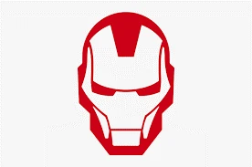
| What is the symbol for Iron Man? The common symbol for Iron Man is the depiction of his helmet, or the arc reactor. |
| Who is Tony Stark based on? The creators of the Iron Man character based him on the industrialist Howard Hughes, whose lifestyle and demeanor is depicted in Stark quite well. |
| What is the Iron Man suit made out of? Except for the Mark I suit that Stark and Yinsen made while prisoners, no suit has been made with iron. From Mark III onwards, the suit has been made from titanium or titanium-gold alloy to counter issues like corrosion and freezing at higher altitudes. As for the later armors such as the Mark XLVI used in Captain America: Civil War’s earlier fights or Endgame’s unique armor, better known as the Bleeding Edge, it is made from vibranium nanotechnology. |
Conclusion
To sum it up, the Iron Man logo is a mainstay of Marvel Comics, representing one of the most proliferate characters in its universe. From being a part of the Avengers and the Illuminati, to being a solo hero who achieved more than any other vanilla human did, Tony Stark’s journey from a billionaire playboy inventor to a next-gen armored superhero is inspiring.
Latest news you want to know!
Subscribe for cutting-edge design inspiration at Logo Poppin! Elevate your brand with updates on logos, branding, web design, and video animation.
Note that by clicking “subscribe,” users may agree to our privacy policy and consent to Logo Poppin to use your contact data for newsletter purposes.
Logopoppin
Logopoppin is a graphic design agency that specializes in logo designing, web development, video production and advanced branding services. We love to innovate businesses with new age technologies, allowing them to improve their visual reputation.

