Table of Content
Explore the Great Evolution of Jack Daniels Logo in Detail
Jack Daniel’s stands out as the top-selling whiskey brand in the United States, a position it has maintained consistently over the years. Its strong domestic performance reflects a combination of heritage, distinctive flavor, and effective branding strategies that have resonated deeply with American consumers. The brand’s association with authenticity and tradition has helped it build a loyal customer base within the competitive U.S. whiskey market.
Due to its extensive distribution and enduring popularity, the Jack Daniel’s logo has become one of the most recognizable symbols in the alcoholic beverage sector. The iconic black-and-white label, with its vintage typography and classic design, is frequently seen in bars, restaurants, and stores around the world. Designed by professional logo design services, this logo plays a crucial role in reinforcing Jack Daniel’s as a household name in whiskey.
Beyond national borders, Jack Daniel’s has achieved remarkable international success, making it one of the most globally recognized whiskey brands. It is sold in over 170 countries and has gained widespread popularity in markets such as Europe and Asia. If you want to know more about the history of Jack Daniels logo, read this article completely. It will let you know the evolution of the JD logo in a quick summarized form.
What Makes Jack Daniels a Popular Whiskey Brand?
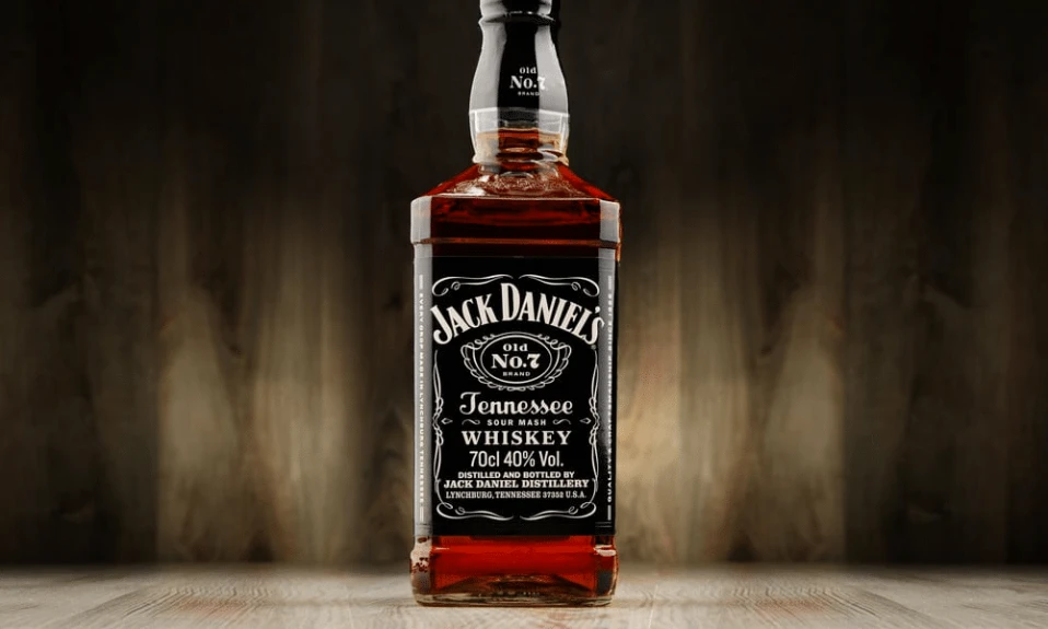
Jack Daniel’s enjoys widespread popularity in the whiskey market due to its rich heritage and longstanding legacy. Founded in 1866 in Lynchburg, Tennessee, it is one of the oldest registered distilleries in the United States. The brand’s deep-rooted history, combined with its storytelling around founder Jasper Newton “Jack” Daniel, creates a sense of tradition and authenticity that appeals to consumers. This legacy fosters trust and loyalty among both long-time whiskey enthusiasts and new drinkers exploring the category.
Another key factor contributing to Jack Daniel’s popularity is its distinctive taste and craftsmanship. The whiskey is made using the Lincoln County Process, which involves filtering the spirit through charcoal before aging. Its flagship product, Jack Daniel’s Old No. 7, strikes a balance between complexity and approachability, making it a versatile choice for drinking neat, on the rocks, or in cocktails. This consistent quality has helped build a strong reputation over decades.
In addition to its product quality, Jack Daniel’s has mastered branding and global marketing. Its iconic black-and-white label, and association with music and Americana culture have made it a cultural symbol beyond just a beverage. The brand frequently partners with artists, sponsors events, and maintains a strong presence in bars and media, reinforcing its image as both a premium and accessible whiskey. This strategic brand positioning, along with wide availability, has ensured Jack Daniel’s remains a leading name in the global whiskey market.
History of Jack Daniels Logo
Jack Daniels is one of those brands that has not done much modifications in the logo. It has largely kept the design same, so that a definite branding image can be shown to the industry. Here is how this logo evolved with little tweaks during the last few decades.
Jack Daniels Logo – 1950
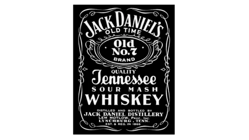
Introduced around 1950, the first official Jack Daniel’s logo marked a significant step in establishing the brand’s visual identity. Prior to this, the brand used various informal labels and designs, but the 1950 logo brought a cohesive and recognizable image to the product. Featuring the now-iconic black-and-white color scheme, the design emphasized a classic, vintage aesthetic that aligned with the brand’s historic roots.
The typography used in the 1950’s vintage logo further contributed to its timeless appeal. With elegant, serif fonts and ornamental borders, the design conveyed a sense of tradition, quality, and craftsmanship. The layout was symmetrical and clean, enhancing readability while preserving a distinct old-world charm. This attention to visual detail helped the brand stand out on shelves and in advertisements, at a time when the spirits market was becoming increasingly competitive.
What made the 1950 logo particularly enduring was how it managed to balance heritage with marketability. It not only communicated the story and authenticity behind the Jack Daniel’s brand but also created a powerful image that could be easily recognized by consumers around the world. This consistency has played a major role in building brand loyalty and making the Jack Daniel’s logo one of the most iconic in the whiskey industry.
Jack Daniels Logo – 1990
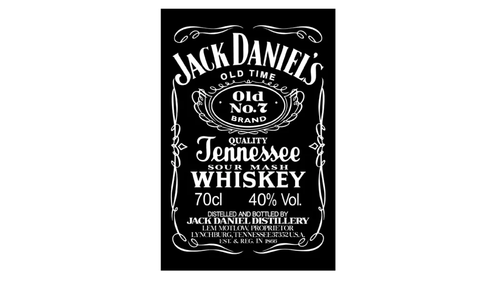
In 1990, the Jack Daniel’s logo underwent a series of subtle yet strategic design modifications aimed at enhancing brand visibility and modernizing its appearance. While maintaining the traditional black-and-white color combination and vintage-inspired style, the updated logo focused on refining specific elements to better capture consumer attention. These changes were part of the brand’s effort to stay relevant in an evolving market while preserving its rich heritage.
One of the most noticeable adjustments in the 1990 redesign was the resizing of the text elements. The name “Jack Daniel’s” was enlarged, giving it greater prominence on the label and reinforcing it as the focal point of the design. This shift helped strengthen brand recognition, ensuring that the name stood out clearly on shelves and in advertisements. The enlarged name also reflected the brand’s growing international appeal, making it more legible and impactful across various packaging and promotional formats.
Conversely, the phrase “Old Time,” was reduced in size during the redesign. This change was intentional, aimed at directing consumer focus more squarely on the brand name itself rather than on nostalgic language. While “Old Time” still remained a part of the logo, its diminished emphasis allowed “Jack Daniel’s” to take center stage. Overall, the 1990 logo update demonstrated a thoughtful balance between honoring the brand’s storied past and adapting to modern branding needs.
Jack Daniels Logo – 2011
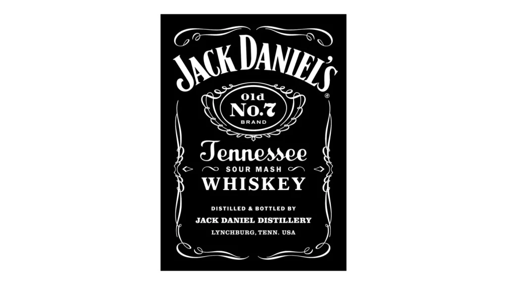
The most recent major redesign of the Jack Daniel’s logo, introduced in 2011, involved a careful refresh of both the label’s layout and the bottle’s shape. This redesign was not a complete overhaul, but rather a refined update aimed at modernizing the brand’s presentation while preserving its iconic identity. The goal was to enhance clarity, improve shelf presence, and ensure consistency across global markets, all while staying true to the brand’s heritage and distinctive style.
One of the key changes in the 2011 redesign was the streamlining of the label elements. The typography was sharpened for better legibility, and certain decorative flourishes were adjusted to create a cleaner appearance. While retaining the classic black-and-white color combination, the refreshed label allowed the text to stand out more clearly, making it easier for consumers to recognize the brand at a glance. These subtle updates gave the design a crisper, more contemporary feel without losing its traditional charm.
In addition to label adjustments, the bottle shape itself was slightly altered to improve ergonomics and enhance visual impact. The redesign maintained the signature square silhouette but refined the edges and proportions for a sleeker look. This updated bottle design not only improved handling but also reinforced Jack Daniel’s premium image. Together, the changes made in 2011 represented a thoughtful evolution of the brand, blending time-honored elements with updated logo design trends.
Frequently Asked Questions
| Why Jack Daniels whiskey is famous in the world? Jack Daniel’s whiskey is famous worldwide for its smooth, charcoal-mellowed flavor and rich heritage dating back to late 50s. Its iconic branding and global presence have made it a symbol of quality and authenticity in the whiskey industry. |
| When was the first Jack Daniels logo introduced in the market? The first official Jack Daniel’s logo was introduced in the 1950s, marking the beginning of its consistent brand identity. This design featured the iconic black-and-white label and the “Old No. 7” emblem. |
| What is the color of Jack Daniels logo? The Jack Daniel’s logo features a classic black-and-white color scheme. This timeless combination reflects the brand’s heritage, sophistication, and bold character. |
Final Words
That takes us to the end of this blog in which we have discussed the complete history of Jack Daniels logo. It represents one of the most famous whiskey brands in the world that is loved by millions of people. Having a rich legacy of alcohol manufacturing, the company has always focused on top class branding, which is why it has largely kept the logo same since the inception. This blog has however highlighted the complete journey of the logo, demonstrating how it evolved during the last few decades. It is a fine illustration of the Jack Daniels’ branding evolution that has always remained highly compact and qualitative in nature.

Logopoppin
Logopoppin is a graphic design agency that specializes in logo designing, web development, video production and advanced branding services. We love to innovate businesses with new age technologies, allowing them to improve their visual reputation.


