
Table of Content
Discover How These Iconic Jewelry Logo Ideas Became Global Phenomenon
Fashion accessories are an important part of your personal style. Among other items, jewelry is also a critical part of that, helping tie your outfit together. Today, people wear bejeweled accessories sporting a variety of jewelry logos, from world-famous brands to independent crafters and designers.
Nowadays, men and women alike are opting for unique fashion accessories and pieces of jewelry, from diamond-encrusted watches, necklaces, and earrings, to custom dental grills inlaid with precious gems. And those who have got the money for it, are always on the lookout for exclusive jewelry items to collect, albeit with a jewelry logo that they can flaunt easily.
But most of these jewelry brand logos we know today have logos that are simple. So how did their hired logo design services manage to create symbols that became so iconic? Let’s look at a few of these well-known luxury jewelry brands and their symbols, and discover what is it that makes their icons so iconic.
Amping Up Your Jewelry Logo’s Impact – Five Artistic Luxury Design Elements
Many of the most famous and well-known fashion and jewelry brands date back decades, some even more than a hundred years. That is why most of them have simple, wordmark types of logos. However, over the past few decades, the smarter companies have revisited their symbols to revamp them according to the design trends of today.
By hiring experienced logo design services to retool their logos, these brands ensured that their logo and brand identity was still relevant in today’s times. And by evaluating these brand symbols, we have discovered the five all-important factors that can be used to turn any logo into an icon of style and luxury.
Using Custom Fonts and Typefaces for a Unique Visual Impact
Custom fonts are a necessity if you want to make any of your designs unique. Take a moment, and think. When we talk about luxury and high fashion, what kind of typefaces come to your mind?
Cursive, handwritten, and calligraphic fonts. That is because our minds are accustomed to think of luxury in terms of elegance and extravagance. And what is more elegant than the intricate flowing characters of your custom logo fonts?
While there’s nothing stopping you from using popular commercial fonts that are available for designers, the best way to stand out and make your logo iconic is to use a set of custom fonts, tailored especially to your brand aesthetics.
The element of uniqueness provided by those fonts adds an element of allure, helping it stand out as one-of-its-kind. However, no matter the type of font you use, you need to ensure that the characters are legible, and suited to your brand personality and market niche.
Opt for a Minimalist Elegance in Your Jewelry Logo Design
Simplicity in design is the order of today. In the past, intricate and elaborate designs were considered high-end, with big businesses and brands sporting highly detailed seals and logos. However, over time, as researchers studied how consumers perceive certain design elements, a new trend designed to increase the impact of these symbols was introduced.
The purpose of designing something to look luxurious and elegant is to make the product’s individual features pop. And in a highly saturated setting, that cannot be possible. Just look at the interior of any high-end boutique or jewelry store. Their display cases or garment racks are not crowded.
Instead, each item is displayed individually in order to draw the viewer’s eyes to it, and only itself.
That is the concept of minimalism. Sometimes less is more, especially in the world of visuals. The more elegant the brand today, the simpler its logo, in terms of color as well as design.
Incorporate negative Space in Your Jewelry Brand Logos for an Amazing Visual Appeal
Expanding on the concept of minimalism, space is an important factor in design. It allows your consumers to properly understand the message your logo is trying to portray, without overwhelming them with unnecessary details.
However, it also serves another ulterior motive. It makes the overall design look elegant and posh. If your design has smooth and clean strokes, accented by ample amounts of negative space, the end result is a logo that looks classy.
Conveying your entire brand message is what a logo is supposed to do. That means that the space that is going to be occupied by the logo is quite valuable. A minimalist design uses a lot of that as negative space. The more space left over, the higher the value of that specific design.
Build Your Color Palette with Shades that Complement Your Brand Aesthetic
Some color palettes are more likely to be viewed as opulent and exotic, then others. Deep, silky shades are often associated with elegance, while lighter pastels are often considered sophisticated. A black-and-white combo, as well as lighter blues, beige, greens, pinks, silver and gold are all examples of the latter.
When creating a color palette for your jewelry brand logos, the idea is to choose one suited to your target audience. Targeted towards a more mature, diamond oriented market, you can choose a soft gold and silver palette, or even a simple black and white one too.
However, if your store is targeted for a younger, more casual crowd, then you can use a mix of soft blue, pink or more to create a lively yet aesthetically pleasing logo. And for a group of senior citizens with old world sensibilities, you could even go for a darker, more royal color palette made up of emerald green or deep sapphire, contrasted with dark gold or silver.
Add a Few Design Flairs to Your Jewelry Logo to Give it Some Panache
While we are on the subject, minimalism and simplicity does in no way meant to exclude any artistic flairs that might make your design unique. They are the elements of your design, which help you stand out from the competition.
Moreover, they are also important for a luxury jewelry logo, as the subtle additions to the design are what attracts your target customers by informing them about what you sell. A few ways to do that is add a border to the logo, which centers and highlights the main design of symbol.
Secondly, you can use textures and other graphical flairs to give your logo a unique identity, without going overboard with the design itself. This combination of design elements will turn a simple logo into a truly regal jewelry symbol.
Famous Jewelry Logos from Jewelry Brands Known for Their Luxury Offerings
Today, we can find a variety of jewelry businesses around us, from simple artisanal crafters to high-end international boutiques sporting well-known fashion brand logos. As not all jewelry brand logos have a popular symbol to boast, let’s take a look at some of the well-known, international jewelry logos.
Tiffany & Co. Jewelry Logo
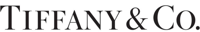
One of the oldest jewelers to still be in business around the world, Tiffany & Co. is a USA-based brand which was established in 1837. Their logo is a simple wordmark that spells the company’s name, and they are known as one of the most popular purveyors of diamond jewelry in the country.
Coming to the logo, the wordmark is designed using a custom serif font, called the Sterling. It was commissioned from the Hoefler Type Foundry, who named it so due to the regal style of its letters. The logo comes in two different color combinations. The first is a simple monochrome, black on white color palette. The other is their signature black letters over a trademarked shade of blue, called the Tiffany Blue, which made it one of the most famous jewelry logos in the world today.
Cartier Luxury Accessories and Jewelry Logo
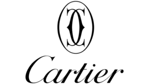
Cartier is a French brand from for their luxury watches and other jewelry items. Beginning its journey in France in 1847, the brand was soon well known among the European royalty, with King George VII commissioning the company to create 27 tiaras for his coronation in 1901. Moreover, the company also received royal warrants from the British monarchy, as well as the royal courts of Portugal, Russia, Spain, and the royal House of Bourbon-Orleans of France.
The logo they use is either their wordmark written in a custom script style typeface. Or they might use a logomark featuring a pair of interlocked “C”, arguably one of the most famous jewelry logo in France and Europe generally. Portraying the initials of the company founder Louis-Francois Cartier, the logo uses a custom Cartier CG calligraphic typeface in the style of many vintage fonts, in a simple, monochrome design.
Dior Fashion and Accessories Logo
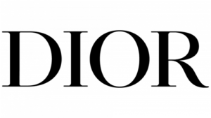
Founded in 1946, Dior is a haute-couture fashion house from France. The original designer was Christian Dior, who named the brand after himself. Today, the brand creates luxury fashion items like clothing and footwear, as well as accessories including jewelry.
The company creates beautiful necklaces, bracelets and the like, all of which sport the iconic jewelry logo known around the world. The logo itself is a simple wordmark, which uses a custom designed serif font known as the Nicolas Cochin. The result is a beautiful design that manages to combine elegant aesthetics and classic vibes intone of the most famous jewelry logos today.
Hermès Jewelry Logo
Another entry in the list of famous jewelry brand logos that has been around for more than a century, the company is called the Hermès International S. A. Starting in 1837, the company has a rich history of serving the elite, the rich, and the aristocrats. And that history is perfectly captured by their jewelry logo.
The brand symbol features an ornate horse drawn carriage, hitched to an elegant stallion in front of a man in coattails and a top hat. This design from one of the most famous jewelry logos today symbolizes the company’s connection to the elite of the society. And that is a good thing, as in their early years they were the crafters and providers of carriage accessories for the aristocracy.
Swarovski Crystal Jewelry Logo
They are one of the most well-known brands, as well as market leaders, who create crystal items. Launched in 1895, the company was named after its owner, Daniel Swarovski. Their crystal work is one of the best in the world, creating exquisite show pieces, clothing and other fashion accessories, resulting in its swan symbol becoming one of the most famous jewelry logos for decades.
Their jewelry logo is an interesting one. It features the image of a floating swan, elegant and poised. After using the image of the Edelweiss flower as their logo for nearly a century, they changed it to the Swarovski Swan in 1988. The Accompanying wordmark uses a custom ITC Novarese Medium font, designed by Aldo Novarese.
Patek Philippe Logo
Patek Philippe is a relatively unknown brand, whose symbol is one of those famous jewelry logos that are known only to a minuscule percentage of the world. However, those who are aware of it know it as one of the most exclusive watch makers, including gem encrusted jewelry chronometers as well.
Founded in 1839, the company is one of the oldest watch manufacturers in the world. Their logo was designed nearly a century and a half ago, and except for minor tweaks to the color palette, the design has remained the same. The font used is custom designed, but looks similar to the sans serif Monotype Grotesque Regular typeface.
Elegant Jewelry Logos That Opt for an Understated Wordmark as Their Symbol
Many of the established jewelry businesses often rely on the strength of their brand name and its wordmark itself to attract their customers. They rely on word of mouth to attract new customers, as they have transcended the need to extensively market their products. Instead, they focus on what they offer, and ensure that they deliver products that exceed consumer’s expectation.
Let’s take a look at some of these wordmark-based jewelry store logos.
Van Cleef & Arpels Jewelry Logo
This brand is the brainchild of the two Frenchmen, Alfred Van Cleef and his father-in-law Salomon Arpels. The company produces a variety of fashion-based item, including perfumes, watches, and other pieces of jewelry. Formed in 1896, their designs often feature flowers, animals, and creatures like faeries from ancient mythos.
Their logo is a simple wordmark, spelling out the names of the original owners of the company. The black on white symbol uses a custom serif font, and employs one of the most simplistic jewelry logo ideas to its design.
Graff Jewelry Logo
The brand is a multinational jeweler based out of London in the UK. Its founder, British jeweler Laurence Graff, formed the company in 1960, which created watches as well as other jewelry items. In 1973, they were the first jewelers to receive the Queen’s Award for Industry and Export, and have won it four times since.
Following the Kimberly Process for sourcing their diamonds, they comply and advocate ethical sourcing of their raw gemstones. The company uses a simple wordmark logo that displays their name, using a plain yet elegant monochrome color palette, which gives its jewelry brand logo an elegant charm.
Buccellati Jewelry and Gems Logo
It is an Italian brand that was came into being in the early 1919. The primary jewelry logo is an aesthetically classic wordmark that spells the name of the company. However, the brand added a small intricate design to the logo as well, kind of a visual accent.
The logo itself uses a sans serif typeface in all uppercase letters. The strokes are all different line weights, and when combined with a simple black-on-white color palette, makes for a dynamic visual impact.
Piaget Luxury Accessories Logo
Another well-known luxury fashion brand, the company was founded in 1874. Today, they are known as one of the world’s foremost craftsmen for Swiss luxury watches and jewelry, with their jewelry brand logo adorning a number of expertly crafted accessories. While starting their own line of watches in the 1900s, the brand today has stores in over eighty countries so far.
The logo is a wordmark spelling the name of the brand in uppercase letters. The font used is a serif font, with sharp ends making the character look quite distinctive. The letters vary in height, with the first and the last characters of the name larger in size than the rest, adding another unique element to the logo.
Bulgari Fashion House Logo
Spelled BVLGARI, the name and its pronunciation itself is one of the most unique things about this brand. Based out of Rome, the spelling was changed to mimic the phonetic sound of the founder’s name – Voulgaris, making it one of the more interesting and memorable luxury fashion brand logo designs.
Taking inspiration from the Latin language from Rome, the letter “U” was replaced with “V”. The entire jewelry logo is written using a custom serif font. However, the serifs are so small and blend so well into the design, that the overall look is one of elegance.
Zales Jewelry Logo
Zales Diamond Store is one of the most well-known diamond jewelers in the world. They primary deal in crafting custom and high quality diamond jewelry, with their jewelry brand logo incorporating the gemstone into its design. However, they also work with a variety of accompanying gemstones.
Their logo is a simple wordmark, that uses a simple black-on-white color palette. The design is classy, with all uppercase letters in bold weight written in a san serif typeface. The only visual accent to the design is the addition of a small, upside-down triangle beneath the letter “A”, which is meant to mimic a diamond.
Best Jewelry Logos from Fashion Brands and Couture Houses
We might come across a few businesses in our lifetime, whose logos might not be well known or iconic, yet their aesthetic appeal speaks to you in a way like no other. Let’s take a look at some of the best jewelry logos in our opinion.
Givenchy Logo
Givenchy is one of the foremost fashion brands today, based out of France. The founder of the company, Hubert de Givenchy, was the pioneer in introducing luxury, ready-to-wear clothing line. They are also famous for their line of perfumes, as well as jewelry.
The emblem on top of the wordmark is usually used to denote their line of fragrances, or “Parfums”. The square-shaped spirals are meant to denote the scent of the perfumes rolling through the air around us. The font for the jewelry brand logo is a simple, sans serif typeface which has ample whitespace around each character, making it look balanced and clean.
Chanel Logo
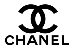
Chanel is most commonly known for their apparel and perfume line. Started in 1925 by designer Coco Chanel, it soon rose to prominence to become one of the most iconic fashion houses in the world. But that is not all they make.
They produce a variety of accessories that sport their jewelry logo, including bracelets, watches, belts and more. The typography of the symbol is a custom designed sans serif font that also features their monogram atop the wordmark.
Boucheron Jewelry Logo
Boucheron is a Parisian fashion and jewelry house, one of the oldest ones in the city. This French jewelry logo is designed to portray the brand name using a bold, serif font. The name of the city is written in smaller characters below the wordmark.
This combination is a good one, when we consider the visual impact of the logo. The wordmark is often accompanied by a small stylized icon of the letter “B”, with a tower to depict the straight stroke of the alphabet. Overall, this is one of the most subtle yet memorable of the jewelry logos we have seen today.
What Role Does Color Psychology Play in Designing Jewelry Logos?
Color psychology is very important when we talk about jewelry store logos. Jewelry is all about pristine, clean color palettes, with warm tones for metals such as gold, and cooler color tones for white gold, silver, and platinum.
Moreover, while bright and sparkling colors are often used to depict various gemstones, color theory suggests that simple color palettes speak to your aesthetic better than those with a variety of shades and hues.
How Do I Design a Lasting, Memorable Jewelry Logo for My Business?
Now, if you are starting a jewelry business, and are looking to create a jewelry brand logo for it, you have a couple of option to choose from. Let’s take a look at what they are.
Use a Well-Reputed Branding Agency
There is no denying the value that a professional branding agency can add to your business. From the establishment of your brand, including the development of a logo, brand color palettes, fonts, tone, and more, the agency does it all.
However, while it is the recommended option, it can be quite expensive. So, what are you to do if your business is strapped for cash, yet still requires a strong, memorable jewelry logo?
Hire a Professional Logo Designer
So, if you are unable to afford hiring a branding agency, then the next best option for you is to hire a professional, freelance logo designer. While not as effective as a complete branding agency, you can be sure that the jewelry logo they create would be unique, well researched, and a true representative of your brand.
Frequently Asked Questions
| What jewelry has a swan logo? Swarovski Jewelry and crystal company uses a swan as its logo. |
| What jewelry company has a flower logo? The company with a flower logo is Buccellati. |
| How do I choose a jewelry name? You can use an online name generating tool to help you, or you can evaluate the market for inspiration in choosing your perfect jewelry business name. |
| How do I design a logo? If you want to create a logo, you can either use a popular online tool like Wix logo maker, or you can hire a professional designer to do so. |
| What is a good jewelry logo for a business? Most modern, high-end jewelry companies either go for an understated yet regal wordmark, or they opt for an abstract design with thin, flowing lines colored in a metallic sheen of gold, silver, or platinum. |
| What is the most popular of jewelry brand logos today? Tiffany & Co. is known across the world for its range of exquisite diamond jewelry, while Swarovski is known for its beautiful, expertly crafter jewelry with their patented crystals. Then we have the popular names like Hermes, Cartier, Bvlgari, and more, who are extensions of luxury fashion brands and couture houses. |
Conclusion
Creating a truly iconic brand symbol is no easy task, but these jewelry logos have succeeded in doing so. Many people believe that just learning how to design a logo is enough to get them started creating an effective logo for their brands. But there is a lot of technical knowledge, experience, and more, that goes into creating an effective brand symbol.
However, what you can, and should do, is look to the jewelry brand logos of your competition, to understand how they managed to establish their businesses. That will inspire your own brand logo, helping you explain your vision to the professional designers you hire.
Now, if you need a professional branding agency to help you out, the experts at Logo Poppin will help create the best brand symbols representing your brand identity effectively.
Latest news you want to know!
Subscribe for cutting-edge design inspiration at Logo Poppin! Elevate your brand with updates on logos, branding, web design, and video animation.
Note that by clicking “subscribe,” users may agree to our privacy policy and consent to Logo Poppin to use your contact data for newsletter purposes.
Logopoppin
Logopoppin is a graphic design agency that specializes in logo designing, web development, video production and advanced branding services. We love to innovate businesses with new age technologies, allowing them to improve their visual reputation.

