
Table of Content
Understanding the Complete History of Justice League Logo
Every DC Comics fan know about the existence of Justice League. It is the famous superhero team-up that unites all the big characters of DC. From Superman to Batman, Justice League is the group that brings everyone together whenever the world is under threat. This team is represented by a logo that is quite popular among the fans. They simply love the Justice League logo due to its alliance with the identity of top DC superheroes. Whenever this logo appears on films or comics, fans get excited to see the union of their favorite heroes.
Today, Justice League has become a established name that showcases the bold persona of different DC superheroes. Its history in the comic book is quite long, dating back to the classic era of 60s. It was the time when Justice League first appeared on the covers of DC comics. Basically, it gave an introduction of the formation of a new team that will work together against the big bads of DC. From Anti Monitor to Steppenwolf, Justice League has always come good against the likes of these villains due to their stunning battle strategy.
Talking about the logo of Justice League, it certainly represents a bold class through its design. If you will look at it closely, you will notice a star embedded in between the typography of the logo. It has been designed quite creatively using the concept of whitespaces. This technique must be well known to the experienced designers, hence it is always advised to take logo design services from them to get the best results.
In this blog, we will take a look at the history of Justice League logo, as how it evolved and changed over the years. This will certainly be a good read for comic book fans, especially the followers of Justice League. So, let us first take a look at the introduction of this league in the comics, as that will help us understand its origins effectively.
Emergence of Justice League
We all know that DC is a powerful franchise of superheroes. From Shazam to Aquaman, there are plenty of names in the DC lineup that has always amazed fans through their intrepid powers. They have taken down several villains fearlessly by showcasing grit and will to fight for the world. However, these heroes often need help from each other due to the bigger threats of interstitial enemies. These are the big bads of DC that are quite powerful and ruthless when it comes to destroy different worlds.
To fight against such big villains, even the likes of Superman needs some smart tactical help from Batman. This is one of the ideal alliances fans like to see, as they represent the main face of DC. These superheroes are therefore brought together under one umbrella called Justice League. It is a team full of heroes ready to fight against the big threats for the sake of humanity. They are fearless and smart, representing an ideal team-up of the world’s best superheroes.
So, the name of Justice League first appeared in the comics named ‘The Brave and the Bold #28’. The role of the team got a short glimpse in this publication as a new superhero alliance similar to that of Justice Society of America. Now, that is a separate league containing other prominent DC characters from the early time of 1940s. We will discuss about them in any other content piece, as the focus in this blog is purely on Justice League.
Evolution of Justice League Logo
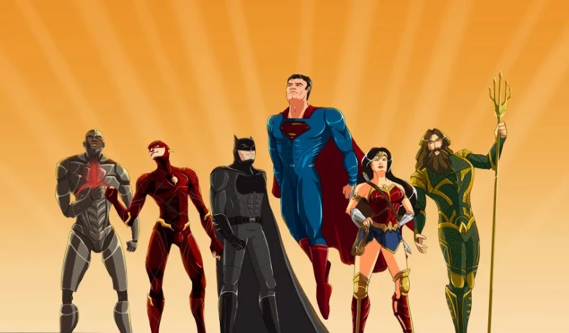
Justice League has got a strong bold reputation in the comics and cinematic world. People know about this league due to its star-studded superhero lineup i.e. Superman, Batman, The Flash, Aquaman and more others. All of these names have got huge individual followership, hence their alliance in a team only makes a big thrilling news for the fans.
The Justice League logo represents the team up of these heroes. It is an iconic emblem that has got a great history in the DC comics world. If you do not know much about it, take a look at the complete timeline given below. It will let you know how this famous superhero logo evolved and got the attention of people through different comics and films. Let’s take a look at it below.
Justice League Logo – 1960
Justice League first appeared in the DC comics series ‘The Brave and the Bold #28. It was the time when DC was only publishing series containing solo characters. However, a new idea emerged stating to bring them together to form a strong superhero team. This concept was also earlier executed in the form of Justice Society of America, including different early era superheroes. So, it was decided to give this team a short glimpse in the adaptation of Batman i.e. The Brave and the Bold.
The name of the Justice League was revealed on the covers of this new DC publication. It was simply designed with a wordmark defining the complete name of the league. The visual on this cover was also very interesting, as it depicted a strong fight between the Justice League and Starro. It precisely gave an idea about the formation of a new team that will work together to defeat bigger enemies threating the peace of the world. It was the first public illustration of Justice League that excited the fans for a new age of superheroes.
Justice League Logo – 60th Anniversary
Justice League is active in the comics world from quite some time. It has become a symbol of strength for the DC fans. To celebrate its long strong existence in the comics world, a new logo was introduced couple of years ago. This was quite simple as it only included the name of the league in a wordmark style. The bold typography of the wordmark made the logo highly attractive. It showcased a strong identity of the team, so that a reputable branding persona can be established in the world.
The iconic star symbol was one again used in this new logo that looked very good. Meanwhile, the color combination of blue and white was chosen for this logo, so that it can relate a bit with the old logo. The DC fans around the world liked this new rendition of logo that was purely created to celebrate the 60th anniversary of Justice League in the comics universe.
Justice League Logo – 2017
Coming to the 2017, DC announced the first debut of Justice League in the cinematic world. This news quickly got the attention of fans, as they have been waiting to see their favorite superheroes live on the big screen. This movie was part of Zack Snyder’s trilogy plan that started with the Man of Steel in 2013. But, due to some unfortunate reasons, Snyder had to leave the direction of the movie, and later Joss Whedon took the lead of that role. He was picked due to his directorial experience with The Avengers that was also a mega hit in the industry.
With the release of the film, a new Justice League logo was also revealed. This new logo was entirely different from the previous versions. It was indeed simple yet highly bold and classy in looks. The color combination used for this logo was also different. It was a blend of black and grey with the iconic star in the middle. It could be said that this logo was the best of the lot, as it had all the ingredients of a modern design that made the logo visuals highly enthralling.
Justice League Logo – 2021
The famous DC superhero team-up released in 2017 didn’t had a good run at the box office. It received mixed reviews from the market, as some called it a very ordinary film and some just appreciated the storyline. The cinematography was however rejected by many fans, as they were hoping something better from Joss Whedon. Due to this uproar, a new demand in the market was risen to release the Snyder cut. It basically meant to release the version of the movie that was directed by Zack Snyder originally. Though that movie was not completed due to some reasons, but fans demanded Snyder to once again work on it.
Listening to these huge demands, Zack Snyder’s Justice League was released in 2021 that literally got huge appreciation from the audience. It was certainly a masterpiece crafted by the stunning mindset of storytelling maestro, Zack Snyder. Along with the release of this movie, a new logo with a slight tweak in the design was also introduced. It didn’t had much changes in the design, except for adding the name of Zack Snyder at the top of the logo. It was done to precisely describe the directorial identity of Snyder that was long demanded by the fans for the original Justice League movie.
Famous Superheroes of Justice League
Justice League includes some of the top superhero names from the comics world. Let us take a quick look at them, so that you can know why this league is so much popular among the fans around the world.
Batman
Batman takes the major lead in the famous team-up of Justice League. He is often seen as the core figure who commands everyone in the league. Therefore, the Batman logo is also very famous among the fans, as it represents the identity of a major lead of the team.
Superman
Superman is undoubtedly the most powerful character of Justice League. He carries the true legacy of Krypton which makes him the most strong entity in the entire universe. The Superman logo also illustrates this truth by showcasing ‘S’ sign in the logo which basically means symbol of hope.
Wonder Woman
The warrior of Themyscira, Wonder Woman, is yet another a noticeable name in Justice League. She commands the power of Amazon, which is why her persona is simply unmatchable. The Wonder Woman logo is therefore beautifully crafted to perfectly exhibit the identity of this female hero. It has also evolved greatly over the years, showcasing the true class of a stunning DC superhero.
Frequently Asked Questions (FAQs)
| Why is Justice League logo so famous? Justice League logo is quite famous among the DC fans. The reason is that it represents the union of popular DC superheroes including Superman, Batman, Aquaman and more others. |
| What is the meaning of Justice League logo? Justice League logo represents the team of saviors. It describes the identity of heroes that are willing to fight for the world to bring long lasting peace and justice. |
| When was the first Justice League logo introduced? Justice League was introduced in 1960s in the comic book series of The Brave and the Bold. The first logo of the team was revealed in that series which instantly got huge attention of the audience. |
| Which colors are used in the Justice League logo? The logo of Justice League has been created using different colors. The 60th Anniversary logo was designed using the combination of blue and white, while the last logo was created with a simple combination of black and grey. |
| What type of fonts are used in the Justice League logo? The font type used in the Justice League logo refers to the category of masculine fonts. It looks bold and solid, depicting a classy identity of the famous DC team. |
Final Words
That takes us to the end of this blog in which we have discussed about Justice League logo in detail. It is indeed an important emblem that exhibits the union of famous DC superheroes. This article has defined plenty of details related to this logo, so it is definitely a good read for the true JL fans.
If you are also looking to design a fancy superhero logo similar to that of Justice League or Spiderman logo, give us a quick call today. We will help you to design quality logos that can give your mascot or fancy event a stunning branding identity.
Latest news you want to know!
Subscribe for cutting-edge design inspiration at Logo Poppin! Elevate your brand with updates on logos, branding, web design, and video animation.
Note that by clicking “subscribe,” users may agree to our privacy policy and consent to Logo Poppin to use your contact data for newsletter purposes.
Logopoppin
Logopoppin is a graphic design agency that specializes in logo designing, web development, video production and advanced branding services. We love to innovate businesses with new age technologies, allowing them to improve their visual reputation.

