
Table of Content
How KIA Emblem Became Dominant in the Asian Car Manufacturing Industry
KIA Motors is one of the leading automobile manufacturing brands in the world. It has established a strong footprint in major parts of the world, and is continuously growing more to cover further grounds. The branding of the KIA Motors has given its products a huge edge in the market. The KIA logo is renowned today in many different countries. They have perfectly set up their car manufacturing and its branding in the commercial market. This has given them a huge leverage to get customers attention and increase car sales regularly in the industry.
Talking about KIA logo, it is certainly a symbol of global car manufacturing dominance. People trust the KIA brand logo due to its great automobile manufacturing history. They know that KIA Motors is their go to brand whenever a car is needed for family or personal use purposes. Just like people associate popular car logos like Toyota and Honda with dependability and reliability, KIA too is slowly inching its way up as the economical go-to brand for all purposes. It has earned people’s trust on KIA symbol, enabling them to prefer its great cars all the time.
This shows how reliable the KIA brand has become for customers. Though the logo has been also modified from time to time by taking professional logo design services, but still the prominence and reputation it holds has not seen any lacking. In this article, we will take a look at the evolution of KIA logo in detail. It will let you know how this logo evolved and changed from time to time. Let’s first take a short look at the history of KIA Motors to understand its overall journey in the automobiles industry till to date.
History of the KIA Motors Logo & the Automotive Corporation it Represents
KIA Motors was founded by Kim Chul Ho in 1944. At the start, it was launched with the name of Kyungsung Precision. This was the time when the Asian automobiles industry was testing the waters before it entered the global market. During this period, there were not many companies operating in the market. So Kyungsung Precision was seen as a pioneering name in South Korea. It promoted the idea of local car manufacturing which later on became the mainstay of South Korean automobile market.
Later on, the company decided to change its name, hence the idea of KIA was put forward. It was indeed a fresh change, giving company a better approach to move forward in the market. In just a little while, the KIA logo showcased its true value by featuring on locally produced quality automobiles. It led the company to get a stronghold in the Korean market, and then in the overall world.
Today, KIA Motors has become a symbol of trust in the global automobiles industry. Its great history in moving along with the manufacturing trends is exemplary for everyone. The South Korean car giant is now ranked among the top car makers in the world. Its revenue and customers pool just keeps on increasing with the passage of time, showcasing its great overall value in the industry, especially against pricier European and American car brands.
How Did the KIA Logo Come About? Discovering the KIA Logo History
Since the foundation of company in 1944, the KIA logo has seen various revisions and modifications. That is precisely done to keep the branding of the company fresh according to the latest standards. The logo that we know today is not the first one company came up with in the market. It had other versions that were used at the start of the company. If you do not know much about them, take a look at the complete list given below.
KIA Logo – 1944
The first KIA Motors emblem introduced in the market was quite complicated in looks. It had a very unorthodox design having no simplicity in the presentation. This logo was created when KIA was still manufacturing bicycle parts. It had a little relevance with that, which is why company decided to move along with it for a short period of time.
Meanwhile, it should be noted that this design was still quite unique during that era. Its idea to use three diamond shape with KIA name in the center was different from other car logos, especially Mitsubishi which had been using its tri-diamond logo on its vehicles since late 1910s. Moreover, the perfect usage of monochromatic color scheme in the KIA logo design was very appealing and catchy in looks. It was however changed in the 1964 when company decided to bring up something simpler to represent its automobile manufacturing identity in the market.
KIA Logo – 1964
The new KIA automotive logo was introduced in 1964 to overhaul the company branding. This time, the logo was made very aesthetically to represent a decent company identity. During this period, the company was starting its new car manufacturing operations. That is why they decided to came up with a new logo to get the needed attention in the market. It was indeed a fresh change that offered good dividends for their branding.
The color chosen for this new logo was green. It was a very unlikely decision to go with this color from a branding perspective, because the company was still in a building phase. They didn’t have any particular branding theme, hence they decided to experiment with some catchy color combinations. The circular design was however a good choice, as it made more sense to their branding. It gave a simple presentation to the logo that was something long aspired by the company, and a touch of modernism to the brand symbol.
KIA Logo – 1986
Coming to 1986, it was the first time that the company incorporated its wordmark as a central element in its logo. This was a major step towards the right branding strategy, that was further elaborated in the other logo versions that came after it.
This emblem was designed with a completely different branding thought process compared to the 1964 logo. The idea behind that was to give the company branding a fresh change. From new logo colors to different types of logos, everything was changed in the 1986 KIA logo to make it more attractive for business branding.
The most appealing thing in this logo was the designing of a curving line over the letter “K”. It looked somewhat like a waving flag or a breeze colored with blue. It gave the KIA logo a very subtle touch, allowing the design to grab people attention. The navy blue shade used for the masculine font below was however a bit different. It was much darker and solid, precisely chosen to highlight the company name strongly.
KIA Logo – 1994
The arrival of 90s saw the change in trends of branding design. The KIA Motors Corporation also decided to capitalize on the new aesthetic by introducing a new logo. This time around, the previous logo used since 1986 was completely scrapped, and a completely fresh design was launched. The new logo was purely based on a wordmark highlighting the name of the KIA company. It was simpler than the previous logos, and decent in looks, which is why it became a permanent part of the company branding.
This wordmark of this logo had an eclectic yet creative style. It was put inside a spherical shape whose border was made using a thick, variable stroke. The new KIA logo colors were a shade of dark, deep red, as it highlighted an essence of strength and energy. Besides the logo, other branding elements of the company also followed the new theme effectively.
It eventually became the main theme of KIA’s market branding, enabling it to design flyers, brochures, business cards, etc. using the same red and white color theme. It was indeed a renewed style that enabled KIA Motors to change its branding bringing it into the modern age.
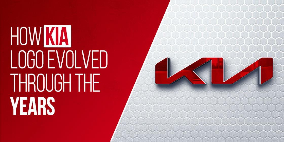
KIA Logo – 2021
In 2021, KIA launched a new logo inspired by the modern trends of angular geometric designs. This logo variation is based on the same wordmark, but its styling is quite different from the ones before it.
It uses a technique called recursive typography to highlight a change in the company’s branding style. The launch of this new logo was nothing short of a celebration, as the company staged hundreds of drones in the air to demonstrate the new KIA logo. Ideally, the design should have set new standards for the company, as they were eagerly looking to get great market advantage through the launch of this new logo.
Unfortunately, that was not to be. The design, while unique, had many people confused with what it portrayed. The biggest confusion was because of one minor detail – the absence of the inner slash within the letter A. without it, people thought the design of the letters “I” and “A” combined to form an inverted uppercase N. This caused a lot of backlash for the company, completely opposite to what they were expecting.
The color scheme picked for this KIA logo was black and white. This was a refreshing change for the brand, as KIA had been using the iconic red since 1994. The company realized that the new logo could not be designed using any element from the previous version, therefore they went for a new, neutral palette. Moreover, the design also used a simple yet catchy logo image. We can say that the new KIA logo was, on paper at least, a masterpiece designed with pure perfection and artistry.
KIA Logo Meaning – What Does the KIA Logo Represent?
There is a lot of curiosity regarding how did the KIA logo come about, and the meaning behind its design. While it may look like it to the untrained eye, it is not just a mere wordmark designed randomly. The logo is basically a subtle tool to highlight the brand value of the company, slowly evolving over time as the vision and scope of the company changes, as can be witnessed in the case of the Ford logo.
The new logo introduced in 2021 proposed an essence of passion, energy and modernism. It offers a very strong look at the company’s new branding direction, enabling people to understand the strong marketing roots of the company.
One thing of note, however, is that the brand uses a different symbol for the local market, which is unique to the automobiles made for and sold in South Korea. Unlike the wordmark-based KIA logo that we are used to, the South Koreans associate the brand with the KIA Motors emblem featuring a dark blue/black circle with a thick outline, and the letter “K” inside.
And although this logo is quite different from the one we call the KIA car brand logo, the emblem is quite unique and effective in its own right.
Discovering the Font for the KIA Motors Logo and Symbol Design
The typography used in the new KIA logo is very artistic, yet minimalist in its design. It uses a specific type of futuristic fonts in a way portrays modernism and a drive for moving forward at the same time. Moreover, with no other design element in sight besides the wordmark itself, we can say it is the crux of the KIA brand logo and branding strategy. And for a brand like KIA which has been going for subtlety in brand design their entire lives, the use of such a brand logo is the epitome of that practice.
Historically, KIA Motors has used a mix of serif and sans-serif fonts in its logos. For example, the previous logo design in dark red had a blocky font, with very slight and subtle serifs. However, besides that, the ones they used earlier, as well as the version being used right now, are all sans-serif typefaces.
The new logo, nevertheless, has added one more subtle element to the wordmark. It has used the recursive style instead of going for the conventional one. This has made the wordmark more stylish, enabling the design to grab people’s attention at a glance due to its uniqueness.
KIA or KN – Understanding the Modern Kia Motors Logo Meaning and Design
We have discussed the release of KIA’s newest logo, which was introduced in 2021. Its design, while unique and attractive, has been the cause of some confusion on the part of the consumers. For many people, the absence of the inner slash of the letter “A” made the logo look like the word KN instead of KIA, with the letter N inverted.
Now, in some circles, that caused an uproar, with consumers critically reviewing the brand symbol, and listing its faults and failures. However, despite that, the company has stuck to its guns, and have continued using it as their commercial logo.
It isn’t like the confusion regarding what the design portrays is that widespread. In fact, the majority of consumers not only liked the logo, they understood what it stood for in as little as a glance. With that feedback, as well as the branding strategy the brand already had in place, KIA decided to keep using the logo symbols, letting people get used to it eventually.
People Also Ask (FAQs)
| 1. Why did KIA change their logo to KN? The company did not change its logo from KIA to KN. In fact, the design of the new logo makes it look as if it spells the word KN, with an inverted N. |
| 2. Why does KIA have two logos? KIA Motor Company has two logos in operation, one the wordmark that we are all familiar with, and the other an emblem that is unique to KIA automobiles manufactured for the South Korean market. This is designed for their strategy to incorporate different elements for the two markets, local and international. |
| 3. What is the story of the new KIA logo? The new KIA logo is designed to be modern and avant-garde. The purpose of the company changing its logo was to highlight the fact that they are now growing and have new horizons and the future of automobile industry as their goals. |
| 4. What does the word KIA mean in Korean? In the Sino-Korean letter, the letters KI and A can be roughly translated as ”Rising from East Asia”. This highlights the brand as an East Asian symbol of hope and growth, which is true for the South Korean automobile brand. |
| 5. When was KIA Motors Corporation founded? KIA Motors was founded in 1944 by Kim Chul Ho. It started with the name of Kyungsung Precision which later changed into the name of KIA. It was also one of the first car manufacturing companies been founded in South Korea after the emergence of Hyundai. |
| 6. What is the color used in KIA logo? The color used in latest KIA logo is black and white. Earlier than that, the logo had red and white color combination which also looked very appealing to the eye. It has long remained an important part of company’s branding theme, precisely due to its perfect relevance. |
| 7. Why did KIA change their logo? KIA is known to be forward looking company that keenly strives to move ahead of the current trends. That is the reason they opted for creative marketing by changing their logo to meet the futuristic branding demands. The new KIA logo colors and symbols are designed to be more modern and future-proof, showing that the company is thinking about sustainability and long-term brand growth. |
| 8. What does the new KIA logo say? The new KIA logo has been getting a lot of attention since it was introduced in the market. According to the official company statement, the new logo embodies the symmetry, rhythm and rising business culture. It sets perfectly with their branding ideology that has long given them success in the industry. |
Final Words
That concludes our entire blog in which we have discussed the KIA logo changes over the years in detail. It is indeed one of the prestigious emblems known in the car manufacturing industry. It has earned people’s trust by offering quality in automobiles production. From hatchbacks to sedans, KIA has approached every type of car manufacturing with a proper strategy that has enabled it to find great success in the market.
This article has detailed how the KIA logo has evolved from time to time. The company has perfectly modified and introduced different versions to keep its branding fresh. It has given them a great edge over other companies in terms of branding and marketing. If you are for how to create a logo or redesign your brand logo just like KIA, contact us today. We will assist you to design quality logos, perfectly according to the given demands.
Subscribe for cutting-edge design inspiration at Logo Poppin! Elevate your brand with updates on logos, branding, web design, and video animation. Note that by clicking “subscribe,” users may agree to our privacy policy and consent to Logo Poppin to use your contact data for newsletter purposes. Logopoppin is a graphic design agency that specializes in logo designing, web development, video production and advanced branding services. We love to innovate businesses with new age technologies, allowing them to improve their visual reputation.Latest news you want to know!
![]()
![]()
Logopoppin
![]()
![]()
![]()
![]()
![]()

