
Table of Content
Understanding the Evolution of the Old LA Rams Logo into Its Current Form
The Los Angeles Rams, known more popularly as the LA Rams, is a professional football franchise that is part of the National Football League, or the NFL. Based out of the LA metropolitan area today, the team’s nearly nine-decade long experience in the sport makes for an interesting history.
The Rams hold the honor of being the first professional football team to feature their symbol, the LA Rams logo, on the helmets. And true to their name, the LA Rams logo has always featured one distinctive design element – stylized curling ram horns in one form or the other.
Though this style was first introduced in 1948 when player and commercial artist Fred Gehrke painted a set of horns on the team’s leather helmets, the style has been adopted as propriety since then. And what an iconic design it has been for the team.
So what was it about the old LA Rams logo that made it so iconic? And was it good enough to represent the team through different iterations of the logo, across three different cities?
Discover the symbol for the NFL franchise that holds the record for winning a league championship with three different sports logos in the NFL. Creating an impactful custom los angeles logo design is no easy task. So read on to find out how the LA Rams managed to design such a memorable logo.
The LA Rams Logo History and the Formation of the Rams Franchise
The Rams was formed in 1936, and was named the Cleveland Rams. An Ohio-based attorney named Homer Marshman and former Ohio State football player Damon Wetzel founded the franchise.
Wetzel, who had previously played for the Chicago Bears and the Pittsburgh Pirates, was named the general manager for the franchise, while Marshman served as franchise principal. Backed by Marshman, Wetzel chose to call the team the “Rams,” named after his favorite college football team from Fordham University.
The start of their career saw the team join the newly minted American Football League and finish the 1936 season in second place. The very next year, the Cleveland Rams joined the NFL, and saw themselves assigned to the West division of the league. The next few years saw the turning of the franchise’s fortunes, with the team suffering more defeats than wins.
Since then, over a career that spans nearly nine decades, the Rams have played for three different cities, starting from Cleveland, to St. Louis, and lastly, Los Angeles.
- The team first moved their base of operation from Cleveland to LA in 1946, after their new owner Reeves threatened to leave the NFL if the request was not accepted. This move made the National Football League USA’s first coast-to-coast sports association. And it was this move that prompted the modification of the old Rams logo.
- After nearly 50 years in Los Angeles, the team decided to move to St. Louis due to a dwindling fan base caused by years of lousy team management and worse luck. This is where the LA Rams old logo became the new St. Louis Rams logo.
- The Rams franchise moved back to Los Angeles for the 2016 NFL season, as the stadium owners in St. Louis had failed to meet their contract requirements with the Rams. The franchise became the LA Rams again, going on to win the 2021 Super Bowl against the Cincinnati Bengals just a few years later.
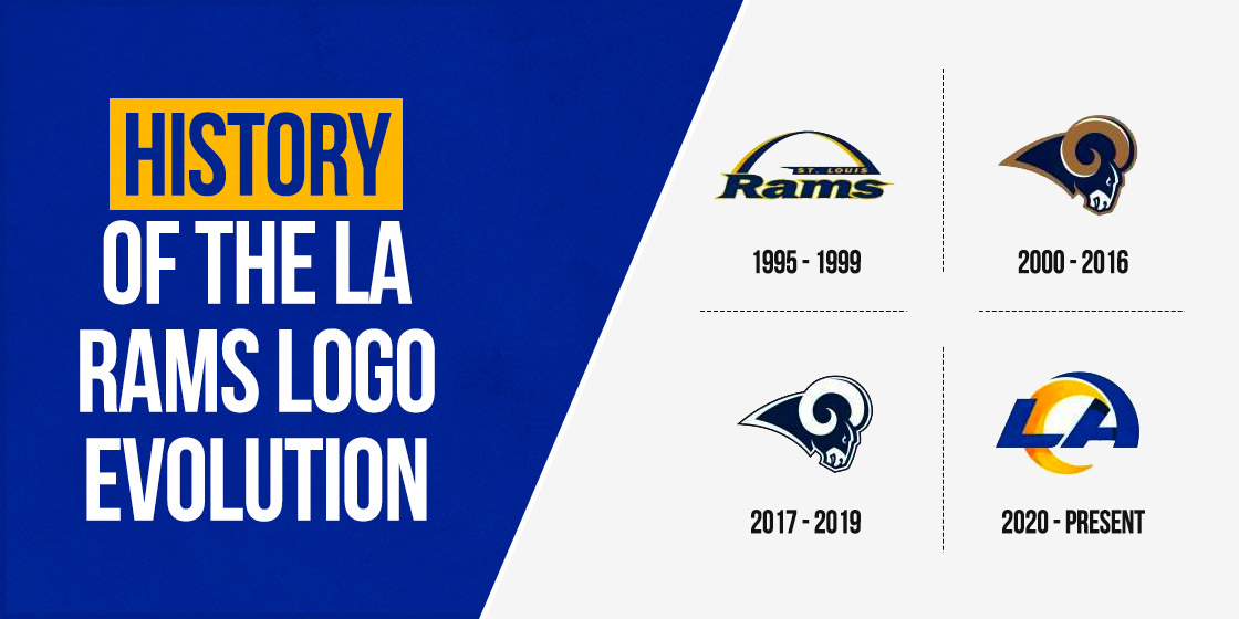
From Cleveland Rams Logo to the Modern LA Rams Logo – A Journey of Evolution
Over a career spanning nearly nine decades, the Rams logo is one of the few NFL logos that have seen quite a few changes, primarily to account for the changes to their host cities. The old Rams logo, the one they used in Cleveland, featured a stylized ram’s head, which was an excellent complement to the team’s name.
The Rams were the first team in NFL history to wear helmets bearing the franchise logo. The trademark ram horns have been seen on team helmets since the late 1940s, with minor changes in style and colors seen through the years.
Cleveland Rams Logo History
Starting with the team joining the NFL in 1937, the franchise spent the next eight years calling Cleveland their home. This era of their career was marked by misfortune and bad luck, resulting in them suffering defeat season after season.
With the American involvement in World War II causing a lack of players, the franchise sat out the 1943 season, returning to football the next year. A year later, in 1945, the team enjoyed their first successful season. The Rams won the NFL championship against the Washington Redskins in, marking their last year playing for Cleveland on a positive note.
During their time as the Cleveland Rams, the team used two versions of the Rams logo. Both logos featured a ram head with curling horns, with the first iteration of the symbol facing right and colored in blue and white. The second of the Rams old logo debuted in 1942 and featured the ram head now facing left, colored in gold and blue. The style of the symbol was different in this design, but the overall logo design still represented the team name well.
The Old LA Rams Logo (The First Era)
The following five decades of their career were spent playing for Los Angeles. During this time, the Rams old logo saw several modifications and tweaks based on changing artistic trends over the years. This era was initially quite successful for the franchise, seeing several winning seasons. Still, several extremely dismal seasons over time resulted in a dwindling fan base.
Between 1946 and 1947, their first year in Los Angeles, the team used the old Rams logo designed the year before in Cleveland. The LA Rams new logo was revealed in 1948 and featured a detailed ram’s head facing left, colored white and yellow. This logo was used for twenty-three years, the longest-running team logo for the franchise to date.
The team logo saw another redesign in 1972 and portrayed the ram head now facing right. This logo was used until 1983, seeing minor changes in colors and design details. The four years between 1984 and 1988 saw the team forgo the ram head in favor of a bold and brightly colored wordmark design.
Although a good symbol, the wordmark experiment did not go over well. The logo was changed again to feature a 2D image of the team’s blue helmet with yellow curling horns. And the last six seasons for the team’s first stint in LA saw the Rams new logo featured as the franchise symbol.
The St. Louis Rams Logo Era
Moving to St. Louis in 1995, the franchise called the city its home for the next two decades. The first ten years of their career in the new town were some of their more successful years, with the team picking up some fantastic players and playing some of the best games in the NFL.
After 2005, the next few years saw the team fail to make the playoffs year after year despite a strong lineup. In 2015, the team franchise decided to move back to Los Angeles. St. Louis had been unable to fulfill the terms of their contract stipulating they provide a proper stadium with new facilities for the team to keep them in the city.
The next twenty years from 1995 to 2015 saw the team make several changes to the Rams logo. The first change was to redesign the old Rams logo, with the new design now featuring the team’s name in blue, white, and yellow, stretched under the St. Louis arch.
The symbol used a pair of complementary fonts to write the team’s name, with the word “Rams” written in a stylized font with serifs. The city’s name was shrunk and placed above the team name in an italicized and smaller font, using a mix of blue, gold, and white colors.
The year 2000 saw the team revert to logo symbols again, which featured a cartoon-style ram head and neck with curling horns. This logo was used until 2015, with minor changes in the shades of the colors used, until the team moved back to LA for the 2016 season.
The LA Rams New Logo (The Current Era)
The Rams moved back to Los Angeles in 2016 after St. Louis, and the franchise fell through. After the 2015 NFL season, the league announced that any team approved to relocate to a new city would need to pay a $550 million fee.
After receiving relocation applications from the Rams, the Oakland Raiders, and the San Diego Chargers, the NFL approved the Rams for relocation to LA. Re-energized with massive fan support at their backs, the team started seeing success after years of dismal results, even featuring a league championship title match.
Returning to Los Angeles nearly two decades later, the team modified the old Rams logo to account for the change in the home city but kept the main artwork intact. The next three years, 2017 to 2019, saw the color palette change again, opting for a simple deep blue and white color scheme, turning into the LA Rams logo.
Finally, the team decided to go back towards a wordmark logo instead of an image-based one. The Rams new logo now featured the word “LA”, with the top of the letter A curving into a stylization of the classic ram horns. The logo was done in a mixture of blue and yellow, making It a compelling yet straightforward statement to the team’s return to Los Angeles.
Logomark- Style LA Rams Logos
Over the years, the team has used these styles of Rams logos as their primary visual identifier, either alone or combined with their wordmark logos. Over a career that spanned nearly nine decades, the LA Rams old logo has seen some major and minor changes. Some of these changes were widely popular with the fans, while others did not fare well with the same crowd.
Let us have a look at the primary Rams logos through the years.
1937-1942 (The LA Rams Old Logo)
The first team logo for the Rams was quite easy to associate with the team. Released in 1937, the logo featured a detailed ram head with tightly curling horns. The image was drawn in profile and faced right, using a blue and white color scheme.
As an image that quickly and effortlessly evoked the franchise’s name at a glance, the logo was smartly accented, and had a clear look to it. The use of these accents made the logo more detailed, which made it popular with the fans.
1944-1947 (The First Rams Logo Redesign)
The Cleveland-based NFL symbol saw a logo redesign in 1944. The Rams new logo now featured sleeker and bolder lines, blue and yellow colors in their palette, and the profile now facing right. This redesign made their logo stand out better in a variety of mediums without losing its impact.
In 1946, the team moved to Los Angeles but used the same logo for a year after moving with slight changes. The emblem now featured a lighter color palette for the shades of yellow and blue to differentiate it from the Cleveland version. Meanwhile, the team used that time to figure out a new logo representing the team’s move to LA.
1948-1971 (The LA Rams New Logo)
The first explicitly designed LA Rams logo was released in 1948 and dropped the blue color in favor of plain white. The shape of the ram head and the horns was modified, with precise details outlined in black. The horns were colored yellow and accented with black lines to give the design a depth to the ridged horns.
1972-1983 (Revamping The Color Scheme)
The logo saw another redesign in 1972, which simplified the color scheme to yellow accented by white and outlined in black. The new logo was minimalist, but it looked stylish. The resultant design was a way to protect the franchise’s values aspired to – loyalty, reliability, and, most importantly, professionalism.
The Rams old logo was changed in 1975, with the outline and the accents now changed to a dark blue color. The white color was replaced with dark yellow in 1981, bringing back the original blue-and-yellow color scheme.
1989-1994 (Helmet-Based LA Rams Logo)
After trying out a wordmark logo for a few years to lukewarm response, the franchise launched the Rams new logo featuring a blue helmet with yellow ram horns painted on the sides. The artwork was attractive, with smooth lines and bold colors, signifying the Rams as a football team.
The LA Rams used this logo till the 1994 season when they moved from Los Angeles to St. Louis before the 1995 NFL season.
2000-2019 (LA Rams New Logo)
In 2000, NFL teams started to adopt more straightforward artwork drawn in the style of cartoons for their logos. This move was aimed to make the symbols trendier and modern, and many franchises adopted similar logos.
The LA Rams new logo featured the head and neck of a ram in profile, facing right. The main body of the logo design was colored a dark blue, with white accents around the face and the animal’s mouth. The smoothly curved horns were colored a dark gold, accented by a thin blue streak at the top.
The entire image was outlined in the same dark gold as the horns, giving a solid and aggressive vibe to the logo.
Over the years, the logo saw several minor changes, such as:
- A lightened shade of gold was used for the 2002-2012 version. This shade was made even lighter in the 2013-2015 logo version.
- The light gold was swapped for a darker brown-gray color in the 2016 version of the logo.
- All color was removed from the design except for the dark blue of the body.
Primary LA Rams Logo
Wordmark-style Ram logos are those which are based entirely on typographic stylings. Many NFL teams use their wordmark logos in conjunction with their image-based logos. In contrast, others use them as their primary logos.
The Rams have used several wordmarks over the years, some as primary logos, while others are an accompaniment to their primary image-based logos.
1984-1988 Primary (Restyling the LA Rams Old Logo)
In the mid-1980s, the LA Rams decided to change their iconic ram head logo to a stylized wordmark logo. They used the same color scheme of blue and yellow, with the franchise name written in big and bold letters.
The word “RAMS” was written in a bold and capital san serif font and was colored blue. The initials of their home city were placed over the team name, smaller in size and colored yellow.
The entire Rams logo was displayed over a white background, which helped the logo pop with its bright colors and became more distinct.
While the idea behind the franchise logo design was good, the logo itself was not that popular. After just four years of use, the logo was replaced with a new image-based logo.
1995-1999 (Primary St. Louis Rams New Logo)
Moving to St. Louis in 1995, the team decided to create a new logo signaling the change. The resultant wordmark logo was made up of two lines of text beneath a blue and yellow arch signifying the iconic St. Louis Arch landmark.
The text was written in two different fonts, with the team name written in a fancy serif font using the title case. The font was outlined using a thin yellow bar, while the font used the team’s dark blue.
A thin blue banner over the team name featured the city’s name in minor yellow characters, written in an italic san-serif font. This logo carried over the design aesthetic of previous Ram logos with the blue-and-yellow color scheme. It brought additional design elements signifying the team’s new hometown.
2017-2019 (The Alternate LA Rams Logo)
After the team moved back to Los Angeles in 2016, the management decided to keep the wordmark and the primary logo the same for that season. The only change was the name modified to reflect the new hometown.
The name of the team was written in a bold title case using a sans-serif font. The letter “R” featured a stylized swash meant to mimic ram horns at the top. The bottom right leg of the “R” extended a horizontal bar underlining the other characters of the team’s name.
The entire image was outlined by a thin blue line, separated from the main design by a bar of white. The name of the hometown was written in shrunken capital letters on the top right of the logo. The entire logo used just a white-an-blue color scheme, dropping the iconic yellow-gold from the team’s image.
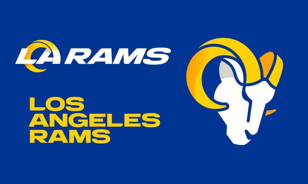
2020-Present (LA Rams New Logo)
Releasing a new logo to commemorate their new home stadium, the team decided to adopt a wordmark as a primary logo in 2020. This simple logo features a blue-white-yellow color scheme, with just the team initials being used as the logo.
The letters “LA” are written in a bold and capital typeface, written in blue. The top of the letter “A” curves out behind the letter, portraying ram horns, and is colored yellow. The entire logo is overlaid over a white background, helping the design look sharp and distinct
Comparing the Old LA Rams Logo and the Modern Rams Logo
The previous logos used by the Rams, whether in Cleveland, St. Louis, or LA, feature an iconic ram head profile signifying the team’s name. Over the years, the logo saw itself modified, with designers tweaking the original concept of the logo to make it look more modern.
But despite the changes, the original concept of the ram head profile is an image that fans identify with the franchise.
The new logo, released in 2020, is quite different from the iconic Rams logo. The designers have tried to incorporate similar iconography to the new logo, such as the curving swash at the top of the letter “A” in LA mimicking a ram horn. Despite that, the abstract design does not go with the team’s vibe.
Since its release, the new primary logo has faced widespread backlash from fans and supporters, criticizing the design team for losing the aesthetic of the original Rams franchise. But despite the backlash, the LA Rams franchise has maintained its position among the five most valuable NFL franchises in 2020.
Frequently Asked Questions
| Why did the LA Rams change their logo? The LA Rams planned on creating a new brand image in time for the opening of their new SoFi Stadium. Their plan was to unveil the new logo and branding at the Grand Opening. |
| What was the Rams original logo? The original Rams logo was a simple representation of the franchise’s name, that is a ram’s head. A simple, two tone white and blue ram’s head with curling horns, facing right. |
| Did the LA Rams change their logo? The LA Rams released their new logo before the 2020 NFL season, featuring the letters LA and the A designed to look like a ram’s horn. They kept the iconic color theme of blue and yellow, with the shades lightened slightly. |
| Will the LA Rams change their logo back? Despite the backlash from fans, the LA Rams will not change their logo back. According to the design team, the logo has been carefully designed by taking inspiration from all previous Rams logos. That resulted in a design that embodies the essence of the entire franchise history. |
| What is the new logo for the Los Angeles Rams? The new LA Rams logo 2020 was released on March 23. The new design featured the same color combination. Still, it replaced the classic navy blue and light gold with royal blue and solid gold. The logo consisted of a blue “LA” over a white background, with a golden curving ram’s horn extending from the letter “A”. |
| Did the Rams change their helmets? The new helmets for the LA Rams feature a throwback design, with a metallic chrome blue shell offset with a yellow gradient horn and accented with a blue face mask. These helmets are paired with blue jerseys featuring yellow gradient numbers and complemented by blue or yellow pants. |
Conclusion
The Rams logo history and evolution is quite extensive. The only team to reach league playoffs for three different cities, the Rams have experienced many lows and highs in their career, spanning nearly nine decades.
But despite the setbacks, the support of a loyal fan base has helped them become one of the most valuable NFL teams in recent history. Besides that, you may also find the evolution and history of San Francisco 49ers logo and Chicago Bears logo entertaining.
Latest news you want to know!
Subscribe for cutting-edge design inspiration at Logo Poppin! Elevate your brand with updates on logos, branding, web design, and video animation.
Note that by clicking “subscribe,” users may agree to our privacy policy and consent to Logo Poppin to use your contact data for newsletter purposes.
Logopoppin
Logopoppin is a graphic design agency that specializes in logo designing, web development, video production and advanced branding services. We love to innovate businesses with new age technologies, allowing them to improve their visual reputation.

