

Table of Content
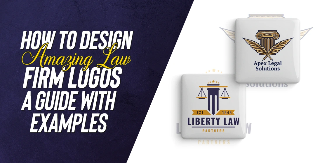
Discover How the Pros Created the Best Law Firm Logos We See Around Us Today
Managing a law firm is similar to how you would run another business – establish a brand, attract customers, provide topnotch services, and ensure a high success rate. So, it shouldn’t come as a surprise that there is a substantial demand for effective law firm logos.
Law firms today can be found in several interesting styles. Some specialize in litigation and trail, which means that they specialize in trying cases in front of a jury. Then there are corporate lawyers who act as legal counselors to businesses and executives, representing the interests of their clients against the other parties.
With the field of law such a vast and varied landscape of niches and specializations, law firms find it necessary to brand and promote themselves effectively. That is why, you will often see law firms involved in the creative industry often having logos that are more interesting than the drab professional designs from other niches. To attract the right clientele, their logo needs to speak to their target consumers.
Let’s dive in and study how to create these effective law firm logo designs, and take a look at some amazing examples from professional logo design services to inspire our own design.
What Are Some Common Elements Overused in Law Firm Logos?
In all industries, some elements are common occurrences in the logos of companies from that niche. That is because those elements have some significance to that industry or niche. However, the overuse of these symbols result in them losing their visual impact, which means that in order to stand out, your logo needs to avoid them at all costs. Or, barring that, utilize a spin on those symbols’ designs to make it looks distinctive.
When it comes to the legal industry, its no different. There are a bunch of design elements that have been used to death by many law firm logos, especially those who either designed the logo themselves, or used an amateur designer to do it for them. The result is that those symbols often start to look alike, from a consumer’s perspective. Even you wouldn’t like the addition of these clichéd design elements in your logo.
Some of these oft-overused law firm logo design elements include:
- A gavel
- The scales of justice
- A set of ornate courtroom columns and arch
- An upright fist
- A thick, open book
As we mentioned earlier, just because they are overused, doesn’t mean that they cannot be tweaked to add value to your design. So, the first thing you need to do before starting your logo design process, is to study and look at your competitors’ logos.
That would give you a clear starting point, as to what you would like or dislike in your design, as well as any inspirations that pop up. So, when at the end you tackle the design process yourself or hire a professional for it, you would have a clear direction as to what you expect from the logo.
Tips to Create Awesome Law Firm Logo Designs That Make an Impact
When it comes to creating the best law firm logos like the one above, there is no one-size-fits-all formula. However, that doesn’t mean that there is no proven way to ensure that your brand logo has the best chance at success in the industry.
If you look at the various law firm logo designs, and identify the ones that are received well by their consumers, you will see that they all have something in common. These points of commonality are the result of adhering to some tips and tricks, which are known for their success time and again. These tips include:
- Select a color scheme that matches your brand vibe
- Choose a design style and color scheme that suits your style of law firm
- Go for fonts that that both suit your brand style and are perfectly legible in print and web both
- Consider the dimensions of common mediums where your logo will appear (letterhead, website, business cards etcetera)
- Try to keep the overall design simple and easy to follow at a glance. No unorthodox shapes and styles that would be hard to remember
- Create logo symbols that could be used with or without your primary logo’s wordmark. They will act as alternative versions of your logo
- Try to incorporate some elements to call out to your law firm’s specialization
Now, these are just some of the more popular law firm logo design tips that the popular brands follow for their brand symbols. And while there are many more of these, just following these is more than enough to give your brand logo a fighting chance.
7 Examples of Best Law Firm Logos That Hit the Mark
Now that we know the tips and tricks to effective law firm logo designs, as well as the overused design elements that we need to avoid, you might be thinking that you are ready to start designing your logo. However, as we mentioned earlier, the first step to designing a great logo is to study your competition, and devise a design plan accordingly.
To make the process easier for you, we have compiled a list of seven of the top law firms from around the world, so that you can study their logos and find the secret to their success. Let’s dive in begin.
WilmerHale Law Firm

The first law firm logo on our list belongs to the WilmerHale law firm. WilmerHale, also known as Hale & Dorr, or Wilmer Cutler Pickering Hale and Dore LLP, is an international law firm headquartered in Washington D.C. and Boston, with offices across Europe and Asia too.
As a global law firm that specializes in general practice, meaning that they do a little of everything, they needed a logo design that served that purpose effectively. And if you look at the logo right now, you will see that the entire logo, from the wordmark to the symbol, exudes professionalism that would suit a law firm perfectly. Plus, the standalone symbol that represents the company would be perfect for mediums where the full-sized logo won’t fit, such as cufflinks or lapel pins.
Latham and Watkins LLP Firm
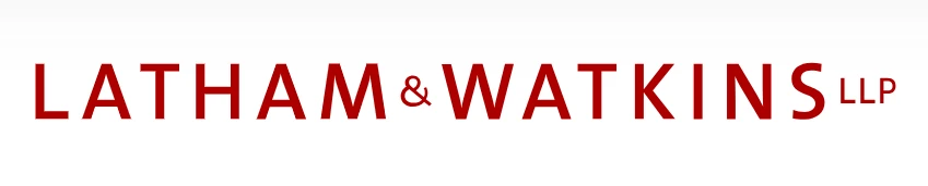
Latham and Watkins LLP is an American law firm that has offices across the globe in the US, Asia, Europe, and the Middle East. Founded in 1934, it is considered the second-largest law firm in the world in terms of revenue generated. Moreover, it is also one of the most profitable law firms in the world, with profits per partner exceeding $5.7 million in 2022.
With over 3500 lawyers employed, the law firm offers a variety of legal services, including transactional, litigation, regulatory and compliance, as well as many other corporate areas. As such, their logo is quite neutral in terms of its design. The modern yet simple font used for the wordmark, as well as the dark red color of the logo, exudes corporate elegance and professionalism. And considering the kind of clientele the firm deals with, that is the perfect vibe you want portrayed.
White and Case Law Firm
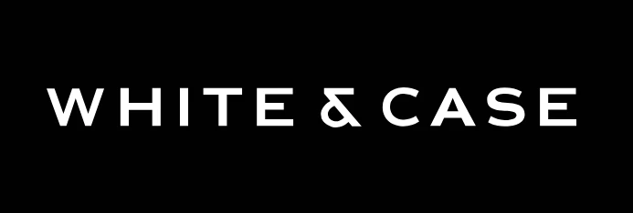
White and Case is another old American law firm with offices across the world. Like the previous two law firm logos on this list, this one too represents one of America’s “white-shoe” law firms, highlighting the firm’s elite status.
With a presence in over 30 countries worldwide, the firm needs to have a logo that represents its elite vibe, while at the same time exude the inherent professionalism that comes with it. To do that, they have used a simple, elegant, and highly visible font for their logo, modifying the ampersand symbol in the middle to give the logo a modern feel.
Jones Day Law Firm
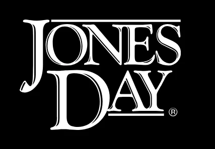
Jones Day is another American law firm that has a global presence around the world. Established in 1893, the firm is one of the largest ones globally with 2300+ lawyers employed, earning a revenue of over $2.5 billion as of 2022.
Among the law firm logo designs we have seen so far, this is the first one that incorporates a sense of history into its design. Rather than going for modern logo fonts, the company uses a decidedly vintage style of design to create their wordmark. The rounded letters and the classic style of the typography shows that it is a firm with a rich and fruitful history.
Morrison Foerster Law Firm
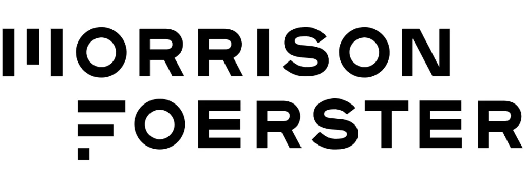
Morrison Foerster is a US-based law firm that, while not as big or profitable as the ones we have discussed so far. With over a 1000 employees, the company has offices in Asia and Europe too, alongside its American headquarters.
Founded in 1883, you would expect the company to have a logo that calls back to its historical roots, for a sense of legacy. However, the design is arguably one of the most modern-looking ones on this list, despite being devoid of any logo symbols. For the company’s initials, the designers decided to forgo the characters’ conventional design in favor of using sets of triple lines to represent them, a great way to make the design memorable.
Osborne Clarke Law Firm
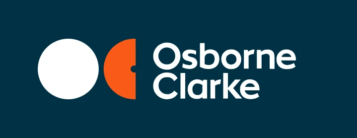
Osborne Clarke is a UK-based global law firm that has over 25 offices around the world, mostly around Europe. Inaugurated in 1748, it is the oldest law firm on this list, and has played an important role in the UK’s development, especially for their role in the development of the railway network in Southern England.
Offering a variety of legal services for industries as varied as healthcare, real estate, energy, tech, and more, the minimalist wordmark is accompanied by a simple yet highly memorable symbol. Designed after the company’s initials, the design has a characteristic 1970’s logo design vibe to it, with its circular geometric shape and color scheme.
Mayer Brown Law Firm

Mayer Brown is another “white-shoe” law firm based out of Chicago IL. Established in 1881, the company has 27 offices spread across the Americas, Asia, Europe, and the Middle East. The company has been a part of many landmark cases, which have established their credentials as one of the top legal services provider in the industry.
Their logo represents the name of two of its earliest partners, especially the co-owner of the American operation Levy Mayer. And despite the company’s growth through the decades, the firm is still known by the name of those partners. The design of their logo is quite simple; a wordmark of the two names written in a simple, sans-serif font, separated by a single vertical mark to round off the design. While minimalist, the design is highly memorable due to its sheer simplicity.
Conclusion
To sum it up, you can find many lists mentioning the best law firm logos on the web. However, just because a style worked for a specific law firm, doesn’t mean that it would work for your firm too. Before you design your law firm logo, you need to evaluate your business to find out its vibe, in order to find out how to create a logo that represents your law firm perfectly.
In any case, if you want to start creating your law firm logo designs right now, then the tips above will help you navigate the process successfully.
Latest news you want to know!
Subscribe for cutting-edge design inspiration at Logo Poppin! Elevate your brand with updates on logos, branding, web design, and video animation.
Note that by clicking “subscribe,” users may agree to our privacy policy and consent to Logo Poppin to use your contact data for newsletter purposes.
Logopoppin
Logopoppin is a graphic design agency that specializes in logo designing, web development, video production and advanced branding services. We love to innovate businesses with new age technologies, allowing them to improve their visual reputation.

