Discover the Best List of Colors Starting with F and Their Emotional Impact on Viewers
Imagine yourself strolling through a vibrant new age art gallery, each canvas bursting with a captivating array of hues. As those colors jump off the canvas and dance before your eyes, you will see each shade telling a story and evoking an emotion. As you turn a corner, your eye jumps from a fiery sunset to a calming blue sky that is slowly darkening to a dark frost black; an interesting blue-black hue from shades of black color, for an interesting effect. As you journey through the gallery, you explore the world of captivating colors that start with F, the diverse palette of shades full of personality and purpose.
Let us explore the list of colors starting with F and delve into their unique characteristics, the emotions they evoke, and the ways they work in our daily lives. From fire engine red to flint grey, let’s explore this array of colors and see how these vibrant shades work to enhance a professional graphic design agency’s color palette.
Embracing the Familiar Shades of Colors that Start with F
Starting from colors that start with A, all the way down to Z, the vibrant array of shades and hues offer unlimited options for an artist to choose from. Now whether that artist is a graphic designer, an interior designer, a fashion designer, or a practitioner of the finer arts, it doesn’t matter. Their choice of colors would depend upon the message they are trying to portray.
So, from eye-catching fire engine red, to the electrifying flax flower blue, let’s explore the range of common shades and colors that start with F.
Fire Engine Red (#FE0002)

Red belongs to the trio of primary colors of life, and the only one that belongs to colors that start with R. One of the most iconic shades of red color called fire engine red is a bold and energetic color, symbolizing passion, excitement, and warmth. It is a color found in a fiery sunset, a bowl of ripe strawberries, and as the name suggests, as the primary color on fire trucks. And in a somewhat lighter hue, could also be considered among dark shades of orange color, quite close to red-orange.
Forest Green (#228B22)

Forest green is a dark shade of green, another prong of the primary color trio, and one of the darker shades of the eponymous colors that start with G. Lush and verdant, this shade of green is used to represent growth, connection with nature, and harmony. When you think of forest green, you imagine a dense forest, a refreshing spring meadow with the season’s lush foliage, or a healthy potted plant at home. Although dark in shade, it is slightly less saturated than its counterpart emerald green from colors that start with E.
Fuchsia Pink (#EF2B7C)

Fuchsia pink is a shade of fuchsia with a more vivid shade of magenta in it, making the purplish element a little less obvious. Vibrant and playful, the color evokes feelings of joy, creativity, and most importantly, a sense of powerful femininity. Imagine a blooming fuchsia flower in bright sunlight, a little girl’s playroom, a beautiful summer evening dress perfect for all occasions, from a house party to a wedding reception at the beach. Along with Carnation Pink from colors that start with C, it is one of those shades often used to denote something as girlish.
Flesh Pink (#FFCBA4)

Flesh pink is an interesting shade of pink, which adds a pastel filter with slight orange overtones to this parent shade from colors that start with P. Flesh pink can be said to remind us of a skin of an healthy and plump toddler, with the light flush they get when they are sleeping deeply. Pale and versatile, it offers a natural and realistic representation of lighter human skin tones. Think about traditional nude makeup shades and clothing, or the skins of people in portraits found in the western world. Discover how flower puns and color symbolism grow on you and bloom with deeper meaning.
Flax Flower Blue (#4499DD)

Flax Flower Blue is one of the brighter shades of blue color, which retains some of its richness of pigment despite the lightness. Bright and calming, the shade is reminiscent of flax flowers. And the shade is used to symbolize tranquility, mental serenity, all with a touch of elegance. In fact, it is quite similar in impact to the shade Baby Blue from colors that with B, offering a darker shade of that color. When you think Flax Flower Blue, imagine a clear summer sky, a calming spa room, and a beautiful classic blue and white porcelain vase.
Transform Your Business with Professional Logo and Branding Services
Revamp My Brand
Uncovering the Hidden Gems of Colors that Start with F
Now that we have taken a look at some of the more popular colors that start with F, you might be wondering – is that all there is to that, or are there some lesser-known shades with great vibe? Well, there are certainly a lot of shades of colors that starting with F that people don’t know about, or confuse them with some other shades.
So, join us as we go beyond the familiar and explore some of the most unique and intriguing F colors, and see what color theory has to say about their impact.
Fawn (#E5AA70)

Fawn is one of the lighter shades of tan color, with a certain yellow tinge to it. A light and warm shade that reminds us of a young fawn deer, it symbolizes warm comfort, stability, and a strong connection to nature. Although some people often confuse it with ecru, a shade of brown from colors that start with E, there is a subtle difference between the two, as ecru has more of a gray tinge to it, while fawn has more of a warm yellow tone. When you think fawn, imagine a cozy wood cabin, a cup of light coffee with cream, and the soft spring down of a fawn.
Fern Green (#4F7942)

Both fern green and forest green, the color we discussed earlier, are shades of green color that often appear together due to their complimentary emotional evocations. However, while forest green is the green deep within the foliage, fern green is the green on the bright and vibrant ferns. A deep and verdant shade that reminds us of ferns in bright sunlight, fern green represents growth, and freshness. Imagine the green at the edge of a forest that leads to an open meadow, and the flowering bushes besides the garden path.
Fandango Pink (#E04F80)

IF you have ever seen a flamenco dancer twirl around on a dance floor, chances are you have seen this color in play. One of the more vibrant and exciting shades of pink color, fandango pink captures the energy and liveliness of the Latin dance, symbolizing passion, celebration, and a touch of Spanish flair. Imagine a picturesque sunset, with the lights just twinkling on, and the sky a beautiful shade of orangish-pink. That’s what this shade from colors that start with F signify.
Faded Rose (#BF6464)

Now faded rose is an interesting color, and one that is quite polarizing. A soft and muted shade of pink, it is reminiscent of a rose that is past its prime, and is starting to dry out. It symbolizes warm nostalgia, and a touch of vintage charm. Now, desert rose from colors that start with D is a shade that is quite similar to this one. However, while that has a little violet tone to it, desert rose has more of a brownish-tinge to it, similar to the patina on a vintage photo, or flower dried between your favorite book.
Flint Grey (#A09C98)

Flint gray is among the coolest neutral shades of gray color that reminds us of flint stones. It symbolizes resilience, strength, and a touch of cool sophistication. Think of a steely winter sky, a sharp suit that displays your confidence, or the modern aesthetic of minimalism in interior design color palettes and architecture. Representing an interesting mix of strength and confidence, it is a must-have for your color palettes nowadays.
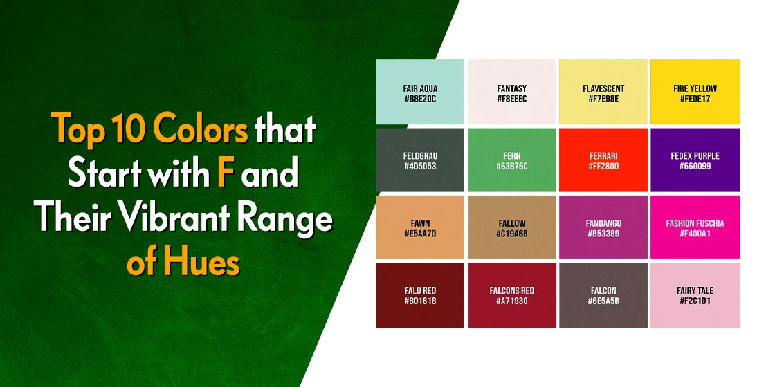
Beyond the Basics – A Quick Reference of 20 More Colors That Start with F
So we’ve explored the popular favorites and the hidden gems — but the world of colors that start with F runs much deeper than just ten shades. Whether you’re a graphic designer building a color combination for a client project, or you’re simply curious about what other hues are hiding under this letter, here’s a quick-reference table of 20 more stunning F colors that deserve a spot on your radar.
| Color Name | Hex Code | RGB Values | Quick Description |
| Flamingo | #FC8EAC | 252, 142, 172 | A playful pink-coral that channels tropical vibes |
| French Blue | #0072BB | 0, 114, 187 | A refined deep blue evoking trust and sophistication |
| Firebrick | #B22222 | 178, 34, 34 | An intense reddish-brown radiating confidence and power |
| Flax | #EEDC82 | 238, 220, 130 | A warm, buttery yellow that feels like soft sunlight |
| Falu Red | #801818 | 128, 24, 24 | A deep Scandinavian crimson with earthy brown undertones |
| Fog | #D7D7D7 | 215, 215, 215 | A soft, neutral gray that whispers subtle elegance |
| Feldgrau | #4D5D53 | 77, 93, 83 | A muted military gray-green symbolizing resilience |
| French Lilac | #86608E | 134, 96, 142 | A dusty purple with a romantic, vintage feel |
| Fiery Rose | #FF5470 | 255, 84, 112 | A bold coral-pink that demands attention |
| Frost | #E1E8ED | 225, 232, 237 | An icy blue-white perfect for clean, modern aesthetics |
| French Raspberry | #C72C48 | 199, 44, 72 | A rich berry red dripping with luxurious energy |
| Fallow | #C19A6B | 193, 154, 107 | An earthy golden-brown inspired by fertile soil |
| Fandango | #B53389 | 181, 51, 137 | An electric pinkish-purple bursting with dance-floor energy |
| Fashion Fuchsia | #F400A1 | 244, 0, 161 | A runway-ready magenta pink that screams confidence |
| Field Drab | #6C541E | 108, 84, 30 | A rugged olive-brown rooted in natural landscapes |
| French Rose | #F64A8A | 246, 74, 138 | A warm, vibrant pink full of playful charm |
| Folly | #FF004F | 255, 0, 79 | A daring neon red-pink that refuses to be ignored |
| Foam | #D8FCFA | 216, 252, 250 | A whisper-light aqua evoking sea foam on a calm shore |
| Fern | #63B76C | 99, 183, 108 | A bright, lively green with fresh springtime energy |
| French Bistre | #856D4D | 133, 109, 77 | A sophisticated warm brown with golden undertones |
Each of these shades carries its own personality — from the tropical warmth of Flamingo to the understated strength of Feldgrau. If you’re working on a branding project or refreshing your visual identity, consider these lesser-known F colors as unexpected alternatives to the usual suspects.
And here’s a pro tip: colors like French Blue and Firebrick work beautifully in professional branding because they project authority without feeling cold or unapproachable. Meanwhile, shades like Flamingo and French Rose are perfect for lifestyle brands that need to feel fresh and inviting. Understanding how logo colors carry meaning can help you make that choice with confidence.
List of Colors Starting with F and Their Refreshing Splash of Vibrancy in Life
Now, you might be thinking that many of the colors that start with F are just derivations of the shades we have seen before. And you would be correct. However, it is those subtle differences that make all the difference in how we perceive those shades, changing the color meanings with slight tweaks in hue, saturation, and more.
Here’s how these colors starting with F play an important role in our daily lives.
- Fashion: Imagine a bold fire red dress that makes a powerful statement, a sophisticated fawn brown overcoat that exudes a timeless elegance. How about a playful fuchsia pink scarf with bright polka dots from various shades of yellow color, or a stunning necklace and earring set in flamingo pink to add a touch of vibrancy to any outfit?”
- Design: Utilizing color psychology and contrasting power to create impactful visuals and evoke emotions in design projects, here’s how they colors help us.
- A website using forest green to convey creativity and growth.
- A restaurant using warm fawntones to create a feeling of comfort.
- A brand logo using fire red to grab attention and symbolize boldness.
- A calming home interior decorated with soft shades of flax blue and fern green for a relaxing living space.
By exploring the variety of applications of colors starting with F, we gain a deeper understanding of the impact and power they hold to communicate and inspire their viewers.
How to Use Colors Starting with F in Branding and Design – Color Pairing Ideas
Knowing a color’s name and hex code is one thing. But knowing how to pair it with other shades to create a cohesive visual identity? That’s where the real magic of color theory comes in. Colors that start with F happen to be incredibly versatile when it comes to creating palettes that communicate clear messages — whether you’re designing a complete branding package, decorating a living room, or choosing the right tones for your next project.
Here are five tried-and-tested color pairing ideas built around F colors:
Fuchsia Pink + Flint Grey – Bold Meets Sophisticated
This pairing is a designer’s secret weapon. Fuchsia pink brings the energy and eye-catching vibrancy, while flint grey grounds it with cool sophistication. Think of it as the visual equivalent of wearing a statement piece with a tailored suit. It’s a combination that works wonderfully for boutique logos and modern beauty brands that want to feel both playful and premium.
Forest Green + Fawn – Nature’s Own Palette
There’s a reason this combination feels so effortlessly right — it’s borrowed straight from nature. The deep richness of forest green paired with fawn’s warm, golden-brown tone creates a palette that feels organic, trustworthy, and grounded. It’s ideal for eco-friendly brands, landscaping businesses, and artisan food brands that want to evoke warmth and authenticity.
Fire Engine Red + Flax Flower Blue – Energetic Contrast
If your brand needs to make people stop scrolling, this high-contrast duo delivers. Fire engine red commands immediate attention, while flax flower blue provides a calming visual anchor that keeps the design from feeling overwhelming. This kind of energetic contrast works perfectly for sports logos and athletic brands that need to convey excitement and action.
Fern Green + Frost – Clean and Refreshing
Pairing fern green’s lively natural tone with the icy crispness of frost creates a palette that feels fresh, clean, and modern. It’s the kind of combination you’d see in spa branding, health-focused companies, and wellness brands — anywhere the goal is to communicate purity and renewal.
Fandango Pink + French Blue – Playful Elegance
This pairing might sound unexpected, but the vibrant warmth of fandango pink against the refined depth of French blue creates a striking balance of fun and professionalism. It’s a palette that works beautifully for creative agencies, event planners, and lifestyle brands that refuse to be boring.
When building your own palettes, remember that contrast is your friend. Pair a bold F color with a neutral or muted one, and you’ll create visual hierarchy that guides the viewer’s eye exactly where you want it to go.
What Is the Difference Between Fuchsia, Magenta, and Hot Pink?
If you’ve ever found yourself staring at three seemingly identical pink-purple swatches and wondering, “Wait, aren’t these all the same color?” — you’re not alone. Fuchsia, magenta, and hot pink are three of the most commonly confused shades in the entire color spectrum, and the confusion is so widespread that even experienced designers sometimes use these names interchangeably.
But here’s the thing — they’re not the same, and understanding the differences can make or break your design choices.
Fuchsia (#FF00FF) is a vivid, equal blend of red and blue light with zero green, placing it right at the intersection of pink and purple on the color wheel. It’s named after the fuchsia flower, and its balanced composition gives it that distinctive vibrant quality that feels both warm and cool simultaneously. In digital design, fuchsia and magenta actually share the exact same hex code — which is the root of the confusion. However, in traditional color theory and print design, they diverge.
Magenta leans slightly more toward the purple side of the spectrum. In print (CMYK), magenta is one of the foundational ink colors alongside cyan, yellow, and black. When you see magenta in a printed context, it tends to appear deeper and more purple-shifted compared to how fuchsia renders on a screen. Think of it this way — magenta is the more “serious” sibling of the two.
Hot Pink (#FF69B4), on the other hand, is a distinctly different shade altogether. It has far more red in its composition and much less blue, which pushes it firmly into the pink family rather than the pink-purple territory that fuchsia and magenta occupy. Hot pink is lighter, warmer, and less intense — it’s the shade you’d associate with bold fashion statements and retro pop culture, but it lacks the purple undertone that defines fuchsia.
Here’s a quick visual breakdown:
| Color | Hex Code | Red | Green | Blue | Leans Toward |
| Fuchsia | #FF00FF | 255 | 0 | 255 | Equal pink-purple |
| Magenta | #FF00FF (digital) / varies in print | 255 | 0 | 255 | Slightly more purple |
| Hot Pink | #FF69B4 | 255 | 105 | 180 | Warm pink, less purple |
So why does this matter for your next design project? Because these subtle differences carry different emotional weights. Fuchsia feels electric and modern — perfect for gradient logo designs and tech-forward brands. Magenta communicates creativity and artistic sophistication, making it a natural fit for purple logos with a bold edge. And hot pink brings pure, unapologetic fun — ideal for nail salon brands and playful lifestyle businesses.
The next time you’re choosing between these three, ask yourself: do you want equal pink-purple energy (fuchsia), a slightly deeper artistic mood (magenta), or pure warm-pink vibrancy (hot pink)? That answer will guide you to the right shade every time.
For a deeper dive into how different shades of pink carry different meanings across design and branding, check out our dedicated guide.
FAQs
| What color is fuchsia? Fuchsia is a vibrant shade of purplish red color that often gives a magenta-purple vibe. That is why Fuchsia is commonly considered among shades of purple color and pink color. |
| Is fuchsia a fake color? Yes, fuchsia can be said to be a fake color because our mind perceives it to be pink-purple, a phenomenon that occurs when our brain sees clashing colors with very high and very low wavelengths at the same time. |
Conclusion
From the common and familiar to the unique and intriguing, the world of colors that start with F offers a vibrant and diverse spectrum of color combinations. It ignites our creativity, evokes positive emotions, and shapes the world around us.
Here we have explored the character of just a few of these colors, going beyond the familiar to discover hidden gems, and witnessed their applications in various aspects of life.
As you come across these colors throughout your daily life, take a moment to appreciate their character and the stories they tell. Remember, these colors are more than just visual elements; they are a language waiting to be explored, understood, and expressed.
Latest news you want to know!
Subscribe for cutting-edge design inspiration at Logo Poppin! Elevate your brand with updates on logos, branding, web design, and video animation.
Note that by clicking “subscribe,” users may agree to our privacy policy and consent to Logo Poppin to use your contact data for newsletter purposes.
Logopoppin
Logopoppin is a graphic design agency that specializes in logo designing, web development, video production and advanced branding services. We love to innovate businesses with new age technologies, allowing them to improve their visual reputation.