Picture this: you’re staring at a blank Figma canvas, the deadline is tonight, and your client just said the brand should feel “warm but bold, classic but unexpected.” You start typing color names into your search bar, and somehow you keep landing on the same five overused shades. Sound familiar?
Colors that start with F happen to be one of the most underrated letters of the alphabet for designers. From fire engine red to flax flower blue, the F family covers nearly every emotional register a brand could need: passion, calm, sophistication, playfulness, and earthy authenticity. And yet, most designers stop at fuchsia and forest green.
In this guide, we’ll walk through 30 of the best colors starting with F, including their hex codes, RGB values, the emotions they communicate, and the smartest ways to use them in branding and design. By the end, you’ll have a working palette of F-shades you can drop straight into your next project.
What Are Colors That Start With F?
Colors that start with F are any named hues whose common color names begin with the letter F, such as fuchsia, forest green, fire engine red, fawn, flax, and fandango. The category includes vivid primary-derived shades, soft pastels, deep neutrals, and earthy browns, giving designers a wide tonal range to choose from for branding, fashion, and interior design.
What makes the F family especially useful is its tonal diversity. You’ll find bold attention-grabbers (fire engine red, fashion fuchsia), nature-inspired neutrals (fawn, fallow, fern green), refined corporate tones (French blue, feldgrau), and even sweet pastels (foam, frost, flesh pink). That mix means almost any brand personality can be expressed using only F-colors. According to the Pantone Color Institute, color choice can shape up to 90% of a consumer’s first impression of a product, so picking the right shade matters more than most people think.
Top 10 Most Popular Colors Starting With F (With Hex Codes)
These ten F-colors are the ones you’ll see most often in logos, packaging, fashion collections, and home decor. They’re the safest starting point if you want a shade that’s familiar yet still distinctive.
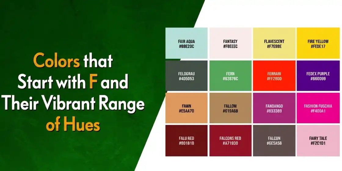
1. Fire Engine Red (#FE0002)

Fire engine red is one of the most recognizable shades in the world, and for good reason. It’s bold, urgent, and impossible to ignore. Brands use it when they want to signal passion, energy, or immediate action: think emergency services, sale banners, and food brands fighting for attention on a crowded shelf.
If you’re drawn to red as a brand color, take a look at our breakdown of famous red logos and what they communicate for inspiration on how the world’s biggest brands use this shade.
2. Forest Green (#228B22)

Forest green is the deep, slightly muted green you’d see in dense woodland canopy. It signals growth, stability, and a strong tie to nature, making it a top choice for eco-friendly brands, outdoor gear companies, and wellness businesses. It pairs beautifully with creams, fawns, and soft golds.
3. Fuchsia Pink (#EF2B7C)

Fuchsia pink is vibrant, joyful, and a little bit rebellious. Named after the fuchsia flower, this shade carries a strong feminine energy without being soft or shy. You’ll find it in beauty, fashion, and entertainment branding, and it’s a frequent choice for modern wellness and lifestyle brands that want to feel both playful and powerful.
4. Flesh Pink (#FFCBA4)

Flesh pink is a soft, peachy-pink that sits between pastel pink and beige. It’s warm, calming, and often used in beauty products, baby brands, and clothing lines that lean toward a natural, neutral aesthetic. Designers love it because it works as a near-neutral base while still carrying a hint of warmth.
5. Flax Flower Blue (#4499DD)

Flax flower blue is a clear, medium-bright blue inspired by the small five-petaled flowers of the flax plant. It feels calm, optimistic, and slightly modern. Use it for tech brands that want to feel approachable, wellness companies, or any brand trying to balance trust with a fresh, contemporary edge.
6. Fawn (#E5AA70)

Fawn is a warm, golden tan with subtle yellow undertones, named after the soft coat of a young deer. It’s grounded, comforting, and a smart choice for brands in hospitality, artisan food, leather goods, and home decor. Fawn pairs effortlessly with deep greens, navy, and ivory.
7. Fern Green (#4F7942)

Fern green is brighter and slightly more vibrant than forest green. It evokes new growth, fresh air, and the lush feeling of a sunlit meadow. It’s an excellent choice for spa and wellness brands, plant-based food companies, and any business that wants to feel both natural and lively rather than dark and heavy.
8. Fandango Pink (#E04F80)

Named after the energetic Spanish dance, fandango pink is a bold, slightly warm pink that radiates celebration and confidence. It’s perfect for event branding, dance studios, beauty brands, and creative agencies that don’t want to play it safe. It’s distinctive enough to feel modern, but classic enough to age well.
9. Faded Rose (#BF6464)

Faded rose is a softer, dustier take on traditional rose pink. It carries vintage charm and a touch of nostalgia, making it a favorite for boutique brands, wedding stationery, and editorial design. Pair it with cream, sage green, or warm gray for a romantic, timeless feel.
10. Flint Grey (#A09C98)

Flint grey is a cool, slightly warm-leaning neutral gray named after flint stone. It feels strong, modern, and quietly sophisticated. It’s a natural fit for architecture firms, fashion houses, and tech brands that want to feel premium without going fully black or stark white. As a backup neutral, it pairs with almost anything.
Transform Your Business with Professional Logo and Branding Services
Revamp My Brand
20 More Lesser-Known F Colors Worth Knowing
Once you go beyond the popular shades, the F family really opens up. These 20 colors give you fresh options when you want to stand out from competitors using the same overused palettes. Each one is a real, named color with its own emotional weight, not just a random hex code.
| Color Name | Hex Code | RGB | Quick Description |
| Flamingo | #FC8EAC | 252, 142, 172 | A playful pink-coral with tropical energy |
| French Blue | #0072BB | 0, 114, 187 | A refined deep blue evoking trust and sophistication |
| Firebrick | #B22222 | 178, 34, 34 | An intense reddish-brown radiating confidence and power |
| Flax | #EEDC82 | 238, 220, 130 | A warm, buttery yellow that feels like soft sunlight |
| Falu Red | #801818 | 128, 24, 24 | A deep Scandinavian crimson with earthy undertones |
| Fog | #D7D7D7 | 215, 215, 215 | A soft, neutral gray that whispers subtle elegance |
| Feldgrau | #4D5D53 | 77, 93, 83 | A muted military gray-green symbolizing resilience |
| French Lilac | #86608E | 134, 96, 142 | A dusty purple with a romantic, vintage feel |
| Fiery Rose | #FF5470 | 255, 84, 112 | A bold coral-pink that demands attention |
| Frost | #E1E8ED | 225, 232, 237 | An icy blue-white perfect for clean, modern aesthetics |
| French Raspberry | #C72C48 | 199, 44, 72 | A rich berry red with luxurious energy |
| Fallow | #C19A6B | 193, 154, 107 | An earthy golden-brown inspired by fertile soil |
| Fandango | #B53389 | 181, 51, 137 | An electric pinkish-purple bursting with energy |
| Fashion Fuchsia | #F400A1 | 244, 0, 161 | A runway-ready magenta pink that screams confidence |
| Field Drab | #6C541E | 108, 84, 30 | A rugged olive-brown rooted in natural landscapes |
| French Rose | #F64A8A | 246, 74, 138 | A warm, vibrant pink full of playful charm |
| Folly | #FF004F | 255, 0, 79 | A daring neon red-pink that refuses to be ignored |
| Foam | #D8FCFA | 216, 252, 250 | A whisper-light aqua evoking sea foam on a calm shore |
| Fern | #63B76C | 99, 183, 108 | A bright, lively green with springtime energy |
| French Bistre | #856D4D | 133, 109, 77 | A sophisticated warm brown with golden undertones |
If you’re picking a brand color from this list, pay attention to the personality each shade carries. Firebrick and Falu Red feel grounded and authoritative, perfect for law firms or financial brands. Flamingo, French Rose, and Fiery Rose bring instant warmth and approachability for lifestyle, beauty, and wellness companies. And earthy options like Fallow, Field Drab, and French Bistre work beautifully for artisan, organic, or heritage-style branding.
Want to go deeper on how individual hues shape a brand’s first impression? Our guide on logo color meanings breaks down how each color choice affects perception and recall.
What’s the Difference Between Fuchsia, Magenta, and Hot Pink?
Fuchsia and magenta share the same digital hex code (#FF00FF), an equal mix of red and blue light, while hot pink (#FF69B4) is a warmer, less purple shade with significantly more red and less blue. In print (CMYK), magenta tends to render slightly more purple than fuchsia, but in digital design the two are often interchangeable. Hot pink is its own distinct shade entirely.
The confusion between these three is one of the most common color questions we hear from designers and clients. So let’s break it down clearly.
| Color | Hex Code | Red | Green | Blue | Leans Toward |
| Fuchsia | #FF00FF | 255 | 0 | 255 | Equal pink-purple balance |
| Magenta | #FF00FF (digital) | 255 | 0 | 255 | Slightly more purple in print |
| Hot Pink | #FF69B4 | 255 | 105 | 180 | Warm pink, less purple |
Here’s how to think about which one to use:
- Fuchsia feels electric and modern, ideal for tech-forward brands, beauty companies, and gradient logo designs that need a pop of intensity.
- Magenta leans more artistic and creative. It’s a natural choice for creative agencies, art platforms, and editorial brands.
- Hot pink is pure, unapologetic fun. Think nail salons, fashion boutiques, and Y2K-inspired lifestyle brands.
If you want a deeper look at this whole color family, our full guide to shades of pink and what they mean covers more than 30 named pinks and how to use them.
How Do You Use F Colors in Branding and Design?
To use F colors effectively in branding, start by matching the shade’s emotional weight to your brand personality, then build a balanced palette by pairing one bold F-color with two or three supporting neutrals or accents. Use the bold F-shade for logos, calls-to-action, and hero imagery, and use the supporting tones for body text, backgrounds, and secondary UI elements.
Most successful brand palettes follow a simple rule: one hero color, one or two supporting colors, and one or two neutrals. F colors work especially well as hero shades because so many of them have strong personalities. Fire engine red commands attention. Forest green communicates trust and stability. Fuchsia signals creativity. Once you pick your hero, the rest of the palette should support it without competing.
When we work with clients on logo and branding services, one of the first questions we ask is how they want their audience to feel in the first three seconds of seeing the brand. The answer almost always points to a specific color family, and surprisingly often, it points to an F-shade.
Color Pairing Ideas Using F Shades
Knowing a hex code is one thing. Knowing how to pair it is what separates a hobbyist palette from a professional one. Here are five tested combinations using F colors, each tuned for a different brand personality.
Fuchsia Pink + Flint Grey: Bold Meets Sophisticated
Fuchsia brings the visual energy. Flint grey grounds it. Together they feel premium and fashion-forward, which is exactly why this pairing works so well for boutique beauty brands and modern lifestyle products.
Forest Green + Fawn: Nature’s Own Palette
This combo is borrowed straight from a forest floor. The deep green and warm tan together feel organic, trustworthy, and quietly luxurious, ideal for eco brands, artisan food companies, and outdoor lifestyle brands.
Fire Engine Red + Flax Flower Blue: Energetic Contrast
When you need a brand that stops the scroll, this high-contrast pair delivers. The red commands attention, while the blue keeps the design from feeling overwhelming. It’s a strong choice for sports, athletic, and youth-focused brands.
Fern Green + Frost: Clean and Refreshing
Lively green meets icy white-blue. The result feels fresh, modern, and clean, which is why you see this kind of palette across spa, wellness, and skincare branding.
Fandango Pink + French Blue: Playful Elegance
An unexpected combination that balances fun with professionalism. It works beautifully for creative agencies, event planners, and lifestyle brands that want to feel approachable without losing credibility.
When you build your own palettes, the rule of thumb is contrast. Pair a bold F-color with a neutral or muted shade, and your designs will have natural visual hierarchy without you having to force it.
Where Do F Colors Show Up in Real Life?
F colors aren’t just theory. You see them every day in fashion runways, brand identities, restaurant interiors, and product packaging. Here’s a quick tour of where they show up most.
Fashion: A fire engine red statement coat, a flax-flower-blue summer dress, a fawn leather handbag, or a fandango pink scarf. These shades have anchored fashion collections for decades because they photograph well and translate cleanly across seasons.
Branding and Logo Design: Forest green is a favorite for outdoor brands, fuchsia drives beauty packaging, fire engine red dominates emergency and food branding, and flint grey shows up across architecture and tech. If you’re starting a new business, our roundup of modern logo design trends can help you see how these shades are being used right now.
Interior Design: Soft pairings like flax blue and fern green create calming bedroom spaces. Faded rose and fawn add warmth to living rooms. Flint grey and frost work well in modern, minimalist kitchens.
Web Design: F colors are heavily used in modern UI palettes because of their tonal range. Frost and foam make excellent background tones, while fashion fuchsia and fire engine red work well as accent and CTA colors. Designers building their first sites can also browse our tips on web design principles to see how color choices fit into the bigger picture.
Frequently Asked Questions
| What is the most popular color that starts with F? Fuchsia is widely considered the most popular F color, followed closely by forest green and fire engine red. Fuchsia stands out because of its vibrant, attention-grabbing quality and its versatility across fashion, beauty, and lifestyle branding. |
| Is fuchsia a real color or a fake color? Fuchsia is a real, named color, but it’s sometimes called a “non-spectral” color because it doesn’t appear on the visible light spectrum as a single wavelength. The brain perceives it when red and blue light hit the eye together, which is why some scientists call it a “made-up” color. It’s still a valid, widely used hue in design and digital media. |
| What color starts with F and is similar to brown? Fawn is the most well-known F color in the brown family. It’s a warm, golden tan inspired by the coat of a young deer. Other F-shades that lean brown include fallow (a deeper golden-brown), field drab (an olive-brown), and French bistre (a warm, sophisticated brown with golden undertones). |
| Are fuchsia and magenta the same color? In digital design, fuchsia and magenta share the same hex code (#FF00FF), so they appear identical on screen. In print (CMYK), magenta tends to render slightly more purple, while fuchsia stays closer to the pink-purple midpoint. Most designers use the names interchangeably in casual conversation. |
| How many colors start with the letter F? There are well over 50 named colors that start with F, including popular shades like fuchsia, forest green, and fire engine red, plus dozens of lesser-known options like fandango, feldgrau, falu red, and French bistre. Most professional design palettes draw from a working set of 25 to 30 F-colors that cover the major emotional and tonal ranges. |
Conclusion
The world of colors that start with F is wider, deeper, and more useful than most designers ever realize. From the fiery confidence of fire engine red to the quiet sophistication of flint grey, this single letter gives you everything you need to build a strong, distinctive palette.
The next time you’re stuck choosing between the same five overused brand colors, come back to this list. Pick a hero F-color that matches your brand’s personality, pair it with a complementary shade or neutral, and watch how quickly your design starts to feel like its own thing.
Need help turning your color palette into a complete brand identity? Our team specializes in transforming raw color choices into polished logo designs and branding packages that actually move the needle. Book a free consultation and let’s bring your brand to life.
Latest news you want to know!
Subscribe for cutting-edge design inspiration at Logo Poppin! Elevate your brand with updates on logos, branding, web design, and video animation.
Note that by clicking “subscribe,” users may agree to our privacy policy and consent to Logo Poppin to use your contact data for newsletter purposes.
Logopoppin
Logopoppin is a graphic design agency that specializes in logo designing, web development, video production and advanced branding services. We love to innovate businesses with new age technologies, allowing them to improve their visual reputation.